It was in the year 1976 when Apple was born with a group of three brilliant entrepreneurs Steve Jobs, Steve Wozniak, and Ronald Wayne who co-founded it in the California city of Cupertino as a very small tech company, creating machines that were user-friendly for computers. Apple would grow into one of the most important shapers of the technology industry thanks to the personal computer, the smartphone, the tablet, and computer software. Well, an Apple Logos is something more than an image. A logo as we know is a symbol of a specific identity, set of beliefs and everything that, for the consumers, is expected from a given brand.
Part 1: Evolution of the Apple Logos
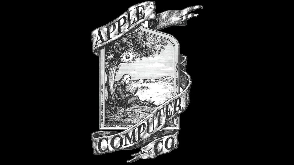
1. The Original Logo (1976): Newton Under the Apple Tree
The first logo by Ronald Wayne was of Sir Isaac Newton sitting under an apple tree, where the apple hangs above his head. This was a rather elaborate logo that symbolized discovering gravity and the inspiration to innovate that Apple Inc. intended to bring to the world. There were detailed elements to this design and a ribbon-like banner that read “Apple Computer Co.”
Why It Was Replaced Quickly
The logo had an innovative idea but was considered too elaborate for its own good, too tricky to create in small size, making it hard to be a highly recognized trademark. Furthermore, the drawing itself did not follow what would be the standard aesthetic from now on at Apple, where minimalism became a thing. The old logo is changed just after a year.
2. The Rainbow Apple (1977–1998)
In 1977, Apple came up with a new logo designed by Rob Janoff, in the form of a simple, stylized apple with a bite taken out of it. The logo had rainbow stripes and presented a jolly image and, thus, matched the freedom spirit of that time. This design was very popular immediately and helped Apple adopt a very strong branding both in visual terms.
Meaning Behind the Colors and Its Impact
The rainbow stripes were taken as a symbol of diversity, creativity, and accessibility. The multi-colored design signified Apples vision of computing for a large category of human beings and not the formal corporate image that other computer firms had adopted. The rainbow logo became the epitome of Apple’s personality: recreation, creativity and progressive.
Steve Jobs’ Influence on This Design
Steve Jobs was key in the decision to use the rainbow logo. He wanted a logo that would express Apple’s creativity and accessibility philosophy. His involvement in designing the logo helped establish its core values early on in the company, which would impact its products and branding for generations.
3. The Monochrome Apple (1998–Present)
In 1998, when Apple was transforming itself from a struggling company into one of the most successful brands in the world, the logo was also transformed. In place of the rainbow-colored stripes, a simple black or silver monochrome apple replaced it, giving it a more modern feel and look, minimalistic but sophisticated and elegant. The new design was in consonance with the renewed efforts of Apple to focus on simplicity, sophistication, and elegance.
Design Versatility and Significance in the Digital Era
With the monochrome logo, aspects were easy to change and make adjustments depending on the media and platform it was used in. It was readable on both dark and light backgrounds which made its clean lines perfect for digital interfaces. This design change was Apple’s transition toward the production of stylish and highly useful gadget that was used in the modern world in an efficient manner and in addition, had been modified to fit the aesthetics of a modern gadget.
Various Adaptations (Glass, Gradient, Flat Designs)
Over the years, the monochrome apple logos has been used differently in order to adapt according to different design trends ranging from glass, gradient and flat styles.
The glass version used during the launch of iPhone provided the logo with an impression of 3-D, reflective look. The flat design came out as Apple started using iOS7 and represented a modern style, clean approach to branding through visuals. All of these changes have ensured the apple remains as relevant, dynamic, and appropriate for use in lines of different products and marketing materials.
Part 2: The Symbolism of the Apple Logos
1. Global Recognition and Cultural Impact
Apple is well-known for its minimalist apple silhouette with a bite taken out of it. The clean, modern design of the logo communicates the company’s cutting-edge technology and focus on usability. The bite in the apple reinforces the notion of accessibility, as if inviting consumers to take a “bite” out of technological advancement.
The Logo’s Role in Popular Culture
The Apple logos has surpassed its status as a corporate symbol and entered popular culture. It represents not just a tech brand but a choice of lifestyle for many people. When it comes to music, movies or even clothes people associate it with everything that is new and trend setting. Most of the people in the world today are so familiar with this logo that one can say decisively that Apple has made its logo a trademark.
2. Theories Behind the “Bite” in the Apple
One of the popular theories behind the “bite” in the Apple logos is that it is a tribute to Alan Turing, the British mathematician and computer scientist who played a crucial role in breaking the German Enigma code during World War II.
There are truly rumours that Turing tragically committed suicide due to eating a poisoned apple – and so the bite represents that. While this theory has not been endorsed by Apple. This theory gives an emotion and intelligence to the symbolic interpretation of the logo and enhances the real tangible linkage of Apple to brilliance in the technology space.
Practical Reasons for the Bite (Scale and Recognition)
Apart from this possible tribute to Turing, the bite in the Apple logos also provides a more practical functionality. Originally, without the bite, the shape could have resembled a cherry or a tomato; hence it would have been less identifiable as an apple. Through the addition of the bite, the logo immediately becomes very recognizable and unique and thus better identifiable at all sizes and in different situations.
Part 3: Designing a Memorable Logo
The Apple logos is perhaps the best example of how a simplicity of design can really come together to be extremely powerfully recognized by brands. Its clean lines, minimalistic nature make for easy reproduction. That makes for instant recognition in its website form, an advertisement or even as a tiny application icon on a mobile. The lesson here is that a successful logo should be simple yet distinctive enough to be recognized at a glance.
Evolution with Changing Times Without Losing Essence
The Apple logos has changed over the years, but its core identity has remained the same. From the colorful rainbow apple of the 1970s to the sleek, monochromatic version used today. Apple has adapted its logo to reflect changing design trends while staying true to the original concept. This ability to evolve while retaining the essence of the logo is key to maintaining long-term brand recognition. Learn here about logo evolution as a marketing tool: how to change your logo.
The Role of Logos in Modern Branding
A logo is usually the first thing that comes to a consumer’s mind when thinking about a brand, and it can highly influence how they perceive the company. A good logo can create trustworthiness, professionalism, and quality, but a bad one can have just the opposite effect. For instance, in the case of Apple, the sleek design of the logo and its association with innovation has helped to position the company as the leader in the tech industry.
Tips for Creating a Logo That Stands Out
A thoughtful process must go into designing a memorable logo. Here are some tips on how to create a logo that stands out:
- Keep it Simple: Keep it simple, stupid. As is proven by the Apple logos, this really works. A simpler design is more likely to be remembered and recognized by your target consumers.
- Ensure Versatility: Make sure your logo looks effective on a variety of media, from large-scale print advertisements to tiny digital icons.
- Make It Timeless: A good logo should stand the test of time. Avoid trendy designs that will date your company soon.
- Be Meaningful: A logo should mean something about your brand. Whether it is a color, shape, or symbol, it should reflect something meaningful to your company or story.
- Consider Color Psychology: Colors elicit different feelings in people. Therefore, select colors that match your brand’s personality and your target audience.
Part 4: Bring Your Logo Vision to Life with Arvin AI
Creating a logo that truly represents your brand identity is a crucial step in establishing your business’s image. Arvin AI provides unique service in logo design that is fast and affordable. It is easy for anyone to use for both design students and experts. Designed as an AI system, Arvin AI can offer specific tips to create the best logo in terms of your brand’s message and identity. Whether it is a modern, minimalistic design or something more elaborate. Arvin AI features ensure a user-friendly experience that brings your vision to life with just a few clicks.
Key Features of Arvin AI for Logo Creation:
- AI-powered Design Suggestions: Creative and personalized logo ideas according to the information of your brand.
- User-friendly Interface: Simple and easy to use design platform for professionals as well as beginners.
- Wide Range of Templates: Huge library of pre-made templates available according to industries and styles.
- Customization Options: Complete control over colors, fonts, shapes, and icons to customize your logo.
- High-quality Output: Download your logos in high-resolution formats like JPG, PNG, SVG, and more for digital and print usage.
Steps to Design Iconic Branding with Arvin AI
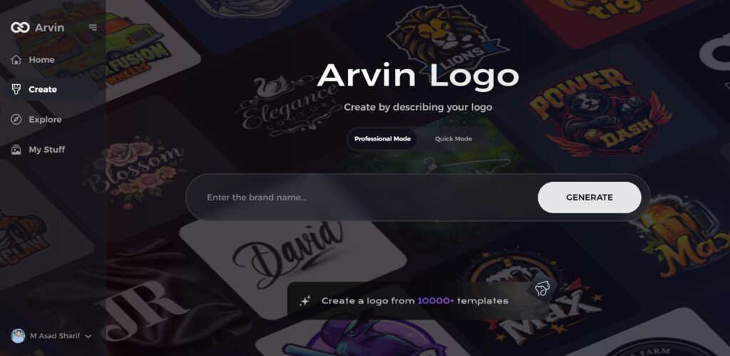
Step 1: Go to the Arvin AI Website
Open your browser and navigate to Arvin Logo Maker to start designing an iconic, transparent logo for your brand.
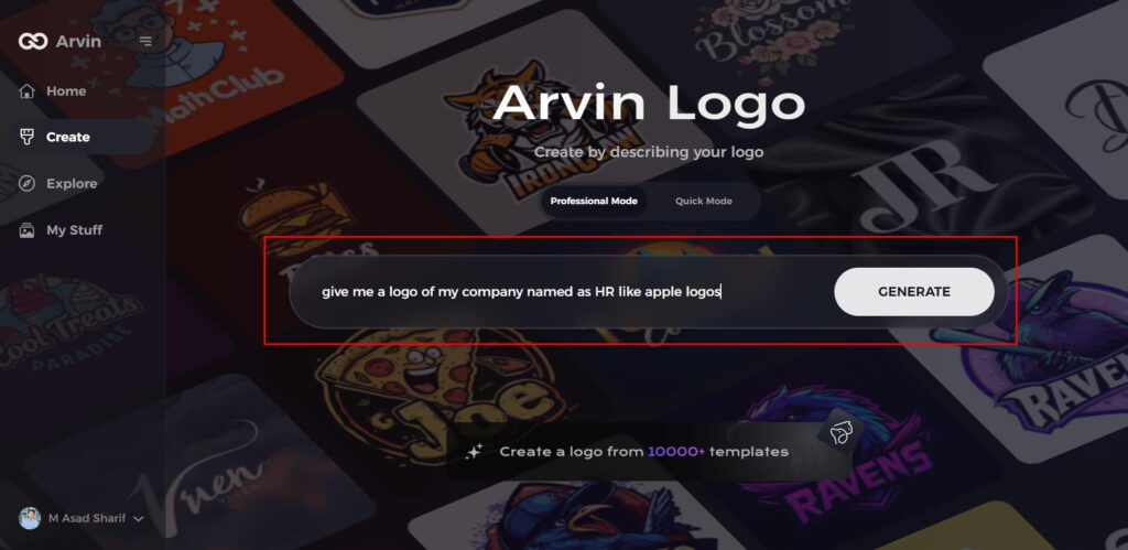
Step 2: Input Your Brand Details
Input your brand name and select its category. Request a transparent logo to allow the AI to create custom designs that represent your business correctly.
Step 3: Select Your Industry
Select the industry category that your brand falls in. This helps the AI create concepts for logos suitable for your brand’s niche and values.

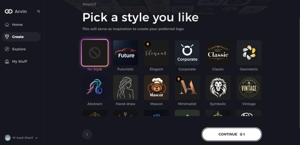
Step 4: Select a Style Theme
Select a theme of design that suits you. If you are undecided, then choose “no style” so that AI generates you out-of-the-box logo concepts.
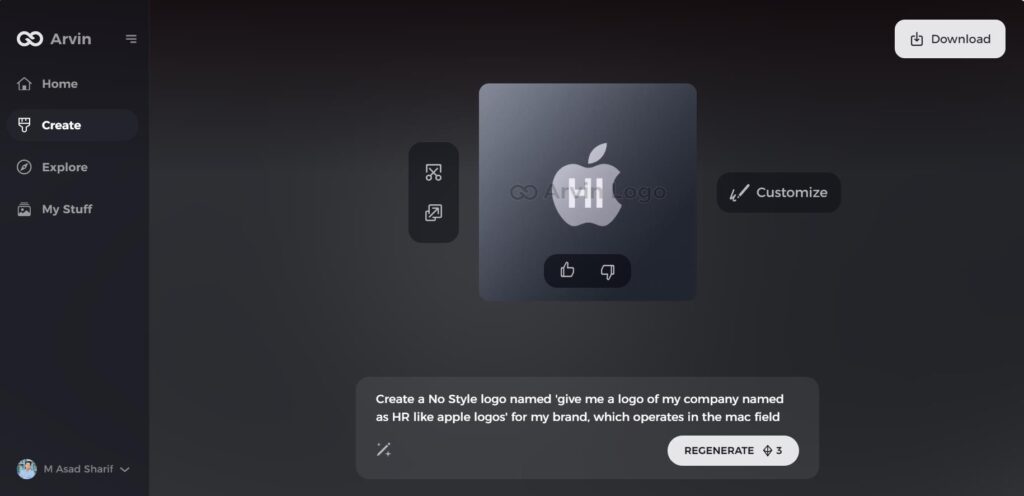
Step 5: Choose Your Logo Concepts
Go through the logo ideas that Arvin AI designed. Look for the most relevant designs that suit the identity and vision of your brand.
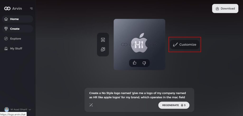
Step 6: Refine Your Iconic Logo
Tweaks the chosen logo further to ensure that its color and font. Also its icon all reflect the personality of your brand and its aesthetics.
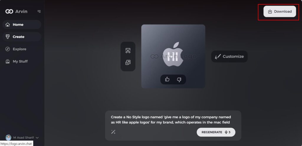
Step 7: Download Your Unique Logo
When you are satisfied, you can download your logo in formats such as PNG and SVG. It will therefore look professional on any digital or print media.
Part 5: The Legacy and Future of the Apple Logos
Apple logos have been associated closely with creativity and quality and a number of the company’s most popular marketing promotions have used the image. In this guide, six different Apple advertisements have been examined and it can be seen that, in each case, the centerpiece of every communication was the company’s iconic logo. You will like to read about our guide on minimalist fonts: how to choose the perfect style for your brand.
How the Logo Reinforces Apple’s Identity
The simplicity of the Apple logos—a clean, minimalist design—reinforces the company’s ethos of simplicity and user-friendliness. Its design is not only visually striking but also carries deeper associations of creativity, innovation, and premium quality, which are reflected in the brand’s products and services.
Predictions for Future Adaptations
As technology advances, it can be expected that the Apple logo will be subtly modified to remain consistent. Such changes might be related to the color palette in line with a more contemporary and modern feel of being technological savvy or dynamic logos for various digital media.
Staying Relevant in a Competitive Tech Landscape
Now, when the pace of evolving and adopting new technologies in a company’s flow is fast. Apple has to find a sweet spot between continuing previous successful practices and experimenting with something new. The simplicity of the Apple logos makes it flexible and adaptable to future technologies, making it relevant as the company expands into new markets.
Conclusion
The Apple logos have undergone a fascinating transformation, evolving from a detailed design to the sleek, minimalist icon it is today. This evolution reflects the company’s journey toward simplicity, innovation, and accessibility. The meaning behind the logo, from the apple being knowledge to the bite that indicates discovery and engagement, has a crucial role in the definition of Apple’s identity. A powerful logo like that of Apple is sure to have a long-lasting impact on branding. Arvin AI has tools powerful enough to help one come up with professional, memorable logos; hence, it would be perfect for anyone wanting to create their own iconic brand mark.
FAQs about the Apple Logo
What Does the Apple Logos Symbolize?
This logo represents simplicity and innovation since the company has been committed to developing easy to use technologies with knowledge and improvement of technologies.
Why Is There a Bite in the Apple Logos?
There is a bite in the Apple logo for clear identification from other fruits. It represents knowledge and innovation, based on the biblical apple of knowledge and discovery.
How has the Apple logo changed over the years?
The Apple logos has changed from a detailed illustration in 1976 to the simple, rainbow-colored logo in 1977. And finally to the sleek monochromatic version introduced in 1998, reflecting modern design sensibilities.
Can I create a similar iconic logo using Arvin AI?
Yes, Arvin AI can help to draw professional logos with more design opportunities and ease of use. It has good in-built templates allowing people to create such logos as Apple one.
Read More
Sticker Size Guide: Choose the Perfect Dimensions for Your Needs

