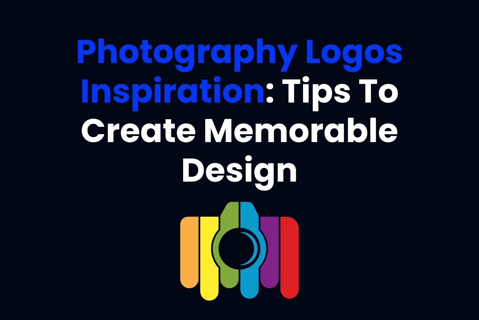
A photography logo is an integral part of branding that differentiates and establishes recognition. Because photographers use their personal style, the logo needs to be able to express this personal aspect. A great logo attracts clients and is not easily forgotten. This article is going to discuss why photography logos are significant, how to design one, and what you can do to create a really very unique logo that would actually represent your brand.
Part 1: The Power of a Great Photography Logo
A well-designed photography logo makes your brand memorable and shows off your style. It builds trust and helps clients easily recognize your business. The iconic logos reflect your photography style, whether it is portraits, events, or nature, and keeps you’re branding consistent across platforms. Iconic logos like Annie Leibovitz’s initials and National Geographic’s yellow frame are simple, memorable, and match their brand.
Part 2: Key Elements of a Photography Logo
Choosing the proper elements that come together to form a unique and effective brand image is the true art of designing a photography logo. The elements to consider are color, typography, and iconography. Each one among them plays a very critical part of how your logo might express your sense of style and draw in potential clients.
Color Psychology
How logo Colors Influence Perception in Photography Logos: Colors are effective tools in design because they can evoke a lot of emotions and perceptions. For photography logos, the color you use might make your clients perceive your business differently. A color like blue gives a feel of trust and professionalism, whereas yellow might seem energetic and creative.
Typography
The role of logo fonts and lettering in making a design memorable: Your logo’s type is known as typography, referring to the types of fonts in your logo. A font can define your brand personality. For example, a clean, modern font might be great for a photographer who works mainly on sleek, contemporary pieces, while a hand-written style font will do the job for someone focusing on personal, artistic projects.
Iconography
Using Symbols Such as Cameras, Lenses, or Other Relevant Imagery: Iconography is the use of symbols or images in your logo, such as cameras, lenses, or other photography-related items. These symbols help communicate what your business is all about in a simple and clear way.
Part 3: Photography Logo Design Trends
Photography logos can be designed in a variety of ways, and there are several popular trends that photographers often choose to reflect their style and personality. These trends range from simple and clean designs to more nostalgic or personal styles.
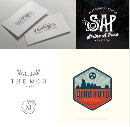
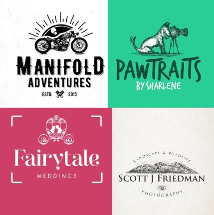
Vintage photography logos
When you look at 35mm photos, emotions such as nostalgia, warmth and memories are evoked. If your photography business specializes in classic style photography, the logo needs to express the same feeling. A great way to achieve it is to use vintage fonts in the era when film was commonly used. The above example uses fonts reminiscent of Art Deco, handwritten letterpress fonts, and even old-fashioned writing.
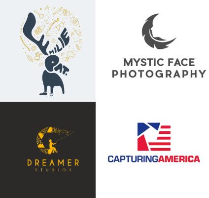
Clever logos for unique photography
If you own a photography business that does more than standard points & shoots, we recommend that you consider a conceptual logo that will help clients understand your work. This is a very skillful concept that helps explain how Capturing America is a business that specializes in photographing stock photos that capture the essence of the country throughout the United States.
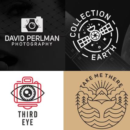
Line art logos
Experienced photographers know that good photographs are integrated into composition, space, lines and aesthetics. One way to express the basics of such photographs with a logo is to create skillful compositions complemented by clean, modern line art. We like that the Take Me There logo creates a solid symmetrical composition that includes water, trees, mountains, sunrise and whale tails!
Fun photography logos
Customers in the photography business are often visual people, and when they look at the image, they understand what it represents. One way that logo design draws the attention of a visual person is to create visual dajare and metaphors. This is particularly effective for businesses with nimble, friendly, and fun identities.
Logos that make your subject the star
All you need for a photo logo is a simple illustration of the subject you are specializing in. Nothing so easy! If you shoot a dog, use the illustration of a happy dog. Bike? How about a cool bike and the sun rising behind it? Furthermore, if you are committed to attracting the right clients, this approach is a sure way to attract the right people. Bikers will not try to bring a bike to your dog photo studio!
Part 4: Mistakes to Avoid When Designing a Photography Logo
While creating a photography logo, it is very difficult to hold on to that enthusiasm for a unique design. Let’s look at the common mistakes made by photographers while designing, which most avoid to make sure that the logo works for the brand effectively and is flexible for use in a variety of settings.
Overcomplicating the Design
Why less is Often More There are many things wrong with a logo when it is overcomplicated. Too many elements in one design will tend to confuse your logo with all the details. Simple designs are usually more effective because they have an easier tendency to be remembered and work better across platforms.
The Use of Too Many Colors or Fonts
Another common mistake is using too many colors or fonts in a logo. While it may be tempting to use various colors to make your logo stand out, too many can make it look messy and unprofessional. Stick to a limited color palette—usually two or three complementary colors that reflect your brand’s personality. The same goes for fonts. Using multiple fonts can make the logo look disorganized and harder to read. Instead, select one or two fonts that go well together and fit the aesthetic of your photography.
Not Designing the Logo to Be Scalable
A logo should be flexible enough to work in different sizes and on different mediums, from business cards to websites. If your logo very detailed, the image will likely not work out well in scaling down to size for the little spaces that sometimes are a pain, like for social media profiles or as watermarks.
Part 5: Using Arvin AI to Improve Your Logo Design Process
Arvin AI is a tool that can make your photography logo absolutely perfect. Using only a few keywords or preferences, Arvin AI generates a set of ideas for logos that are made according to your style. This saves time as it gives you suggestions for creative work and allows you to fine-tune the design so that it is suitable for your brand. Features of Arvin AI are so easy to use that even a nondoing professional can create his logo. It’s a good way to bring your vision to life quickly and professionally.
Key Features of Arvin AI
There are following key features of Arvin AI:
- Easy logo creation: Helps you design logos in just a few steps.
- Variety of options: Offers different logo styles to choose from.
- Customizable: Allows you to adjust colors, fonts, and icons.
- Saves time: Quickly gives you several logo ideas to consider.
- Simple to use: No need for design skills to create a professional logo.
- High-quality designs: Ensures your logo looks great on all platforms.
- Personalized results: Generates logos based on your photography style and needs.
Steps to Using Arvin AI in Creating Your Photography Logo
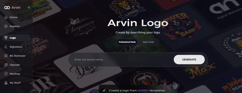
Step 1: Register and Login
Access the logo-making tool at the site of Arvin AI and create your account then login for use.
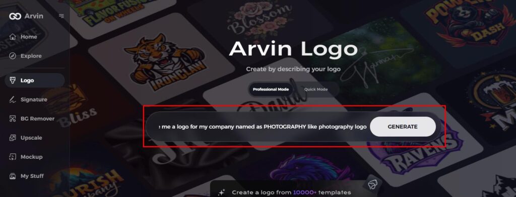
Step 2: Provide Information about the Brand and Your Desire
Write in the space available the name of your brand, tagline and line of industry, your font choice, image idea, and other.
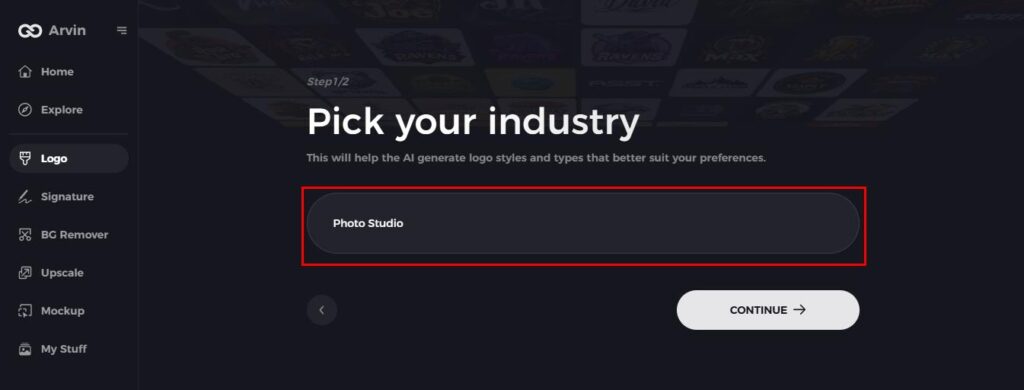
Step 3: Select your industry
Choose your photography niche, whether it’s portraits, events, or nature, to help AI generate the most fitting logo options.
Step 4: Choose Your Logo Style
Pick a logo style that matches your vision. This will guide AI in creating a logo inspired by your preferences.
Step 5: Personalize Your Logo with Arvin AI Tools
After Arvin AI generates your logo, customize it using available tools—adjust font styles, layout, and icon positions until you’re happy with the result.
Step 6: Save and Download Your Logo
Preview your logo, then save it in a high-resolution format suitable for both print and digital use.
Conclusion
A photography logo should stand out to be memorable, therefore helping attract clients. Thus, choose a design that reflects your style and represents what your business is all about. Simple, relevant, and professional: those are the lines you shouldn’t cross. If you want an easy way to create a logo, then Arvin AI is the go-to tool in order to produce the perfect logo quickly and easily. Get started with Arvin AI today and make your photography logo ideas a reality!
FAQs
What makes a photography logo memorable?
A good photography logo should be simple, unique, and unique but well-fitting for your brand’s style. It should also be recognizable and reflect the kind of photography you do.
How do I pick the right colors for my photography logo?
Colors play an important role in your logo. For photography, choose colors matching the mood or style of work you do like using calm color for nature photographs or bold color for creative photography.
Can AI be used for designing a logo for photography?
Yes, Arvin AI is a good tool to help you design your logo. It expresses unique ideas based on your style as well as preferences, thus making logo creation fast and easy.
What are some common mistakes when designing a photography logo?
Common mistakes include using too many details, colors, or fonts, and creating a logo that’s hard to scale for different uses. Keep it simple and clear to avoid these issues.