
Your business card goes beyond a piece of paper; it is a reflection of your brand and your professionalism. Typography is one of the most important aspects of business card design. The best font for business cards guarantees that your contact information is legible, your branding is nice, and your card sticks in the memory. In this article, we will check out various font types, what industries they are most appropriate for and what is the best font for business cards.
Part 1: Why Choosing the Best Font for Business Cards Matters
A good font creates a good first impression, helps readability, and is in-line with your industry’s branding. Of course, making the right choice ensures that your business card stands out in a professional and effective manner.
First Impressions Count
For most professionals, a business card is the first touch point that a potential client or collaborator has with them. A well thought out card with a considered font can speak of trust, reliability and professionalism. A negative impact would be created if the typography is too messy, small, or unreadable, leading to junking of your cards by the recipients themselves.
Readability and Professionalism
The primary function of a business card is to make sure you transmit relevant contact information like: your name, company name, phone number and email. So, make sure you use a clear, readable font so people can access this information easily. Decorative fonts may seem fashionable, but they can often sacrifice readability, which is why choosing a clear, professional font is necessary.
Matching Your Industry and Branding
This is based on the principles of typography, where different industries must have different typography designs that go in line with that brand. For example:
- Tech startups and modern brands often use sans-serif fonts like Helvetica or Montserrat for a sleek, clean look.
- Traditional businesses such as law firms and finance companies prefer serif fonts like Times New Roman or Garamond for a classic, trustworthy feel.
- Luxury brands and creative businesses may opt for script or display fonts to add personality and uniqueness.
Part 2: Understanding Font Categories for Business Cards
Different fonts transmit different brand signals. Furthermore, Understanding serif, sans-serif, script, and display fonts will help you select a perfect typeface for the business card to be professional and visually attractive.
Sans-Serif font
Business Card Sans-Serif Font: A typeface without decorative strokes (serifs) at the end of the letters. These are modern and minimalistic yet readable fonts, hence the most popular choice for businesses looking for a clean and contemporary aesthetic.
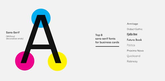
Why Choose Sans-Serif Typography?
These fonts are highly effective in digital and print design, making sans-serifs a well-rounded option. They also read well at small sizes so every detail on a business card stays legible and professional.
Sans-Serif Examples
Sans serif is one of the best font for business cards: Helvetica: A timeless and professional typeface, Helvetica boasts excellent readability. Another option is Arial: a simple, versatile and corporate font. Futura’s geometric composition bestows a contemporary feel, while Montserrat presents a chic typography thats ideal for startups and creative entrepreneurs.
Serif Font
Serif is when the end of the letters has a little stroke to them, or what you call the “serif”. These fonts are associated with tradition, reliability, and authority, which can be beneficial for companies looking to convey credibility and trustworthiness to their customers.
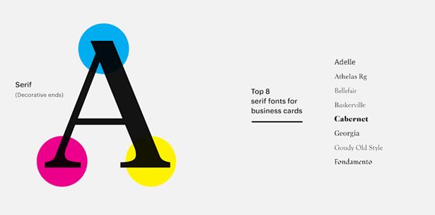
Why Choose Serif Typography?
Serif fonts are generally used in trustworthy industries. They create more of a sense of refinement & class and thus businesses that want to present a long-lasting, trustworthy brand identity do prefer these fonts.
Examples of Serif Font
Good examples of serif fonts for business cards are Times New Roman, a standard in the formal business world. Garamond is an eye-catching elegant font, and Baskerville is a serif font that is classic and offers great readability..
Script Font
Examples of business card script fonts mimicking handwriting or cursive strokes. Usually used to give a more personal and artistic touch but use them sparingly in the text, where they can lose their readability.
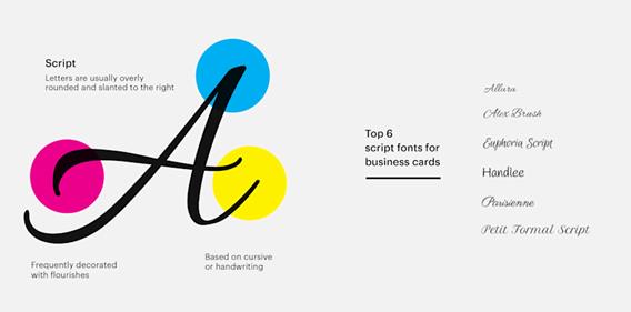
Why Choose Script Fonts?
Script fonts evoke an air of elegance and sophistication, which is why they are a good choice for businesses in creative or high-end sectors. Mostly they are used as promotional taglines and decorative text, not for basic contact information.
Examples of Script Fonts
Here are some of the great script fonts for business cards such as Pacifico—playful and stylish. Dancing script provides a bold yet elegant flowing style, and Great Vibes is a highly decorative cursive that serves luxury brands well.
Display Font
Business Cards display font is meant to pop and be eye catching. Many of these fonts are very stylized, and work best in logos or headlines rather than body text.
Why Choose Display Fonts?
Display fonts are bold and unique, and are great for brands looking to show off their creative side. They assist businesses in making a lasting first impression and setting themselves apart from competitors.
Examples of Display Fonts
Best font for business cards: Impact (bold and strong). Lobster is an elegant yet decorative typeface with a unique vibe whereas Bebas Neue is modern all-uppercase font which is suitable for branding.
Part 3: Best Font Combinations for Business Cards
Selecting the font pair may aid in readability and aesthetics. This when revised proportionately offers a smart look and guarantees clarity along with uniformity on business card.
Why Font Combinations Matter
Read this article if you are interested by card fonts and looking for different killer font combinations to make the business card more professional and wholesome. Using a combination of different fonts adds contrast between information elements, highlights important areas, and introduces visual interest without cluttering the card. On the contrary, the use of wrong fonts can make your text look inconsistent and not easily readable.
Pairing a Sans-Serif with a Serif Font
Pairing a Sans Serif font with a Serif font is one of the best ways to create contrast in your business card design. Sans-serif fonts which are modern and clean contrast well with serif fonts that are more formal and traditional. The combination of them gives a well-balanced and professional appearance, making it both easy to read yet visually pleasing.
Using Different Weights of the Same Font
Another tip for successful typography is to utilize the mixed weights (bold, regular, italic) of the same font family. This approach maximizes consistency but still allows for visual variation. An example could be using a bold version of a typeface for a name and the regular version for contact details, keeping the key aspects prominent without multiple font families.
Avoid Using More Than Two Fonts
Font Pairings are the cherry on top, but using 3+ fonts can make a business card look cluttered and unprofessional. To keep things looking neat and tidy, stick with a maximum of two fonts. The font-families you choose should work well together and second, use weight variations (bold, thin, light etc,) instead of using different typefaces to guarantee elegance and sophistication.
Part 4: Best Font Size for Business Cards
The size of the font is a critical factor affecting reading. Selecting the appropriate size makes certain that the names, contact details, and branding elements are visually appealing and legible when recommended and played.
Font Size and the Ease of Reading
Choosing the correct font size is essential to ensure that all of your business card information is readable and clear. Too small a text would be difficult, whereas too big a text would make the card look unbalanced. Font size highly varies based on the type of text and how important it is on the card.
Ideal Font Sizes for Different Elements
- Names and Headlines: The most important text on a business card is the person’s name or business name. To ensure clarity and impact, the font size should range from 10pt to 16pt.
- Contact Information: Phone numbers, email addresses, and website URLs should be readable but not overpowering. A font size of at least 8pt ensures clarity while maintaining a clean design.
- Taglines and Secondary Text: If your business card includes a tagline or additional information, the font size should be 8pt to 10pt to keep it legible without drawing too much attention.
Fonts to Avoid in Small Sizes
Script fonts or thin serif fonts in small sizes can be less legible. Script fonts can lend elegance but are hard to read at reduced size. In the same vein, thin serif fonts can also lose detail when printed small, resulting in bad text. With extremely simple and clear typeface, choose one that will make every detail on your business card easy to read.
Part 5: Mistakes to Avoid When Choosing Business Card Fonts
When it comes to business card design, one common mistake in design is mixing up too many typefaces. While mixing two fonts can give the card a distinctly contrasting look, going for three or more fonts would end up making the card either too chaotic or tacky.
Choosing Overly Decorative Fonts
Just because a font looks fancy, doesn’t mean it’s readable, and while that too is a stylistic choice, it’s generally not a good one. Since business cards need to be read quickly, especially in networking settings, your font should also be easily legible, so steer clear of decorative and highly stylized fonts that could make key information difficult to extract. Instead, choose fonts that achieve a balance between high aesthetics and clear readability.
Not Considering Printing Methods
One final consideration that does not get much attention is how fonts look once printed on materials — whether paper, plastic, or fabric. Even if a font looks great on a screen it may not reproduce well when printed on glossy, textured or embossed business cards. Thin fonts, for instance, might not be clear on textured paper while too bold fonts may look too heavy on glossy surfaces. Selecting a font that is well-balanced and prints nicely on all surfaces will help keep your business card looking professional no matter the format.
Part 6: How Arvin AI Can Help You Design a Professional Business Card
Arvin AI Logo Maker, an AI-powered design tool for anyone from businesses to startups and entrepreneurs and creatives to generate easy and professional logos. Whether you’re creating a fresh brand from scratch or rebranding an existing business, Arvin AI makes the logo creation process super easy with smart design suggestions, templates that you can customize (edit and modify to your liking), and high-quality logo downloads.
Key Features of Arvin AI
- AI Logo Maker: Create a custom logos and identity designs tailored to your industry and preferences.
- Wide Range of Customization: When it comes to fonts, colors, icons, or layouts, you can alter it all to ensure your logo is in line with your brand.
- Premium Vector Downloads: Acquire one of the print-ready high-resolution files you need for digital and physical branding of (PNG, SVG, and EPS)
- Industry-Specific Logo Templates: Select from thousands of professionally designed templates optimized for the likes of tech, fashion, real estate and more.
- Instant Branding Kit: Get a full branding kit that includes color palettes, typography, and mockups for a consistent brand identity that stands out.
Steps to Use Arvin AI for making Logo
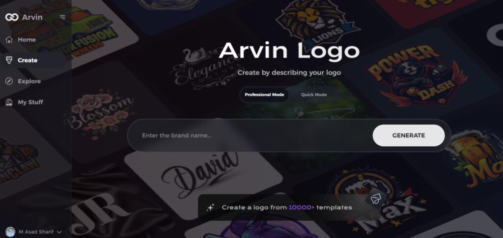
Step 1: Visit the Arvin AI Website
Begin by opening your web browser and navigating to the logo creation page on Arvin AI to start crafting your bird-themed logo.
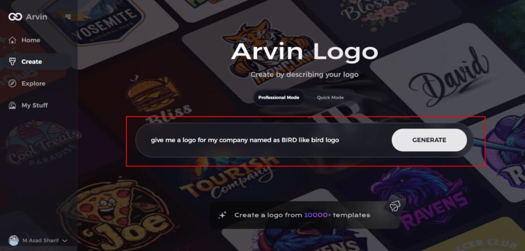
Step 2: Enter Your Business Details
Provide essential business information such as your company name and industry. This step helps the AI generate logo designs tailored to your brand’s identity.
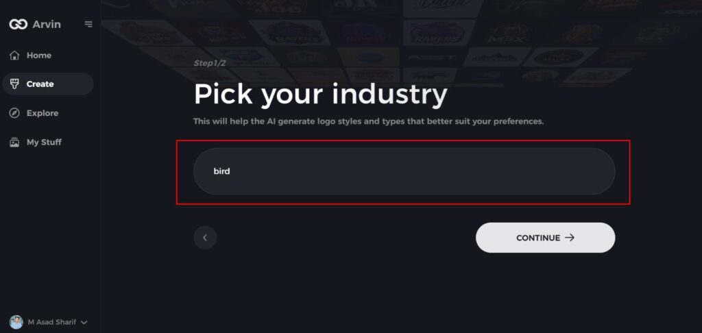
Step 3: Select Your Industry
Choose the relevant industry from a list of options. This allows the AI to narrow down design styles and offer ideas that best match your sector.
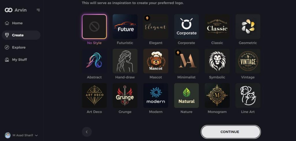
Step 4: Choose a Style
Browse through the available style options and select one that aligns with your brand’s vision. If you’re unsure, simply skip this step, and let the AI suggest a style based on default preferences.
Step 5: Explore Logo Concepts
The AI will generate a variety of bird-inspired logo concepts based on your inputs. Review the designs that resonate with your brand’s image and goals.
Step 6: Customize Your Logo
Personalize your selected design by adjusting elements such as colors, fonts, icons, and layout to make the logo truly your own.
Step 7: Download Your Logo
Once satisfied with your customized bird logo, download it in formats like PNG or SVG, ideal for use on websites, social media, and print materials.
Conclusion
Selecting the best font for business cards is critical in leaving a lasting impression. The ideal typeface should capture your brand identity, be readable, and express professionalism. Good cards are a huge credibility-booster and make for better brand awareness. Arvin AI is an advanced AI-powered design tool if you want to create a high-quality business card without much effort. It offers ideal font pairings, customizable templates, and high-resolution downloads for a professional logo. Design a stunning business card in minutes using Arvin AI.
FAQs
What is the most professional font for a business card?
The most professional fonts for business cards include Helvetica, Garamond, and Montserrat. These fonts are clean, easy to read, and widely used in corporate branding.
Can I use multiple fonts on my business card?
Yes, you can use two complementary fonts, such as a serif and a sans-serif. However, avoid using more than two fonts to keep your design clean and professional.
What is the minimum font size for business cards?
The minimum recommended font size for business cards is 8pt to ensure readability, especially for contact details. Headings and names should be 10pt to 16pt for visibility.
How can I create a business card with the best font?
You can use Arvin AI to design your business card with pre-selected font pairings and layouts optimized for branding. It ensures your business card looks professional and is easy to read.
