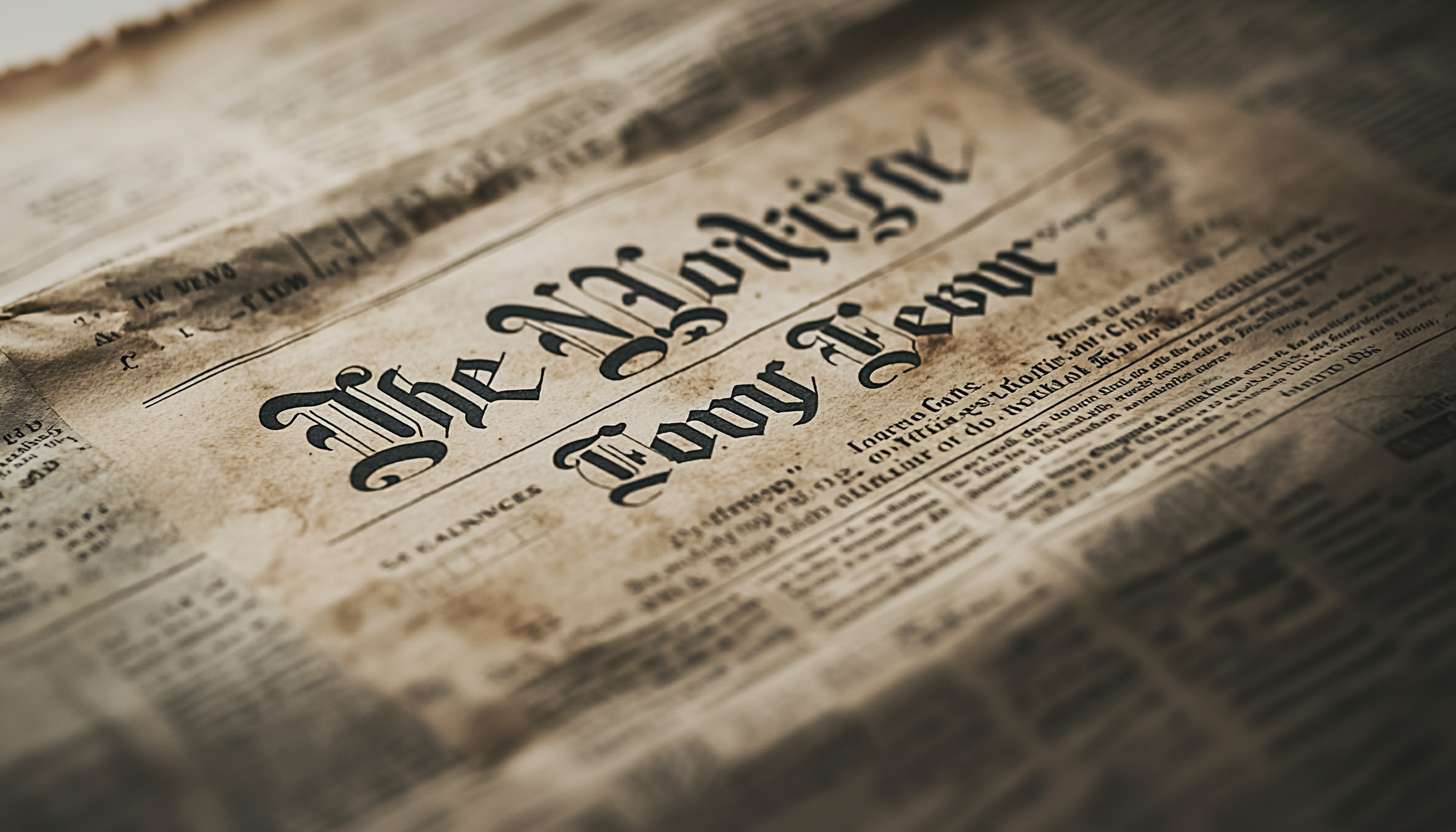
The logo of the New York Times (commonly known as the Times, NYT, NY Times) has been unique since the newspaper’s founding in 1851. The logotype been changed many times, but has never been fundamentally changed. Therefore, the New York Times should be a timeless newspaper. The current New York Times symbol mark is widely regarded as one of the best and most powerful logotypes of all time. The New York Times logo designed in the late 1960s by Edward Benguiat, a prominent U.S. typographer. Let’s take a closer look at it.
Part 1: The New York Times Logo History and Evolution
The New York Times founded in 1851 by Colonel Raymond. He wanted to create a newspaper that would be an appropriate source of information for people, without shedding damn rumors and gossip. The once reputable New York Times has suffered from business shortages. By 1916, the newspaper had nearly 350,000 copies. Its iconic masthead, designed in a distinctive Lettermark Logo, became a symbol of journalistic integrity and recognition across the nation.
1851 – 1857
The founders, who wanted the appearance of the newspaper to be something like London Time, aimed for a very elegant and sophisticated New York Times logo. New-York Daily Times. I chose a gothic font for the letter. As seen in later versions, hyphens and the title-ending period were an important part of the name. The name written in black, further enhancing the classic and timeless impression. It interesting that this newspaper published in black and white.
1857 – 1890
The inscription “The New-York Times.” Changed to. Hyphens and periods were also used in this version. The spacing between words appears to be wider, but this may be because the designer wanted the length of the entire inscription to be the same as the original. Since the font has not changed much, the New York Times logo looks almost identical to the first one.
1890 – Present
The font used from the beginning used as it is. However, in bold, the thin and delicate lines on the other two logos removed. At the same time, the clean lines and all the neat details create a very cohesive look. Lettering definitely portrayed by perfectionists. The deletion of hyphens with periods at the end not only frustrated some subscribers, but also contributed to a more balanced appearance as the spacing between words and words.
Symbol Mark
In early 1967, typographer Edward Benguiat was tasked with redesigning the legendary logotype. Although given the chance, he gave up making drastic changes to the New York Times logo or changing the original style. What he hoped was that this symbol mark would still be recognizable, and that by maintaining its distinctive appearance and style, readers would always be able to identify which newspaper this symbol is.
Part 2: Design Elements of the New York Times logo
The legendary New York Times logo is not made by itself, nor is it made famous without reason. The famous logo, the logo that you can see at a glance, and the New York Times logo that clearly shows that it is from a specific company, is not easy to make. The logo contains elements that make it stronger and stand out. The New York Times logo stands out among the millions of logos on Earth, and it is very different. What are the factors that make that difference?
Font
The current font used for the New York Times logo designed by Edward Benguiat, a typographer known for his work on many great logo fonts. As a typographer, he also designed great logos for magazines such as Esquire and Reader’s Digest. Since this logo is a wordmark, it was important to use a prominent font and play an important role in giving individuality to the logo. The fonts used make this logo timeless and increase the popularity of this logo.
Color
The newspaper color palette is simple, black and white only. This was consistent from the first logo, so there was no need to dare to expand from the simple two colors that the New York Times has been consistent with for more than two centuries. The choice of this color is classic, and it also the color scheme used by the paper for heading. Bold logo colors make the word mark character stand out and show strong.
Part 3: History of The New York Times
It is undeniable that there is a newspaper company that has a long history, like the Times. As is the case in any business, the paper has overcome times of hardship, but it never pulled its feet. The New York Times published in New York and distributed internationally. The company owns 15 papers, including the Boston Globe. Let’s take a look at where this newspaper began and how far it progressed during the second century.
1. Birth of The New York Times
The Times founded on September 18, 1851, by Henry Jarvis Raymond as a penny paper to objectively report all news. Rather than trying to appeal to more readers, the editors got off to a powerful start by appealing to intelligent and cultural readers. It tells stories that other newspapers around the world don’t report, in a unique way. Although he got off to a strong start, he was unable to make a sword on a large number of other papers.
2. Sunday Magazine & Price Reduction
The paper was acquired by Adolf Simon Ochs in 1896, at the time a $1000-a-week deficit. Ox’s mission was to turn the Times into an international daily newspaper, emphasizing coverage of international events and trying to eliminate fiction from newspapers. He added Sunday magazine to the newspaper and reduced the price to 1 yen.
3. Rising Popularity and Early Milestones
Over the next few years, the Times gained popularity with readers, covering news such as the fall of the Titanic and two world wars, and building a solid reputation in New York. It became known in world news and became a reliable source for readers. As the years progressed, the Times covered a variety of topics, some of which became controversial and made readers noise.
4. Adapting to Innovation
In 1995, the company also launched an online edition to address technological advances around the world. It was quick to respond to the latest technology, such as the use of color photographs for printing plates. It launched a subscription service to charge readers to access the online version. This was called Time Select, which unfortunately lasted only two years and was subsequently abolished.
5. Shift to Free Content
Much of the content that was paid until then was released to the public. Later in 2006, however, the Times Leader was founded. It was an electronic version of the Times, a platform where readers can download and read the current print version online. In 2007, it moved to the new New York Times Building in Manhatten. About four years later, we started a digital subscription plan that restricted free access to content.
Part 4: The Present and Future of the New York Times
The Times is arguably the most influential daily newspaper in the United States, but in the number of publications, the Wall Street Journal and the U.S.A. Today newspaper worship dust. Sales on weekdays and Sundays reported to be 1,120,240 and 1,627,062, respectively. The newspaper currently owned by the New York Times, controlled by the Salzberger family.
Pentagon Papers
Since winning the first Pulitzer Prize for World War I coverage in 1918, the Times has won 98 Pulitzer Prizes, including seven crowns in 2002. The Times published the “Pentagon Papers” (the U.S. Department of Defense) and released a leak document proving that the U.S. government had lied to the public that the Vietnam War was going well.
Award-Winning Journalism
As a result, a court battle between the United States and the New York Times in 1971 ruled that the government’s prior control of confidential documents was unconstitutional. In 2004, The New York Times again won the Pulitzer Prize for a series of articles written by Lowell Bergman and David Barstow on workplace safety issues and employers.
National Expansion of The New York Times
The Times headquartered in New York City, with 16 news offices, 11 national news offices, and 26 overseas news offices. By increasing the number of printing bases to 20 and enabling early morning issuance in many new markets, it has further strengthened its position as a national paper.
Part 5: Arvin AI: Transforming Branding with AI-Powered Insights
Arvin AI is an intelligent platform that assists companies in branding and producing content. It applies artificial intelligence in data analysis and the delivery of significant insights. Whether it is writing support, branding, or improving your web presence, Arvin AI makes it easy. It boasts easy-to-use functionality and robust analytics, assisting companies in producing quality content and constructing a strong brand.
Key Features of Arvin AI
- Intelligent Technology: Arvin AI applies AI to study data and enhance branding strategies.
- User-Friendly: The platform is made simple and easy to use, and anybody can use it.
- Strong Analytics: It makes businesses aware of trends and generates effective content.
- Automated Content Creation: Arvin AI produces high-quality content in no time, with no effort and time.
- Brand Consistency Features: It ensures all content produced with a uniform brand voice and style.
- Market Trend Analysis: The AI identifies trends to make companies move ahead of the competition.
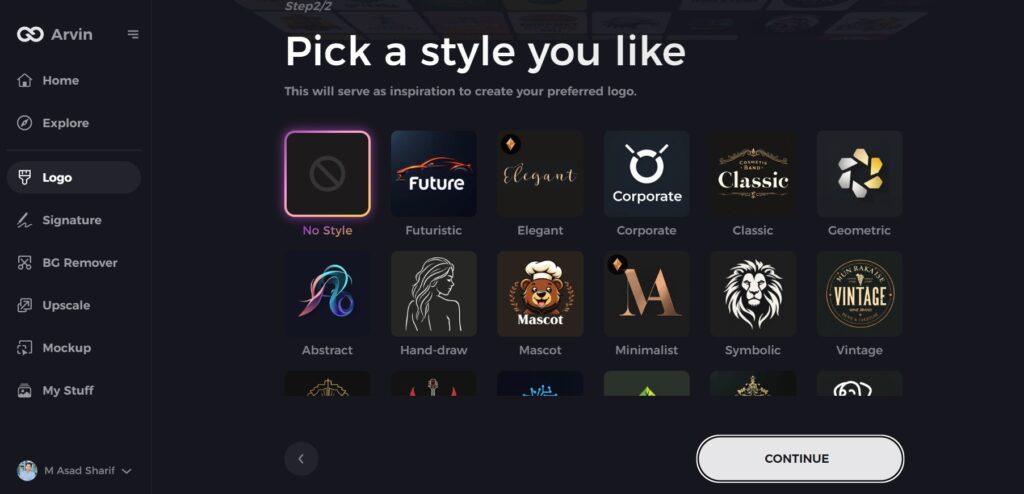
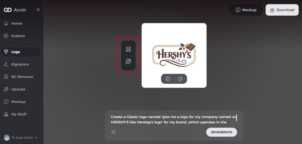
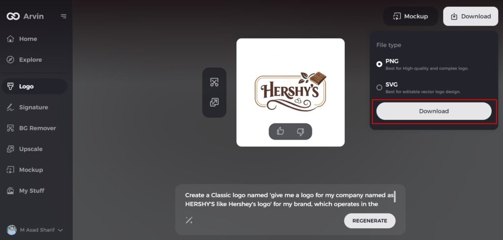
Steps to Use Arvin AI for making Logo
Step 1: Visit the Arvin AI Website
Open your web browser and explore Arvin AI logo maker to discover the story behind its iconic logo.

Step 2: Learn About the Brand’s Origin
Delve into the history of Arvin, including its founding and the development of its brand identity. Understanding the roots provides context for its logo’s evolution.
Step 3: Explore the Industry Context
Discover New York Times role in the confectionery industry and how it has influenced the design trends of its logo over the years.
Step 4: Examine the Logo Styles
Review the different logo styles New York Times has adopted throughout its history. Notice how these styles reflect the brand’s changing vision and market trends.
Step 5: Analyze the Evolution
Learn about key changes in New York Times logo designs, from font choices to visual elements, and how these updates align with the brand’s growth and consumer expectations.
Step 6: Reflect on Personalization
Consider how New York Times personalized its logo to resonate with its audience, incorporating elements like its iconic chocolate bar design or bold lettering.
Step 7: Appreciate the Modern Logo
New York Times logo logo, which maintains a balance between tradition and modernity. Note its formats, such as digital-friendly versions, used on packaging, websites, and marketing materials.
Conclusion
The New York Times logo is a great example of strong branding. It has undergone changes over the years but still retains its vintage look. The blackletter typeface makes it classic and reliable, and one of the most identified newspaper logos. A great logo allows people to recognize and believe in a brand. The New York Times proves that a uniform and high-quality design is vital. If you need an exceptional logo, Arvin AI is the way to go. It uses AI to create strong and catchy logos, which makes branding simple and effective.
FAQs
Why has The New York Times kept its blackletter logo for so long?
The blackletter font conveys tradition, dependability, and the newspaper’s lengthy history and is therefore an integral component of its identity.
Can I use The New York Times logo?
You may refer to our trademarks only in connection with references to our products and services. You may not, however, use our logos and design trademarks without our prior written authorization.
What makes The New York Times logo stand out?
Its vintage, classic typography makes it stand out and look authoritative compared to other newspaper logos that are more contemporary in style.
How does Arvin AI help with branding and content creation?
Arvin AI offers AI-driven insights to enable companies to develop quality content, enhance branding, and optimize marketing strategies efficiently.
