McDonald’s is one of the top fast-food companies in the world. The brand name recognize almost everywhere, and the golden Curves are more than just a brand symbol. They shows fast food culture and globalization. The simple but powerful design appreciat by millions. Through the McDonald’s logo over the years, it is seen that they changed with trends yet remained unchanged. It is symbolic of convenience, fast food, and meals preferred by families as well as tourists. The evolution story is quite symbolic of the growing stages of McDonald’s and their place in defining global culture.
What is McDonald’s?
McDonald’s is one of the most popular fast food chains in the world. The company was founded in 1940 and now operates approximately 40,000 stores worldwide (most of McDonald’s stores are franchises). The main menu of the chain is hamburgers.
Part 1: The Birth of McDonald’s Logo
McDonald’s logo has a long history that started with the company’s first restaurant in 1937. In this section, we’ll explore how the logo was created and how it changed as the company grew.
History of the Company’s Beginning
McDonald’s was founded in 1937 when Richard and Maurice McDonald established a small drive-in restaurant in San Bernardino, California. However, it was not until 1940 that they began opening their first McDonald’s franchises, serving burgers and fries with a quick efficacy that attracted more customers.
Evolution to the Demand for a Logo
As McDonald’s expanded, the company saw that they required a logo to express their brand, making it different from others. A logo create recognition, and the brand identity can easily remember. The McDonald brothers were aware that branding was essential when they wanted to expand beyond the first restaurant.
Initial Branding and How It Evolved
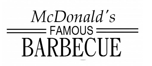
The initial branding for McDonald’s was simple, featuring a wordmark logo with the company’s name. The early focus was on highlighting their “Famous Barbecue” concept. However, as the company shifted towards hamburgers in 1948, their branding evolved. Over time, this also bloomed the company into the world’s largest fast-food chain and its evolution supported the creation of what it is today.
Part 2: The Evolution of McDonald’s Logo
McDonald’s logo changes with time according to its growing and changing identity. With each stage, it reflects how the brand has changed to new ideas and customer needs.
1940 – 1948
McDonald’s first logo consisted of an extra word mark, divided into three stages. At the top, the letters “McDonald’s” were written in Italian style, neat and traditional. The word”Famous” of All Capital written in Sanserif and placed in the center, from which two parallel horizontal lines appear on the left and right. The largest and fattest “barbecue” characters in the entire logo are written in a strict solid line style and placed under the logo, making it the main part of the logo.
1948 – 1953
The concept of barbecue replaced by a hamburger that become popular in the United States. In 1948, the restaurant’s title was changed, and its logo was completely restored. A white McDonald’s Famous Hamburgers sign on a black background and a small white painting of a chef smiling in a friendly way were painted. The writings presented in one style using modern sans serif typefaces. The logo has been in use for only five years.
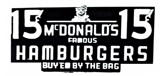
1953-1968
McDonald’s finally changed its name to “McDonald’s” and it’s now where it all started. The logo was still far from what we know today, but red appeared on the color palette to show the right direction for the brand. The smooth italic wordmark with a red tone was expressed in a special sans serif font with thick and smooth lines. It was a very impressive and well-recognized logo, and it was with the company for 15 years.

1961-1968
In 1961, Stanley Meston created a logo that is known all over the world today. The iconic Golden Curve logo was inspired by the architecture of the first company’s restaurant, especially its roof. So, in the first version of the logo, there is a diagonal line through the arch.
A thin red outline drawn on the yellow symbol, and a red word mark placed under it. The new characters are bold and simple sans serif typefaces, with a main pronunciation on the symbol.
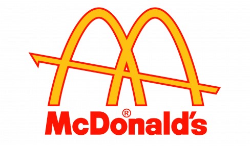
1968-Present
In 1968, the Golden Curves perfected into the iconic “M” symbol. Minor changes made over the years to keep the logo fresh and relevant. Yet, the logo remains simple and instantly recognizable, a perfect reflection of McDonald’s global success.
Part 3: The Golden Arches— McDonald’s Most Recognizable Feature
The Golden Curves are the most recognizable elements of the McDonald’s brand. The Curves originally were part of the restaurant’s design and gradually became a hallmark of the logo. Today, they symbolize McDonald’s all over the world and are identifiable anywhere.
Origin in Restaurant Design
The Golden Curves were first used in the 1950s as part of the design for McDonald’s restaurants. The Curves were initially part of the building structure to make the restaurants stand out. They were big, bright, and easy to spot, and people passing by would notice them. Over time, these Curves became the heart of McDonald’s branding.
Symbolism of the Curves and the Letter “M”
The Golden Curves shape in the form of the letter “M,” representing the first letter in McDonald’s name. This simplicity helped create an association with a brand. Also, the Curves represent trust and consistency: values that customers want to have with their food and service delivery from McDonald’s.
Golden Curves in International Branding
The Golden Curves are among the most effective global branding tools. The bright yellow color is quite attractive, and the simple design is easy to remember. No matter where you go in the world, the Curves are instantly recognizable. They represent quick, familiar meals and have become a universal symbol of McDonald’s, connecting people across cultures.
Part 4: McDonald’s Logo Today
Today, McDonald’s logo known worldwide and continues to play a key role in its branding. In this section, we’ll look at how the logo is used globally and how it stays modern while keeping its familiar feel.
Logo used and Its Significance
McDonald’s logo is used all over the world and is easily recognized in different countries. It adapt slightly in some places to fit local cultures, but the Golden Curves remain the same. The logo is seen on signs, packaging, and advertisements, helping people immediately know its McDonald’s.
Simple Design Trends
Because the trends of designs are simpler, McDonald’s redesigned its logo to be modern. The Golden Curves have a clean, simplified form; thus, simplicity has become their goal. Such style will help keep the brand new and trendy, for nowadays it’s the age of clean and readable designs.
Psychological Effects
McDonald’s has yellow and red in its logo for a reason. Yellow is a bright color that makes one feel warm; it attracts the attention of many people. Red is energetic and exciting, sometimes related to hunger. Together, these colors attract customers and make them excited about eating. These colors choose to influence the emotions of the people and attract them to visit McDonald’s.
Part 5: The Role of McDonald’s Logo in Brand Recognition
A significant role that McDonald’s logo plays in making the brand known throughout the world is discussed in this section, focusing on how it helps people recognize McDonald’s and what feelings it brings.
Psychological Impact of Logos
Logos have a great psychological impact on people. The McDonald’s logo can easily remember and so it is very effective. The Golden Curves are really striking and attract the attention of people and make them feel good about the brand. The logo itself gives a feeling of comfort, which makes a person trust the brand and feel that it is at home.
Global Brand Consistency
McDonald’s logo kept uniform across the globe, which is a vital part of brand building. No matter where you are, the logo looks the same, helping people recognize McDonald’s instantly. This makes the brand dependable and customers know what to expect each time they see the logo. A powerful and consistent visual identity keeps McDonald’s at the forefront of minds in the global market.
Logo raises feelings of joy
The design of McDonald’s logo induces happiness and excitement in most people. Its bright colors along with simple lines shows fun, friendly, and good times with loved ones and family. Positive emotions recalled through the Curves for so many people. A time spent out eating with a loved one or enjoying good times at an event or picnic.
Part 6: How Arvin AI Can Help with Your Brand’s Visual Identity
Arvin AI is very helpful for businesses who intend to enhance their branding using advanced technology to create logos, designs, and visual identities that stand out. With Arvin AI, it is easy to design a unique look for your brand that booms with your customers. Starting a new business or updating your existing brand just got easier through Arvin AI, which will help you create a strong visual identity that suits your company’s goals and values.
Key Features of Arvin AI
Here are the following key features of Arvin AI:
- Easy logo creation: Arvin AI helps you quickly create a logo that fits your brand’s image. And you don’t have to be a designer to use it.
- Customizable designs: You can adjust colors, shapes, and fonts to make the design exactly how you want. It is flexible for different needs.
- Quick turnaround: The software gives you rapid designs. save your time and create professional work.
- User-friendly: Arvin AI is easy to use, even for a beginner who has never designed before.
- Template variety: It offers a lot of templates so that you find the perfect one for your brand’s look.
- Affordable: You get professional designs at a price that doesn’t break the bank.
Steps to Using Arvin AI to Design Your Logo
Step 1: Open an Account and Log in at Arvin AI
Visit the website of Arvin AI and open an account, log in, and select the logo design feature.
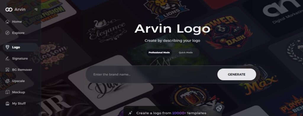
Step 2: Enter Information about Your Brand and Preferences
Enter your brand name, slogan, and type of industry. Select your design preferences, such as fonts, colors, and themes which represent your brand.
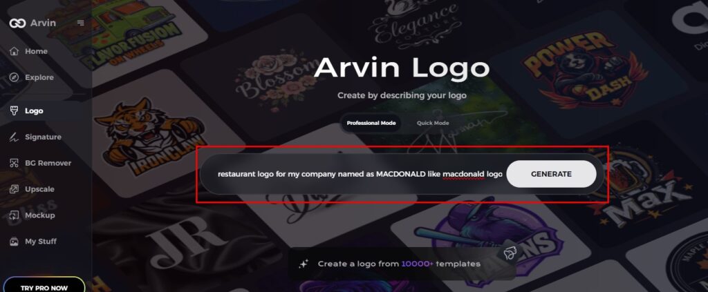
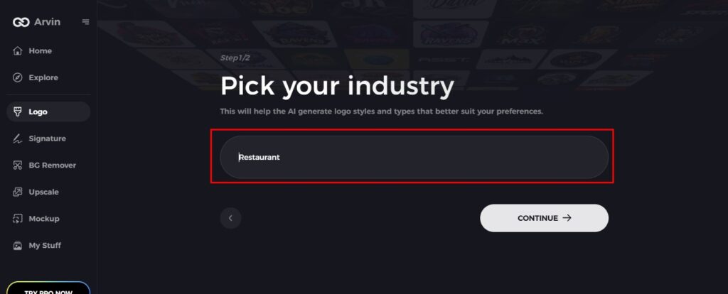
Step 3: Select Industry
Choose the industry of your business. This allows the AI to create logos that are relevant to your niche and style.
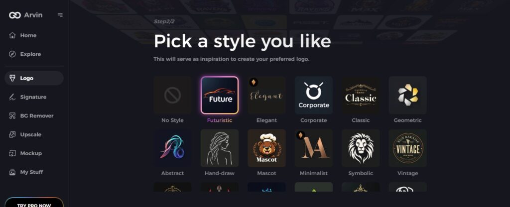
Step 4: Choose a Design Style
Choose a style that suits your brand. This will help the AI create a logo that suits your vision.
Step 5: Customize Your Logo
Once Arvin AI creates your logo, use the customization tools to adjust fonts, layout, and symbols. Experiment with different looks.

Step 6: Save and Download Your Final Logo
Preview your logo, then save it in a high-resolution format suitable for both print and digital use.

Conclusion
The McDonald’s logo is now one of the most recognized logos around the globe. It’s very simple yet uniform globally. Its evolution with digital trends means businesses need to update themselves. If you’re planning to design a brand logo for your own company, do explore how AI tools like Arvin AI can assist you in doing so. The simplicity with which you can use the features will help you in designing a unique logo that can represent your brand with Arvin AI.
FAQs
What makes the McDonald’s logo so effective?
The Golden Curves are simple and easy to remember. They have a psychological impact, making people feel happy and familiar with the brand.
How has the McDonald’s logo changed over time?
The logo has been from a wordmark to the well-known Golden Arches. It has evolved from one design to another as the brand has developed and become simpler yet more recognizable.
Why did McDonald’s switch from the “Barbecue” concept to hamburgers?
McDonald’s dropped the “Barbecue” idea and chose for hamburgers because their menu was becoming too complicated and their service was too slow. The brand evolved to what we have today.
Can Arvin AI help me create a logo for my business?
Yes, Arvin AI can help design a unique logo for your business. It uses smart technology to create logos that match your brand’s identity and style.


