The North Face is a widely recognized brand internationally, known for its high-quality gear and fashionable clothes. In those five decades it has been the leader in both technology as well as in the spirit of exploration and has appealed to those who live and play outdoors. Among such iconic elements lies the logo of the brand-an emblem synonymous with quality, durability, and adventure. This paper will explore history, meaning, and timeless design in the NorthFace logo and what gives it an edge in the rather competitive world of branding.
Part 1: The North Face Logo Meaning and Inspiration
Strength, endurance, and a natural connection are attributes found in this iconic logo created for The North Face, which draws from inspiration directly from Yosemite’s Half Dome.
- Philosophy behind brand: The company was founded in 1966 and has always focused on providing quality outdoor gear to help explorers push their limits and connect with nature.
- Meaning behind logo: It symbolizes adventure and endurance, making it very common. Inspiringly, the most notable is Half Dome in Yosemite National Park.
- Reference to Half Dome: The stylized quarter-circle in the logo reflects the steep, granite face of Half Dome as a symbol to the brand connecting to nature and outdoor adventure.
- Symbolism: The Half Dome inspiration is not just aesthetically good but also symbolize strength and endurance, necessary qualities for explorations in nature.
Part 2: The History of The North Face Logo
North Face is one of those brands that chose the path they were on from the very day of its conception. Founded as a manufacturer of outdoor mountain wear with snowy peaks and low temperatures in mind, the iconic logo that was published during the 1960s, is surprisingly simplistic.
1966 – The Origin of The NorthFace Logo
The NorthFace logo was born in 1966, along with the brand. Its simple yet effective design used a palette of black and white to reinforce the utilitarian ethic. Clean lines and bold shapes defined the design, catching the rugged spirit of the outdoors, which soon was recognized by the mountaineer and outdoor enthusiast.
2010 – A Modern Refresh
The NorthFace logo was redesigned in 2010 with a subtle touch of drama. The company introduced red and white colors, giving life to its symbol. Red represented energy, passion, and boldness-the color it symbolized, since the brand defined itself as adventurous, and white filled purity and innovation. It refreshed the logo but did not let it lose the essence of the brand.
Part 3: The Key Elements of The North Face Logo
The quarter-circle, sans-serif type, and bold color scheme make the logo both iconic and timeless.
Symbolism of the Emblem
The defining feature of The NorthFace logo is the quarter-circle shape. The shape conveys the image of the Half Dome, infusing majesty with minimalistic design. Since it is simple. It stands the test of time and can applied universally to any given medium or usage.
Typography
The North Face utilizes sans-serif letters that go along with the logo’s modern, clean look. The bold, uppercase lettering creates an impression of power and strength-a perfect image for the brand.
Color Palette
The NorthFace logo has been interesting in its color evolution. Initially, the brand was in monochrome; however, it shifted to red and white in 2010. This was a change that added dynamism and vibrancy to the logo while maintaining the adventurous spirit.
Part 4: Why The North Face Logo Stands Out
The NorthFace logo is simple, timeless, and versatile which means adventure, endurance, and a brand.
- Timeless Appeal: Minimalistic design keeps it relevant even after decades of passing, beating the trend of the moment. The balance of simplicity and symbolism makes it easily resonate with people
- Simplicity and Recognition: The North Face logo is a prime example of simplicity. Its clean lines and geometric elements make it instantly recognizable.
- Integration across mediums: The impact of the logo is the same whether applied on apparel, outdoor gear, digital ads, or retail signage. Consistent branding makes sure it sticks with customers and, through every touchpoint.
Part 5: Create Your Iconic Logo with Arvin AI
Arvin AI is a revolutionary logo maker that allows businesses and individuals to create unique and professional logos. It has a user-friendly interface, offers customizable options, makes AI-suggested results, and outputs high quality graphics, making it easier for you to realize your dream iconic logo that best represents your brand.
Steps to Use Arvin AI for making Logo
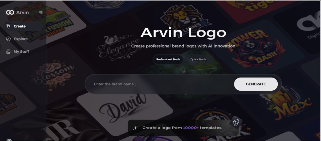
Step 1: Create an account and log in on Arvin AI
Visit the website of Arvin AI, open an account, and log in for the logo design feature.
Step 2: Input your brand information and preferences
Input your brand name, slogan, and industry. Specify all your design preferences, which may include font styles or images themes.

Step 3: Pick your industry:
Now select your industry related to your niche. This will help the AI generate logo styles and types that better suit your preferences.

Step 4: Select Style:
Now select a style which you would like and continue. This will serve as inspiration to create your preferred logo.

Step 5: Design Personalize through the tools of Arvin AI
After Arvin AI gives create your logo, you can customize those logos with the tools that have elements such as font style, layout, and the positioning of symbols. Experiment on different designs until you like what you see.

Step 6: Save and download the final logo
Preview the finished logo and save it in a high-resolution format for both print and digital uses.

Conclusion
The NorthFace logo is the best example of how branding works if done properly. Its elaborate history, sense-filled design, and timeless attraction show what a thoughtfully designed logo is capable of. For the world of first impressions, it is so crucial to be memorable in logos. Designing an iconic logo is just one step away with Arvin AI today. It can help turn your vision into a professional logo, one suited for your brand.
FAQs About The NorthFace Logo
What does The NorthFace logo represent?
The North Face produces outdoor clothing, footwear, and related equipment. Founded in 1968 to supply climbers, the company’s logo draws inspiration from Half Dome, a distinct rock formation rising over 8,700 feet (2,700 m) above sea level in Yosemite National Park.
Why was red chosen as the primary color for the logo?
Red stands for real energy, passion, and intensity as the spirit of the brand itself characterized as active and travel-like.
How has The NorthFace logo changed over the years?
The logo changes from a monotone in 1966 to red and white in 2010, that made it livelier and caught more eyes.
What mountain is The North Face Named After?
The Name Tompkins chose for his business speaks to the same mission at the heart of The North Face today. The name itself based on the North Face of the Eiger.

