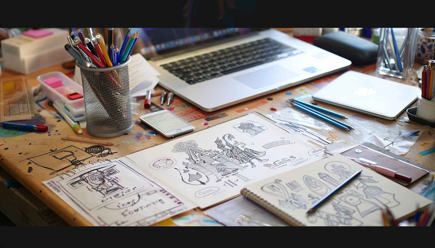
How can you stand out if no one remembers you? You can’t. So, it is important to have a timeless logo that represents you and your brand accurately, as it can be people’s first (or last) impression of you. Regardless, it must be superb, and this blog will guide you through the step-by-step method on how to design a logo (a custom logo at that!) with a logo maker from start to finish.

But, let’s be honest; logo design isn’t exactly a walk in the park. It can take a lot of time, creativity and quite a hefty budget (especially if you are a small or medium business). Additionally, if you were to cut corners, a rushed or poorly executed logo can do more harm than not having one entirely, making your business appear unprofessional or not well thought out.
There is also the challenge of balancing uniqueness with simplicity; in the world of minimalist giants like Nike and Apple, how can you compete? No one wants an exact logo that’s too generic or cluttered to recognize, but it cannot be too similar to something that already exists.
Importance of Having a Great Company Logo
A logo is a visual representation of your business; a silent ambassador if you will (according to Paul Rand, creator of iconic corporate logo designs).
Think about how certain logos instantly spark feelings when you see them. The Coca-Cola logo might give you the initial bubbles of anticipation, akin to its iconic drink. Or even give you the old, Guinness nostalgia of your first pint. All within a fraction of a second.
Or, on the flip side, could evoke feelings of disappointment. What do we mean by that?
I.e. the less-than-welcome Jaguar rebrand. The execution and rollout of the announcement that the heritage company has decided on a new logo shocked many, with some feeling:
I’m not entirely sold on the typeface. Within the logos itself it’s OK I guess, but using this font across their website feels like a misstep. Its roundness, especially when paired with round buttons, comes off as overly quirky—it almost feels like the old Smart branding. It doesn’t convey a premium feel at all.
and:
With the heritage that Jaguar has, the ads write themselves: a man in a suit, a lady in a dress, and the coasts of Italy. Maybe sprinkle a bit of racing history into the ad. You’re done.
Just WHY you would throw away your heritage emblem (the leaper and the growler) and replace it with a “Jaguar” text that is written in the ugliest font imaginable, is beyond me.
It doesn’t scream class, it doesn’t even scream new beginnings, boldness or new invention. It just screams “woke playbook from 10 years ago”.
Ouch! Needless to say, a good logo makes the difference between a brand people buy from, and one they fall in love in.
Should You Use an Online Logo Designer or Hire a Designer?
Looking to make a logo but not sure where to begin? You typically have two main options:
- Use an online AI-powered tool like Arvin AI Logo Maker
- Hire a freelance graphic designer through platforms like Fiverr or Upwork
| Feature | Online Logo Designer (Arvin AI) | Real Designer |
| Cost | Low / Free | Medium to High |
| Speed | Instant (within minutes) | Slower (days or weeks) |
| Ease of Use | No design skills required | Requires collaboration and time |
| Customization | Moderate with customizable templates | High (fully custom) |
| Originality | Startups, personal brands, and rapid launches | Highly unique |
| Creative Direction | AI-generated suggestions | Human creativity and interpretation |
| Scalability | Very scalable (multiple variations easily) | Not scalable without more cost/time |
| Best For | Startups, personal brands, rapid launches | Legacy brands, niche or premium branding |
Option 1: Use an Online Logo Maker (Recommended for Most)
If you’re handling your own logo design project, there are now countless online platforms tailored to all experience levels. Whether you’re a complete beginner or someone with a sense of design, tools like Arvin AI Logo Maker allow you to create clean, professional logos in minutes.
Why choose an AI logo maker like Arvin AI?
- No design experience needed
- Fast turnaround with drag-and-drop simplicity
- Budget-friendly
- AI-powered suggestions tailored to your industry and preferences
Ideal for:
- Startups
- Personal brands
- Side projects
- MVPS and quick launches
Option 2: Work with a Freelance Designer
If you have a very specific vision or need a fully custom design, hiring a freelance logo designer can be the right move. Platforms like Fiverr or Upwork connect you with experienced professionals who can bring creative direction to your project.
Pros of hiring a designer:
- Personalized design tailored to your brand story
- Full creative control and strategic input
- Suitable for premium or niche branding
However, this route typically involves:
- Higher costs
- Longer timelines due to revisions and communication
- A need for clear creative direction from your side
If you’re thinking of doing it yourself, there are countless online platforms available that cater to a wide range of skill levels. Whether you’re a total beginner or someone with a flair for design, tools like Arvin AI Logo Maker can help you create something that represents your brand effectively.
How to Make a Logo Online
The first step in making a logo online is deciding whether to hire a professional or take the DIY route. Both options have their merits, and your choice will depend on your budget, time, and desired level of customization. Once you’ve decided, you can move on in the logo design process.
Step 1: Identify Your Brand’s Core Values
Your brand’s core values are the guiding principles that define its purpose and personality in the logo design process. They should act as the cornerstone of your logo design, ensuring it represents not just what you do, but what you stand for.
Start with a central concept, like your brand’s mission, and branch out with related ideas.
Step 2: Understand Your Target Audience
Your target audience is just as important as your business itself. Making a logo that resonates with your ideal customer helps establish a stronger emotional connection and builds trust faster.
To define your audience, ask yourself:
- What age group am I trying to reach?
- What businesses do they already engage with?
- Which platforms do they spend the most time on?
- What are their interests or hobbies?
- What factors influence their purchasing decisions (e.g. price, sustainability, quality)?
- What common pain points do they face that my business helps solve?
Understanding these factors helps refine your logo design project by aligning the visual style with what your audience finds appealing and trustworthy.
Step 3: Do Competitor Research
Look at what your competitors are doing, not to copy but to identify gaps or opportunities. If their logos are too bold, maybe a minimalist approach will set you apart. Study their color schemes, typography, and shapes, and think about how you can differentiate your brand visually.
Strong competitor analysis helps you avoid blending in and positions your custom logo as a visual differentiator. It supports brand recognition and ensures your logo for your business feels intentional, not generic.
What to Look for During Logo Competitor Research
Use the questions below to shape your custom logo and ensure it aligns with your brand identity, appeals to your audience, and supports long-term recognition:
- What feelings should our logo spark? Should it inspire trust, excitement, creativity, or perhaps nostalgia?
- Are there any design features visuals, icons, or symbols that encapsulate our business’ story or mission? Think about icons, timeless logo symbols, or visuals that naturally reflect your mission and values. These should support brand recognition and leave a memorable impact.
- What type of font best matches our vibe? Is it something modern and sleek, whimsical and fun, or perhaps refined and sophisticated?
- Which colors truly capture the essence of our business? Consider hues that not only align with your values but also resonate with your audience on an emotional level.
- How can we make the design stand out while keeping it clean and impactful? Simplicity is key, but a great business logo should also leave a lasting impression.
Step 4: Generate Creative Ideas
Once your values and audience are clearly defined, the next step is to start gathering visual direction for your own logo (making your mood board). A mood board is a curated collection of visuals such as images, colors, textures, and typography that help capture the look and feel you want your logo to express. Think of it as a visual brainstorming tool that helps organize your logo inspiration and clarify your creative direction. This phase is all about exploring ideas, experimenting with aesthetics, and identifying what kind of design style best represents your brand.
Where to collect inspiration:
- Pinterest boards focused on logo design
- Instagram or TikTok saves from branding accounts or designers
- Screenshots from websites or brands you admire

Pro Tip: Explore hashtags like #LogoDesign, #BrandingInspiration, or #CreativeLogos on social media platforms to discover trending styles and innovative approaches.
Save hours of brainstorming with the Arvin AI Logo Designer. This tool combines creativity and efficiency to deliver stunning logos tailored to your brand.
Explore Current Logo Design Trends
Staying aware of current design trends can help you create a logo that feels modern and relevant. Here are a few examples:
a) Hand-Drawn Elements
Logos with hand-crafted illustrations, like those used by Innocent Drinks, add personality and a sense of authenticity.
b) Gradient Logos
Brands such as Instagram have embraced vibrant gradients to create depth and dimension in otherwise simple designs.
c) Minimalist Designs
Companies like Apple and Airbnb prove that clean, minimal logos can feel timeless, adaptable, and instantly recognizable.
Step 5: Decide on Logo Type
Choosing the right logo type is one of the most important decisions in your logo design process. The structure and style of your logo determine how your audience perceives your brand and influence everything from brand recall to scalability.
Here are the main types of logos to consider when designing your custom logo:
a) Wordmark
Definition: A wordmark is a text-only logo that turns your brand name into a design.
Best for: Brands with short, distinctive names.
Why it works:
- Focuses on typography and legibility
- Clean and professional look across print and digital
- Ideal for strong name-driven brand recognition
“Good typography is invisible. Bad typography is everywhere.” — Erik Spiekermann
b) Lettermark / Monogram
Definition: A logo made from initials or a single letter.
Best for: Brands with long names or legacy positioning.
Examples: Chanel (CC), Louis Vuitton (LV)
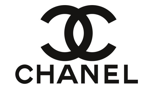
Why it works:
- Minimalist and elegant
- Easy to remember
- Scales well across formats
- Technically dependent on kerning and spacing for balance
A Harvard Business Review article explains that minimalistic monograms often achieve “lasting recall through simplicity,” which is why they’re favored by high-end brands.
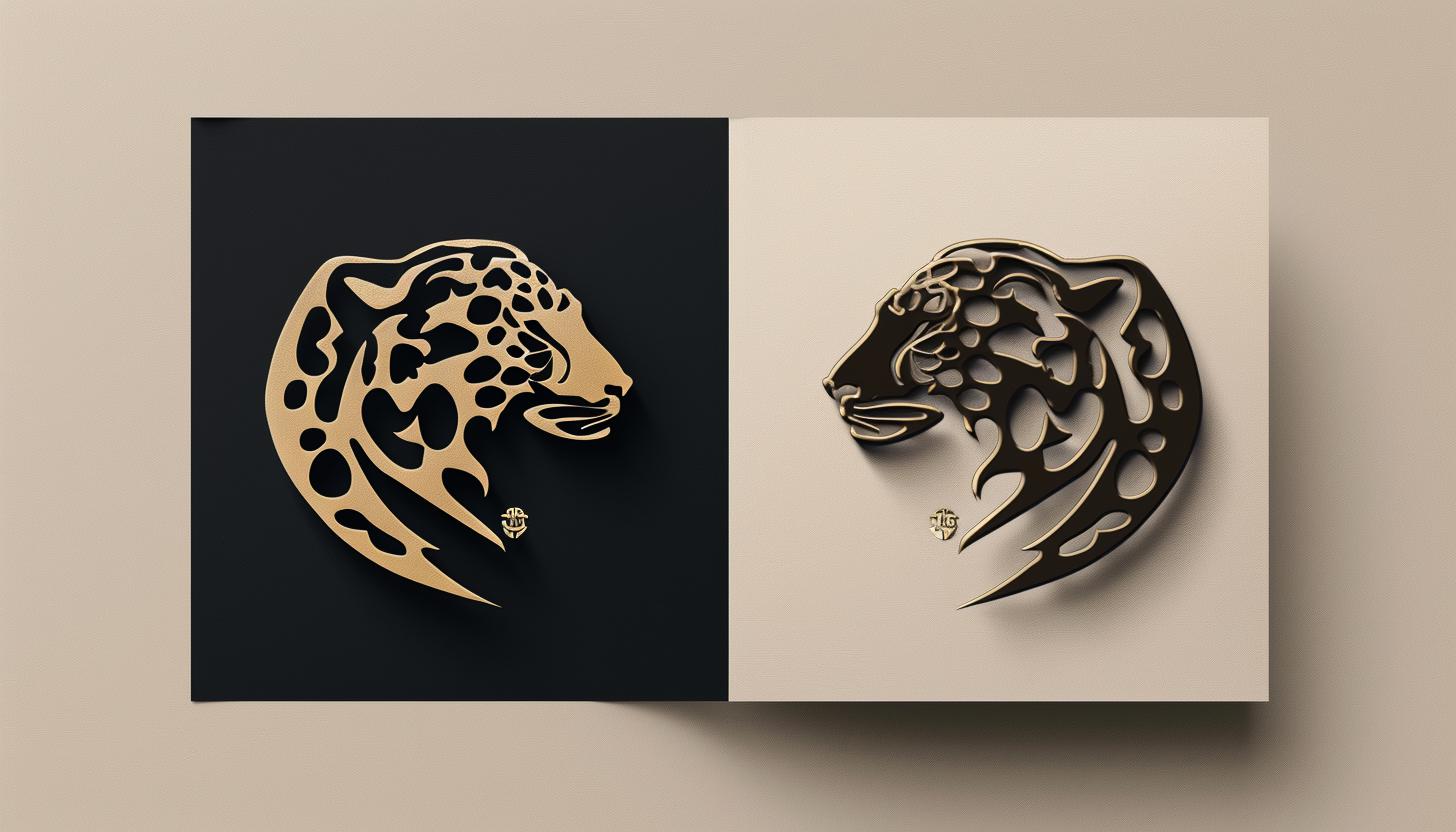
c) Symbol / Brand Mark
Definition: A logo built around a visual icon or shape, with no text.
Best for: Brands with established recognition or a strong visual identity.
Examples: Nike swoosh, Apple’s bitten apple
The psychology of shapes plays a major role in these designs: circles often evoke unity, while angular shapes suggest strength.
Why it works:
- Communicates meaning instantly
- Highly memorable and globally recognizable
- Works well across languages and cultures
“Logos are the graphic extension of the internal realities of a company.” — Saul Bass
d) Abstract Logo
Definition: A conceptual, non-literal mark using abstract shapes or forms.
Best for: Brands wanting flexibility and creative edge.
Examples: Pepsi globe, Airbnb’s “Bélo”
Why it works:
- Visually unique and flexible
- Conveys emotion and values without being literal
- Often uses Gestalt psychology for clever design impact
These designs often use principles of Gestalt psychology, like figure-ground relationships, to create visual intrigue. Abstract logos work well for brands seeking flexibility in conveying complex values across diverse markets.
e) Mascot Logo
Definition: A logo featuring a character that personifies the brand.
Best for: Brands targeting families, kids, or looking to build emotional rapport.
Examples: Tony the Tiger (Frosted Flakes), Colonel Sanders (KFC)
Why it works:
- Highly personable and memorable
- Builds long-term connection
- Brings storytelling into branding
“Logos should be immediate, but mascots create stories that deepen over time.” — Debbie Millman
Mascot logos feature characters that give your brand personality and relatability. Tony the Tiger from Frosted Flakes and Colonel Sanders from KFC are prime examples of how mascots foster emotional connections.
f) Emblems
Definition: A badge-like design that integrates text and imagery into a unified mark.
Best for: Traditional institutions, schools, coffee brands, or heritage-focused companies.
Examples: Starbucks, Harvard University
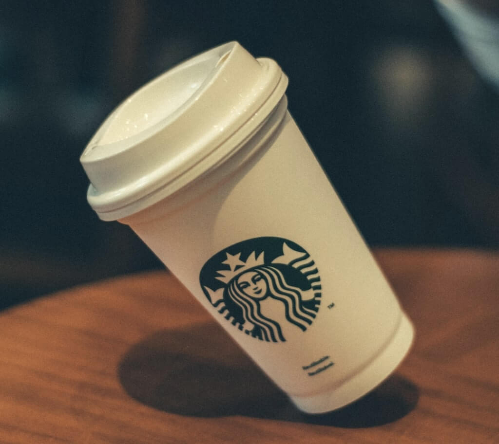
Why it works:
- Timeless and authoritative look
- Often symmetrical and highly structured
- Suggests heritage, trust, and credibility
Emblems often utilize symmetrical designs and consistent typography to create a structured, professional look. Additionally, studies on design perception indicate that emblems are particularly effective for institutions and organizations aiming to convey longevity and authority (Starbucks, Harvard).
g) Pictorial marks
Definition: A simplified image that represents the brand literally.
Best for: Brands wanting instant visual communication of their product or name.
Examples: Twitter bird, Target’s bullseye
Why it works:
- Directly represents what the brand is or does
- Simple, scalable, and easy to associate
- Strong tool for visual identity building
h) Combination mark
Definition: A hybrid logo that combines both text and a symbol or icon.
Best for: Brands seeking flexibility across platforms and uses.
Examples: Burger King, Lacoste
Why it works:
- Balances clarity with visual impact
- Allows for flexible use of text or symbol independently
- Ideal for new brands aiming to build both name and recognition
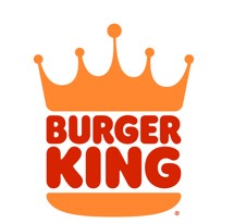
For brands aiming for versatility across different mediums, combo logos strike the perfect balance between visual impact and clarity.
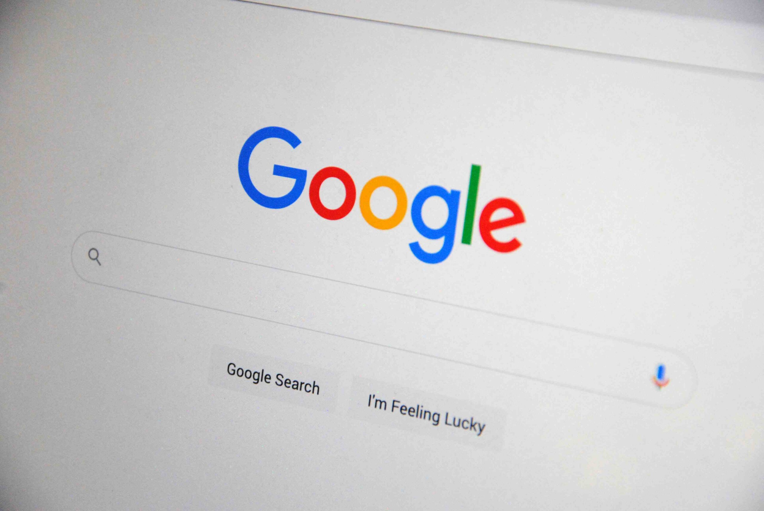
i) Dynamic Logo
Definition: A logo that adapts or changes based on context, platform, or audience.
Best for: Digital-first brands and those with constantly evolving campaigns.
Examples: Google Doodles, MTV
Why it works:
- Keeps the brand fresh, relevant, and engaging
- Ideal for digital campaigns, product launches, or seasonal promotions
- Great for brands with multiple sub-products or audiences
“Dynamic logos ensure that brands don’t just stay relevant—they lead the conversation.” — Michael Bierut
Step 6: Decide on a Color Scheme
Colors aren’t just something we see; they’re something we feel, and they influence how we think, feel, and even behave. This effect is called color psychology, a fascinating field that has been used in marketing and analysing consumer behaviour.
a) Red
The color red is more than a mere visual cue—it is a dynamic tool deeply rooted in human psychology and biology. Studies published in the Journal of Experimental Psychology demonstrate that red stimulates the autonomic nervous system, triggering increased heart rates and heightened alertness. This physiological effect makes red a go-to color for brands that want to evoke urgency, energy, and passion.
“Red has the power to grab attention and evoke strong emotions, which is why it’s often associated with both love and danger,” notes Dr. Andrew Elliot, a psychologist specializing in color research.
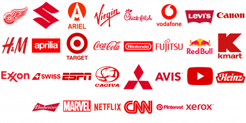
Image from 1000logos.com
Red’s high wavelength makes it the most visible color in the spectrum, which is why it’s often used for stop signs and emergency signals. In branding, this visibility translates to immediate recognition and an ability to evoke action.
As branding expert Paul Hekkert explains,
“Red can be a powerful trigger for consumer decisions, especially when paired with active messaging that demands engagement.”
However, red’s potency comes with a caveat: overuse can lead to overstimulation or associations with aggression. This duality makes it essential for brands to balance red with complementary tones like white or black to soften its intensity.
For example, research in Color Research and Application shows that pairing red with neutral tones can enhance its positive associations while mitigating potential negative connotations. When applied strategically, red becomes more than a color—it becomes a scientifically backed tool for capturing attention, evoking emotion, and influencing behavior.
b) Blue
Ever noticed why so many tech companies—think Facebook, Twitter, and LinkedIn—opt for blue in their logos?
Blue, often referred to as the color of trust and dependability, plays a critical role in the branding of major corporations. Studies in color psychology reveal that blue is strongly associated with feelings of security, competence, and professionalism.
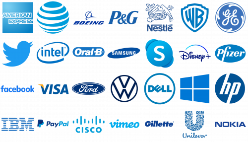
Image from 1000logos.com
This explains its dominance among technology firms, financial institutions, and healthcare brands—industries that rely heavily on consumer trust. According to research published in Frontiers in Psychology, blue hues also evoke a sense of calm and tranquility, making them a popular choice for fostering an inviting and reassuring brand presence. Lighter shades of blue, reminiscent of serene skies or still lakes, often symbolize openness and clarity, while darker tones emphasize authority and strength.
c) Green
Scientifically associated with wavelengths of 495–570 nm, is deeply embedded in human perception as a symbol of life, renewal, and equilibrium. Green is uniquely calming due to its role in signaling safety and abundance in evolutionary terms.
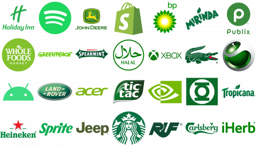
Image from 1000logos.com
Physiological studies indicate that exposure to green can lower heart rates and reduce stress, attributed to its calming effects on the parasympathetic nervous system. This aligns with findings from environmental psychology, which suggest that green is often linked to restorative environments and mental well-being. As a result, it is a preferred choice for brands like wellness centers, spas, and eco-conscious companies that prioritize relaxation and sustainability.
Notably, green is also leveraged in branding to signify eco-friendliness and sustainability. For instance, brands such as Greenpeace or iHerb strategically use green to visually communicate their environmental commitments.
Leatrice Eiseman, a renowned color expert, notes,
“Green is universally associated with balance and the restorative power of nature, making it uniquely positioned to connect with audiences on a psychological and biological level.”
d) Orange
On a psychological level, orange is associated with sociability, motivation, and a sense of fun, making it particularly effective for engaging younger or dynamic audiences. Brands such as Fanta capitalize on the playful and fresh appeal of orange, leveraging its vibrancy to create a sense of joy and vitality. This aligns with findings in chromatic psychology, which indicate that orange can enhance emotional responsiveness and create a sense of approachability.
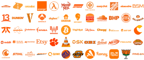
Image from 1000logos.com
Orange, as a color in branding, operates within the wavelength range of 590–620 nm and is uniquely positioned between red and yellow on the visible spectrum. This placement allows it to combine the passionate energy of red with the cheerful optimism of yellow, making it a versatile tool for brands aiming to evoke warmth, enthusiasm, and creativity. Studies in Color Research and Application suggest that orange can stimulate appetite and boost energy, which explains its frequent use in industries like food, fitness, and entertainment.
Physiologically, exposure to orange has been linked to increased oxygen supply to the brain, promoting mental stimulation and fostering a sense of invigoration.
e) Pink
Scientifically, pink lies within the wavelength range of approximately 620–750 THz, giving it a distinct place in the visible spectrum as a lighter, softer variation of red. This subtlety imbues it with the ability to evoke feelings of warmth and tenderness without the intensity often linked to stronger colors.
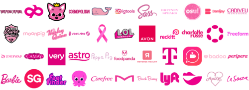
Image from 1000logos.com
Pink’s connection to femininity and care, which explains its frequent adoption by brands in the beauty, wellness, and childcare industries. For example, companies like Barbie have capitalized on pink’s ability to convey youthfulness and vibrancy, crafting a brand identity that is both iconic and deeply emotional.
Exposure to pink is known to have calming effects.
A study conducted by Schauss (1979) identified the color’s potential to reduce aggression and promote relaxation, a phenomenon sometimes referred to as the “Baker-Miller Pink Effect.” This quality makes pink an excellent choice for brands aiming to communicate trust, comfort, and positivity.
Furthermore, the cultural connotations of pink have evolved, with modern interpretations embracing its gender-neutral applications. As Leatrice Eiseman of the Pantone Color Institute explains, “Pink is no longer confined to traditional definitions; it represents confidence, innovation, and inclusivity in a contemporary context.”
f) Purple
Purple has long been associated with royalty, luxury, and exclusivity, largely due to the historical rarity and expense of purple dye, which was derived from the murex sea snail. Its scarcity in ancient times meant it was reserved for the elite, including monarchs and high-ranking clergy.
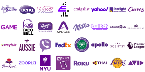
Image from 1000logos.com
From a scientific perspective, purple occupies a unique position in the visible spectrum, combining the energy of red with the calm of blue. This duality enables it to evoke a balance of passion and tranquility, appealing to diverse emotional triggers.
g) Yellow
Yellow, often referred to as the color of sunshine, conveys warmth, energy, and optimism.Yellow stimulates mental activity and boosts memory retention, which is why it’s often used in environments requiring focus and learning.
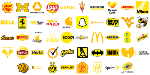
Image from 1000logos.com
In branding, yellow creates a sense of cheerfulness and approachability. Companies like McDonald’s and IKEA utilize yellow to foster a welcoming atmosphere, signaling positivity and accessibility to their customers. As color theorist Josef Albers once noted, “Yellow is the most visible color of the spectrum, and its ability to instantly capture attention makes it a strategic choice in design and advertising.”
However, yellow must be used judiciously. Its vibrancy, while uplifting, can become overstimulating in large doses. Research from the Color Psychology and Branding Institute highlights that excessive yellow can lead to feelings of agitation or strain, especially in highly saturated hues.
h) Black and White
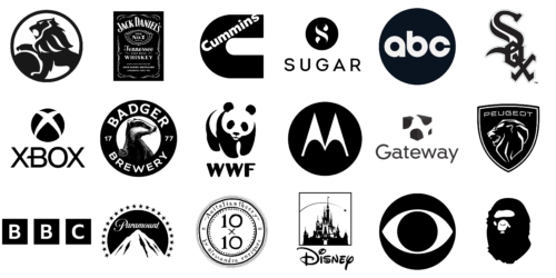
Image from 1000logos.com
From a branding perspective, black and white are frequently used by companies aiming to project a sense of professionalism and timelessness. For example, high-end brands like Jack Daniel’s and minimalist tech companies like Motorola leverage black and white to communicate authority and dependability. Color psychologist Angela Wright notes that black-and-white design often signals a “no-nonsense” approach, reflecting straightforwardness and trustworthiness.
Additionally, black-and-white logos are exceptionally adaptable. They maintain their impact across various mediums, whether in print, digital, or physical formats, ensuring consistency in brand identity. Furthermore, these logos are cost-effective, as they avoid the complexity of color printing or digital reproduction.
Types of Color Harmony for a Perfect Logo
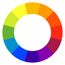
The traditional RYB (red–yellow–blue) color wheel, often used for selecting harmonious colors in art.
a) Monochromatic
This scheme relies on variations of a single hue, using different tints, tones, and shades. It creates a cohesive and understated aesthetic. Monochromatic schemes are often used in branding to convey simplicity and unity, as studies in Perceptual and Motor Skills suggest that limiting the color range can make designs appear more professional and less overwhelming.
b) Complementary
Opposite colors on the color wheel, such as blue and orange, form a complementary scheme. This contrast maximizes visual impact and creates a vibrant, dynamic energy. Research in Color Psychology and Marketing highlights that complementary schemes can enhance readability and highlight essential elements in digital and print design.
c) Triad
Formed by three evenly spaced colors on the wheel, this scheme balances harmony and vibrancy. Triadic palettes, like red, yellow, and blue, are often used to evoke playfulness or energy while maintaining balance, making them ideal for brands targeting younger demographics.
d) Analogous
This scheme uses colors adjacent to each other on the color wheel, such as green, blue-green, and blue. Analogous palettes are commonly found in nature and evoke calmness and unity. According to designer Josef Albers, analogous colors are excellent for creating immersive and cohesive designs, as they guide the viewer’s eye effortlessly.
e) Tetrad
This scheme uses four colors arranged in two complementary pairs, offering diversity and visual richness. It works well for more complex designs, allowing multiple focal points without visual clutter. Tetradic palettes are especially popular in entertainment and gaming, where a broad spectrum of colors is used to create engagement and excitement.
Step 7: Pick a Font
Typography plays a major role in shaping how your brand is perceived. The right font choice reinforces your brand’s personality.
a) Serif Fonts

Image from Wikipedia
Examples: Times New Roman, Garamond, Georgia
Best For: Traditional, professional, and authoritative brands.
Serif fonts, with their small decorative strokes (serifs) at the ends of letters, evoke a sense of trust, stability, and heritage.
b) Sans-Serif Fonts

Image from Wikipedia
Examples: Helvetica, Arial, Open Sans
Best For: Modern, clean, and minimalistic brands.
Sans-serif fonts lack the decorative strokes of serif fonts, making them sleek and easy to read on screens.
c) Script Fonts

Image from Wikipedia
Examples: Pacifico, Brush Script, Lobster
Best For: Elegant, personal, or artistic brands.
Script fonts mimic the fluid strokes of handwriting, offering a sense of creativity, luxury, or intimacy.
d) Display Fonts
Image from Wikipedia
Examples: Impact, Bebas Neue, Cooper Black
Best For: Bold, attention-grabbing brands.
Display fonts are designed to stand out, often used for headlines and logos. Their unique designs can communicate fun, creativity, or even edginess. However, they can overwhelm when used excessively, so they’re best suited for focal points.
e) Monospaced Fonts
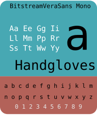
Image from Wikipedia
Examples: Courier, Consolas, Source Code Pro
Best For: Tech-savvy or retro-inspired brands.
Monospaced fonts, where each character occupies the same width, are often associated with typewriters and coding.
f) Custom Fonts
Image from Font Meme
Examples: Coca-Cola (Spencerian Script), Netflix (Netflix Sans)
Best For: Brands looking for a unique identity.
Custom fonts are designed exclusively for a brand, ensuring a distinct and consistent visual identity. Coca-Cola’s Spencerian script, designed in 1886, remains iconic to this day. Although costly, custom fonts can deliver unparalleled branding consistency and recognition.
Step 8: Outline a Logo Shape
The shape of your logo plays a critical role beyond aesthetics. The structure of your custom logo design influences emotional response, readability, and how easily it fits into different platforms and formats. Different logo shapes can communicate entirely different brand traits, so choosing the right form is essential for a cohesive and impactful identity.
a) Circles and Ovals
- Examples: Target, Pepsi, NASA
- When to Use: Great for brands that want to appear approachable and community-focused, such as social networks, healthcare, or family-centric businesses.
b) Squares and Rectangles
- Examples: Microsoft, National Geographic, Lego
- When to Use: Perfect for conveying structure and order, especially in industries like law, construction, and corporate sectors.
c) Triangles
- Examples: Adidas, Google Drive, Delta Airlines
- When to Use: Use triangles to evoke energy and forward-thinking, particularly for tech, aerospace, or sports industries.
d) Abstract and Geometric Shapes
- Examples: Airbnb (Bélo symbol), BP (Helios logo), Mitsubishi
- When to Use: Ideal for modern and design-forward brands that want to push boundaries.
e) Organic Shapes
- Examples: WWF (Panda logo), Starbucks, Twitter
- When to Use: Perfect for eco-friendly, artisanal products, or businesses aiming for a personal connection.
f) Combination Shapes
- Examples: Mastercard (two intersecting circles), Burger King (circular text with rectangular patty), Audi (overlapping rings)
- When to Use: Ideal for wanting to tell a more complex story or symbolize partnerships.
Step 9: Choose a Free Logo Generator
If you’re not working with a designer, using a free logo generator or logo templates is a smart way to create a professional, business logo without the high cost. These tools streamline the process and are perfect for startups, freelancers, and small business owners who need quick, high-quality results.
We highly recommend Arvin AI Logo Maker for its balance of ease, customization, and design intelligence. It offers:
| Logo Maker | Free Plan Available | Template Variety | Customizable Designs | Brand Kit | Download Formats | Pros | Cons | Price Range | Best For |
|---|---|---|---|---|---|---|---|---|---|
| Arvin Logo Maker | Yes | 5,000+ templates | Yes (colors, fonts, layouts) | Yes | PNG, SVG | User-friendly, high resolution logo vector files, watermark-free downloads | Limited advanced features on free plan | Free plan available; premium from $8/month | Small business owners needing quick, professional logos in a high resolution logo file for non designers |
Whether you’re a non-designer looking for a simple tool or someone with a design background wanting more control, we’ve got you covered. Check out our full review of the best logo generators for small businesses, where we compare platforms based on ease of use, available logo templates, customization features, pricing, and overall logo options. It’s the perfect resource to help you find the right logo generator no matter your skill level or brand vision.
Step 10: Make a Logo
Craft a unique logo design effortlessly using Arvin AI Logo Designer. It simplifies the creative process while ensuring high-quality results.
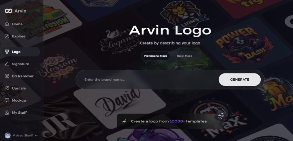
a) Input Your Brand Details
Enter your business name, tagline (if any), industry, and key brand values. This helps the AI understand your visual direction.
b) Choose a Design Style
Select your preferred logo type and design style (modern style, classic style, different style, minimal, etc.).
c) Customize Your Logo
Browse AI-generated company logo options and tweak them to match your vision. You can edit:
- Fonts
- Icons
- Colors
- Layout
d) Download Your Logo Files
Once satisfied, download your logo files from your logo maker, including:
- High-resolution JPG files and PNG files
- Vector files (SVG, PDF) for scalability
- Files with transparent backgrounds for flexible use
- Multiple logo file formats for digital, print, and merchandise
Things to Do After You Have Your New Logo Design
So, your new logo design is ready—now what? Having a logo is just the beginning. To fully unlock its potential, you’ll need to apply it consistently across your brand’s visual identity. Here’s what to do next:
1. Build a Brand Kit
A brand kit is a centralized set of design elements that ensures your branding materials are consistent across every touchpoint.
Include in your brand kit:
- Your unique logo in multiple high resolution file formats (JPG, PNG, SVG, PDF)
- Color palette (hex, RGB, and CMYK values)
- Brand fonts (with usage guidelines)
- Icon variations or alternate effective logo layouts
- Dos and don’ts for great logo usage
This kit is essential for sharing with designers, agencies, or internal teams working on marketing materials or branded content.
2. Create Social Media Assets
Apply your new logo and visual elements to all major platforms. Consistent presentation builds trust and brand recognition.
Assets to create:
- Profile pictures (with your professional looking logos in a square format)
- Cover/header images
- Story highlight icons
- Branded templates for posts or ads
- Watermarked logo overlays for videos or reels
Tools like Canva, Figma, or Adobe Express are great for applying your logo design to marketing content efficiently.
3. Update Your Marketing Materials
Replace outdated visuals with your new branding across all touchpoints.
Don’t forget to update:
- Website favicon and header
- Email signatures
- Business cards and brochures
- Presentation decks
- Product packaging or labels
- Advertising materials (print or digital)
- Social media posts
Consistency in your marketing assets reinforces your brand identity and makes your logo for your business instantly recognizable.
Final Words
A great logo resonates with your audience, communicates your brand values, and leaves a lasting impression. Whether you’re a startup or an established business, the steps outlined in this blog—supported by tools like Arvin AI Logo Designer make the process easier and more efficient. Remember, a well-designed logo isn’t just an investment in design, it’s an investment in your brand’s future success.
FAQ
Start by brainstorming ideas and researching your brand’s identity. For a streamlined process, use Arvin AI’s Logo Designer, which simplifies everything from ideation to finalization.
Focus on personalizing the design to reflect your unique identity. Arvin AI’s Logo Designer offers tailored solutions to help you create a logo that resonates personally.
Photoshop is a great tool for experienced designers. However, if you’re looking for a more user-friendly approach, try the Arvin AI Logo Designer for efficient and professional results.
1. Keep it simple
2. Ensure it’s memorable
3. Make it versatile across platforms
AI tools like Arvin AI Logo Designer use advanced algorithms to generate creative and unique designs, saving time while ensuring top-notch quality.
To standardize your brand elements, start by creating a clear brand style guide that outlines your logo usage, color palette, typography, imagery, and tone of voice. Store all assets like logos, fonts, and templates in one centralized folder for easy access. Use design tools like Canva or Figma to create consistent templates for social media, presentations, and marketing materials. Make sure your team understands how to apply these elements across platforms, and perform regular audits to keep everything aligned and up to date.
