GE logo is an international brand that operates in many industries and economic zones, including providing financial services to over 100 million consumers. General Electric produces its products across three main business sectors which include energy and electricity industries and transportation as well as healthcare. From his many years of leadership in the household appliance manufacturing industry.
Part 1: What is GE?
General Electric is one of the most innovative companies in the world. From incandescent lamps to reactors for power plants to engines for nuclear submarines, he has been active in many fields. GE is one of the largest companies in the world in revenue and production.
Part 2: Meaning and History
General Electric was founded in 1878 by world-renowned genius Thomas Edison. The original name was Edison Electric. On April 15, 1892, Edison Electric and Thompson Houston Electric merged and began operations under the name GE. The founders were Thomas Edison, Thomson Eliffe, Charles Coffin, and Edwin Houston. This is one of the iconic logos for your brand to achieve uniqueness.
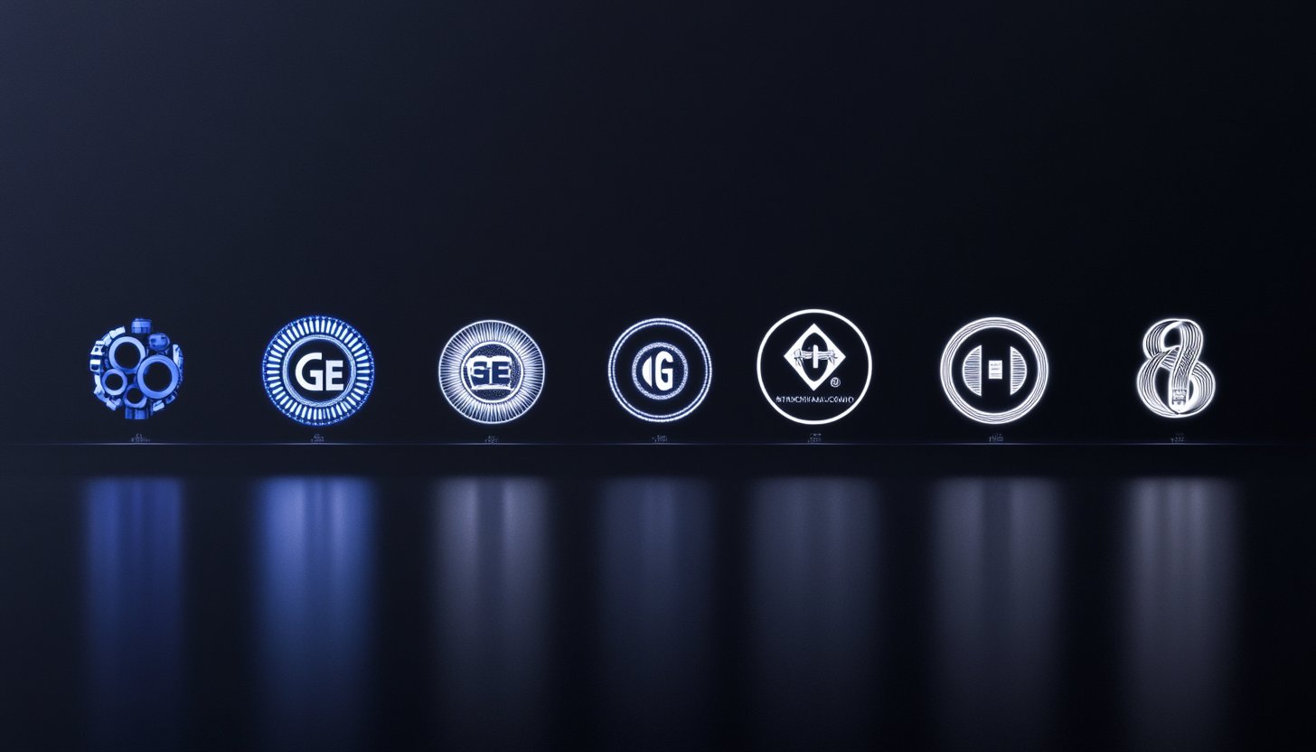
1892 – 1900
The company’s logo, which has made significant changes to the world, was very delicate, dynamic and sophisticated. The initials of the company were characterized by a brilliant and elegant writing style. In addition, the black tone gives a sophisticated impression, making it a timeless design.
1900 – 1909
It is unclear who designed the iconic GE logo, which became the base of all later logos. There is also a theory that Arthur L. Rich worked in the catalogue department or Sven Stalberg, a draftsman. There is also a theory that he was Charles Kelly, an employee of Stalberg. In any case, the design was successful. A more symmetrical initials monogram was placed on a round pedestal. The latter had four decorative spirals curved inward counterclockwise.
1909 – 1969
In 1909, a flat version of the previous logo was announced. The background is black and features white initials and edge decoration. The initial line looks slightly thick. The swirl stands out on the black ground, symbolizing the speed of innovation that GE has demonstrated since its inception.
1969 – 1987
It is not easy to immediately identify what modifications were made. However, when I put two logos together, I realize that the white element of the logo stands out more because the stroke becomes thicker. The logo becomes bolder and less delicate than before.
1987 – 1998
Landor Associated made the logo more powerful and powerful. Both initials and circles were adjusted to the end of the spiral. It is no longer curved, and both ends are rounded. Also, the initials themselves do not take much space on the emblem. Nevertheless, the logo became more powerful.
1998 – Present
With the design change in 1998, the sophisticated line of the GE logo became a little shorter, the image balanced, and the monochrome badge added a sense of excellence and professionalism.
2004 – Present
The refreshed GE logo was unveiled in 2004 and features the same round badge in a decorative yet delicate frame and two herbal letters with curled and smooth lines at each end. The difference between the new version and the old version is only the color palette, but with the black changed to light blue, the atmosphere and impression of the logo changed dramatically.
Fonts and colors
For more than 100 years, GE has used a black and white logo colors. In the 21st century, the company switched to blue and white. Both give a professional, classic and sophisticated impression. The first color palette was a timeless choice, but Blue’s introduction reflected the company’s reliability, reliability and loyalty to its customers. This shows colorful logos to attract its audience.
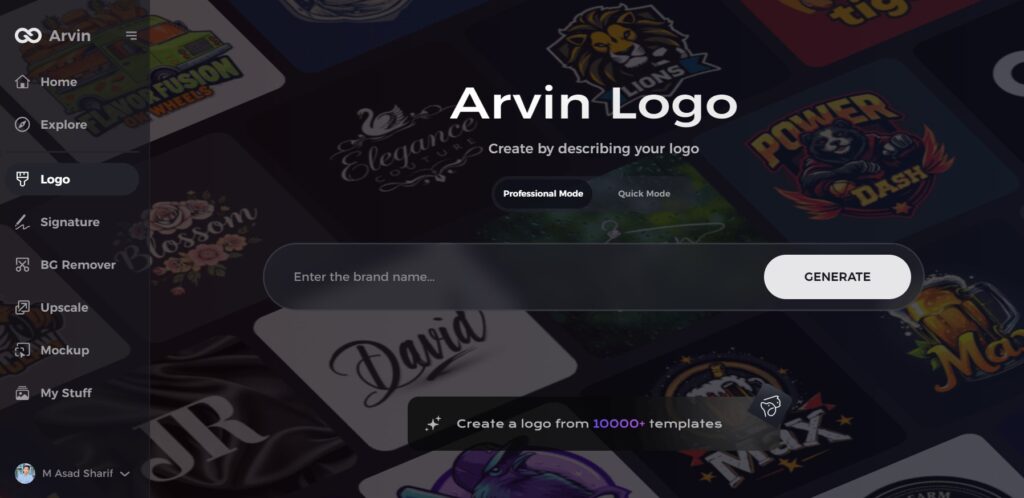
Part 3: Arvin AI: Your Ultimate Design Partner for Branding
Just as GE’s logo has held up for years, companies require clean branding in order to hold their own. A solid logo instills confidence and familiarity. Businesses utilize Arvin AI’s platform to develop their brand identity and enhance it through efficient solutions because of the user-friendly system. The logo creation platform from Arvin AI guarantees exceptional logo quality in digital and printed media.
Key Features of Arvin AI
- Logo Analysis: Arvin AI analyzes current logos and offers simple methods to enhance them.
- Design Optimization: Makes logos appear clear and sharp on screens and when printed.
- AI-Powered Branding: Offers intelligent insights to ensure a logo captures a company’s objectives.
- Customization: Assists companies in developing one-of-a-kind logo designs that fit their brand.
- Efficiency: Saves time by providing speedy, high-quality design recommendations.
Steps to Use Arvin AI for making Logo
Step 1: Access the Arvin AI Website
Start by opening your web browser and navigating to the Arvin AI logo maker’s design page to begin creating your logo.
Step 2: Enter Your Business Details
Provide essential information, such as your business name and category. This helps the AI generate designs tailored to your brand’s identity.
Step 3: Select Your Industry
Choose an industry from the available list. This step allows the AI to refine logo styles and options based on your selected field.
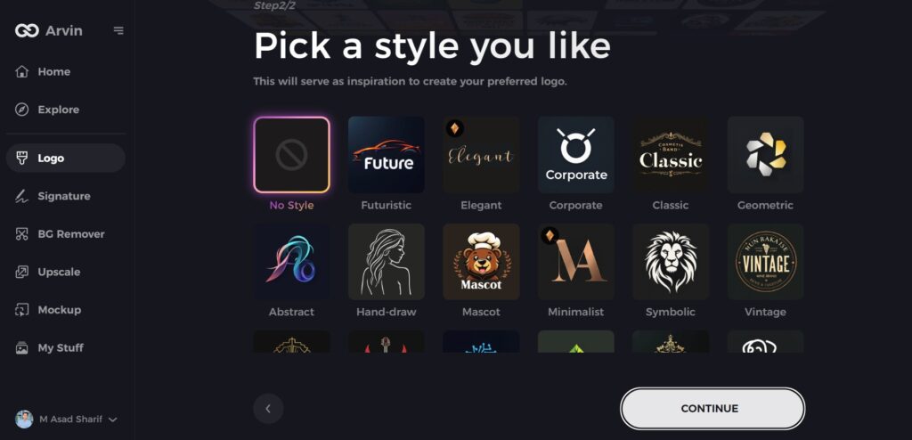
Step 4: Choose a Style
Browse through various style options and select one that aligns with your brand’s vision. If undecided, you can skip this step, and the AI will use its default inspiration.
Step 5: Review Logo Ideas
Arvin AI will generate a variety of logo designs based on your inputs. Explore the options and identify the ones that best represent your brand.
Step 6: Customize Your Logo
Fine-tune your selected design by adjusting colors, fonts, icons, and layouts to suit your preferences and brand image.
Step 7: Download the Final Design
Once satisfied with your logo, download it in versatile formats like PNG or SVG. These formats are suitable for websites, social media, and printed materials.
Conclusion
The GE logo symbolizes stability, innovation, and trust. Despite the changes in time, the original identity has never changed. A consistent, strong logo contributes to a long-lasting brand. With AI tools such as Arvin AI, today’s businesses can design and improve their logos. A simple and clean logo sets a company apart. If it is the start of a new company or the repairing of a current one, a good logo increases the visibility and popularity of your brand.
FAQs
Why has the GE logo stayed mostly the same?
The GE logo is simple yet classic in nature and reflects the company’s longevity and reliability. Leaving it intact has made the brand easy for individuals to remember and believe.
What does the GE logo mean?
The circle in the logo symbolizes teamwork and development. The color blue symbolizes trust and reliability, and the cursive writing makes it traditional and professional-looking.
How has digital branding changed the GE logo?
The underlying design hasn’t changed, but it has been modified to appear clearer on screens and digital platforms.
Can Arvin AI help create better logos?
Through its intelligent tools Arvin AI helps with companies to develop stronger brand logos which start from new creation and move through enhancement and refinement processes.