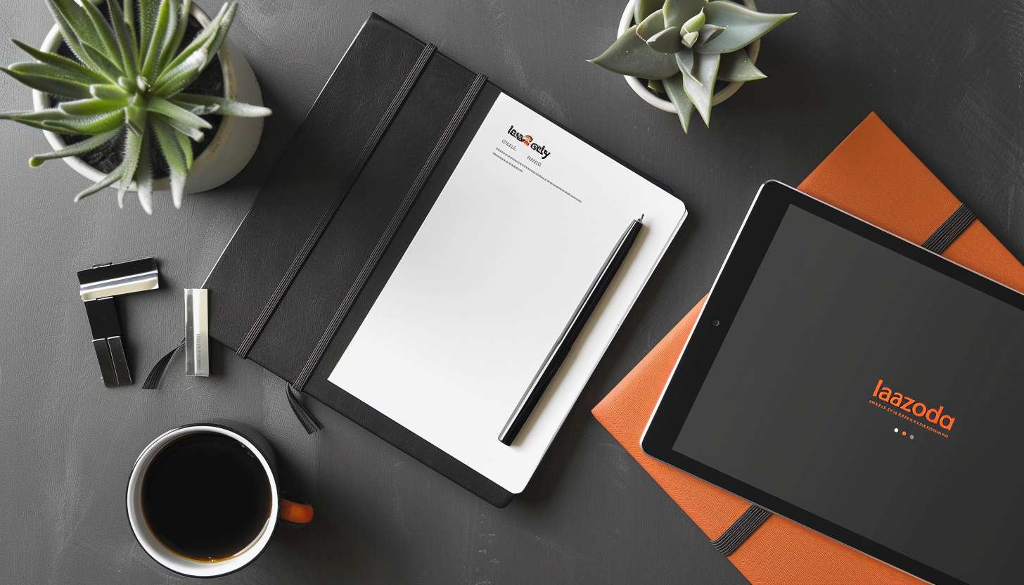
As a leading e-commerce player, the Lazada logo serves as a vital aspect of the brand’s identity, separating it from the competition. The design reflects the concept of simplifying online shopping, according to Lazada. The logo is often the first thing consumers see of a brand. The Lazada logo builds trust, recognition, and identity in online shopping. This article explores its evolution, meaning, and impact on branding, showing how design elements shape consumer trust and recognition in a competitive market.
Part 1: How the Lazada Logo Represents the Brand
The logo of Lazada successfully expresses company personality and characteristic. It’s color scheme as well as its modern artwork inspires ideas of energy, passion and innovation. The logo has changed over the years, but it’s always been professional, but is also approachable when typeset. In fact, visual recognition of Lazada’s brand and its logo is highly important for the company itself. The logo is also an excellent advertising tool and within the establishment of brand loyalty.
The Impact of the Lazada Logo on Consumer Trust
There is a tendency in consumers to give brand credence to logos that are bold and easy to remember. The design of the Lazada logo contributes to a perception of trustfulness, thereby reassuring customers that they will be able to shop on the platform. In a e-commerce environment, a unique and eye-catching company logo like that of Lazada differentiates it from other online-based merchants. Through this visual identity, Lazada is able to become a dominant e-commerce brand in Southeast Asia.
Part 2: Meaning and History of the Lazada Logo
Logos change to reflect a brand’s growth and vision. The symbol of Lazada has changed historically, reanswering market needs and consumer needs. Thinking about its history allows us to understand how the brand has been able to beef up its identity.
Lazada Logo Evolution
The Lazada logo has evolved over the years, reflecting the brand’s growth, innovation, and commitment to creating a strong visual identity.
2012 – 2014:
The first logo of Lazada was developed in 2012, when Lazada was began. It featured a shopping cart integrated into the brand name, emphasizing the platform’s focus on online retail. The cart was positioned within the letter “z, making it a key visual element of the design. The original logo used a combination of bright colors, including blue, pink, and yellow. The design was striking and playful, with a broad appeal to an online shopping crowd online.
2014 – 2019:
In 2014, Lazada introduced a more refined and minimalist logo. The shopping cart was deleted and the brand was displayed in a simple, capital font. The three letters “A” in “Lazada” were stylized, creating a distinctive visual identity. This design was more readily identifiable and went along with present branding. The use of capitalized letters added a sense of strength and confidence, reinforcing the brand’s credibility in the e-commerce industry.
2019 – Present:
The greatest redesign occurred in 2019 when Lazada redesigned its current heart-shaped logo. It is a design of a three dimensional cube with a heart cut out from its interior from the outside. The new logo is more striking and appealing because there is a gradient of pink, orange and purple. This 3D design has the capacity for depth and the feel of modernity which is why it is suitable both for desktop as well as for mobile environments.
The Symbolism Behind the Lazada Logo
The heart design in the Lazada logo stands for love, trust, and loyalty. It also correlates to the attitude of the company offering a good shopping experience and maintaining good reputation with customers. The heart-shaped cube symbolizes not only the idea of a gift box, but also enriches the online shopping with the feeling of excitement and surprise.
The Role of Colors in the Lazada Logo
Colors have an important function in branding, and the color palettes of the Lazada logo are chosen to produce feelings. Combination of pink, orange, and purple color expresses excitement, and creativity. That is, these are those the colors allow Lazada to be different from competitors but keep a smile and a contemporary look.
Typography and Its Importance
The logo’s font employed for the Lazada logo is clean, bold and slightly rounded. This typeface provides legibility and creates a modern logo. Font selection is in line with the rest of design, it allows to easily remember and recognize the character set.
Part 3: The Influence of the Lazada Logo on Branding
A strong logo gives a huge advantage of increasing brand awareness and trust. Given that Lazada’s brand identity includes a particular application of the Lazada logotype, this must be uniformly applied across all platforms. This mainly brings to fore the fact that an easy, simple to execute design of a logo is critical in designing a logo that has an impact on consumers’ thought and brands’ loyalty.
Lazada’s Logo and Brand Identity in Southeast Asia
Lazada is present in several countries namely Indonesia, Malaysia, the Philippines, Singapore, Thailand, and Vietnam. Its logo is a branding symbol which helps the company establish market presence given promising potential in these market. Standardized application of the brand across all screens has led to it one of the most recognizable emblems in the Southeast Asian e-commerce.
How Lazada Uses Its Logo Across Marketing Channels
The company’s presence is clearly felt with the Lazada logo gracing their web site, mobile app, and even with their promotion materials. The promotion is also shown on packaging, on other side of digital business and on the physical side of the business. Lazada creates brand recognition as well as customer loyalty by having frequent visual branding.
Consumer Recognition and the Lazada Logo
A well-designed logo increases consumer recognition. The Lazada logo is instantly recognizable and thus a useful stimulus for recall. The heart-inspired is so iconic logo that it went through a series of launch events and has put an already well-known e-commerce marketplace in Lazada, as seen by its series of trusted names in retail.
Part 4: Lazada Logo Design Elements
Every aspect of the aesthetics of the logo, including colors and typography, all influence a brand’s visibility. The colors, font, and form of the Lazada logo designed to give it both a modern and dynamic appearance. Analyzing these choices helps explain its effectiveness in digital and offline branding.
Font and Typography in the Lazada Logo
In the Lazada logo, the typeface used is intended to be legible and stylish. The staring, slightly rounded shapes give a feeling of stability and seriousness. The font selection contributes to the design style and provides the design with good visual appeal in a variety of devices and screen sizes.
Lazada Logo Color Codes
Lazada logo employed some combination of orange, pink, and purple to form a gradient that’s hard to miss. It combines well for its contemporary and colourful appearance making it visually attractive. The energy, passion and innovation of the colors helps the brand to break the e-commerce competitive and establish an active emotional bond with the consumers.
The Psychology Behind Lazada’s Colors
Temperature with bright and vivid colours produces a good emotional response. Orange and pink are stimulating and cheery, whereas purple brings a touch of sophistication and trustworthiness. The gradient effect makes a modern logo which becomes appropriate for digital branding.
Part 5: Design A Professional Logo
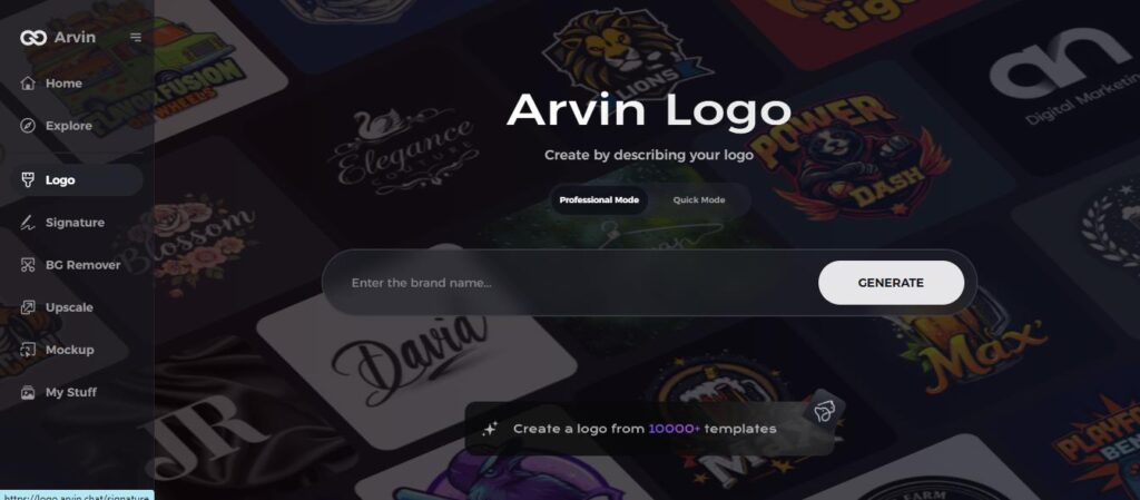
A professional logo strengthens a brand’s identity. Arvin AI provides AI-based tools for logo design which feature unique shapes, own colored fonts and typographies. For companies seeking to establish strong visual stature, Arvin AI streamlines logotype design. Arvin AI is an advanced logo design tool that uses artificial intelligence to create professional and visually appealing logos. It cuts down the design process and thus it becomes available for all kind of businesses.
Key Features of Arvin AI
- AI-Powered Design Suggestions: Generates logo ideas based on industry trends and brand identity.
- Customizable Typography: Allows users to choose fonts, text styles, and positioning.
- Diverse Color Palette: Provides tailored color recommendations for branding consistency.
- High-Resolution Export Formats: Supports PNG, JPG, and vector files for digital and print use.
- User-Friendly Interface: Simplifies the logo design process with an intuitive platform.
Steps to Create a logo with Arvin AI
Step 1: Sign Up & Log In
Go to Arvin AI’s logo maker, create an account, and log in to start designing.
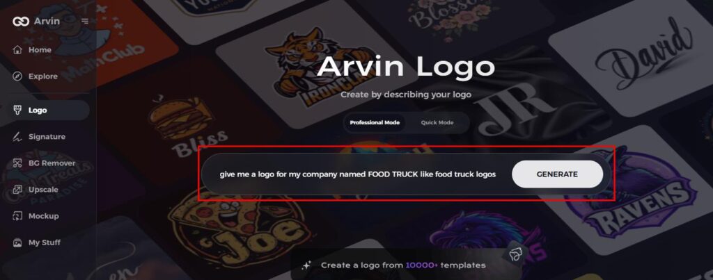
Step 2: Enter Your Brand Details
Add your food truck name, slogan, and industry. Choose design preferences like font styles and colors.
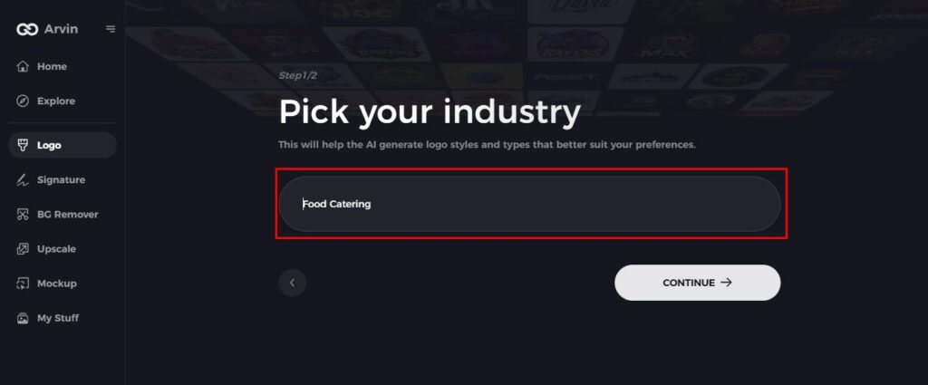
Step 3: Select Your Industry
Pick a related category to help Arvin AI generate relevant logo ideas.
Step 4: Choose a Logo Style
Select a design style that fits your brand’s personality for better customization.
Step 5: Customize Your Logo
Use Arvin AI’s tools to adjust fonts, layouts, and symbols until the design looks perfect.
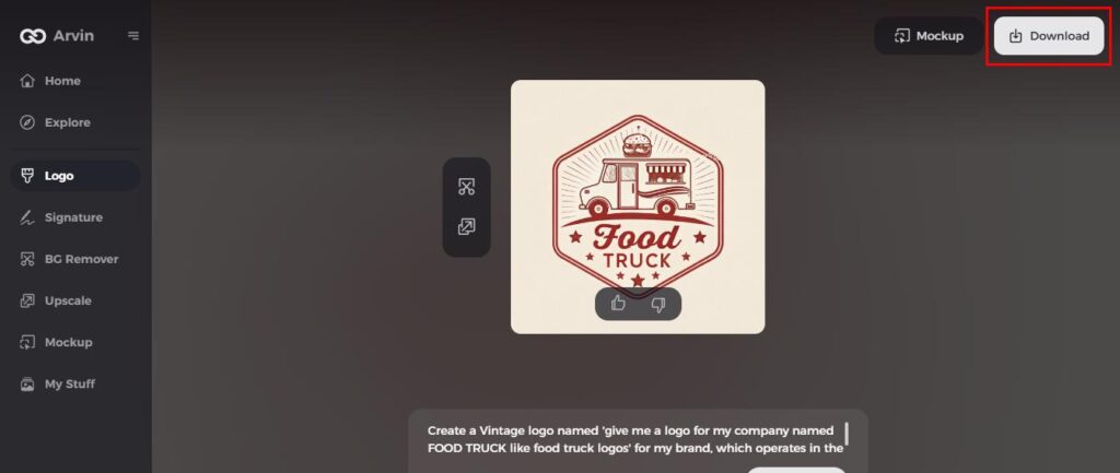
Step 6: Save & Download
Preview your logo and download it in high resolution for use on your truck and marketing materials.
Conclusion
The Lazada logo has been adapted along the way in order to show the growth of the brand and the focus on customer satisfaction. The design has been a key element in formulating the identity of Lazada within the e-commerce landscape. For companies who want to get a custom and professional logo in the simplest and most convenient way, Arvin AI offers an easy and convenient solution. With AI-powered design tools and customization options, Arvin AI makes it simple to develop a brand identity that stands out.
FAQs
What does the Lazada logo represent?
The logo of the Lazada is the symbol of love, trust and customer satisfaction. The heart shape imagery is thus a means of demonstrating the brand’s drive to offer appealing shopping experience.
How has the Lazada logo evolved over time?
The Lazada logo has undergone three major redesigns, starting with a shopping cart design in 2012, a minimalist wordmark in 2014, and the current heart-inspired emblem in 2019.
What is the size of Lazada store logo?
For the store logo, the image size is 600 x 600 px. After preparing the banners and logo, you can click the header box here, then a pop-up window will show up, you can click to upload the store banner for PC and Mobile. To upload the store logo, you can click Store Settings here.
Is it possible to make a logo like Lazada using Arvin AI?
Yes, the tools provided by Arvin AI to design logos with custom colors and fonts will facilitate the design of a professional logo such as Lazada with high resolution output.
