The Miami Dolphins logo is widely considered to be one of the most iconic logo within all of professional sports, known for its vibrant colors, and sleek design. The logo has seen several revisions throughout the years, as the team has developed its own identity and branding. The Dolphins logo has undergone significant change since its bubblegum beginnings in 1966, evolving into its sleek, minimalist form of the current era. Here is the story, evolution, and meaning of the Dolphins logo.
Part 1: The Origins of the Dolphins Logo
The Miami Dolphins rolled out their first logo in 1966, when a leaping dolphin dove over a bright sunburst. This design encapsulated Miami’s coastal identity and laid the groundwork for the team’s look in the N.F.L.
The Original Dolphins Logo & Its Inspiration
The Dolphins logo first appeared in 1966, the year the Miami Dolphins came into the American Football League (AFL). Meant to evoke Miami’s relationship with the sea, the original logo showed a solicitous dolphin leaping through a bright orange sunburst. This imagery was associated with speed, agility, and energy — characteristics that reflected the team’s competitive nature. The colors turquoise, orange and white used in the logo were chosen to reflect the colors of Miami’s coastal waters, sunsets and sandy beaches.
Usage of the Original Dolphins Logo
The original Dolphins logo was heavy on symbolism, incorporating multiple themes that distinguished it from other logos in sports. The leaping dolphin represented action and power, reflecting the team’s desire to control the game. Then came a football helmet, topped with an “M” for Miami, to solidify the sports angle and indicate that the logo was for an athletic organization and not a high school club. The sunburst behind it was not just a design decision but the predominant sunlit and tropical climate in Florida, contributing a cheery and active element to its visual identity.
Part 2: The Evolution of the Dolphins Logo
The Dolphins logo has been modified over the years to keep up with the times, yet retains its classic features. Each redesign refined the dolphin’s shape, adjusted colors and enhanced visibility, keeping the logo relevant and visually appealing over the decades.
1974–1989: Refinements and Simplification
The Miami Dolphins’ popularity increased, and the team subtly modified their logo in 1974 to sharpen it. The dolphin itself was more defined and streamlined, which added to its external aesthetic appeal. This change made the logo visible on TV games and merchandise when broadcast.
Sunburst Alterations
The sunburst, which is a central part of the design, was also altered. Its shape was subtly changed to make it look more balanced while its colors were slightly enhanced. This made the logo stand out without compromising its original appeal.
Maintaining the Original Charm
Even with these updates, the essence of the original logo was still intact. The idea was to provide a new look to the design while keeping it familiar to the fans. These updates made the Dolphins’ logo remain current as the team’s branding changed with time.
1989–1996: A slightly modernized view
Later in 1989, the Dolphins continued to refine their logo to fit in with the styles of that era. The dolphin was more elongated than before, giving it a more powerful and fluid appearance. This imparted a feeling of movement into the emblem that enhanced the team’s sense of competition.
Darker Aqua for Better Contrast
The team also darkened the shade of aqua used for the dolphin. This darker shade enhanced the contrasting and made the logo leap out even more on team uniforms and promotional gear. It enabled greater visibility across all platforms, from print through television.
Bolder Helmet “M” Design
The refinement of the helmet’s “M” emblem was another noticeable change. And the letter was beefed up with a firmer outline that strengthened the branding of the team. This minor though effective touch improved the prominence and cohesion of the logo in relation to the overall design.
1997–2012: A New Look
In the late 1990s, the aesthetics of sports logos had become bolder and more aggressive. In 1997 the Dolphins debuted an updated logo with a more muscular and less cartoony dolphin. This change was indicative of the team’s competitiveness and grit on the field, ahead of a big test against a Leyton Orient side that will be difficult to beat.
Striking Sunburst
There was an update to the sunburst element. Its detailed nuances were simplified for stronger visual appeal. The simplified sunburst helped to enhance the overall clarity of the logo.
Intensified Colors for Visibility
The palette was sharpened, especially the orange which was deepened and enriched. This revision made the logo more visible so that it would stand out on jerseys, helmets and fan merchandise. The deeper shades were in keeping with the bold rebranding lots of sports teams adopted in the late ’90s.
2013–2017: The Sleek, Minimalist Approach
The Dolphins’ logo became a minimalist logo in 2013. The removal of the football helmet was one of the biggest changes. This helped make the design cleaner and more modern but still reflected the team’s identity.
Refined Dolphin Shape
The dolphin itself, was more refined, smoother, more fluid. This redesign stressed speed and agility, both common characteristics of dolphins as a species and professional football teams.
Sharper Sunburst Design
The sunburst received an update featuring sharper, more defined rays. This nuanced update contributed to the logo’s sophistication while still connecting it to Miami’s sunny coastal atmosphere.
2018 to Present: Last Updates
The logo, adopted in 2018, made final tweaks to the Dolphins’ branding. One of the most important modifications was the color depth, which became much stronger, contrasting more strongly with the background, which made the emblems stand out even more.
Speed and Agility Improved Dolphin Shape
The dolphin’s shape, on the other hand, was optimized in detail for speed and movement. This last adjustment added reflection of the teams athleticism in the logo to reflect the teams dynamic gameplay.
Modern Design with a Traditional Twist
This version is both traditional and very modern. It retains the classic features of previous designs but also embraces smooth updates in line with modern-day sports branding. And so it is that a timeless symbol in its own right gets special mention: a defining symbol of the Miami Dolphins.
Part 3: Implications of the Dolphins Logo
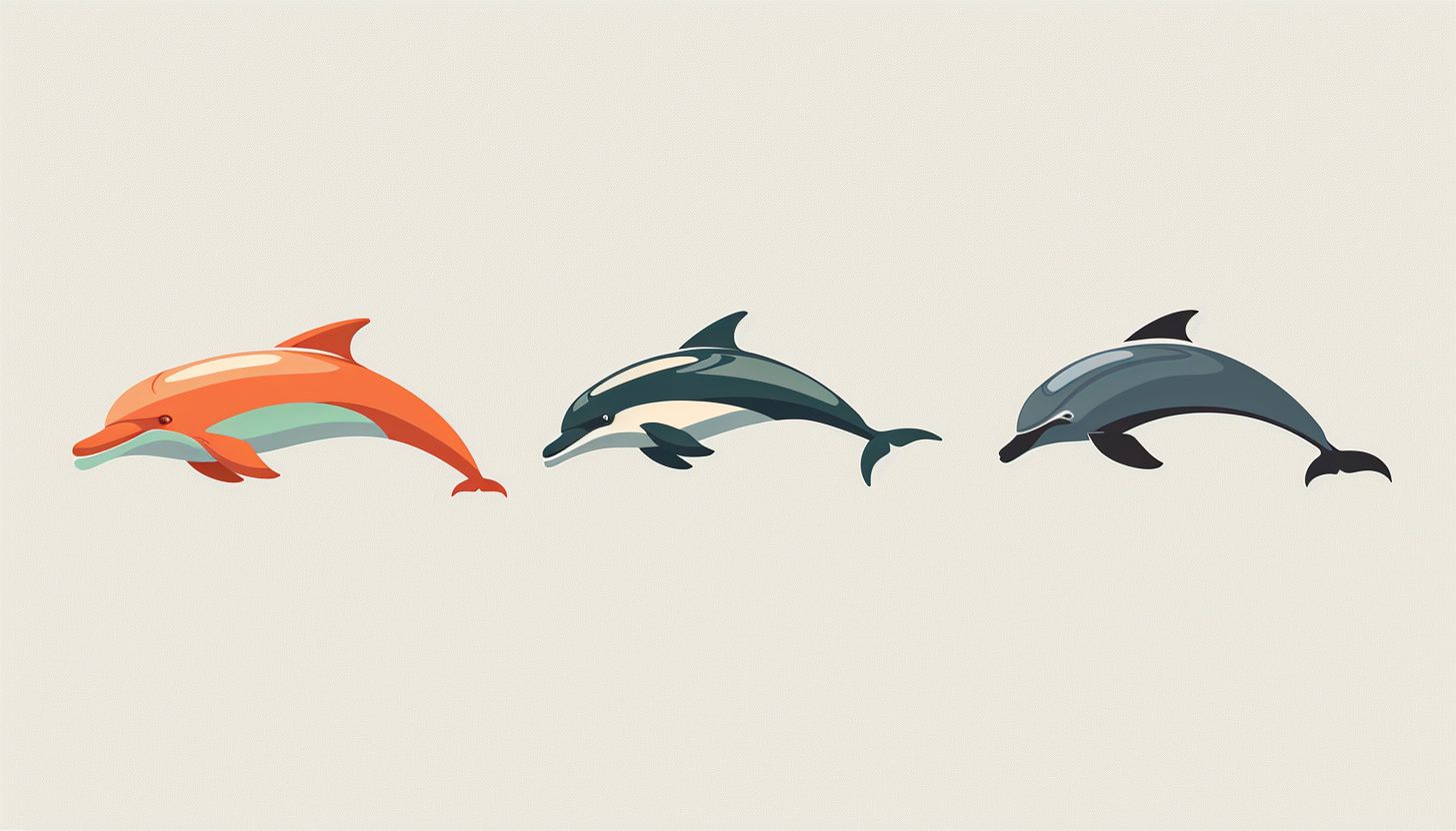
Evolve through the design because the Dolphins logo stands for intelligence, agility, and teamwork. The dolphin’s movement represents adaptability and the sunburst is a reference to Miami’s energy. Combined, these components create a mighty badge that symbolizes the team’s competitive drive and passion.
The Symbolism of the Dolphin in Sports
Professional sports require intelligence, agility, and teamwork — traits long associated with the dolphin. The selection of a dolphin thus also suggests a fair share of character traits for the Miami Dolphins, making them dedicated yet as swift as a spark-type Pokemon on the field. The dolphin , whose communication, co-operation, and speed through water are also famous, represent adaptation and endurance. It reflects the need of the team to adapt, innovate, and remain competitive in the rapidly evolving world of the NFL.
Role of Colors in Brand Identity
Even though the Dolphins don the aqua blue, color psychology has significant influence on sports branding and the Dolphins logo takes advantage of that. The brilliant turquoise signifies calm, trust, and confidence, embodying the team’s strong and determined spirit. The dynamic colors of the sport are represented by bold energy, enthusiasm, and excitement of the orange. The juxtaposition of these two colors creates a dynamic visual balance which makes the logo attractive to viewer’s eyes whilst remaining memorable. These deliberate colors promote brand recognition as well as foster a sense of intrinsic meaning in fans.
PART 4: Dolphins Logo Influenced Sports and Fan Culture
The Dolphins logo strengthens branding across jerseys, merchandise, and marketing materials, as one of the team’s most essential parts of identity. Its unmistakable look creates fan loyalty and helps keep the franchise visually distinct in the N.F.L.
Dolphins Logo — A Representation of Team Identity
A sports team logo is more than just an image — it encapsulates a team’s story, identity, and fan allegiance. The Dolphins logo has established itself as much a piece of the fabric of Miami’s football culture, as the signature on a visiting team’s game checks the Friday before a game — uniting generations of fans under a similar identity. The evolution of the emblem had fans in debate every step of the way, proving that every single step to shaping the franchise’s brand image has been significant.
Impact of Merchandise & Branding
It is one of the most marketable figures in the NFL: from apparel to accessories to collectibles, the Dolphins logo sits prominently on so much merchandise that it goes well beyond the fields. Dolphins-branded gear also stands out with a unique color palette of turquoise and orange, which has helped it gain popularity among sports fans and consumers. Year after year, the franchise has managed to refresh its logo while retaining certain key features, which has resulted in ensuring the sustainability of its branding success, keeping the fans engaged and the merch rolling out.
Reactions from the Fans on Finalized Logo Changes
Fans reacted to the Dolphins’ latest alternate logo with a mix of excitement and nostalgia. Some welcomed the new conversions, loving the new look and a fresher aesthetic, and others swore by their appreciation for the traditional models. In particular, the dolphin’s helmet redesign in 2013 sparked debates, as some fans missed the traditional look. As is often the case with new sports logos, the new look eventually became fairly common, attesting to the Dolphins’ logo and visual identity’s ability to adjust and endure.
The Dolphins Logo in Popular Culture
The Dolphins logo has also had its moments in pop culture, from movies and TV shows to music and fashion logos. Dolphins gear has gotten even more celebrity and athlete wear, helping its visibility grow. The logo’s tropical aesthetic extends beyond football too, representing the more laid-back but still vibrant lifestyle in Miami. And whether it’s video games, movie memorabilia collections or digital properties, its brand is never too far from the pop-culture conversation.
The Dolphins Logo in the Future
The design trend with the Dolphins logo may be more refined in future as the time passes. Staying true to its roots, the new Quo vadis may emphasize more digital capabilities, adapting to different media as its efficacy there is despite its long tradition. As AI-driven design and branding tools proliferate, the team may consider new ways to refresh the logo while honoring its long legacy. Potential changes aside, the Dolphins logo will forever represent Miami’s football legacy.
Part 5: Dolphins Logo Font, Typography and Color.
Typography and colors are all part of the best of strong branding. The clean lines of the modern sans-serif font speak to energy and movement, which, when paired with bright aqua and orange, create a bold but memorable visual identity.
Dolphins Logo Signature Colors
Aqua is the primary color of the Miami Dolphins logo and the other two colors are orange and white. Aqua, the deep blue of the ocean and Miami’s tropical fauna, quickly lends itself to the idea of speed and nimbleness. The use of orange as the sunburst will represent warmth and energy, while the contrasting boldness of the orange color will add dimension to make the design pop. White is frequently used as a background or outline to bring contrast and equilibrium. The 2013 redesign brought a deeper aqua and a richer orange, making for a bolder appearance.
Typography in the Dolphins Logo and Branding
While the main logo of the Dolphins isn’t much based on typography, the branding of the team has a significantly distinctive word mark. Not obvious in this style, the typeface has some customization. This design gives off an impression of movement and energy, strong enough to reiterate the competitive spirit of the team. The letters slant forward and are stretched out, representing speed and innovation. The word mark is bold and very readable whether on product, signage, or digital.
Colors and Typography, Their Effect on the Dolphins Brand
Crafted colors combined with modern typography played a huge role in shaping the Dolphins brand identity. Bright aqua and orange, set against all dynamic lettering, make the logo highly recognizable. From jerseys to promotional materials to online graphics these elements help create a cohesive visual brand that embodies the energy and tradition of the team and its connection to Miami culture.
PART 6: Design Your Professional Dolphin Logo
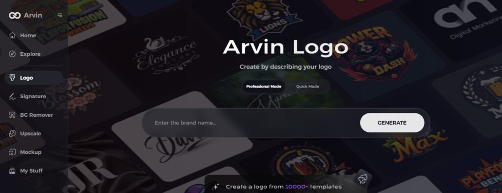
Artificial intelligence had touched almost everything in the world. If you’re looking for a dolphin-themed logo maker, then look no further than Arvin AI, which is one of the best logo makers powered by AI that can help you design custom logos. Arvin AI offers intuitive tools to help you realize your vision whether you are a business owner, a sports team, or an individual seeking a unique branding solution.
Key Features Of Arvin Ai
- AI-Powered Logo Generation: Creates professional logos instantly with advanced AI algorithms.
- Customizable Designs: Modify colors, fonts, and symbols to match your brand identity.
- High-Quality Graphics: Produces vector-based logos for clear, scalable designs.
- User-Friendly Interface: No design experience needed; easy-to-use platform.
- Multiple Style Options: Choose from modern, classic, and creative logo templates. Get instant previews and see the layout live before finalizing it.
Steps to Design a Logo with Arvin AI
Step 1: Create an Account and Log In
Go to the website of Arvin AI logo maker, create an account, and log in to access the feature of designing the logo.
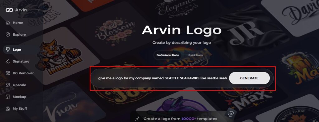
Step 2: Insert Brand Details and Preferences
Inputs are made by filling out your brand name, slogan, and industry. Specify your design preferences, such as font styles and image themes.
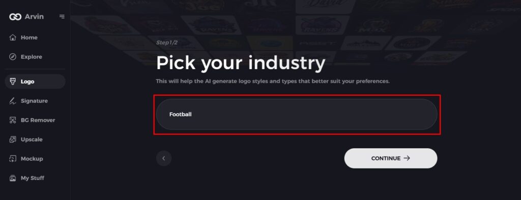
Step 3: Choose an Industry
Please select the industry or niche so Arvin AI could get an idea of logo styles pertaining to your business needs and vision.
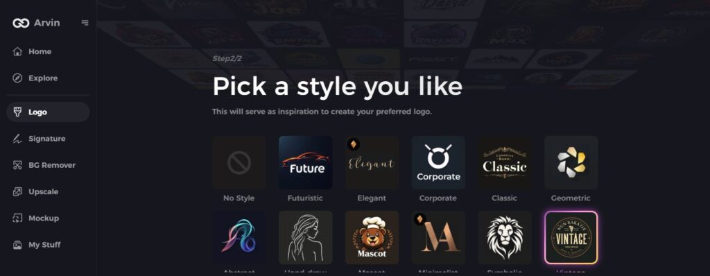
Step 4: Choose a Style
Just choose the style of logo that appeals to you. From it, Arvin AI will get ideas for designing your logo.
Step 5: Customize Your Design
Once the AI creates your logo, personalize it using tools for font style, layout, and symbol positioning. Play around with different designs until you’re satisfied.
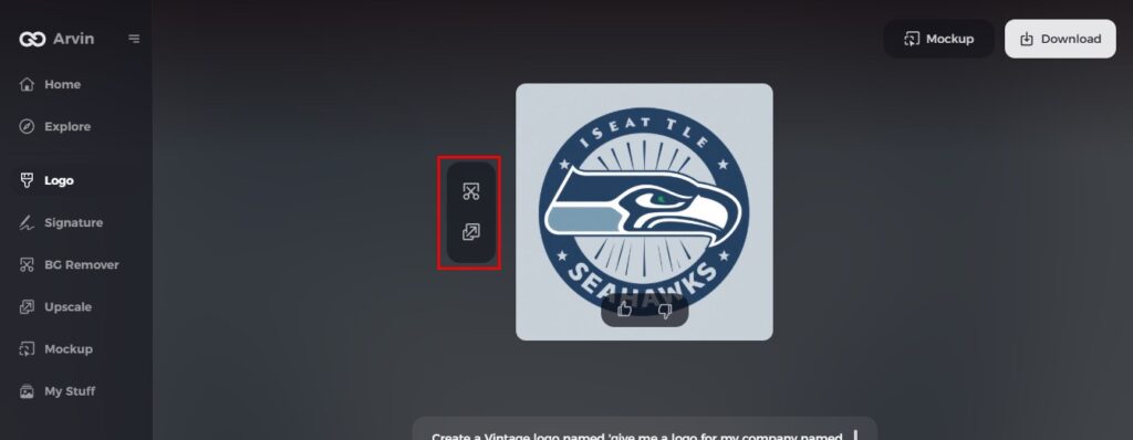
Step 6: Save and Download Your Logo
Preview your final logo and download it in high resolution, suitable for both print and digital use.
Conclusion:
Over the decades, the Dolphins logo has changed a lot, with modern iterations straying somewhat from the original but always maintaining the same energy. From the original fun-loving dolphin to today’s sleek and sophisticated one, the logo has been an enduring symbol of Miami’s passion for football. Inspired by the Dolphins branded journey to create your own professional logo? Try out Arvin AI today. Its AI-powered design tools allow you to create beautiful, high-quality logos that reflect the spirit of your brand in a matter of clicks. Join now and easily translate your vision into reality.
FAQs
How has the Dolphins logo changed over the years?
The Dolphins logo has gone through multiple redesigns since 1966, evolving from a playful, helmet-wearing dolphin to a sleek and modern version. The most significant changes include color refinements, the removal of the helmet, and a more streamlined dolphin design.
What do the colors in the Dolphins logo represent?
The turquoise symbolizes Miami’s coastal waters and a sense of calm confidence, while the orange represents energy, enthusiasm, and the bright Florida sun. These colors create a strong visual identity that connects the team to its environment.
Why was the dolphin’s helmet removed from the logo?
The helmet was removed in 2013 to create a cleaner and more modern design. This change aimed to streamline the logo while maintaining the team’s identity and symbolism.
Can I create a similar logo using AI?
Yes! With AI-powered tools like Arvin AI, you can easily design a professional-quality dolphin-themed logo. These platforms offer customizable templates, intelligent design suggestions, and various editing options to create a logo that fits your brand.