Every logo has a story behind it. Today, we’re going to show you some fascinating stories hidden in the iconic logo of the iconic Four Seasons Hotels & Resorts, a symbol of elegance. The essence of this commitment to luxury, hospitality, and an experience no other guest could enjoy is embodied in this simple yet richly symbolic emblem. The logo in branding is of high importance as it symbolizes a brand’s value and reputation visually. Here’s the case with Four Seasons logo an excellent example of how design reflects the brand identity.
Part 1: Meaning of Four Season’s Logo
The Four Seasons logo is based on the iconic name of the hotel and resort company. The center of the logo is a tree, representing the four seasons in four distinctive segments. At the lower right of the tree, the leaves symbolizing spring begin to grow, and on top of them, the leaves symbolizing summer begin to grow.
Who owns Four Seasons?
Since 2007, Bill Gates, a well-known technology icon, has become one of the major shareholders of the Four Seasons Hotel through his investment company Cascade Investments. Prince Al-Waleed bin Talal is also a major shareholder of the Kingdom Holding Company. Bill Gates owns about 71.25% of the brand and Kingdom Holding Company owns 23.75%.
Part 2: Timeless Evolution of the Four Seasons Logo
The Four Seasons logo is synonymous with luxury, elegance, and durability. Beginning from its origin in 1960, created by Alan Fletcher. The logo has evolved from being a minimalist to an elegant symbol for the brand. It has taken up various global cultures over time but has retained the essence of the core identity as the symbol of legacy for excellence in hospitality. This shows the excellence of cute logos for your brand.
Evolution of Elegance
The evolution of the Four Seasons logo is an evolution of the classic style. Designed by renowned graphic designer Alan Fletcher in 1960, the logo has been improved over the years and has garnered timeless appeal. The products are inspired by a clean and fine industrial and minimalist aesthetic which are the philosophy of the brand, to simplify the production and ceaselessly seek for excellence.
Global Harmony
As a global luxury brand, the Four Seasons logo, which has a presence in various places, adapts to the surrounding environment. The signature tree of the Four Seasons seamlessly blends with a variety of cultural backgrounds to create a harmonious expression that resonates with the hearts of guests from all over the world.
Symbolic Resilience
The legacy of the Four Seasons logo for many years lies in its iconic resilience. Even as the hospitality industry evolves, the brand’s commitment to timeless elegance is immortal.
Brand Promise
The Four Seasons logo is not just a coat of arms, but a promise of luxury that transcends borders. The Hospitality Academy shares this commitment to providing the highest standards of service and ensures that students will graduate with a deep understanding of their co-existence with a lasting heritage of branding, guest experience and excellence.
Legacy in Every Leaf
The story around the iconic Four Seasons logo shows a fusion of design, symbolism and excellence. The Hospitality Academy honors this heritage and incorporates the lessons of the Four Seasons into its educational philosophy.
Part 3: History Behind the Four Seasons Logo
The history of the Four Seasons Hotel Chain begins with the opening of the first hotel in Toronto in 1960. Isadore Sharp, a Jewish son who moved from Poland to Canada, had a degree in architecture and worked in residential architecture as a family business.
1960 – 1978
The previous Four Seasons logo was almost identical to the current one, but there are actually many minor differences. At the center of the design is a tree that symbolizes the transition from one season to another. In other words, it symbolizes the name of the hotel. The branches are divided into four groups, each symbolizing a different season.

1989 – 2021
The most obvious difference is that the word “Hotels and Resorts” has disappeared. The name “Four Seasons” has become wider and appears to have lost weight. The sharper, thinner, angular lines are echoed by the upper tree’s “thorns.” As a result, this design appears more consistent than the previous one. Does this logo play its own role? It is not easy to answer this question. This symbolize the iconic logos which uproot the visual identity of your logo.
Part 4: Key Design Elements of the Four Seasons Logo
The Four Seasons logo is based on the iconic name of the hotel and resort company. The center of the logo is a tree, representing the four seasons in four distinctive segments. At the lower right of the tree, the leaves symbolizing spring begin to grow, and on top of them, the leaves symbolizing summer begin to grow.
Font
The Four Seasons logo is highlighted by the use of a relatively sharp, angular, serif font. This font was chosen to seamlessly blend with the unique design of the tree while showing the refined nature of the brand. While the Four Seasons logo font is unique to the company, it also has similarities with existing fonts such as Aviano Didone Text Black and Questal Medium fonts.

Color
The Four Seasons logo colors are highlighted by the use of a relatively sharp, angular, serif font. This font was chosen to blend with the unique design of the tree while at the same time showing the refined nature of the brand. Though this is a unique font to the company, it has a similarity to some existing logo fonts, among which are Aviano Didone Text Black and Questal Medium fonts.

Symbolism
The Four Seasons logo aims to convey the brand’s consistency, strength and connection to the natural world. Through the logo, the Four Seasons will tell you that they will be with them all year round in any situation.

Part 5: Arvin AI: The Future of Logo Design and Branding Efficiency
The Four Seasons logo is a good example of how such a well-designed logo can effectively represent a brand’s identity. Its elegant typography and seasonal symbol convey luxury and sophistication and speak to the timelessness of what the brand sells. If you would like to create a logo that somehow relates to the essence of your brand, you may use the tool Arvin AI. This allows you to make a unique business logo for you brand identity.
Key Features of Arvin AI
- AI-Powered Design: The AI-powered platform offers personalized suggestions for fonts, colors, and design elements.
- User-Friendly Interface: Arvin AI makes logo creation accessible for users.
- Alignment of Brand: Arvin AI ensures your logo reflects the core values and unique personality of your brand.
- High-Quality Output: The platform provides logos in high resolution which is impactful on all platforms.
- Multi-Platform Compatibility: Once created, your logo can be easily exported and used across a variety of digital and print media.
Steps to Use Arvin AI for making Logo
Step 1: Visit the Four Seasons Logo Design Page
Begin by opening your browser and navigating to the Arvin AI logo maker to start creating your personalized luxury logo.
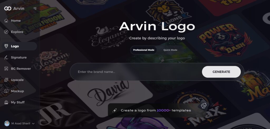
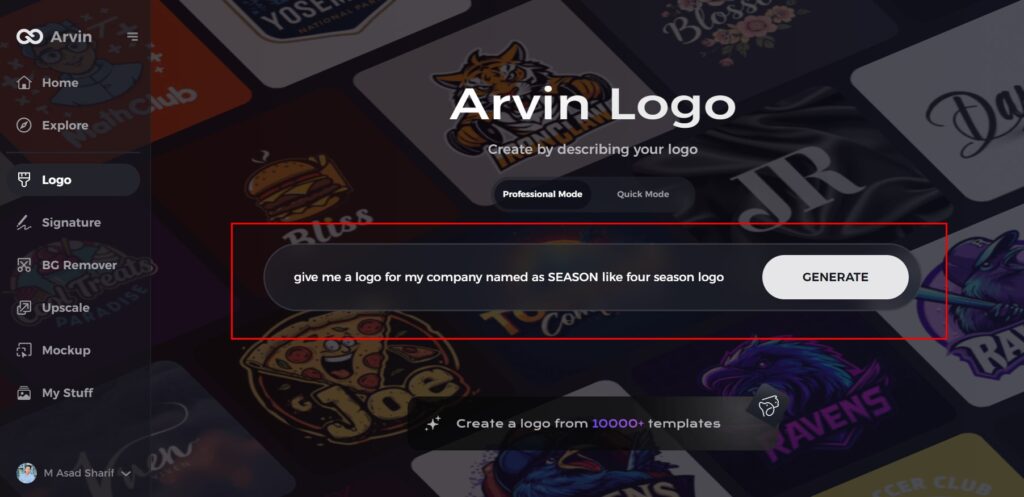
Step 2: Enter Your Business Details
Provide essential information about your business, such as the name and industry. This helps the AI tailor the logo designs to reflect the elegance and luxury associated with your brand.
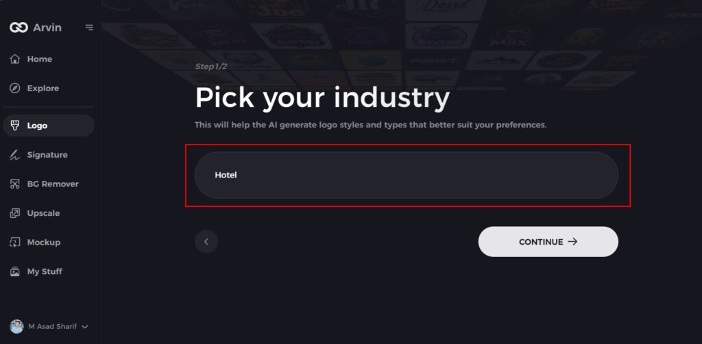
Step 3: Select Your Industry
Choose your industry from the available options. This step ensures that the logo design options are fine-tuned to match the aesthetic of your particular field.
Step 4: Choose a Design Style
Browse through the available styles and select one that aligns with your brand’s vision of sophistication. If none stand out, you can skip this step and let the AI suggest its default style.
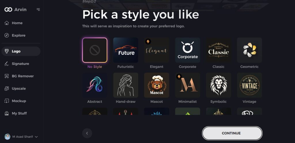
Step 5: View Logo Concepts
The AI will generate several logo options based on your input. Review these concepts to find one that best represents the luxury and elegance of your brand.
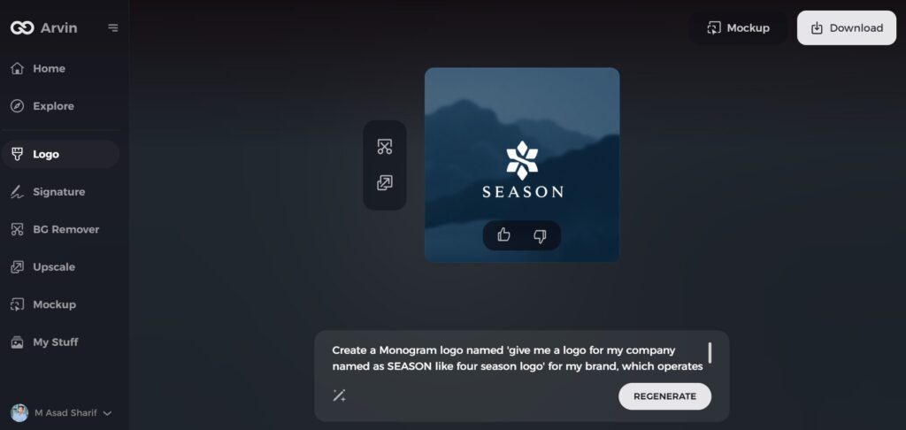
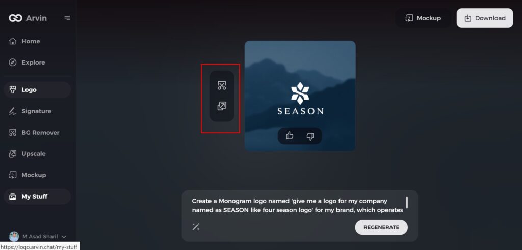
Step 6: Customize Your Logo
Enhance the design by adjusting colors, fonts, icons, and layouts to match your desired luxury aesthetic. Tailor every detail to fit your brand’s identity.
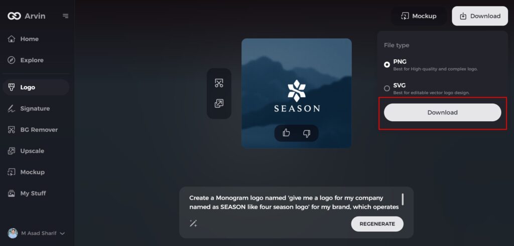
Step 7: Download Your Final Logo
Once satisfied with the design, download your logo in high-quality formats like PNG or SVG. These formats ensure your logo is ready for use on websites, social media, and promotional materials.
Conclusion
The Four Seasons logo is much more than a mere symbol. It’s a carefully crafted piece of branding, reflecting the company’s commitment to luxury, elegance, and quality service. With time, the logo has become a representation of the timeless Four Seasons experience yet still connected with nature and luxury. For those looking for a unique logo that will make their mark, use Arvin AI to make a professional logo. With Arvin AI, you can adapt a professionalism for your branding. You can make your brand visually perfect by using this AI tool.
FAQs
What does the Four Seasons symbolize?
Spring represents new beginnings and youth. Summer represents passion, growth, and young adulthood.
What does the 4 seasons logo mean?
The logo is a tree with four seasons as a motif. This visually expresses the brand’s commitment to providing the perfect service and luxury experience all year round. This concept embodies the idea that guests can expect the highest level of service regardless of season.
What makes the Four Seasons logo a great symbol for luxury?
There are fancy letters, keywords, references to the seasons, and the usage of beautiful and prime color.
Can I use Arvin AI to design a custom logo for my brand?
Yes, Arvin AI helps you design custom logos tailored to your brand’s needs using AI-powered tools.

