Sleep Token is an mysterious music project that blends metal, post-rock and ambient, renowned for its secrecy and richness of theme. It was crafted by anonymous existence named “Vessel” and was born in England. Behind their branding lies the legendary Sleep Token logo, a symbol as familiar as it is representative of their enigmatic and intriguing existence. This blog delves into the universe of Sleep Token and delves into the origin, design and meaning of the logo, which is a vital tool for their art.
Part 1: History and Evolution of Sleep Token Logo
Their journey began with the EP “One” in 2016, followed by “Two” in 2017, with singles other than the album. Their first studio album Sundowning was released in 2019 and later came with a deluxe version. Just like how a strong visual identity matters in music, Cute Logos for Your Brand can make a lasting impression and help define your unique style.
2016 – Today
The emblem logos show a central arch with five beams stretching radially, reminiscent of the rising sun and the path of light. This central icon is spelled “Sleep Token” in letters inspired by symmetrical runes. Rune alphabets create an ancient mystical atmosphere, suggesting a connection to the symbols and hidden meanings of the old world. The jet-black line with a white background gives the logo a modern yet timeless, bold graphics, and corresponds to the style of the band that blends contemporary sound with mythical themes.
Early beginnings
When Sleep Token first appeared in the music scene, their logo was simple and clean. He boldly arranged the capital letters “S,” and produced a depth feeling with a subtle shadow effect. This early logo was often accompanied by a band name, written in sophisticated modern fonts, and exuding a contemporary atmosphere. Since this early logo design is simple, the band name plays the main role, emphasizing their mysterious nature and leaving room for interpretation.
Evolution and Symbolism
As Sleep Token’s music journey progressed, their logos evolved. The band began to incorporate more complex elements, drawing inspiration from various artistic movements and their unique vision. The current Sleep Token logo is a masterpiece of symbolism. It features stylized “S” with complex details such as ancient rune characters and sacred geometry. This character surrounded by a circular frame, creating a sense of balance and unity.
Font
The sacred geometric pattern of the sleep token emblem is sometimes accompanied by a loud capital letter lettering written in clean, distinctive sand-serif logo fonts. The typefaces used in the inscriptions slightly deformed Futura, with letters separated from each other.
Color
The logo colors palette of Sleep Token’s visual identity is based on a combination of white and black, sometimes alternated with dark gray. And these shades best suit the mysterious and sacred essence of the band.
Part 2: Design Elements and Interpretation
The Sleep Token logo is a masterpiece of the design that conveys the essence of the band and is carefully made to make an impression.
Fusion of Minimalism and Complexity
One of the most striking points of this logo is the balance between minimalism and complex details. The bold letter “S” stands out, and this logo can be seen at a glance, but on the other hand, the complex pattern intrigues with depth.
Adaptability and versatility
The Sleep Token logo is surprisingly versatile and easy to use in various media. The logo maintains its impact and awareness, including album jackets, goods and stage backgrounds. Because it is simple, it can be scaled down without losing its essence.
Part 3: Impact of Visual Branding on Sleep Token Logo
The Sleep Token logo plays an important role in establishing their brand identity and connecting with audiences.
Attract audiences
The Sleep Token logo is a powerful tool to attract fans. Its intricate design and secret symbolism invite fans to dig deeper and create a feeling of community and shared understanding. Fans tend to interpret the significance of the logo for themselves, adding a personal element to their identification with the band.
Goods and Collections
The popularity of the logo led to various goods and collector’s items using iconic designs. From T-shirts and hoodies to posters and records, fans can proudly show their love for Sleep Token while wearing and decorating the logo. This merchandise not only brings revenue to the band, but also serves as a powerful marketing tool to penetrate the band’s brand widely.
Part 4: The symbolism of Sleep Token and its Mythological Vives
The symbolism of Sleep Token colored in religious and mythological references. The band’s core narrative centered around the deification of an enigmatic deity called Sleep, which is used as a metaphor for transcendence, love and sacrifice. The myth is not only evident in the lyrics, but also in the visual aspects of music videos and stage sets, which frequently consist of dark, surreal images that are reminiscent of religious iconography.
Visual identity of Sleep Token Logo
Beyond live performances, Sleep Token’s visual identity extends to album artwork, logos, and merchandise. Their album covers tend to have abstract patterns and soothing logo colors, so that they are mysterious and emotive. Dark colors and surreal, dreamlike imagery used along with them serve to match the mood of their sound and enhance the auditory-visual symbolism connection.
Part 5: Ritual Experience Sleep Token Live Show
Sleep Token’s live shows are an important element of their artistic identity, and the band turns concerts into immersive, almost ceremonial events. These performances are meticulously crafted to transport spectators to another dimension where the distinction between reality and fantasy is blurred. The dim lighting, thick mist, and minimalist movement on the stage produce a somber mood with a feel of ritual.
Silence as a Statement
The lack of interaction between the band and the audience during the performance further enhances the feeling of ceremonial offerings. Instead of chatting and acting in traditional concerts, the band keeps silence and allows music and video to speak. This minimalism solidifies the perception that every performance is a religious act and dedicated to the travel of Sleep God and the sentiments of the audience.
Part 6: Arvin AI – The Future of Logo Insights
In this modern era, AI is simplifying it to learn and know about design. Arvin AI is an intelligent tool that aids in examining logos, brand identity, and design trends. It provides valuable information about the transformation of logos over time and about how logos resonate with people. For music bands as well as businesses, AI-based tools like Arvin AI assist designers in identifying what is working and why. In this section, we will see how Arvin AI enhances logo analysis, monitors design trends.
Key Features of Arvin AI
- Smart Logo Analysis: Analyzes logos to search for patterns and design decisions.
- Brand Identity Insights: Enables brands to see the impact of their logo on recognition.
- Visual Aesthetic Evaluation: Analyzes proportion, shape, and balance within logos.
- AI-Powered Recommendations: Provides suggestions for design optimizations based on statistics.
- Competitive Comparison: Contrasts logos against competitors to review uniqueness and success.
Steps to Use Arvin AI for making Logo
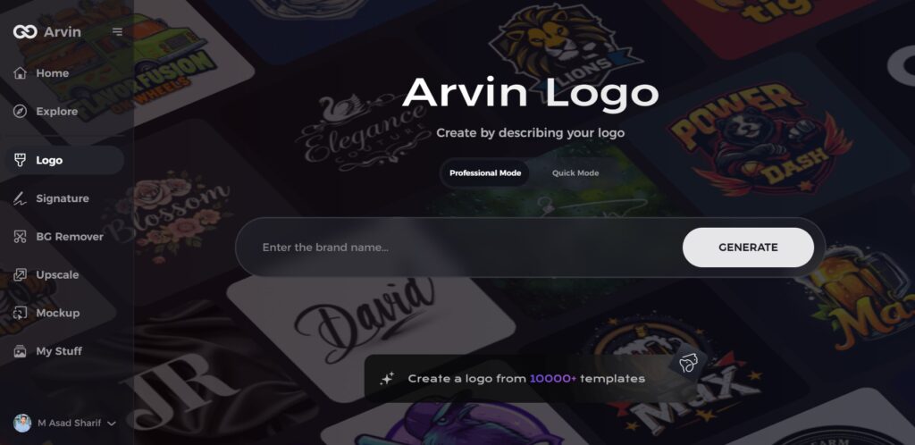
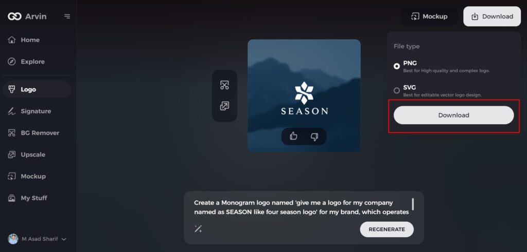
Step 1: Visit the Four Seasons Logo Design Page
Begin by opening your browser and navigating to the Arvin AI logo maker to start creating your personalized luxury logo.
Step 2: Enter Your Business Details
Provide essential information about your business, such as the name and industry. This helps the AI tailor the logo designs to reflect the elegance and luxury associated with your brand.
Step 3: Select Your Industry
Choose your industry from the available options. This step ensures that the logo design options are fine-tuned to match the aesthetic of your particular field.
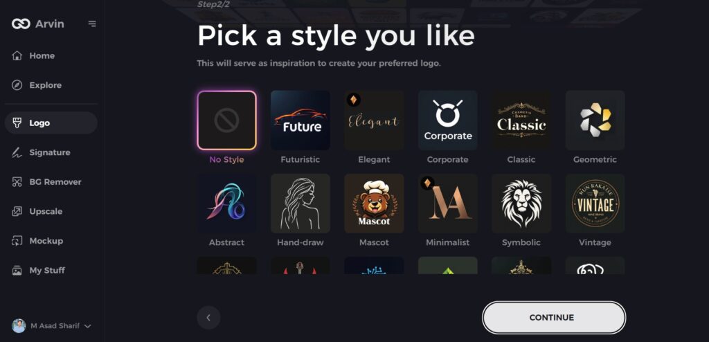
Step 4: Choose a Design Style
Browse through the available styles and select one that aligns with your brand’s vision of sophistication. If none stand out, you can skip this step and let the AI suggest its default style.
Step 5: View Logo Concepts
The AI will generate several logo options based on your input. Review these concepts to find one that best represents the luxury and elegance of your brand.
Step 6: Customize Your Logo
Enhance the design by adjusting colors, fonts, icons, and layouts to match your desired luxury aesthetic. Tailor every detail to fit your brand’s identity.
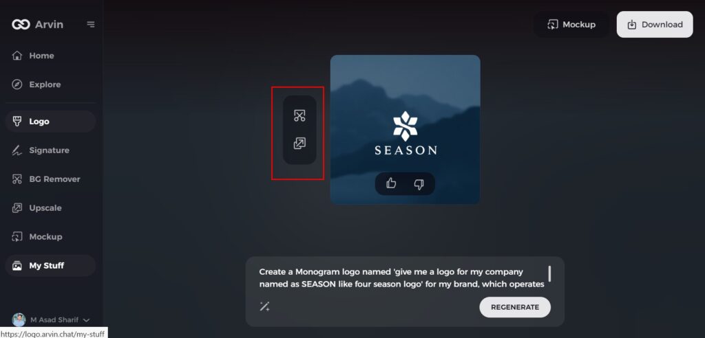
Step 7: Download Your Final Logo
Once satisfied with the design, download your logo in high-quality formats like PNG or SVG. These formats ensure your logo is ready for use on websites, social media, and promotional materials.
Conclusion
The Sleep Token logo is a strong and meaningful symbol that reflects the spirituality, mystique, and unique style of the band. While it has changed a little over time, its core message has not shifted. The fans view the logo as a special part of their relationship with the band. Thanks to AI tools like Arvin AI, it is simpler to research logos. Designers and researchers can now understand how branding, fans, and music interact.
FAQs
What does the Sleep Token logo represent?
The Sleep Token logo means mystery, spirituality, and anonymity as a concept by the band, all consistent with their own distinct musical and thematic aspects.
Is the Sleep Token logo copyrighted?
All trademarks, service marks, trade names, and logos referenced on this site, including the name “Sleep Token,” are the property of their respective owners.
Will Sleep Token tour in 2025?
Sleep Token announced a Fall 2025 US arena tour alongside promotion of their fourth album, Even In Arcadia. The mysterious alternative-metal band will kick off their tour from September 16.
How can Arvin AI help with logo analysis?
Arvin AI provides AI-driven insights on logo design, trends, and brand recall, hence making it a vital resource for artists and designers.
