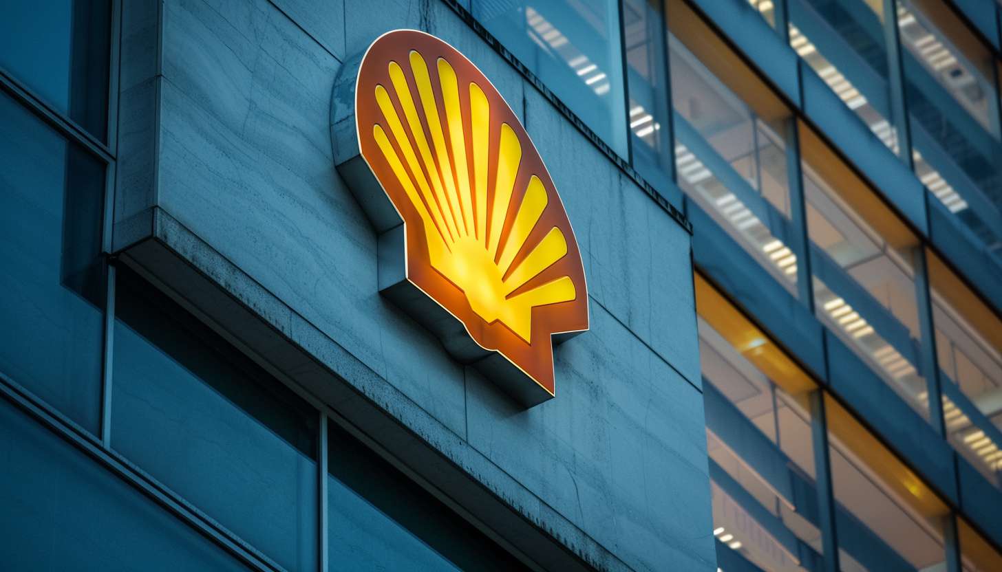
The Shell logo is also famous for its seashell design and its bright red and yellow color, making it one of the most recognizable symbols globally. Shell, one of the largest oil and gas companies, adopted this logo to create a consistent global image. The logo is still active today and symbolizes Shell’s heritage as well as the vision of the company itself to always innovate and provide reliable energy This article will take you on a journey through time, following the logo evolution from late 19th-century to present day global icon.
Part 1: The Origins of the Shell Logo
The history of the Shell logo dates back to the early 1900s when it first appeared in the form of a simple seashell. This chapter will take a look at the logo’s first design, and how that told the story of a young company.
Early Beginnings (1900-1904)
The Shell logo introduced in 1900, which consisted of a very simple, black-and-white seashell. This design echoed the company’s early days when it dealt in seashells and oil. The selection of a shell was the company’s connection to the sea, and the badge distinguished Shell from its rivals. The logo was Generic but provided a starting point that symbolized Shell’s name and history in the rapidly developing oil business.
1904-09: Full Redesign and Development
In 1904 the logo updated to a more detailed shell design. The logo now displayed black-and-white stripes, which created some depth in the illustration. Adding a bold primary color, red in this case, gave the logo a bit more punch and visibility when paired with black. This redesign was a huge departure from previous designs as it animated to the logo and made it more visually striking, resonating Shell larger presence and power in the global arena.
Part 2: Evolution of the Shell Logo
As Shell expanded, so did its logo. This section looks at some of the major design modifications that occurred in the 1940s and 1950s, up to Raymond Loewy’s pivotal 1971 redesign.
1909-1930
In 1909, Shell updated its logo once again, embracing simplicity and balance. The shell design became cleaner and flowed better, while the black background removed. This refinement boosted the visual impact of the logo by allowing the emblem to shine independently. Composed of surging shapes, the simplified design represented Shell’s move into a more modern, professional appearance, both stemming from the company’s increased global presence and the significance of an agreed-upon identity.
1930-1948
In the 1930s, Shell refined its logo, making the shell shape bolder and with less details. This minimalistic return of sorts was in tune with the prevailing modernist trends of the time. Attention turned to a cleaner, more geometric form with an accentuated shell. This logo made Shell a recognizably modern, reliable company, one that emphasized both strength and simplicity.
1948-1971
1948 saw a defining moment in the Shell logo’s history with the introduction of the striking red and yellow colouring. These hues came to be associated with the brand’s identity of energy, optimism, and vitality. In addition to the new color scheme, the form of the shell became more abstract and refined. The addition of the word “Shell” in bold letters, cemented the identity of the company as it became increasingly recognized all over the world.
Part 3: The Evolution of the Shell Logo (1971-Present)
In 1971 Raymond Loewy redesigned the Shell logo and took the logo transformation to new heights. Here, we’ll explore how over the decades the logo has stayed mostly the same while responding to an ever-changing business landscape
Raymond Loewy’s Impact (1971–1995)
In 1971, designer Raymond Loewy gave the Shell a modern logo twist with a sleek, art-deco aesthetic. His design condensed details to create a simple and bold shell symbol that was more contemporary and recognizable. Loewy’s influence gave Shell a consistent and timeless look that could resonate around the globe, mirroring the company’s expanding footprint in the international marketplace.
Consistency and refinement (1995–present)
The Shell logo has remained constant since 1995. So effective was the design that only slight tweaks were made. The red-yellow colour scheme and simplicity of the shell symbol have made the branding consistent and globally reputed. These adjustments to logo design have been small in scale but never the less reveal something quintessentially Shell about the historic brand and logotype itself. Ensuring the identity is in lock step with the changing world of design.
Part 4: Symbolism Behind the Shell Logo
For example, the Shell markup is not all about the nice design. Rather it holds a deep-seated meaning and is aligned with the plan and passion driving the organization. The seashell symbol has been used since the company’s earliest branding. And it professionals a strong imagery that is iconic logo for the company.
The Seashell Symbol: A Historical Overview
The shell itself is a nod to the company’s early roots. Shell’s founder, Marcus Samuel, began selling seashells before moving on to oil trading. The seashell serves as a symbol of the company’s origins as well as a reminder of the days of early trade and exploration around the world. It also resonates with Shell’s dedication to the world. As the company continues to rely on natural resources to power industries across the globe.
The Symbolism of the Yellow and Red Color Palette
The patented yellow and red color palette of the Shell logo is also fundamentally meaningful. Not only were these colors bright and eye-catching, but they also had cultural significance, as they were historically favored within California and Spain. Shell’s expansion into California was one of the company’s early successes in the early 20th century. The yellow and red were also a nod to the Spanish flag, a reflection of the company’s ties to the country and the cultural influence of Spanish
Part 5: The Shell Logo: Cultural Fraternity
More than just branding, the Shell logo is an icon of world culture. Let’s look at how it has changed the energy industry and cultural narratives at large, from media to art.
International Recognition and National Identity
The Shell logo is among the most widely recognized symbols in the world, and it has become so much more than a corporate mark, as it is also a symbol of global energy. Its bright yellow and red shell has been on numerous gas stations, ads and commercials, seeping into the daily lives of people around the planet. It’s consistently constant presence throughout the decades has turned it into a cultural icon, and it is commonly linked with travel, reliability and energy.
Shell’s Environmental Strategy
The final iteration of the Shell logo reflects the world on its way to what we know now as clean energy. The company’s engagement in renewable energy projects and its steps to reduce carbon emissions have brought subtle changes to how the brand is perceived. Though unchanged in form, the logo is now linked to energy responsible conversations of environmental responsibility and innovation. And reflecting the brand’s transformation from an oil titan to a energy future corporation.
Section 6: Creating Logo with Arvin AI: The Way Forward
Arvin AI is a state-of-the-art AI logo creator that is revolutionizing businesses logo designs. Arvin AI empowers companies to create professional, top-quality logos that define their brand identity quickly with a clean, designer-quality interface. AI understands what designs are trending and what looks good and functional so rest assured that the logos it creates look modern.
Key Features of Arvin AI
- Ease of Use: Simple and intuitive interface, making logo design accessible to everyone, even without design experience.
- Customization Options: Offers flexibility to tailor logos to reflect unique brand identities, ensuring a personalized touch.
- AI-Driven Designs: Utilizes advanced artificial intelligence to generate modern, creative logos that are in tune with current design trends.
- High-Quality Output: Produces professional-grade logos, suitable for businesses of all sizes, ensuring a polished and effective brand image.
- Time-Efficient: Generates logos quickly, saving time while maintaining high-quality results, ideal for businesses on tight schedules.
Steps to Use Arvin AI for making Logo
Step 1: Create an account and log in on Arvin AI
Visit the website of Arvin logo maker, open an account, and log in for the logo design feature.
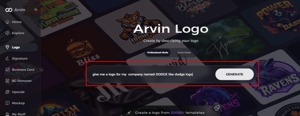
Step 2: Input your brand information and preferences
Input your brand name, slogan, and industry. Specify all your design preferences, which may include font styles or images themes.
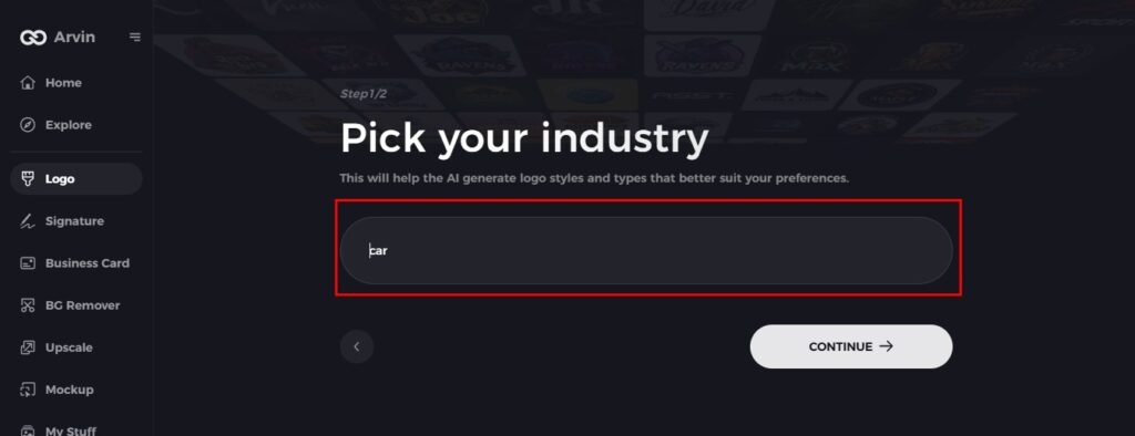
Step 3: Pick your industry
Now select your industry related to your niche. This will help the AI generate logo styles and types that better suit your preferences.
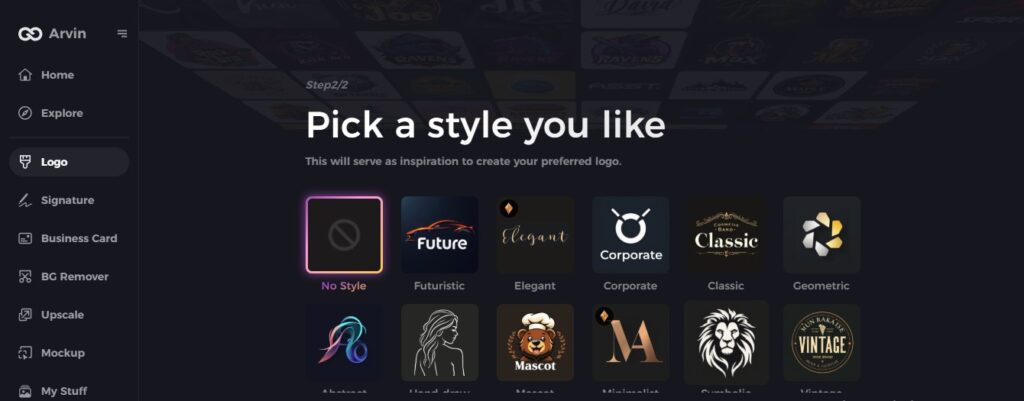
Step 4: Select Style
Now select a style which you would like and continue. This will serve as inspiration to create your preferred logo.
Step 5: Design Personalize through the tools of Arvin AI
After Arvin AI gives create your logo, you can customize those logos with the tools that have elements such as font style, layout, and the positioning of symbols. Experiment on different designs until you like what you see.
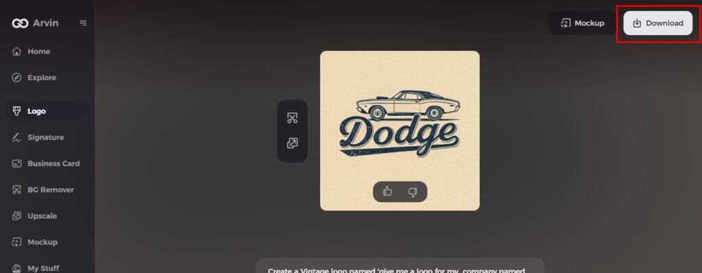
Step 6: Save and download the final logo
Preview the finished logo and save it in a high-resolution format for both print and digital uses.
Conclusion
Shell logo is one of the most easily recognized logos in the world, with an evolution from a detail-heavy seashell to its current highly streamlined form. Its classic design, made stronger by Raymond Loewy’s work, shows Shell’s lasting success and presence in the global market. Try Arvin AI now if you want to create unforgettable business logos. With its user-friendly interface and artificial intelligence-powered design features, Arvin AI can help you create a logo that withstands the test of time.
FAQs
What does the Shell logo represent?
The Shell logo is a symbol of a seashell, symbolic of the origins of the company in the oil and gas business. It conveys strength, heritage, and worldwide recognition.
Why is the Shell logo so recognizable?
The Shell logo is designed with bold red and yellow colors, making it easily recognizable across various platforms and products worldwide.
How has the Shell logo evolved over time?
The Shell logo has been redesigned a number of times, from a basic monochrome representation to the streamlined showing the company’s expansion and evolving design trends.
Can I create a logo like Shell’s using Arvin AI?
Yes, with Arvin AI’s intuitive logo maker, you can create logos inspired by the Shell emblem, while customizing it to suit your brand’s unique identity and values.