As a small business owner on a branding journey, one of the first steps is to design a logo. Among the various types of logos, the wordmark logo is a popular choice. This detailed guide expands on what a WordMark logo is and under which conditions it is appropriate for your brand, including useful hints on how to create an original WordMark logo that could express your business efficiently.

What is the word mark logo?
The wordmark logo, also known as the logotype, is a type of text logo that consists only of brand name text styled in a unique and distinctive way. No symbols, icons, or graphic elements are used, and only typography expresses the identity of the brand. Famous examples of word mark logos include Coca-Cola, Google, and Disney.
Benefits of the Wordmark logo in business
The wordmark logo has several clear benefits and becomes a favorite of many firms for it.
- Easy to understand: WordMark logo is simple, easy to read and recognize. Still, simplicity is powerful in building up transparency and reliability on the part of brands.
- Strong brand awareness: The word mark logo is centered on the brand name. Brand recall increases because customers immediately associate the brand name with the logo.
- Professional appeal: The wordmark logo with excellent design gives a sophisticated and professional impression and gives trust and trust. For SMEs and startups, the presence of brands can be demonstrated without the need for elaborate design elements.
- Versatility regardless of media: The word mark logo is effective regardless of digital or print media. Because it is text-based, it can be easily adapted to business cards, websites, social media and other brand materials.
When choosing the wordmark logo?
- Launching a new brand: When launching a new brand, especially when you come up with a unique brand name, the word mark logo is quickly recognized and can make a strong impression on the hearts of potential customers. The strong brand base greatly affects the success of new products.
- Brand name clarity: If the brand name is concise, clear and easy to remember, the word mark logo can effectively appeal the brand name and enhance the brand identity without adding symbols or images.
- Typography emphasis: If a brand identity is heavily dependent on a particular font or typography style and conveys a specific message or aesthetic, you can use the wordmark logo to highlight these typography elements and create a clustered visual identity.
- Digital Presence: In today’s digital age, where online awareness is important, the WordMark logo can enhance search engine optimization (SEO) efforts by highlighting brand names in text format, making it easier for potential customers to find and remember brands online.
- Cost-effective: For startups and small businesses with limited resources, the wordmark logo is a cost-effective branding solution.
Tips to Design a Unique Wordmark Logo
1. Find the right typeface
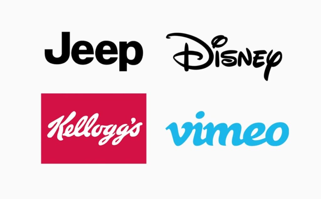
Choosing the right typeface is very important to properly communicate the tone and personality of the brand. Consider elements such as readability, uniqueness, and consistency with brand identity. For example, H&M’s typeface is clean and modern, reflecting the brand’s attitude towards fashion and trends. On the other hand, Jeep’s typeface is bold and unbelievable, reflecting the brand’s adventurous, outdoor-oriented image. This typeface conveys the strength and durability associated with Jeep cars.
2. Use character features
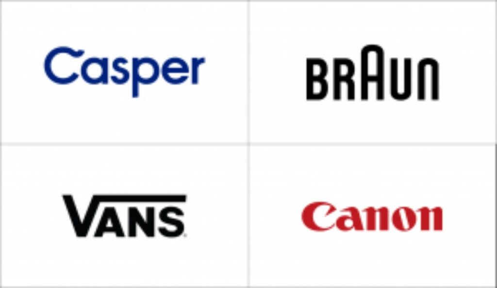
There is a case that between the ordinary “typeface and the eye-catching typeface is only one character that looks different from the other. Think of “Swoosh” in “C” in the Casper logo and “A” in the exaggerated Braun logo. Character features do not work in every case, but can be a fun design element.
3. Multi-color logo design
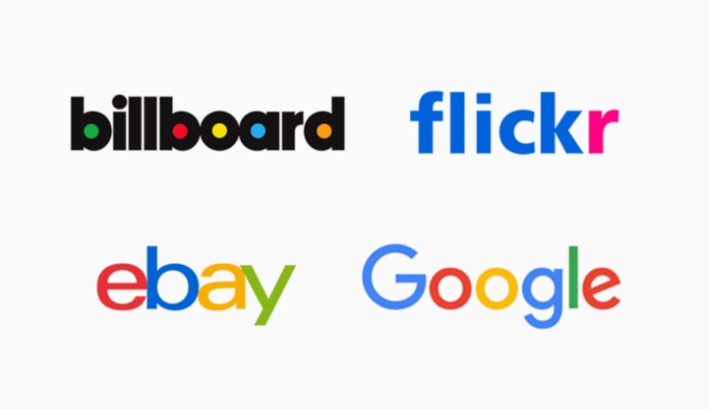
Creating an attractive minimal logo doesn’t necessarily require complex design skills. For example, the iconic Billboard logo uses a minimalist approach, but adds brilliance by filling the white space with vivid colors. This simple and effective technique not only enhances visual appeal but also instantly recognizes the logo. Similarly, the Flickr logo has a minimal appearance by maintaining a concise and clean design. However, the pink color, which is characteristic of the brand, is skillfully incorporated into the letter “r,” adding a pop color that highlights the brand identity.
4. Take Shape
In the word mark logo, designers often use the shape of the logo to inject visual fun and increase brand awareness. An impressive example is the Showtime logo. The first three characters “SHO” are in the red circle. By reversing the color scheme into the negative space logo, Showtime creates a dynamic and unique visual effect. This strategic use of the logo gives not only depth to the design, but also a unique identity that sets it apart from competitors. Similarly, even though LinkedIn is a single-word company name, it uses its logo shape skillfully to make the mark visually stand out. By enclosing the letter “in” in a blue box, it not only adds color, but also visually expresses the connection within the industry.
5. Play with spacing and capital letters
Character spacing, especially kerning, is very important for realizing visually attractive and readable design. Kerning is to adjust the spacing of individual characters to ensure optimal balance and harmony within the word mark. Decide whether to contact all of the characters. By adjusting the kerning, you can control the proximity of the letter and the character, and you can choose whether you prefer a cluster appearance that overlaps properly with spacing, or a more open, airy, clear and readable appearance. Consider how the thickness and angle of the selected font affect the interval.
Wordmark Logo vs Other Types of Logos
There are several types of logos, each with different branding needs. Let’s compare the wordmark logo with other common logos here:
- WordMark Logo: A logo using only the brand name, characterized by typography and style. Ideal for brands with unique and impressive naming and suitable for businesses that want to focus on naming.
- Letter mark logo: Letter mark is an abbreviation logo using initials and monograms such as IBM and CNN. Letter marks are often used by companies with long names, making them simpler and more compact. Although it may be lacking in direct brand recognition, such as wordmark, lettermark becomes a powerful weapon if the brand is famous.
- Pictorial logo: Pictorial logo, also known as icon logo and symbol logo, uses images and graphics to represent the brand. For example, the Apple logo is an icon that does not contain the company name. The Pictorial Logo is ideal for companies seeking a highly recognized image linked to the brand.
- Emblem Logo: The Emblem logo combines text and icons into one design, often using shape or badge formats. Starbucks and Harley Davidson are examples. The emblem gives a traditional impression and is suitable for brands that want to convey history and prestige.
Each logotype has its strengths and can meet different business needs. The word mark logo is outstanding for brands that want to make their brand name a major identifier, giving a clean and professional impression.
How to Create a Wordmark Logo (General Guide)?
Designing an impressive word mark logo requires several steps, from selecting the right typography to tweaking colors and styling. Here is a step-by-step guide to creating a wordmark logo that reflects the brand’s identity:
- Clarify your brand identity: Before starting your design process, clarify your brand’s values, personality, and target layer. This step is very important to understand what fonts, colors and styling resonates with your audience. Consider whether your brand is formal or casual, luxury or reasonable, traditional or modern.
- Select the appropriate font: The font is the core part of the wordmark logo. Try a variety of fonts, including classic impressive lines, modern sans serif, and scripts that express elegance and creativity. Choose a font that matches the tone and personality of the brand.
- Choose the right color palette: color affects how people perceive your brand. For example, blue is reminiscent of trust and professionalism, while red evokes energy and excitement. Let’s squeeze it into one or two colors and make it a clean design.
- Add unique styling and adjustments: By making small adjustments to typography, you can add unique touches to the logo by changing the character spacing and adding hands to individual characters. Subtle stylization, such as character integration and the addition of small design elements, can make the logo stand out without losing simplicity.
- Seek and refine feedback: Collect feedback from colleagues, potential customers, and focus groups when drafting. Test your logo in a variety of formats and sizes to ensure that it looks great and is easy to read across various platforms.
- Final adjustment: Based on feedback, make final adjustments to the logo centering on readability, balance and style. The goal is to make the logo according to the brand identity while being unique.
Why choose Arvin AI for the Wordmark logo
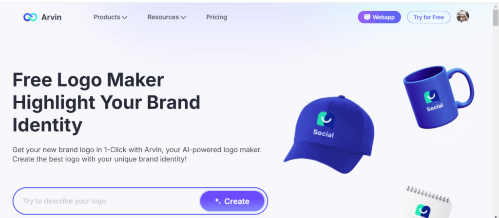
Creating a professional logo is difficult, especially for small businesses without design expertise. Arvin AI is a user-friendly tool that allows brands to easily design high-quality word mark logos with minimal effort. With advanced AI technology, Arvin AI offers intelligent design suggestions so that users can find styles and typography that match the brand’s personality. For companies with limited resources, Arvin AI provides a cost-effective way to create professional wordmark logos without hiring graphic designers. With Arvin AI, brands can get high quality results and gain the competitive edge they need in a crowded market.
Key Features of Arvin AI
- Design proposal by AI: Provides intelligent recommended fonts, colors and layouts based on data.
- Easy-to-use interface: The user-friendly platform is easy to use and quick to create logos for beginners.
- Customization options: Adjust fonts, colors, spacing, unique stylization, and more to create truly personalized logos.
- Typography Library: From modern style to classic style, we have a wide range of fonts that match the personality of various brands.
- Color palette selection: You can propose a color scheme according to the mood and industry of the brand and choose a combination of impactful colors.
Steps to use Arvin AI
Here are simple steps to use Arvin AI for creating a memorable wordmark logo:
Step 1: Sign Up and Log In: Visit the Arvin AI website, create an account if you’re a new user, and log in to access the design dashboard.
Step 2: Start a New Logo Project: Click on “Create New Logo” or a similar option to start a new design project. You may be prompted to enter your brand name, which will form the basis of your wordmark logo.
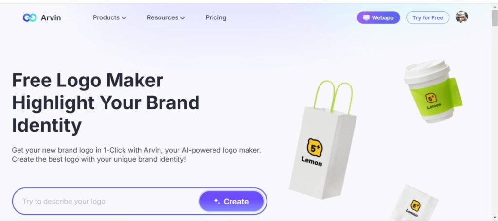
Step 3: Input Brand Details: Provide information about your brand, such as industry, tone (e.g., modern, classic), and target audience. Arvin logo AI uses these inputs to suggest suitable design elements.
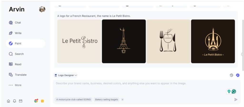
Step 4: Review AI-Driven Design Suggestions: Arvin AI will generate design options based on your input, recommending fonts, colors, and layouts that align with your brand identity. You can browse these options to see what fits best.
Step 5: Customize Fonts and Colors: Use the customization tools to refine your logo. Adjust the font style, size, spacing, and colors to achieve the exact look you want. You can explore the Typography Library for different font choices and select color schemes based on brand mood.
Step 6: Preview Your Logo: Arvin AI allows you to preview your logo across various platforms, like websites and business cards, ensuring it looks great at any size.
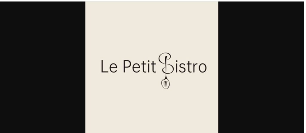
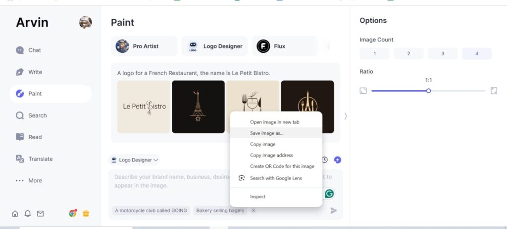
Step 7: Save and Export: Once satisfied, save your design. Arvin AI lets you export your logo in multiple formats (e.g., PNG, SVG) for web and print use.
Conclusion
The excellent Wordmark logo provides clarity and professionalism to the brand, drawing directly from memory. For a direct, powerful visual for branding, the style-focused typography word mark logo is the best. For companies with limited resources, Arvin AI does not require graphic designers to provide a practical and cost-effective solution to create professional wordmark logos. With AI design proposals, extensive customization options and user-friendly interfaces, companies can easily get high-quality results. With Arvin AI, brands can stand out and become competitive in today’s crowded markets.
FAQs
The WordMark logo is just a text-based logo focused only on brand names that use typography and stylization to convey identity. Compared to emblems and pictogos, the use of symbols or images cannot be seen in a word mark logo. Rather, it depends on the font, interval, and color of the text to create a unique and memorable brand impression.
It is because the logo consists of carrying the brand name on it. It goes a long way in recalling the brand name for the audience, and therefore, it is very useful for creating a powerful brand recall for SMEs and start-up companies because of clear-cut typography and style.
For instance, a tech company uses a modern font, and old brands use a classic font. Decide on a color that depicts the atmosphere and industry of the brand. Arvin AI gives libraries of typographic as well as color palettes, so it is quite easy to choose the impact font for your brand as well as the color combination.
Yes, there are many tools that help one create a professional-looking logo without even being a designer. Arvin AI is one of them with AI-driven suggestions and interfaces easy to understand. There are options for modifying the font, colors, and layouts, which allows anyone to finish an individualistic, elegant logo even if one has no experience as a designer.
This term mark logo does very well for most of the businesses but especially the ones where the names of companies happen to be different from many others. There can exist other forms of brands for example letter marks and those with long names that end up being emblems of logos. Word mark can successfully be used by industries on the basis of usage with several kind of fonts and stylizing also.
