One of the best-known internet brands globally, Yahoo logo is famous for its search, news, and email services. The logo of Yahoo has also changed several times with the years as the company grows. It tries to stay relevant in the tech world. We discuss the history and the change which the Yahoo logotype developed over time, from early days to looking modern now, as well as go into the spirit of designing a logo in order to compose a brand’s identity.
Part 1: The Origin of Yahoo and Its Pre Branding Era
In the early 1990s, the internet was still relatively new, and people needed ways to find their way around it. This part of the story of Yahoo shows how the company started. What the first logo designs looked like, and how Yahoo started growing into the brand we know today.
Yahoo in 1994 by Jerry Yang and David Filo
Yahoo founded in 1994 by Jerry Yang and David Filo, two students at Stanford University. They created a website called “Jerry and David’s Guide to World Wide Web.” The initial motivation was to make directory that would enable its users to search for other websites on the internet.
Early Concept Designs and Inspirations
The original Yahoo logo was simple and straight to the point. That gives the idea about the fact that the brand is in an initial stage, with respect to the cause for assisting in exploring and finding an organized internet contents. The vivid and playful bold type with a purple color, which has carried the significance for creativity and innovativeness, has been considered.
Creation of a Defining Brand Presence
The development of the Internet led to yahoo’s expansion where it became very popular in hosting email, news, and different online services within a short period. With its rapid growth, Yahoo realized that the logo needed not only to signify its original mission but also to highlight the broadening scope of the company.
Part 2. History of the Yahoo Logo
The Yahoo brand accelerates constantly through its research activities and creative production while performing future forecasting efforts. Contrary to tradition only one wordmark logo makeup its logo design prior to pairing briefly with a brand image.
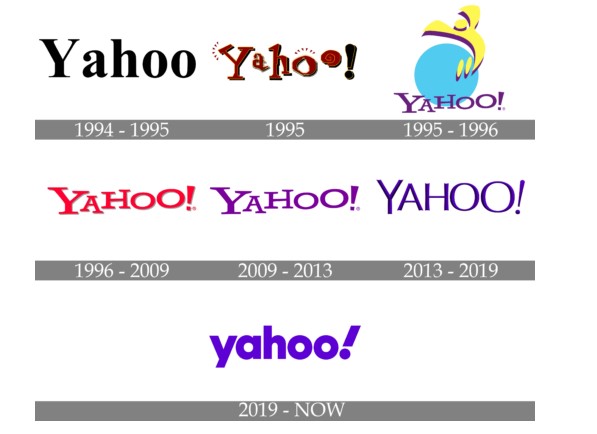
1994 — 1995
The first Yahoo logo created in 1994 and used for only one year. The logo was extremely simple and clear-cut, written in the word “Yahoo” in a classic black serif font. There were no additional design elements added to the logo; it simply consisted of the name in an easy-to-read style.

1995
For a year only, a playful logo had used-letters presented as if they were jumping. It is obvious that the “jumping” typeface and the color scheme, almost brownish-yellow, are never used now. However, we can see that other logos were in the spirit of this casual approach. It can be easily noticed at the way of letter positioning when they are presented above the line as if for showing upward movement.
1995 — 1996
The only available logo with an emblem is a 1995 version of Yahoo. The stylized emblem is colorful – a light-blue circle and the yellow stylized letter “Y” in its shape, imitating a man’s silhouette lifting his hands in the air. The wordmark is in purple colour and customised font with an exclamation mark. Since the first version by the end of 1995, the exclamation mark itself has become synonymous with Yahoo identity.
1996 — 2009
A new funny type of the wordmark is decorated with burgundy-red color with a yellow outline of letters, giving this a funny, friendly and playfully funny character. The darker shade of the burgundy brings out a very exclamation of the logo that was in use for less than a year. The same year the brand comes up with a new icon-like logo – iconic Yahoo typeface with jumping letters and straight confident lines.

2009 — 2013
The Yahoo logo gradually became colorful and creative over time. The wordmark changed to purple color, which provided the logo with an artistic and distinctive look. Purple gave the logo an energetic flow, and in this new version, the exclamation mark that was always there for Yahoo branding became more significant.
2013 — 2019
It has redesigned its Yahoo logo with considerable prominence in the year 2013. The letters feature finer lines which are delicate too and are also three-dimensional in nature. Thus, it becomes more professional, evokes sense of expertise and authority. There is no change in color but purple has now gradient in it in order to give volume to the logo.
2019 — Today
The Pentagram agency made the most recent Yahoo logo in 2019. The wordmark has small lettering and is more solid and heavy compared to the older logos. It retains the color purple but has a brighter and more fashionable color. The sign exclamation point also underlined, creating playfulness within the logo.
Shape
The existing Yahoo logo entered public use during September 2013. The recent design update of the Yahoo logo contains a contemporary appearance that reflects both its organized business strategy and its corporate attitude.
Symbol in Japan
While the international Yahoo home page was changed in 2009 and then again in 2013, Yahoo Japan’s home page was not touched. As Yahoo Japan representative Masaki Hanyuu said, “We chose red because in Japan, this color symbolizes power and activity. Purple has no such associations.” Besides, Yahoo Japan partially belongs to the Tokyo telecommunications giant Softbank Group, so it can have kept its independence to change or not to change its home page.
Part 3. Exploring the Different Yahoo Service Logos
Yahoo has different services with their own logos, but all of them have a common design style that connects them to the main Yahoo brand. In this section, we’ll take a closer look at how they represent their specific service while staying true to Yahoo’s overall identity.
Finance logo
When you visit the Yahoo Finance home page, it is pretty evident that it belongs to the Yahoo family. The word “Yahoo” is written in the same font and purple color as the main Yahoo logo, thus making a strong connection to the overall brand. The only difference is that the word “Finance” is added right below the “Yahoo” part of the logo.

News logo
The Yahoo News logo, like other products of the network of Yahoo’s services, has created considering the same principles as other services in the network of Yahoo. On the whole and in the key part, of course, here is “Yahoo” in a deep purple that attracts attention whereas the word “News” goes below it: in grey big letters.

Mail logo
The home page of Yahoo Mail is utterly minimalist. In contrast to the pages of other services of the network (for example, Yahoo News or Finance), it has much less than the typical elements of any login page. The color palette is very simple, and consists of the purple for the logo of Yahoo Mail, blue and black for other letterings, and white for the background.
Sports logo
The first word on the Yahoo Sports logo is set in the same type as used on other home pages of the network, yet the color differs. Thus, whereas the word “Yahoo” on the Mail and News homepages is in purple, on the Sports home page the wordmark stands in white, inscribed on a black background. Similarly, the word “Sports” is set in white, while the top panel, unlike the one used on other Yahoo’s products, still is in purple.

Part 4. The Dynamic Yahoo Icon: A Simple yet Bold Design
The Yahoo icon is so simple, with just two colors and very few elements making a bold modernistic look, so powerful yet so energizing, yet the simplicity makes the whole design full of life and totally contemporary. Let’s take a look at the icon, colors, and the font of the Yahoo brand, which makes it so unique.
Icon
It is cool and modern. Despite the fact that only two colors are used for the Yahoos Icon and only two plain elements are placed on the background, it still looks so intense, energetic, and very actual. The icon of Yahoo is made of a solid purple circle as background, a white uppercase “Y” in custom serif type with thick straight lines and different heights of the bars.

Color
Colorful logos play a big role in how people feel about a brand. The Yahoo logo uses a bright, bold purple that makes it extremely distinct. The most common display for the logo has the word “Yahoo” in purple with an exclamation mark on a clean white background. In other instances, the colors reversed, using purple as the background and white for the text and exclamation mark.
Font
The Yahoo logo fonts mainly used serif for its earlier designs. However, as time progresses, the brand moves to more contemporary designs. The modern version of Yahoo employs a different typeface that is generally known to people as the “Yahoo font.” The so-called “Yahoo font” is actually an alteration of the sans-serif type, which is far simpler and neater compared with the previous serif fonts.
Part 5: Changing the Face of Yahoo Logo and Brand Identification
The logo of Yahoo has been important in giving a brand character and helping people know it. We will examine logo creative influences Yahoo has had on firms as well as branding patterns prominent today and explain mandatory platform consistency for successful brand success.
How Yahoo’s Logo Influenced Other Tech?
Many companies in the field of technology setting are an example through Yahoo’s logo regarding how simplicity and uniqueness should be taken care of. Most of them that take inspiration from it have clean fonts, bright colors, and unique designs to influence the audience in the best manner possible.
It’s Role in Modern Branding Trends
Yahoo’s logo has remained up-to-date with modern branding trends through the use of minimalism and modernity in design. Years of transition have changed the logos towards simple and flat, which works fine on websites, mobile applications, and social media.
Consistency in Branding
A consistent logo across different platforms, such as websites, social media, and mobile apps, helps build trust and recognition among users. Yahoo’s logo has maintained a consistent look while adjusting slightly to fit different spaces. Whether it appears on a desktop screen, a mobile app, or in advertisements, the logo’s design remains familiar and easy to identify.
Part 6: Why Yahoo’s Logo Has Importance to Its Users
A pretty logo is much more than a decoration; it goes a long way in terms of how people think and perceive a brand. The following section examines why Yahoo Logo creates value for users and builds relationships around the brand.
Building Trust with Consistent Design
The most important thing about the Yahoo logo is that it’s consistent. That is, regardless of where the users see the logo, be it on the website, app, or in an advertisement, it looks the same. When people see something familiar, they feel comfortable. The same is with brands. Having a consistent logo helps Yahoo build trust with its users.
The Power of Simplicity in Design
Yahoo’s logo is simple, and that’s one of the reasons why it works so well. A simple design doesn’t try to do too much, which makes it easy for people to remember. Think of other famous logos—like Apple or Nike. They’re not complicated, but they’re instantly recognizable.
Reflection of the Personality of the Brand
The way a logo looks says a lot about a brand’s personality, and Yahoo’s logo has always reflected the company’s growth and the values it stands for. In the earlier days, it was more playfully fun. It was kind of a time when the internet was something exciting and new, fresh.
Part 7: How Arvin AI Can Help You Create a Memorable Logo
Arvin AI logo maker is a very helpful tool in designing logos that will fit the identity of your brand. The system offers straightforward functionality which enables users to develop special professional logos even without any design expertise. With AI logo maker you can create distinctive logos using multiple design options including various fonts and color choices. Arvin AI will make sure your logo looks great on any platform: be it for a website or social media. With simple steps, you can design a logo that represents your brand perfectly.
Key features of Arvin AI
There are following key features of Arvin AI:
- Font Suggestions: It recommends fonts that suit your brand style.
- Design Insights: The tool analyzes current design trends to keep your logo modern.
- User-Friendly: Simple to use, even for beginners.
- Professional Quality: Delivers high-standard logos for businesses and individuals.
- Time-Saving: Quickly generates logos while keeping designs consistent.
- Smart Choices: Helps in picking the right fonts and colors for your brand.
Steps on Using Arvin AI in Designing Your Logo
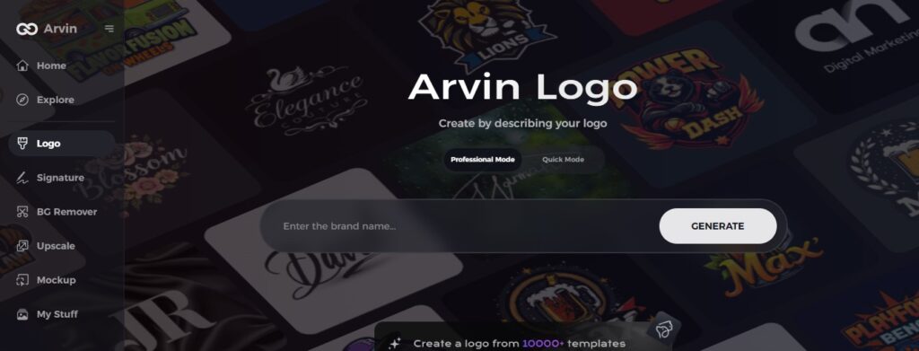
Step 1: Sign Up for an Account and Log In
Go to the Arvin AI website, where you should sign up for a new account. After you have logged in, you can access the logo design feature to create a logo that suits your brand.
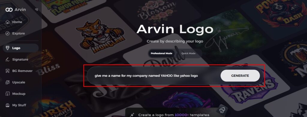
Step 2: Enter Your Brand Information
Describe your brand name and its tagline if you have one. You will also be asked what industry you would place yourself in. Also, you may enter preferences of your style, for example, font usage, color, or symbols you would want to use for your logo.
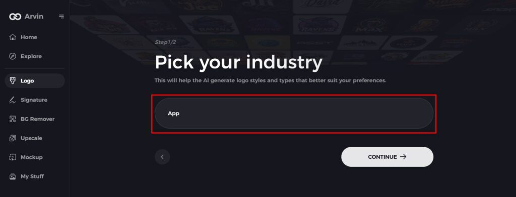
Step 3: Select Industry
Next, choose your industry or niche. Arvin AI uses this information to generate logo styles and designs that best fit your kind of business so that you create a logo that resonates with your target audience.
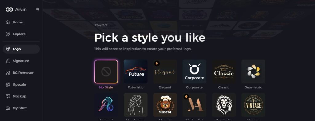
Step 4: Choose Your Style
Pick the style that you feel best matches your brand. Whether it’s modern, playful, professional, or simple, selecting a style will guide Arvin AI in creating a logo that fits the image you want to convey.
Step 5: Personalize Your Design
After Arvin AI has created your logo, you can make further designs using the design tools. Adjust the font, layout, colors, and placement of elements in designing a logo that really represents your brand, just like with what Yahoo has done with this log evolution.

Step 6: Save and Download Your Final Logo
Once you satisfied with your logo, preview it to ensure that everything is fine. Then save it in a high-resolution format for both digital and print usage.

Conclusion
The Yahoo logo is the best example that shows how changing trends should not be forgotten with a strong brand identity. This logo has passed through several years with changes in company vision and audiences’ needs. It is indeed challenging to connect people with the logo, but Arvin AI makes it easier. Through its smart design solution together with easily adjustable features Arvin AI enables businesses and individuals to generate distinctive powerful logos in a matter of clicks.
FAQs
What color is the Yahoo logo?
The color that tied to the Yahoo brand is purple. Purple often represents ambition, creativity, mystery, and power.
What was the Yahoo logo in 1994?
Yahoo got its first logo during its establishment in 1994. It consisted of the “Yahoo” wordmark colored black and in the Times New Roman font, displayed as plain text.
How does Yahoo’s logo show its brand values and changes?
Each redesign of the logo represents how the company advances through its mission alongside its audience inseparably.
Can I design a logo similar to Yahoo using Arvin AI?
Yes, with Arvin AI, you can easily create logos with the same bold and creative style.

