A logo is much more than a simple visual for a company. It stands as an integral part of brand identity; it often represents the first point of recognition and a long-standing visual cue for consumers in today’s competitive marketplace. A successful design can make all the difference between a thriving or failing brand. In this article I will be discussing what is a logo?, why the logo is so critical to branding and providing the 4 key elements of design in order to create an effective logo which will encompass and propagate the value of your brand.
Part 1: What Is a Logo?
Logo means any graphical mark which bears name or emblem of product or service or company or organization. For a business, often it’s the face that links a consumer quickly with its values, products, or services. The objective of using a logo is the establishing of brand recognition, creating a positive emotion, and standing a business out among other competitive business. At its core, a design simply takes complex ideas and distills them into an appealing way. It is a start toward building the identity of the company, and “what is a logo” is often equated directly to the brand.
Evolutionary Development of Logos
Logos have their rich history that dates back to ancient times. In the early days, logos were just simple symbols or marks for a group or family. But with the advent of the industrial revolution and mass production and advertising, logos became a much more sophisticated thing. Businesses sought ways to differentiate their products from others, hence the first logos as we know them today. With time, logotypes began to integrate more into design and were made quite sophisticated.
Types of Logos
Logos come in several different types, each serving different purposes and catering to specific brand identities:
- Wordmarks: These logos consist of the company’s name written in a distinctive typographic style. Examples include Google and Coca-Cola. The focus here is on the font and lettering to make the name stand out.
- Pictorial Marks: A mark that uses a symbol or icon to represent a brand; a pictorial mark, of course, could take a form of an animal or object or abstract. Consider the Apple logo which appears as a simple icon-an apple, representing ideas connected with innovation and technology.
- Abstract Logos: Abstract logos use geometric shapes or symbols that don’t directly represent anything recognizable, but still convey a strong brand identity. The Pepsi logo, for example, is an abstract design with dynamic curves and colors.
- Combination Marks: These logos combine both text and symbols, offering flexibility for brand recognition. Examples include Burger King and Adidas.
- Emblems: An emblem consists of a design that may involve text within a symbol or icon, which generally often has a more classic, formal look. To conceptualize this, logos come in the form of what one would consider Harley-Davidson or the NFL.
Part 2: Significance of Logos for Brands
Logos are important in branding as they help depict a company’s identity to customers, making them aware and connect with the brand. A good design tells a brand’s values, mission, and personality; it answers the question, what is a logo, making it memorable and impactful to the audience. Secondly, it is important in marketing in the sense that it’s what influences how people perceive, carry what regards trust. It can then form a consistent image among all the platforms; this encourages brand loyalty and performance in business.
How Logos Contribute to Brand Identity
A logo contributes much to a business’s identity. It is the essence of the company and will help the business express its values, mission, and vision. A logo is built up through recognition by being applied to all marketing materials, be it a website, package, advertisement, or even a sign. A logo, if done well, can create an identity for a business that is memorable and unique and resonates with consumers to differentiate itself from its competitors.
Role of Logos in Marketing and Consumer Recognition
A logo is often the first contact a consumer has with a brand, and it’s critical to making a positive and lasting impression. It’s applied to all marketing media from business cards to social networking profiles so plays a very central role in the marketing strategy of a brand. A logo that is good increases the recall of a brand and gives customers the loyalty.
Case Studies of Successful Logos on Brand Success
Many successful brands are greatly contributed to their logos. Let’s take a look at a few examples:
Nike:
The Nike Swoosh is an iconic, instantly recognizable logo that conveys speed, motion, and performance. Its fluid design reflects the brand ethos of empowerment and athletic excellence. Designed in 1971 by graphic designer Carolyn Davidson, the Swoosh has become so much more than a simple logo-it’s a symbol of dedication, perseverance, and success.

Apple:
Apple logo is a known symbol around the world. It’s an icon for innovation, simplicity, and high-quality design. The Apple logo features a sleek and minimalistic apple with a bite taken out of it that reflects Apple’s approach towards technology: elegant, intuitive, and user-friendly. The design gives off a sense of sophistication and modernity, perfectly aligning with Apple’s mission to make technology accessible while pushing boundaries.
McDonald:
The golden arches of McDonald are more than a logo; they are an instantly recognizable symbol of fast food and convenience across the globe. Bright yellow and red have been chosen for the logo because they can grab the attention of the consumer and stimulate his appetite. Yellow is warm and friendly; red is exciting and hungry. With years, the golden arches have become a symbol of cheap and fast meals, with which consumers all over the world feel familiar and feel comfortable.

Part 3: Key Elements of Effective Logo Design
A good design is more than just a pretty picture. It should communicate the personality of a brand, be impressive, and recognizable at a glance. There are several essential elements if you have a question that what is a logo.
Simplicity and Memorability
A really great design must be easy and simple enough for people to remember it easily. Complex logos confuse consumers; they will be baffled or confused by how a logo would look and confuse them, too. Instantly recognizable and readable are the characteristics of really perfect logos, for example: like the Nike Swoosh or Target bullseye, easy, yet great to identify in one’s first glance.
Color Psychology in Logos
Color plays a significant role in logo design. Different colors evoke different emotions and perceptions. For example, blue gives the impression of trust and professionalism, that is why most financial and tech companies use blue color in their logos. This is because red color is associated with energy, passion, and excitement, which is why it is quite popular for food and entertainment brands. The right color palette in a logo can be pretty impactful on how the consumer perceives the brand.
Typography Considerations
Typography in a design is as important as the symbol or image it uses. The font style, size, and spacing are factors that can change perceptions about the logo. An example would be that an intense, modern font is strong and innovative, and a handwritten script could imply being creative or elegant. All these have to resonate well with the personality of the brand and its message.
Scalability and Versatility
A good logo must be scalable, meaning it should look as good on a business card as it does on a billboard. It should be versatile enough to work in various formats, including color and black-and-white versions, and across multiple mediums such as digital and print.
Cultural and Industry Relevance
A logo should be culturally relevant and sensitive to the target audience. What may work in one region or industry may not be applicable in another. For instance, a logo that makes use of certain colors or symbols may carry different meanings in different cultures. Therefore, designers need to understand the cultural context when designing a logo to avoid misinterpretation.
Part 4: Common Mistakes in Logo Design
Designing a logo may seem simple, but many businesses struggle with what is a logo truly meant to represent, leading to mistakes that result in logos failing to resonate with their target audience or serves the business’s branding needs. We discuss here some of the most common errors in logo design and how to avoid them.
Overcomplicating the Design
A typical pitfall in logo design is over complication. Logos that are too complicated or contain multiple elements can be hard to identify, especially at smaller image sizes. A busy composition can make it difficult to get your message across or confuse your target audience. The best logos are easy to remember, and simplification is the name of the game. When designing your logo, try to put one or two focus features that best represent your brand. Make sure they can easily be identified.
Selection of Inappropriate Colors and Fonts
Color and typography are very important factors in understanding “what is a logo” and its impact. The wrong colors can make your design perceived negatively. For instance, bright, bold colors like red and yellow are usually associated with excitement and energy, which may be just what a fast-food chain needs. Similarly, the font needs to be chosen in the right way to convey the personality of the brand. Avoid trendy fonts or colors that may go out of fashion soon. Consistency and relevance to what is a logo for your brand are essential for success.
Lack of Originality
Some businesses copy the logos of others as a way of saving time or effort, which is a critical mistake. It not only lacks originality but also damages its ability to stand out from the crowd in a marketplace that has so much going on. A logo ought to be unique to your business and should reflect some values or story that differentiates it from others. A strong, original logo will differentiate your brand and help it carve out a unique place in the minds of your audience.
Neglecting Scalability and Adaptability
A logo that doesn’t scale well is a logo that fails to perform its most important function: recognition. When designing a logo, it’s crucial to consider how it will look across various sizes and mediums. A logo that is attractive on a website may not be legible or recognizable when printed on a small business card or used as a social media profile picture. Avoid this by ensuring that your logo is scalable; it retains its legibility and visual impact regardless of the size or medium in which it is used. It should also be adaptable, so it looks good in color and in black and white.
Part 5: Design a Professional Logo with Arvin AI
Designing a professional logo does not have to be a daunting task? Arvin AI is an AI-based solution that answers the question, what is a logo? By helping businesses design a perfect representation of their brand. It makes the design process easy and accessible to everyone, whether you are a startup or an established business. Arvin AI analyze the trends of designs, color psychology, and typography principles so that a logo will not only look appealing but also match the brand identity.
Key Features of Arvin AI
- Friendly User Interface: Arvin AI has an intuitive interface, making it easy for the user to navigate through the design process. Easy to use for beginner and expert designer.
- Speed and Efficiency: Arvin AI accelerates the design process by immediately presenting logo designs based on a user’s preferences.
- Customization: Though AI helps in generating logo ideas, users have full control to customize fonts, colors, and layout to suit their unique vision.
- Cost-Effective: Traditional design services are usually expensive. Arvin AI offers a more affordable option without sacrificing quality.
- Quality: Thanks to its powerful AI algorithms, Arvin AI produces high-quality, professional logos that are polished and visually appealing.
- Integration with Branding Materials: Arvin AI makes it easy to integrate your logo into a full suite of branding materials, including business cards, letterheads, and social media profiles.
Steps to design professional logo
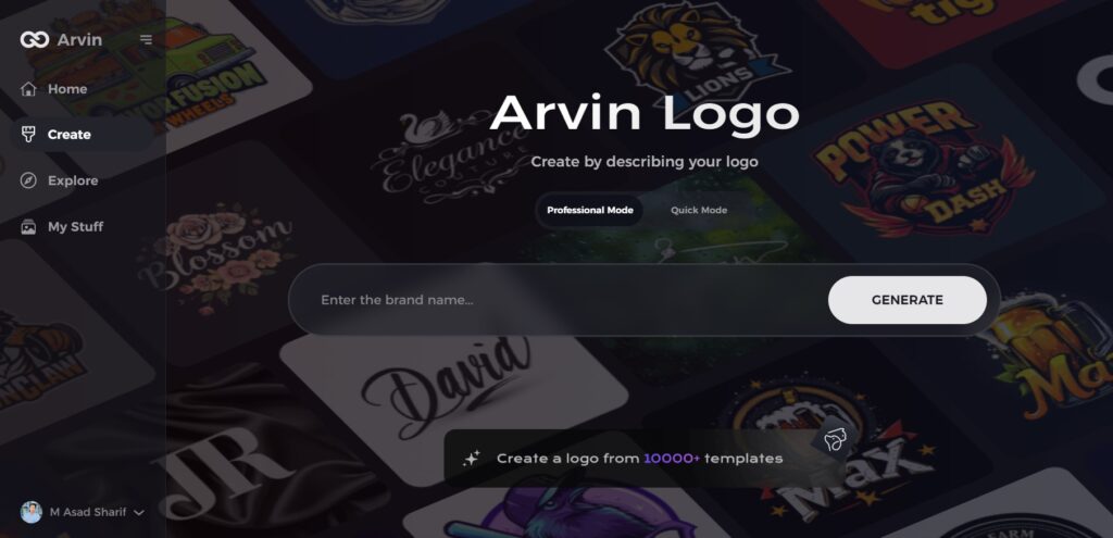
Step 1: Visit the Arvin AI Website
Open your browser and go to Arvin Logo Maker to start designing your logo.
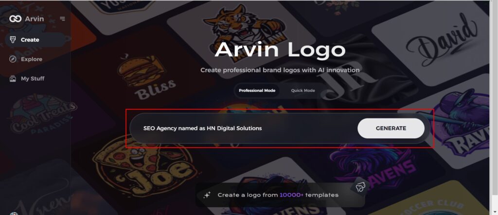
Step 2: Enter Your Business Information
Provide details like your business name and category so the AI can tailor the design to fit your brand.
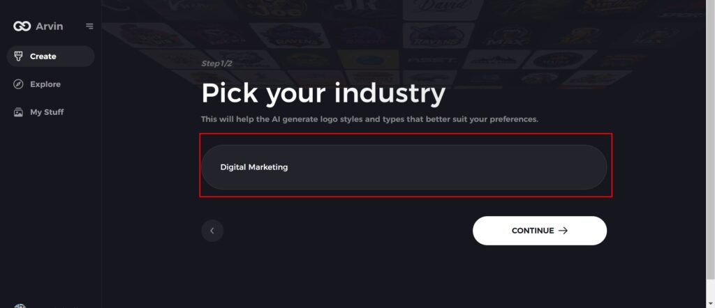
Step 3: Choose Your Industry
Select your industry from the list to help the AI focus on styles and designs relevant to your field.
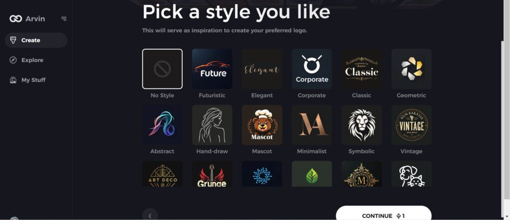
Step 4: Select a Style
Pick a style that matches your brand vision from the options provided. If unsure, you can skip this step, and the AI will use its default inspiration.
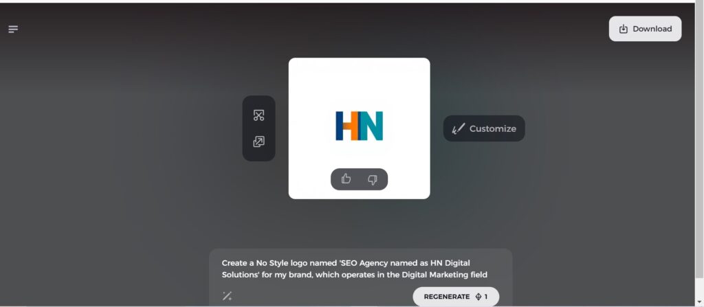
Step 5: View Logo Ideas
The AI will generate multiple design ideas based on your inputs. Review the designs to find one that suits your brand.
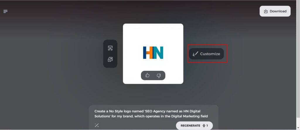
Step 6: Customize Your Logo
Make changes to your selected design, such as adjusting colors, fonts, icons, and layouts, to match your preferences.
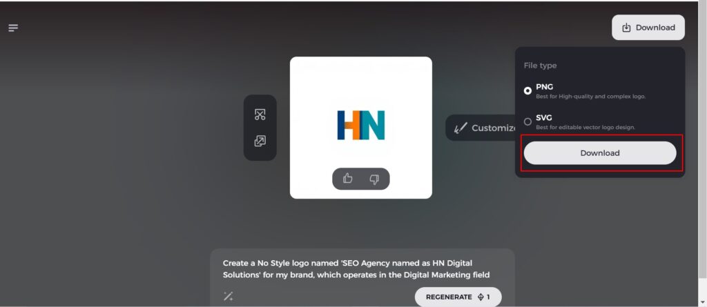
Step 7: Download Your Logo
Once happy with your design, download it in formats like PNG or SVG. So, you can easy use on websites, social media, or print materials.
Part 7: Tips for Implementing Your New Logo
Once you’ve designed your perfect logo, the next crucial step is implementing it consistently across all of your branding and marketing materials. A well-designed logo should be used strategically to strengthen your brand identity and ensure recognition. Below are some tips for effective rolling out of your new logo.
Consistent Use Across All Platforms and Materials
Consistency is the key when considering your logo’s usage. Your logos should appear just as consistently on all forms of platforms, whether it’s your website, social media profiles or business cards. It is that consistency which help build brand recognition and familiarity between the logo and the company name while they come across it anywhere.
Updating Branding Collateral
Upgrading your branding collateral is an important part of the process for implementing your new logo. This encompasses all materials bearing your design, such as business cards, letterheads, email signatures, packaging, and promotional materials. Both digital and physical should be updated to reflect the new logo so that from your website to your store signage, everything matches the new branding.
Communication of the New Logo to Your Audience
Presenting a new logo is a big moment for any business, and thus it is essential to convey this change to your audience. Announce the update on your website, social media channels, and through email newsletters. Let them know why this is evolving company values, or modernizing the look of your brand. This allows your audience to connect with the new design and understand what went into the thought process.
Conclusion
Brand identity is also important and the logo answers the question, “what is a logo” by distinguishing, identify and convey value. Being simple, memorable, and consistent gives you a great visual identity. Arvin AI is an innovative tool which provides access to business logos to any-sized business for the production of professional logos in accordance with the vision of one’s business. As technology advances, the understanding of what is a logo continues to evolve, with logos adapting through AI-driven tools like Arvin AI.
FAQs
What is the primary purpose of a logo?
A logo answers question about what is a logo by visual manifestation of a brand and assists in recognition. The logo depicts the values of the brand and provides identity to it. A design can be considered the business’s contact point for its consumers.
How often should a company update its logo?
There is no time frame; however, most companies tend to refresh their logos every 5-10 years to remain up-to-date and reflective of any changes in the brand. An update of the logo should correspond with a change in company direction, products, or overall brand identity.
Can I trademark a logo created with Arvin AI?
Yes, once you finalize your design using Arvin AI, you may apply for trademark registration, which would safeguard your identity as a brand. Thus, it prevents someone else from using a similar logo of yours.
Is Arvin AI suitable for non-designers?
Absolutely. Arvin AI is user-friendly; any person, no matter how unexperienced with design, can develop great logos. The intuitive interface along with AI-driven suggestions at every step of design help users to create a truly original design.

