The university logo is an icon however, the significance of any university logo represents all those aspects concerning the institutional values, heritage, and aspirations of an institution. Well-thought university logos will raise a feeling of belongingness and pride in people associated with or who are considered graduates of an institution. New or redesign logotype, whether creating a completely new one, it is crucially important to give a purpose or aim in being creative. We will explain how one can design remarkable university logos that will be remembered for a long time.
Part 1: The Power of University Logos in Branding
A university’s logo is far more than an emblem. It is a sign that describes the external aspect of an institution’s identity, values, and legacy. Such a well-crafted logo becomes a vessel that carries history, academic excellence, and community pride, and these become strong means of molding opinion and creating impressions. It serves as the most significant icon to brand a university, from the recruitment of freshmen to engaging the alumni.
Why University Logos Matter?
The visual identity of a school rests on the university logos that represent a first impression to prospective students and an enduring emblem for alumni. A well-designed logo instills pride, creates a sense of connection with tradition and improves recognition in a competitive academic landscape.
Fostering Pride, Recognition, and Tradition
A great iconic logo is more than just an aesthetic face; it is a feeling of belonging. This is because both students and alumni associate their personal success with the logo of the university. Just think about a great university logo, such as Harvard’s shield or Stanford’s tree-what is greater than a good design? A university tradition, that’s what.
What makes a great university logo?
A great university logo is more than just an emblem, it’s a visual basis of the institution’s identity. It represents tradition, excellence, and aspirations, fostering a sense of pride and belonging among students, alumni, and faculty. Let’s explore the key elements that transform a logo into a powerful symbol of academic excellence and community connection.
Simplicity and Timelessness
A great logo is usually simple enough to be memorable and timelessness enough to be relevant for decades. Highly intricate designs soon become outdated, while clean, minimalistic university logos tend to stand the test of time. As Yale University’s very plain “Y”, easily relays authority coupled with academic elites without too much ado; easily scalable and easy to reproduce clear in different sizes and formats.
Relevance to culture and history
This is the actual heritage and culture associated with the establishment of the particular university. If the logo designs are made considering the founding stories or regional elements, it provides authenticity and even depth to that design. For instance, on Oxford University, one will find books alongside Latin inscriptions that symbolize knowledge and academic richness.
Color Psychology and Typograph in the Design
Color and typography are central in shaping perceptions. Colors make people feel and tell a story: blue often symbolizes trust and intelligence, green is growth and harmony, and many more. Typography informs the personality of the university.
- Serif fonts are suitable for older institutions because they give the impression of tradition and formality.
- Sans-serif fonts give the look of a new or more progressive university. These logo fonts are essential for a well-planned logo.
Part 2: Iconic University Logos and What We Can Learn?
The university logos are the product of beautiful designs that reveal, rather than just the institution’s identity but also their aspirations and culture. It will be useful in understanding good principles of design from some of the most iconic university logos in the world.
Harvard University
Harvard is one of the examples of the traditional shield emblem. The Veritas shield is a symbol with three books, and it carries the Latin word “VERITAS” meaning truth which symbolizes knowledge and enlightenment. The crimson color symbolizes passion and determination; it is bold and timeless. This emblem supports Harvard as a global symbol of academic excellence.

University of Oxford
The University of Oxford sports a coat of arms, open book between three crowns that speak of scholarship and the patronage by royalty. Completing the logo with its gravity is the Latin motto, “Dominus Illuminatio Mea,” or “The Lord is my light.” This design comes with the authority steeped in tradition and which Oxford has had for thousands of years.
Massachusetts Institute of Technology (MIT)
The MIT logo is a modernist breakthrough from the generally associated university emblems. The interlocked “MIT” letters represent creativity and advancement. The straight lines and geometric patterns represent the whole interest of the institution in the science and technological fields along with engineering. Thus, this very minimalistic nature makes it quite versatile across the digital as well as print medium.

Stanford University
The Stanford tree is the mascot of Stanford, symbolizing the classic representation of an old redwood tree at El Palo Alto, California. The natural element of the university brings it back to its roots both geographically and culturally, representing growth and sustainability. Deep red and white colors would provide clarity as well as emotive appeal for athletic branding.

University of Cambridge
As with Oxford, University of Cambridge uses a shield for its logo but makes it more colorful, with gold lions and a cross of ermine on a red and blue background. This multicolored emblem emphasizes Yale’s royal past and academic excellence while retaining a unique visual image.

Yale University
The Yale logo rests centrally on a very simple yet dignified shield, with the image of a book and some text in Hebrew. The understated blue and white color combination along with serif font tells tradition, trust, and academia. It is in a manner that transcends the times and speaks to the commitment of the university to intellectual inquiry.
University of Tokyo
The University of Tokyo logo abstractly represents the rising sun. It is a representation of Japanese culture and history. The design embodies a golden orb with petal-like shapes; it represents diversity, harmony, and global outreach. This is an innovative logo connecting tradition and current aesthetics.

Princeton University
The Princeton University logo uses a black and orange colored shield. Its coat of arms is composed of a book and a Latin inscription that focuses on knowledge and discipline. The color used is bold along with a clean design for the logo which gives it great visibility and application-friendly.
University of Melbourne
The University of Melbourne logo has a classical shield with an angel and a constellation of Southern Cross. The university is represented by Australia and its worldwide outreach. These shades of blue and white are deep in color, meaning professionalism and academic integrity.
ETH Zurich
ETH Zurich’s logo has a starkly minimalist design based on clean bold typography. Use of black and white gives an impression of a professional and modern look that follows the theme of science, technology, and innovation. Simplicity ensures its scalability and applicability across platforms.

Part 3: Creative Ideas for Designing a University Logo
This is an excellent opportunity to express an institution’s identity, values, and aspirations in the design of a university logo. A logo with a unique theme and thoughtful design technique will create something that has the power to appeal to its audience and withstand time.
Academic Excellence: Open Books and Light Bulbs
An open book embodies learning and the intellectual thirst for knowledge, as a light bulb reveals innovation and discovery. Mix all these styles using a minimalistic approach to showcase the elementary basis of the institution.
Innovation: Geometric Patterns and Abstract Shapes
Geometric patterns such as interlocking triangles or circles and circles speak of evolution and modernity. Combine these with bold, futuristic fonts, which form an ethos towards a forward-thinking attitude.
Heritage: Traditional Shields and Emblems
An old institution will go well with coats of arms shield that has historical and older motifs such as crests or scrolls or other elements like the laurel wreaths. The inception date of this institution should, thus be included to heighten its antecedents 4. Natural Elements: Tree, Mountain or River
Using elements from the local environment, such as a tree for growth or a river for vitality, can connect the building meaningfully to the community. Such natural motifs also represent sustainability and harmony.
International Reach: Globes and Network Lines
For globe-trotting mission-driven schools, a globe or connected lines might be suitable as this would reflect the reach and sprit of global cooperation. These are extremely flexible elements that work great with contemporary modern clean aesthetics.
Minimalistic Art: Icons and Simplified Typography
Simple geometric shapes, such as single lettering with creative add-ons or simple geometric icons, can look pretty elegant and sophisticated. These types of designs can be quite flexible, too, and suit well with the present day digital trends.
Science and Technology: Circuitry and Molecular Structures
Interests in STEM fields would go across with representations of DNA strands, atoms, or circuit boards, merged with modern sleek fonts and a message about innovation and expertise.
Inclusiveness and Diversity: Hands or Interlocking Shapes
Use motifs, such as hands or interlocking shapes, for unity and oneness. Such logos would be at home in institutions of higher learning that are community-based and cooperative.
Cultural Relevance: Local Icons or Symbols of the Region
Use local symbols, which can be the state bird, flower, or a particular architectural landmark in the region. This approach personalizes the logo and enhances the local feel.
Graphic Typography: Letters as Artwork
Make the university’s initials striking and artistic in bold typography. For instance, merge letters in shape or include subtle patterns inside them. This could be very striking and at the same time not that complicated.
Part 4: Designing University Logos with Arvin AI
Arvin AI is an innovative design platform tailored to simplify the process of creating impactful university logos to attract thinking. With its advanced features and user-friendly interface, it empowers users to craft university logos that are visually stunning and deeply aligned with institutional values. Whether you’re a seasoned designer or a novice, Arvin AI helps transform ideas into professional-grade university logos effortlessly.
Key Features of Arvin AI
- Smart Design Templates: Arvin AI offers an expansive library of templates specifically for the branding of a university. Templates are the best places to develop a logo.
- Elements Which Can Be Edited: You may change each aspect of your logo based on the requirement of the institution-be it color palette.
- AI Suggests: This feature saves time because the logo automatically aligns with the institution’s identity.
- Scalability Optimization: The logos created using Arvin AI are vector-based, meaning that no matter what size or format, from banners to digital icons, clarity does not compromise.
- Collaboration and Feedback Tools: This platform includes features for real-time collaboration, to review and provide input on the design in real time.
Steps to Use Arvin AI for making Logo
Step 1: Create an Account and Access Arvin AI
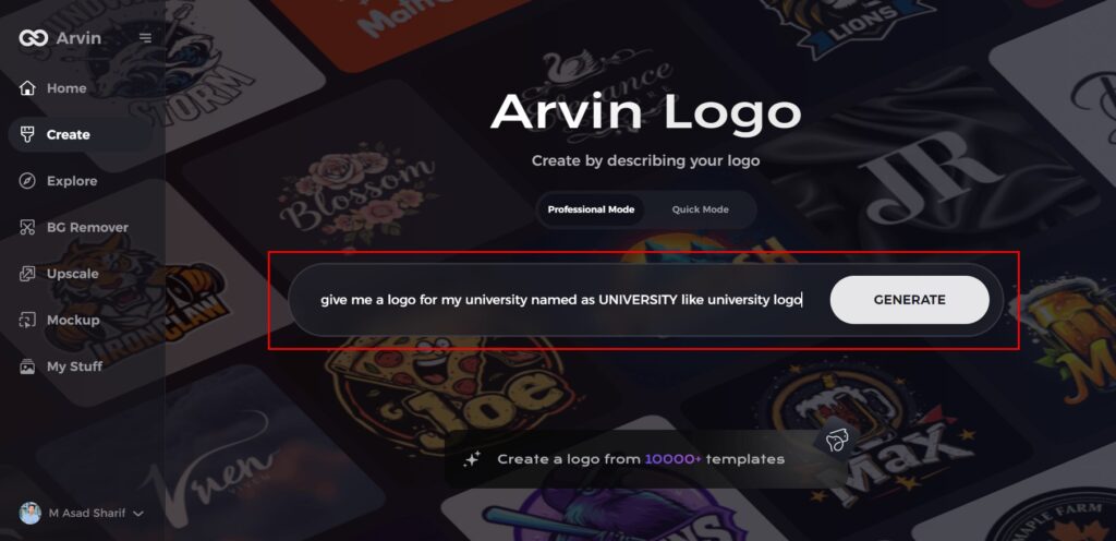
Visit the Arvin AI website, sign up for an account, and Arvin Logo Maker in to access the logo design feature tailored for universities.

Step 2: Provide University Details and Design Preferences
Enter your university’s name, tagline, and primary industry focus. Specify your design preferences, such as preferred fonts, colors, or visual themes that align with your institution’s identity.
Step 3: Select the Relevant Industry Category
Choose the industry category that best represents your university. This step helps the AI generate logo styles and options that resonate with your institution’s unique identity.

Step 4: Choose a Style for Inspiration
Browse through various styles and select the one that reflects your vision. This choice will guide the AI in creating logos that match your desired aesthetic.

Step 5: Customize Your Logo with Arvin AI Tools
Once Arvin AI generates initial logo designs, use the platform’s customization tools to refine them. Adjust fonts, layouts, symbols, and other elements to craft a logo that perfectly represents your university.

Step 6: Save and Download Your Final Logo
Review the finalized logo and save it in high resolution, ensuring it is ready for both digital and print applications.

Part 5: Common Mistakes to Avoid in Designing University Logos
A university logo is no easy feat. It is that delicate balance of creativity, symbolism, and professionalism. A good logo is the face of an institution, reflective of its values, history, and aspirations. Even the most experienced designers may commit mistakes that diminish the logo’s effectiveness. The following sections look into common pitfalls to avoid so that your design truly speaks for authenticity and the test of time.
Over-Elaboration
The largest mistake made in the design of a university logo is over elaboration. Intricate designs may look cool at first view, but they are not very practical to use and certainly do not function well in formats. A far too cluttered logo with too many elements is one that can really lose its point and become irrelevant when trying to reproduce it smaller, such as on business cards or digital.
Lack of Consideration to Cultural Significance
A university logo must carry some meaning to their market: that is, it should represent the cultural or historical significance to the institution. Skipping this aspect disconnects its stakeholders and does not get connected with the community. Symbols, colors, or motifs that symbolize the heritage of the university are full of pride and continuation. Involving alumni, regional experts, or historians in the process of designing the logo will give authenticity to the logo, thus avoiding errors.
Choosing Popularity Over Classics
Design trends change with time, but a university logo should stand the test of time. Whereas an attempt to capture everything that is contemporary, like making use of bold, over the top fonts, or bright shiny gradients, this often quickly outdates. An iconic logo makes for long-lasting recognition and sustains for several decades. Traditional designs are much more versatile: they easily transform to fit almost any branding purpose without appearing archaic. Avoiding fads and focusing on timeless aesthetics ensures the logo remains relevant and iconic.
Part 6: Logo Redesigns: When and Why to Update?
A university logo is an identity that stands the test of time, but even the most classic designs may call for a face-lift in order to be relevant and functional. Strategic redesign of a logo may be done especially to keep up with the times, respond to criticisms, or symbolize growth. Knowing when and how to approach redesigning a logo ensures a seamless transition that pays homage to the past while embracing the future.
Old Aesthetics
Time changes design trends. What was hot a decade ago is no longer the case and has turned outdated. Intricate emblems, old typography, or colors not so appealing to today’s audience are some of the indicators that it’s time to refresh. If your logo can’t be transformed into a digital format or just does not work visually on newer platforms, it’s probably due for a refresh.
Negative Reviews
Students, alumni, and even the faculty can be good sources of opinions on how effective the logo of a university is. If persistent feedback points to confusion, disengagement, or dissatisfaction with the design, then that warrants a change. It pays to listen to these voices as it ensures the redesign is consistent with the institution’s community and objectives.
Methods to a Successful Redesign
A redesign of a logo must be well-planned so as to bring together the perfect innovation and tradition. Among the approaches that will be utilized in arriving at the perfect end result include the following:
Conservation of elements of heritage
During redesigning the logo, the quintessential elements must be carried forward which represent the heritage of the university. Iconic symbols, dates of establishment or even signature colors may provide a linkage between the old and new university logos since this provides a feeling of familiarity and continuity. For example, making a font modern or breaking down a complex shield into simpler lines will reinvigorate the logo but without harming its legacy.
Refresh Design Thoughtfully
The redesign should make it better to give clarity, be versatile, and has relevance. Simple the complex elements; update typography to be readable; and choose a modern color palette. The design needs to be at once modern but timeless, reflecting the aspirations of the future as envisioned for the university.
Involve stakeholders
Involve all the interested parties, students, faculties members, alumni, branding experts who are going to be engaged with the redesign process of the logo as their comments will make it more appealing for the majority. Sessions or feedback sessions with them may actually pin down other issues beforehand to ensure a good design is cohesive and well-received as well as noted.
Test Across Mediums
The new logo has to make it work on all channels-digital screens and paper prints. Scalable and flexible designs make the appeal irrespective of whether the website, social media, or merchandise. Testing the logo in different sizes and formats is meant for its effective performance on all uses.
Conclusion
It serves as the foundation for the brand and identity of any institution. A great logo maintains everything the university holds, its past, and its ambitions and reminds pride and recognition from its community as it executes its power in attracting students and enhancing progress relations. Tools like Arvin AI make designing much easier by filling natural capabilities it represent a good and effective logo for viewers. It help users design university logos that are professional and genuinely representative of the mission and vision of the institution.
FAQs
What is in a university logo?
A university logo, at minimum, is comprised of a few elements-the institution’s name, unique symbol or crest, and defined color palette. All of this should convey and communicate the culture, identity of the university in itself, with ease and versatility.
Do I really need a designer for creating a great university logo?
Yes! For instance, using Arvin AI, one can design a professional-grade university logo without necessarily having the expertise in designing. Such platforms offer customizable templates, AI-powered suggestions, and user-friendly interfaces that make the process accessible and efficient.
How often should a university update its logo?
Universities tend to refresh their logos every 10–20 years. However, other reasons that may make a redesign within a shorter time frame necessary are a significant shift in branding, mission, or audience expectations for the logo to remain relevant and effective.
Why Arvin AI for Logo Design?
That makes Arvin AI unique with intuitive tools to assist you, personalized design recommendations, and extensive customization capabilities for users. This simplifies the process to create while allowing for really impactful, professional-looking university logos perfect for your institutional needs.

