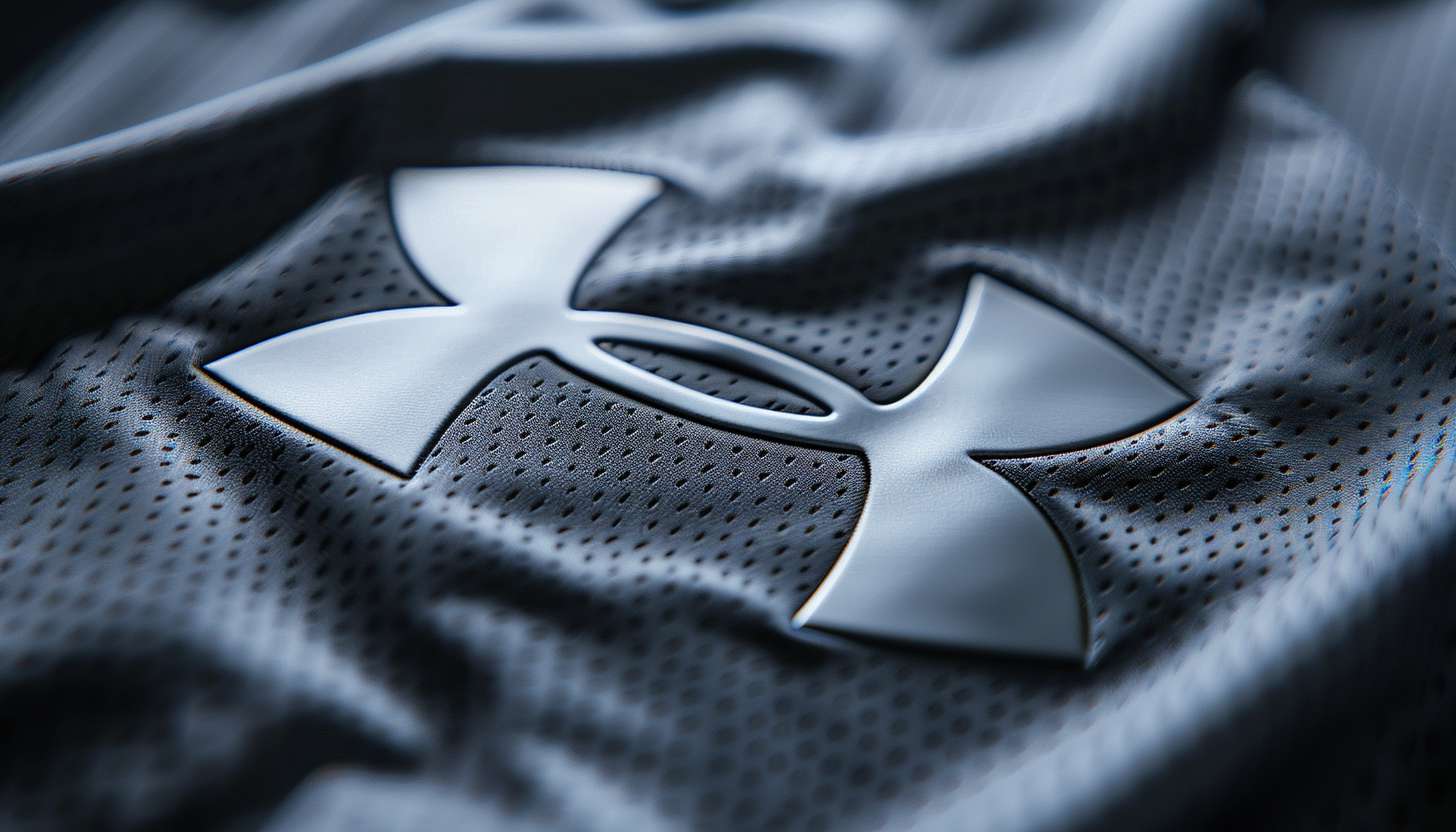
Under Armour is a well-known and established performance apparel and accessories brand that specializes in the sportswear market. Established in 1996 by Kevin Plank, the brand has developed a strong identity built on innovation and quality. The Under Armour logo symbolizes strength, endurance and progress, a crucial part of the brand identity. In the several decades since, this humble yet potent logo has become a staple on athletic kits around the world, synonymous with performance and advancing sportswear technology.
Part 1: History of the Under Armour Logo
Under Armour’s logo has developed throughout the history of the company from a small startup to a global empire. Each rebranding is a testament to the company’s focus on performance, innovation, and having a would-be vision in the crowded world of sportswear.
The Beginning of the Brand
Under Armour started in 1996 with a mission to make moisture-wicking sportswear to help improve athletic performance. Along with this vision Kevin Plank needed a brand to represent his vision. The original Under Armour logo consisted of two arched silhouettes shaped “A” and “U,” the initials of the brand. The design said to be very distinctive and bold. The bold, overlapping shapes were an echo of the company’s belief in durability, novelty and the highest quality in athletic gear.
Under Armour Logo Through the Years
The Under Armour logo, which has been used for many years, has undergone minor adjustments; these changes were made to improve its visual appeal and brand identity. The original versions contained an oval background and a tagline, highlighting that the brand’s origins also rooted in athleticism. But as Under Armour expanded, it simplified the logo to give it a cleaner, more current appearance. By 2005, the logo took its current form — a minimalist black-and-white design.
Part 2: The Meaning Behind the Under Armour Logo
You are The Under Armour logo is a design that stands for its strength, resilience, and top-class sporting performance. The letters that overlap students represent unity and protection, reaffirming the brand’s purpose is to guide all athletes through their journey.
Meaning Behind the Elements of the Logo Design
The Under Armour logo is a simple but striking design that is meant to convey motion and strength. The two overlapping curves symbolize a balanced typology that reflects both unity and endurance.The flow gives an impression of movement, which mirrors the brand’s inherent values of performance and innovation. The bold lines of the design represent reliability, being an effective icon of the brand’s design language. The Under Armour logo is a symbol of premium performance and high-caliber fits.
The Impact of the Overlapping ‘A’ and ‘U’
The Under Armour logo uses the overlapping “A” and “U” letters to create a distinctive visual identity that immediately distinguishes the brand from its competitors. This artistic design incorporates the initials of the brand while also looking bold and chic. The designs evoke interlocking letters that symbolize strength and connectivity — embodying the company’s mission to support athletes. This simple but potent construction keeps the logo classic and immediately recognizable, symbolizing Under Armour’s status as one of the front-runners of a global sports clothing marketplace.
Psychological Impact of logo
Logos play a significant role in consumer perception affecting brand loyalty and trust. The bold, symmetrical design of the Under Armour logo evokes respect, discipline, power, and performance. The black-and-white stands out, building on its authoritative appeal to be a strong and trusted brand. Gleek logos are suggestion to sports men sports women and fans for endurance and innovations, if we discussed about under amour company so we all could be heard about of various products made from that company.
Part 3: Under Armour Logo Evolution
The logo of Under Armour was altered a number of years to improve its clarity and a more obvious design. Every evolution represents the brand’s development, shifting with the times yet still encapsulating the essence of the company as both a sports and fitness brand.
1996–1997: The First Logo
When Kevin Plank started Under Armour in 1996, he needed a unique, stylish, and eye-catching logo to help the new sportswear brand stand out. At the same time, the first iteration was more sophisticated and included two intertwined scrolling lines creating letters “A” and “U.” This made the logo bold and structured and implied durability and an emphasis on high performance. Because of its unusual form, the logo made Under Armor instantly identifiable by athletes and sports lovers.
1997–1998: Perfecting the Design
In 1997, Under Armor elected to go for minimalistic logo. The updates were primarily enhancement to the typeface and icon placement with the goal of increased brand awareness. The overlapping “A” and “U” preserved but the overall structure was simplified for more legible construction. This symbol refresh helped Under Armour create a more solid brand identity, making sure the symbol was consistent with a range of products on the apparel, footwear, and accessory side while still being simple enough to be flexible.
1998-1999: Streamlining and Strengthening of the Logo
Under Armor took their next steps in 1998, it shows a simplified logo while still keeping a strong presence. The brand also switched up the colour scheme, making it darker so that there was more of a contrast for better visibility. So extra elements were ditched to make the emblem more compact and polished. These modifications enhanced brand recognition, allowing the logo to remain clear and distinctive even when it displayed in smaller sizes on sports gear and apparel.
1999–2005: Back to Classic Black
As the brand grew more popular in athletic film, it reverted to a simple black-and-white branding. It sought to ensure consistency across all products while also enhancing the brand’s association with strength and reliability. Color black usually represents power and sophistication; on line with Under Armour’s reputation for sports innovations as a pioneer. The brand managed to further increase consumer loyalty and worldwide notoriety by sharpening its visual identity.
2005–Present: The Under Armour Badge We Recognize Today
The last major redirection in the Under Armour logo happened in 2005 — this modified icon is still going strong. This version holds onto the minimalist yet powerful nature of the interlocking “A” and “U,” which gives it a relatively timeless feel. This logo is now a symbol of performance and a testimonial to Under Armour’s continued success in the sportswear industry. It is so simple that it easily translates to all types of branding, from clothing, footwear, and to digital advertisements and sponsorships.
Part 4: The Under Armour Logo Font and Typography
The Under Armour logo also places special emphasis on its typography, which maintains a clear and authoritative feel. The strong typography render in bold, sans-serif typography that engages with legibility while emphasizing stability, reinforcing the brand’s positioning to produce high-performance athletic apparel and accessories.
Typography Role in Branding
Typography works a lot like a visual ingredient of brand identity and plays a significant role in consumer perception. It embodies modernity, strength, and simplicity, as does Under Armour’s custom sans-serif font. On the other hand, sans-serif fonts symbolize clarity, performance and therefore work well for a sports brand that aims for innovation, endurance and excellence in sportswear.
The impact of font on brand identity
A carefully selected font deepens brand awareness and creates an emotional bond with customers. Under Armour’s typography shows the confidence, reliability, and high performance. A bold and modern font is used to set the brand apart and make sure the brand logo is recognizable and visually appealing in any environment.
Part 5: Under Armour Logo Color and Its Effects
The contrast of Under Armour’s black-and-white logo is bold and represents power and precision, which resonates with the target audience. This is a low-maintenance color scheme that promotes brand recognition and keeps the logo crisp, timeless, and relatable as a part of different sportswear tokens and marketing paraphernalia.
The Psychology of Black and White
Choosing the right colour combinations: With the potential for colours, you can create a good brand image—Your brand words can also evoke certain feelings; according to research, colours can affect human mind, giving rise to certain emotions affecting decisions. Under Armour’s black-and-white logo represents power, strength and simplicity. Black embodies authority and resilience, whereas white symbolizes precision and purity. This bold contrast makes sure the logo stays timeless and versatile when applied to various types of branding materials as well as product designs.
How Brands Use Color to Their Advantage
The way you choose to use color goes beyond aesthetics, it can influence things like consumer trust and product perception. Black is another popular color choice in the premium sportswear market. Under Armour’s simple monochrome design is versatile and can be used on anything from a T-shirt, workout gear or even an outwear, all the while reinforcing its muscular and competitive character.
Part 6: Under Armour Logo and its Global Influence
Under Armour’s logo now represents one of the leading brands of elite sportswear, seen by athletes and fans alike around the globe. The brand has diversified its sports and geographical range through savvy sponsorships and endorsements.
Unleashing the Power of Performance with Under Armour
In the guise of sports gear logo, the Under Armour emblem became accepted and admired worldwide. Its iconic interlocking “A” and “U” symbol stands for innovation, endurance, and strength. The initial logo made this strategy possible by linking the brand to top athletes and competitive sports, thereby cementing the logo as a leading symbol of an athletic brand.
Inspiring Endorsements and Sponsorships That Build the Logo Presence
It has also collaborated with some of the world’s best athletes and sports teams, enhancing its brand presence globally. All embody the brand’s definition of determination and excellence, including some of the most notable like Stephen Curry, Tom Brady, The Rock, and Michael Phelps. These sponsorships further bolster Under Armour’s image as a reputable name in sports apparel.
Part 7: How Under Armour Received Its Name
Top goal: “Under Armour” was the name Kevin Plank had in mind to embody high-performance sportswear. The innovative spelling provides a premium touch, allowing the brand to establish a reputation for itself in the league of heavyweights within the sports clothing industry.
The name original name and inspiration
Discover how a string of trendy fashion names inspired his new brand name “Under Armour” which was originally going to be called “Body Armor” to loom the brand’s purpose of protective and performance-enhancing sportswear. Founder Kevin Plank was looking for something that signified power and resilience. But the final brand name, arrived at by chance, would go on to give the company a strong and lasting identity in sports.
How Under Armour Accidental Got Its Name
The name Under Armour comes from Kevin Plank’s brother mispronouncing the name, which the family thought was interesting. Plank learned the name sounded strong and memorable, perfectly in line with the brand’s mission. The surprise move did a good job of distinguishing the brand, making it distinctive and easy to recognize among sportswear rivals.
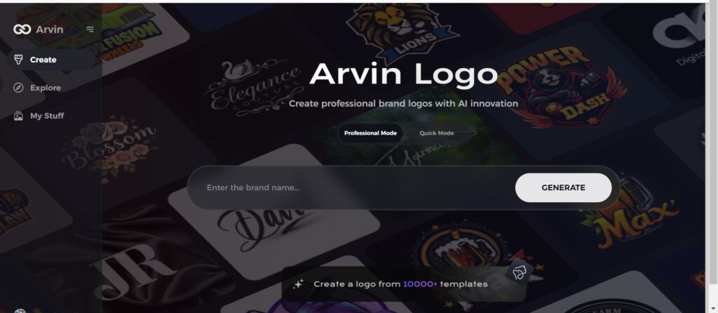
Part 8: Getting started with Arvin AI to create logos
AI-powered tools like Arvin AI make this process much easier These sophisticated tools scan branding requirements and give smart design recommendations, allowing users to select ideal colors, fonts, and styles. With Arvin AI, companies can design impressive logos that reflect their brand personality with ease.
Key features of Arvin Ai:
- AI-driven design recommendations: Creates logo concepts based on brand outlines.
- Editable designs: Users can customize designs to suit their vision.
- Live branding mockup: Live preview of the logo on various products.
- Downloads of high-resolution logos: Professional-quality logos are needed.
Steps to Use Arvin AI for Logo Creation
Step 1: Visit the Arvin AI Website
Open your web browser and go to the Arvin AI logo maker page to begin designing your logo.
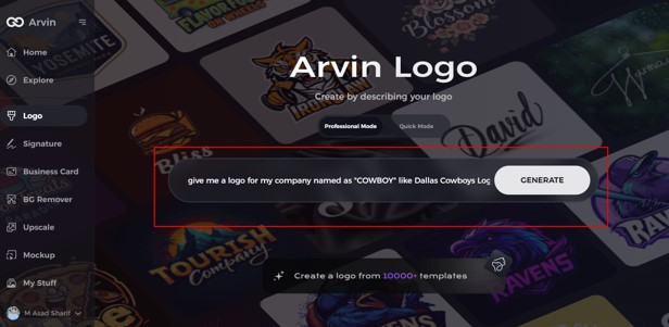
Step 2: Enter Your Business Details
Provide essential information like your business name and category. This helps the AI generate logos tailored to your brand.
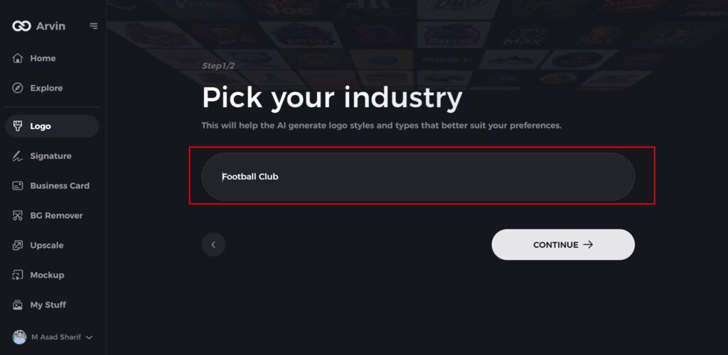
Step 3: Select Your Industry
Choose an industry from the available options. This helps the AI refine logo styles based on your business type.
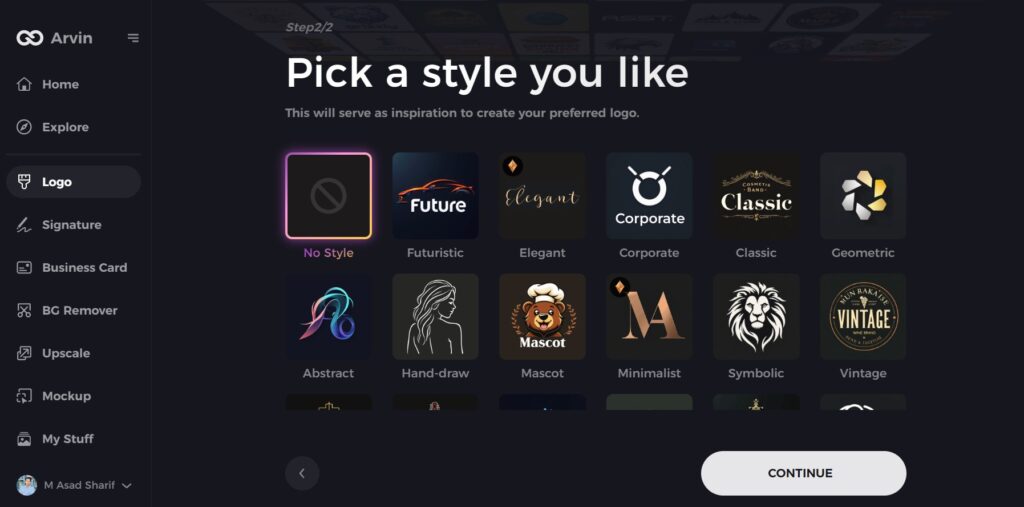
Step 4: Choose a Style
Browse through different logo styles and select one that matches your brand’s identity. If unsure, skip this step, and the AI will generate a design based on default inspiration.
Step 5: Explore Logo Ideas
Arvin AI will create multiple logo concepts based on your inputs. Review the options and pick one that fits your brand image.
Step 6: Customize Your Logo
Adjust colors, fonts, icons, and layouts to align the logo with your brand’s style.
Step 7: Download Your Logo
Once satisfied with the design, download your logo in formats like PNG or SVG for use on websites, social media, and marketing materials.
Conclusion
Over the years Under Armour has evolved into a powerful, performance and innovation brand. The bold looks and evolution show that the brand has grown into a global sportswear gaint. From its early versions to the sleek emblem we see today, the logo has played a key role in defining Under Armour’s identity. If you want to create a standout logo, try Arvin AI. With AI-powered design, customizable templates, and high-resolution downloads, Arvin AI helps you craft a professional and unique brand identity effortlessly
FAQs
What is the meaning of the Under Armour logo?
The Under Armour logo symbolizes performance, innovation, and strength, with its overlapping ‘A’ and ‘U’ reflecting the brand’s initials.
Has the Under Armour logo changed over the years?
Yes, the logo has undergone several modifications since 1996, becoming more refined and simplified over time.
Why is Under Armour spelled with a ‘U’?
Founder Kevin Plank chose the British spelling of “Armour” because it fit well with his branding ideas and was easier to trademark.
Can I create a similar logo using AI?
Yes! Arvin AI allows you to generate custom logos with AI-powered design tools, perfect for businesses looking for a strong brand identity.
