In this competitive world of branding, differentiation is key. Logo is the first impression for customers of any company. Therefore, it has to express the very heart and soul of the brand through instant recognition. One of the best types of logos for building a brand identity is the typographic logo. Simple and powerful typographic logos often rely on fonts, colors, and spacing to produce the visual representation of the personality of a brand. And, in this post, we are going to look closely at whether typographic logos are a good choice in a brand design for most business as well as what features and attributes make them successful.
Part 1: What Are Typographic Logos?
Typographic logos, as the name suggests, are logos that use typefaces or fonts as the main design element. Unlike logos that incorporate icons, symbols, or images, typographic logos focus purely on the written word. These logos depends on the clever typography-the fonts, spacing and minor variations in lettering – for a unique image with great appeal to serve the purpose of the branding. Here the best fonts for you logos to go with.
Types of Typography Logos
There are two main types of typographic logos:
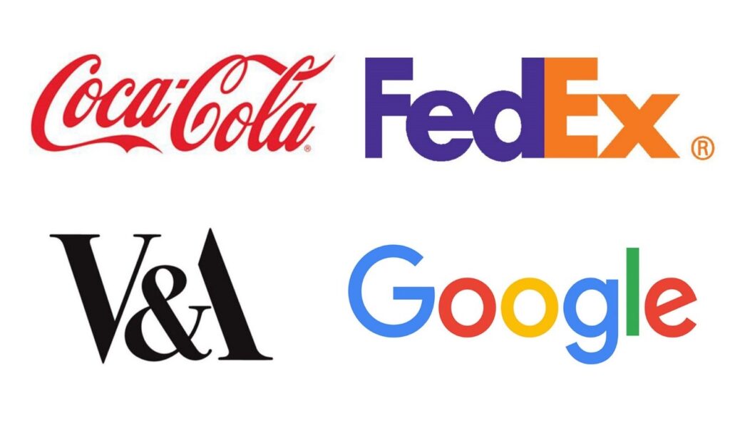
- Wordmark: This type of logo uses the full name of the company, often in a custom or specially chosen typeface. Think of logos like Google, Coca-Cola, and Visa, where the entire brand name is written out in a distinctive font.
- Lettermark: In contrast, lettermarks use initials or abbreviations of a company’s name. For example, IBM, HP, and CNN are all well-known lettermark logos.
Part 2: Why Choose a Typographic Logo?
There are many reasons a typographic logo would perfectly suit a business. Learn more about the Luxury Brand Logos: Key Trends and Best Practices for 2024. Here is a closer look at why such logos are so effective in branding:
Simplicity and Versatility
One of the most significant advantages of typographic logos is that they are simple. Since no icon or image is required, typographic logos rely strictly on the words and the typefaces used to convey them. Whether on a website, business card, or billboard, a typographic logo remains legible and clear in any size or format. For example, a logo like FedEx uses a simple wordmark but is instantly recognizable across all platforms.
Memorability
The human brain processes words faster than images. This means that typographic logos are more memorable. When a logo is in text, consumers can more easily remember the name of the brand. If we look at FedEx logo, how the use of negative space creates an arrow between the “E” and the “X,” subtly suggesting forward movement and progression. One of the aspects of a logo’s design is to making the logo not only memorable, but also make it natural which draws attention and causes conversation.
Clear Brand Personality
A typographic logo allows businesses to communicate their brand personality directly through the choice of font. A bold and strong font may convey reliability and confidence, while a flowing, script-style font may suggest elegance and sophistication. Cadbury, for instance, is very rich and indulgent by the font used in the wordmark. Here the personal brands logo. This kind of identity suits the brand identity to be a high-quality maker of chocolate.
Part 3: Key Features of Successful Typographic Logos
Several key elements must come together like a well-tuned piano to create a successful typographic logo. Let’s now discuss some of the most important features that make typographic logos successful:
Font Choice
The font you choose is arguably the most important element of a typographic logo. The right font can immediately communicate the values and essence of a brand. A clean, sans-serif font may convey modernity and simplicity, while a serif font may evoke tradition and reliability. Custom fonts or altered letterforms can help further distinguish the logo from others. For example, Coca-Cola uses these script font that emphasizes its heritage and timelessness. On the other hand, Google utilizes a simple, modern sans-serif typeface.
Color Scheme
Though the focus would be on typography for typographic logos, color acts as a crucial component to amplify brand recognition. Colors themselves evoke certain emotions and associations which could help a brand rise in a sea of crowds in the marketplace. Take the example of Facebook, which utilizes the color blue. It represents security and trust. Similarly, Cadbury utilizes a rich shade of purple to signify quality and luxury. Types of colors scheme to transform your design projects.
Spacing and lettering adjustments
There’s a difference that can be made by adding or reducing the space between letters. In other words, “kerning” can give huge differences in perception of typographic logos. Proper kerning makes a logo read well, balance, and aesthetically pleasing. A great example of this is the FedEx logo, where the space between the “E” and the “X” forms an arrow pointing forward. These details not only makes the logo aesthetic but also strengthens the brand identity of a company. Here the guide about logos fonts you must read.
Subtle Design Elements
Some of the most memorable typographic logos incorporate subtle design elements that enhance their visual impact without overwhelming the viewer. The Cadbury logo, for instance, uses a cursive font that flows with elegance, while the FedEx logo incorporates the famous hidden arrow, symbolizing movement. These details usually do not draw attention at first glance, but they make the logo stand out and engaging.
Part 4: Inspirational Examples of Typographic Logos
There are few better ways to create a memorable, effective typographic logo than by drawing inspiration from existing successful examples. Some companies have actually used the impact of the typography to give them beautiful logos that evoke responses within the target group. But let’s check out some examples of the typographic logos and why they succeed:
1. Google
The logo of Google is one of the most straightforward and yet very effective typographic logos. The brand has used a playful and colorful sans-serif font that is clean and modern. The colors are vibrant—blue, red, yellow, and green—used consistently across its branding, making it instantly recognizable. The simplicity of the design reflects Google’s user-friendly, innovative nature.
2. Etsy
The typographic Etsy logo, using a font that was hand-drawn and somewhat imperfect, speaks to the idea of craft, creativity, and uniqueness, which feels fitting for a marketplace specializing in handmade items. Such warm, inviting colors would make the brand feel even more personal and approachable.
3. Mailchimp
Another fantastic example of typographic design is the logo of Mailchimp, which uses a funny, rounded sans-serif font. The friendly yet professional feel of the font reflects Mailchimp’s approachability while at the same time giving off the feeling of professionalism. In addition, the use of a single color—yellow—further simplifies the design and makes it an iconic and easily identifiable one.
4. Coca-Cola
Coca-Cola uses one of the most recognized logo scripts in the world with its flowing, cursive style that denotes heritage, premium quality, and timeless appeal. Moreover, the red color can further strengthen the emotional binding of the brand with it, as it evokes excitement and energy.
5. FedEx
This FedEx logo is a class on negative space. On a simple design, an arrow may not easily be seen between the “E” and “X”, but it’s actually brilliant because it represents how this company values speed and accuracy. This brand is enhanced by the visual effect of the contrast between the purple and orange.

6. IBM
This IBM logo is a typographic logo where simplicity depicts professionalism and reliability. This bold, blocky sans-serif font sends out messages of strength and authority. The use of horizontal stripes in the lettering also gives it an impression of motion and modernity, giving the logo an energetic look.
7. Sony
Sony’s typographic logo is simple and bold, using a very straightforward font that conveys the brand’s focus on quality and technology. Its simplicity in black-and-white design makes it very versatile, adaptable to different media and contexts while maintaining a strong brand identity.

8. Disney
The Disney script-style logo is very distinctive and synonymous with the magic and wonder that Disney evokes. This is because of the flowy lettering, as it seems fun and adventurous-the same values Disney aims for in providing a family-friendly brand for consumers.
9. Spotify
Spreads over modern, clean font, yet legible and stylish; the green color is often associated with energy, growth, and vitality, thereby perfectly reflecting the brand’s mission of bringing music to life. The simplicity of the typographic logo is highly versatile and works well on various digital platforms.

10. Nike
The Nike wordmark is, therefore, so iconic: it relies on a bold, yet very simple, font, emphasizing the aspects of power and performance athleticism that define this brand. Its all-black design ensures it’s versatile and sleek enough to be recognized in virtually any context: from print ads to product designs.
Part 5: How Arvin AI Simplifies Typographic Logo Design
The design of a professional typographic logo doesn’t have to be complex or time-consuming. In fact, modern AI tools like Arvin AI make it easy and efficient. This innovative platform makes use of artificial intelligence in the creation of logos. Therefore, it is accessible for even the most experienced designers as well as beginners. Here’s how Arvin AI can help you create a typographic logo effortlessly:
Key Features
- AI-Powered Logo Generation: It uses advanced machine learning algorithms to generate professional typographic logo designs based on your brand’s information.
- Customizable font: This offers a wide choice of fonts and the possibility of changing the size, spacings, and other details of typography to make it unique.
- Real-Time Previews: Instant previews of your logo on different mockups, such as business cards, websites, and social media profiles.
- Color Palette Integration: Provides you with color palettes according to color psychology to select the right colors according to the personality of your brand.
- User-Friendly Interface: The interface is designed to be intuitive and easy to navigate, even for users with no design experience.
- High-Resolution export: Deliver high-resolution, scalable logo files that can be used in both digital and print media.
Steps to Create a Typographic Logo Using Arvin AI
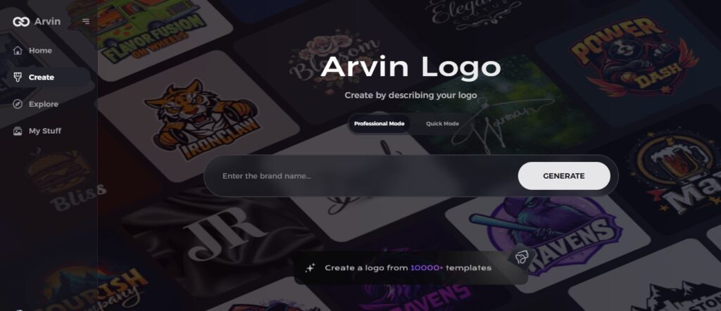
Step 1: Visit Arvin AI Website
Go to Arvin Logo Maker to begin designing your unique typographic logo.
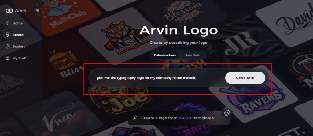
Step 2: Enter Company Details
Input your company name, select its category, and choose a transparent logo option.
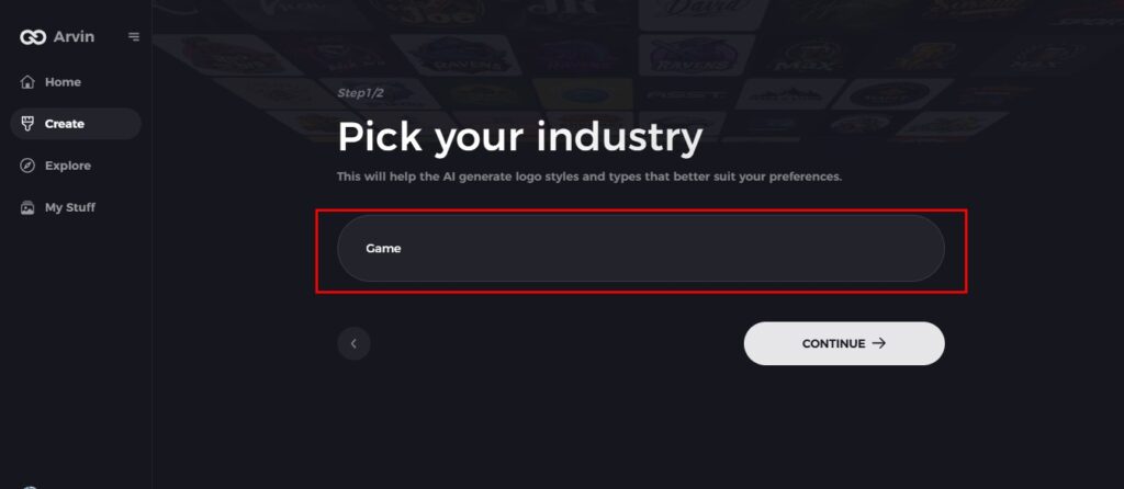
Step 3: Choose Industry
Select your industry to help the AI create designs that align with your brand’s values.
Step 4: Pick a Style
Choose a design style or leave it to “no style” for a surprise typographic creation.

Step 5: Explore Logo Concepts
Browse through various typographic logo ideas and pick the one that fits your brand.
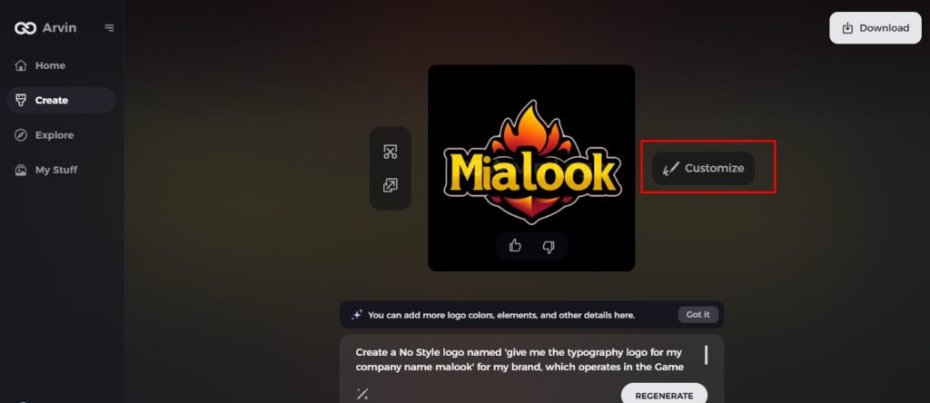
Step 6: Finalize the Logo
Adjust typography, colors, and fonts to perfect your logo’s look.
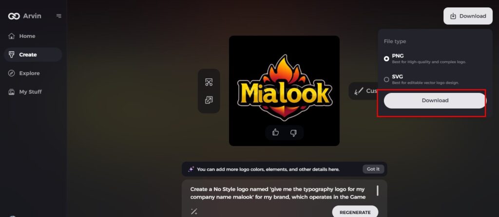
Step 7: Download Your Logo
Download your logo in PNG or SVG formats for use across digital and print platforms.
Part 6: Tips for Creating a Winning Typographic Logo
To be a successful typographic logo, it would need attention to detail in terms of design principles, such as some of these expert tips.
Select the Appropriate Font
The choice of your fonts speaks about the personality you have in communicating your brand. Reflect on your values for the brand and message that you wish to convey to the world. Serif is used in a traditional sophisticated look. Here the How to Make Your Circle Logo Design Stand Out. For modern, clean appeal, use sans-serif font, and use script in an elegant or playful appearance.
Spacing
Adequate spacing, or kerning, is crucial in making the lettering and overall visual flow readable and aesthetically pleasing. Too much spacing can create a disjointed look in the logo, while not enough can cause it to be unreadable. Strive for balanced spacing to make your logo readable as well as aesthetically pleasing.
Utilize Color Psychology
Colors evoke emotions and perceptions, so choose your color palette carefully. For instance, blue is associated with trust and reliability, while red can symbolize passion and energy. Ensure that your colors align with your brand’s identity and message.
Experiment with Letter Modifications
Small changes in letterforms will make your typographic logo unique. Play with the shapes of individual letters, add curves, or negative space to create a distinctive look that sets your brand apart.
Keep It Simple
Simplicity is key when it comes to typographic logos. Focus on creating a design that is easy to read and recognize. Avoid overcomplicating the logo with too many elements or unnecessary details.
Conclusion
An extremely effective way of building a memorable, versatile, and impactful brand identity is through typographic logos. From the simple design to the creative usage of fonts, colors, and spacing, a typographic logos can speak about the personality of a brand in ways that resonate with the customer. With tools like Arvin AI, designing your own typographic logo has never been easier. Begin to design your own professional typographic logos today and take your brand to the next level.
FAQs
What is a typographic logo?
Typographic logos use text, colors, and spacing to represent a brand without icons. It only relies on the wordmark or lettermark to come up with a unique identity.
Why are typographic logos so popular
Typographic logos are extremely popular due to their simplicity, versatility, and the ability to encompass the brand’s very soul, which makes them the favourite among designers. They can be very easily applied across multiple channels and are very memorable as well.
Can I create a typographic logo without a design background?
Yes! Arvin AI simplifies the process of logo creation, making it accessible to anyone, regardless of design experience.
What is the best font for a typographic logo?
The best font depends on your brand’s personality. For tradition, use a serif font; for modernity, go with sans-serif; for elegance, opt for a script font.

