Great TV shows are synchronized with their content and everything. Everything from titles to stories, characters, lines and costumes looks perfect. But the most powerful element is the title logo that engrosses us. The logo of the Game of Thrones, Breaking Bad, Friends and other TV shows is enough to understand the theme and message. The logo of these TV show logos has become a huge hit among viewers. Let’s look at the logo of the iconic TV show of the succession and the concepts behind its specific design.
Part 1: Design Elements of TV Show Logos
Before that, let’s consider what design elements are in the logo of an excellent TV show.
Memorable Design of TV Show Logos
Will the logo remain in mind after the intro sequence fades out? Think of the dazzling fonts of Stranger Things, the dignified iron throne of the Game of Thrones, the bold fonts and impressive images that make you feel impressive. Such designs can be recognized immediately even after the intro flows and remain in mind for a long time.
Clarity and simplicity of TV Show Logos
Can I easily understand and remember the logo at a glance? The best logo avoids complex images and overadorned logo fonts. By choosing a clean line and clear visuals, you can quickly stay in memory. Programs like “The Walking Dead” (“D” with a bloody splash) and “Cheers” (a simple and cheerful font) have perfectly realized this.
Relevance to branding
Does the logo accurately reflect the genre, theme and overall tone of the program? The excellent logo is not only catchy, but also visually metaphorical to the essence of the show. Look at Breaking Bad (periodic table + protective clothing implies dark science) and Mad Men (sophisticated fonts that reflect sophisticated settings). Logo design should be the stage for the story that begins.
Unique
Does the logo stand out in the crowd or avoid clichés and predictability? Common designs are quickly forgotten. Programs like “Ika Game” (a message hidden in the font) and “Muppet Show” (colorful and whimsical design) incorporate this. The unique logo attracts attention and reflects the personality of the show.
Part 2: 20 of the Most Iconic TV Show Logos of All Time
Following are the most iconic TV shows logos of all time:
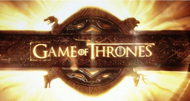
01. Game of Thrones
Our list begins with “Game of Thrones,” one of the most spectacular shows in TV series history. The logo is probably the most recognizable visual asset. The essence of the entire show is in a title sequence designed by three different teams. The title sequence of Game of Thrones uses a Trajan Pro font similar to the original Roman typeface. The logo of the TV show includes a powerful, perfectly aligned word mark in the center.
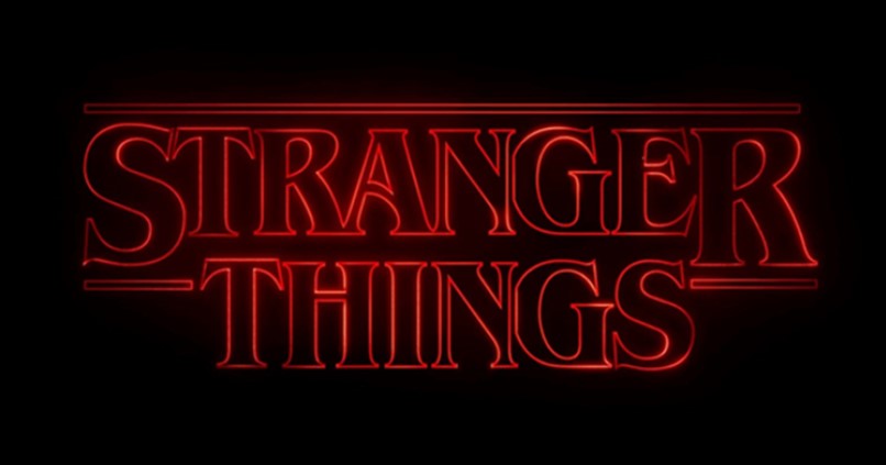
02. Stranger Things
What started in 2016 is now a super hit as a pop culture TV show set in the 80s. Yes, “Stranger Things.” In addition to its story and effect, the logo of the TV show is one of the most talked about. This logo is the ultimate work of Jacob Bogosian, who took the idea and inspiration of logo design from the cover of Stephen King’s book and film posters. This is one of the cute logos for your brand.
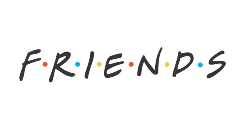
03. F.R.I.E.N.D.S
No one will forget the F.R.I.E.N.D.S. logo. It is undoubtedly one of the most iconic TV show logos ever. In this famous 90’s TV series, six dots representing the six main characters of the show are drawn between the characters. If you look closely, the six dots are the same as the umbrella color of the title song. 6 companions, 6 colors, and 6 dots. Everything symbolizes the logo of this famous TV show.
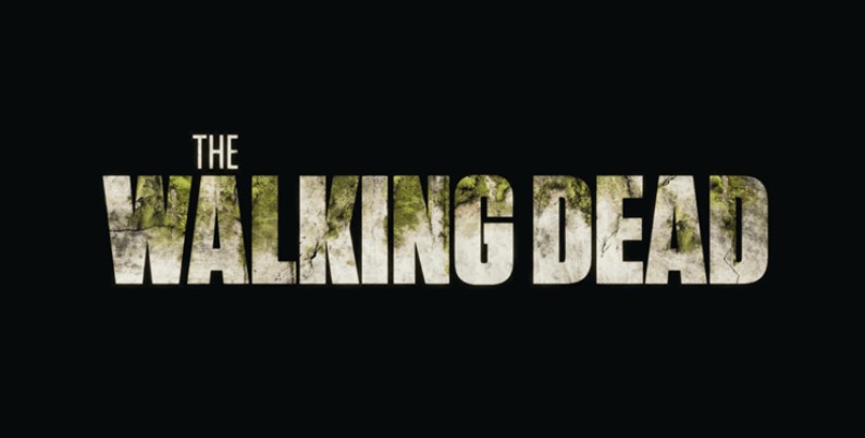
04. The Walking Dead
If you look at the Walking Dead logo, you will discover an interesting twist. It decays every season that it airs. The finale, broadcast on November 20, 2022, features a bloody, faded logo that symbolizes the theme of the series. If you look at the logo of each season, all the questions will clear up.
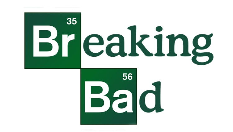
05. Breaking Bad
You can’t forget the TV series “Breaking Bad.” The name itself represents the theme and plot. And if you look at the logo casually clever, you can see the contents of the whole program. It is one of the most popular TV show logos that has created huge fans around the world. The typography logo contains two important elements: bromine (Br) and barium (Ba). The person who took this to the title of the show must have been intelligent.
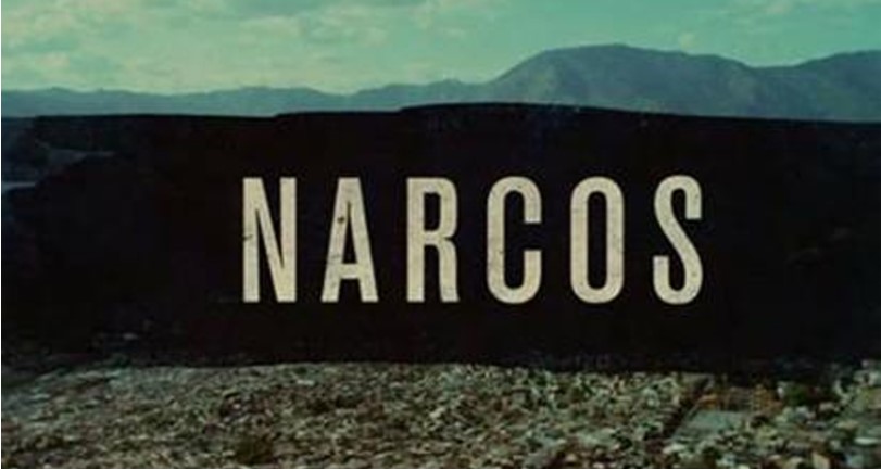
06. Narcos
Narcos is also a typography logo. This TV show is based on the life of the drug king Pablo Escobar. This delicate contrast highlights Pablo’s character.
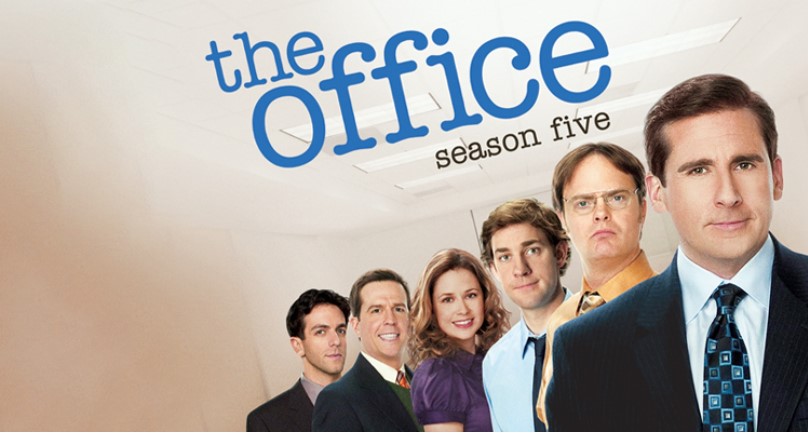
07. The Office
The logo of this interesting workplace comedy show is very simple. All characters are expressed in lowercase letters in typography format. When you look at this logo, it feels like you hit it with a typewriter. This is a subtle connection that implies the script of the show. This logo is simple and easily changed to any logo colors, so you can see that the show is sweet and simple and depicts everything that happens in the office.
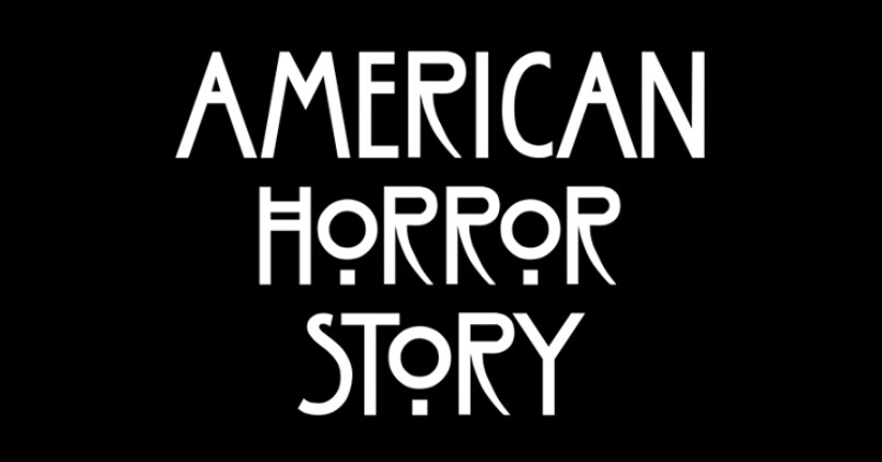
08. American Horror Story
Is typography creepy? Yes, the typography used in the American Horror Story makes the spinal cord run cold. This font references the handwriting of Charles Lenny McIntosh. Mackintosh was a representative of Art Nouveau, an international art style. Art Nouveau is a decorative and cheerful image, but when used in the context of a thriller, the scenario changes. Art Nouveau can be creepy in its natural art form.
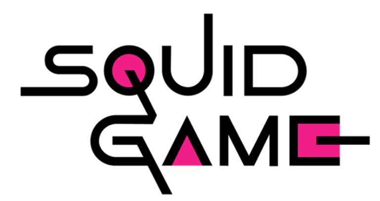
09. Squid Games
The Korean drama released on the Ica Game-Netflix swept the whole world. Everything about the show became popular, including thrilling plots, symbols of squid games, and of course logos. The concept of this mysterious survival game series was born out of a game popular with children. The logo is pink and white in geometric form. The background is black, reminiscent of a dark plot. The original logo is alphabet at a certain height.
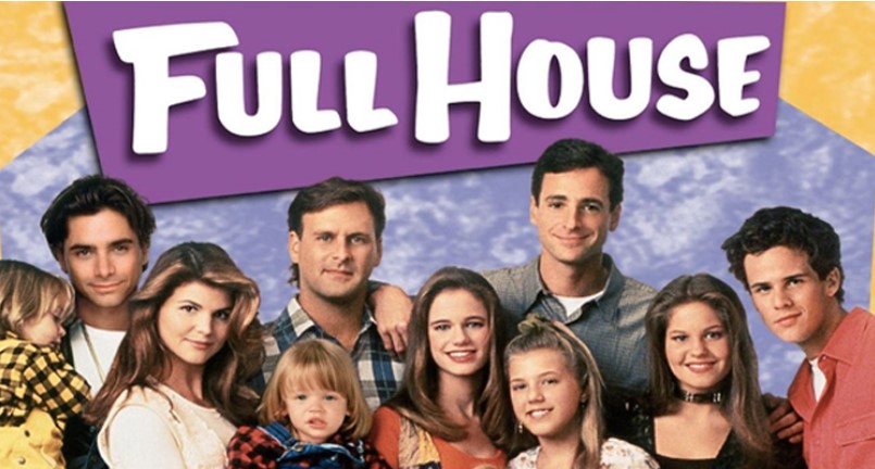
10. Full House
The Full House series depicts one of the famous TV show logos of the 1990s. The logo is very simple. The letters are uppercase, but handwritten fonts are used for health. This typography matches the characters of the show. The same font is used in the spin-off program, which increases popularity.
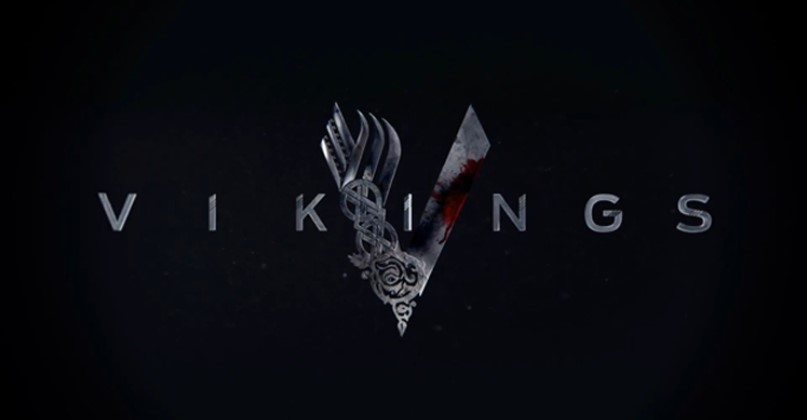
11. Viking
The show has a medieval theme and uses excellent logos in all aspects. The V mark is drawn, one side is a complex design, the other side is plain. The complex design (left) depicts the soft side of Viking culture, while the plain design (right) depicts violence and war.
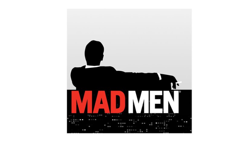
12. Mad Men
It is rare for a human silhouette to be used in a logo, but the Mad Men logo depicts a man smoking a cigarette with his back in the character mark. This male image represents the main character of the series, Don Draper. Black, white, and red colors complement the story.
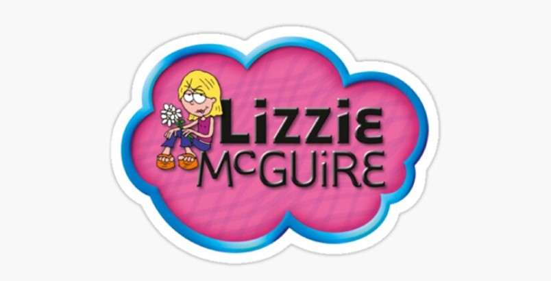
13. Lizzie McGuire
Lizzie McGuire’s show is well-known for its highly designed logo and is supported by many fans as it faces social and personal issues during her time as a teenager. This logo represents Lizzie McGuire’s cartoon version and a funky typography depicting the show’s name. You can see this logo at a glance. Bright colors represent playfulness and youthfulness.
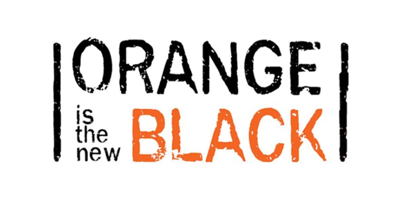
14. Orange Is New Black
The show features morally conflicting characters who face prison and step into new roles. The logo uses black and orange symbolizing Piper, the main character of the show. If you look closely, there are two black rods on each side of the logo, which represent the iron lattice of the prison. The unfinished character means the growth that people experience throughout their lives.
15. X Files
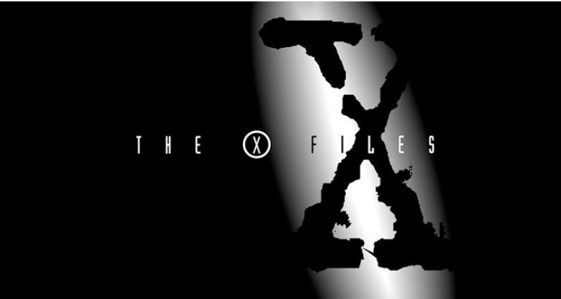
The X-File holds a distinct position in the minds of generation 1990s kids. The logo and foreboding music evoke mystery. The title sequence is among the greatest series in television history, having captured its first Emmy Award in 1994 for its incredible graphics design and sequence. The Industria fonts are used in the logo and FF Trixie fonts for “X” on the background.
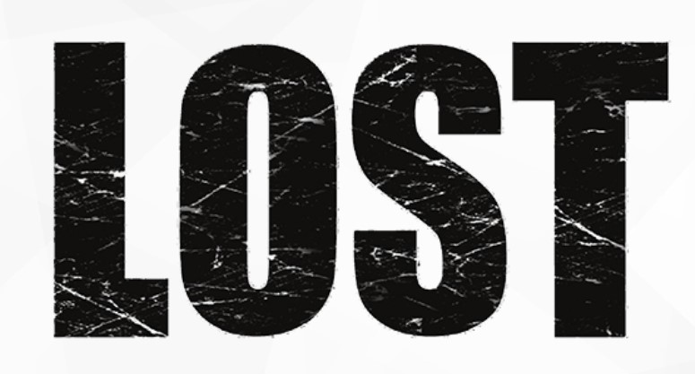
16. Lost
The logo skillfully reflects the important themes of the program – mystery, loneliness, and search for answers – and is one of the best. The program title is shown in a bold, slightly deformed font, indicating the complex reality faced by the characters. The lack of space between L and O increases curiosity and makes viewers think about what is omitted. The logo of this TV series is now widely recognized in popular culture.
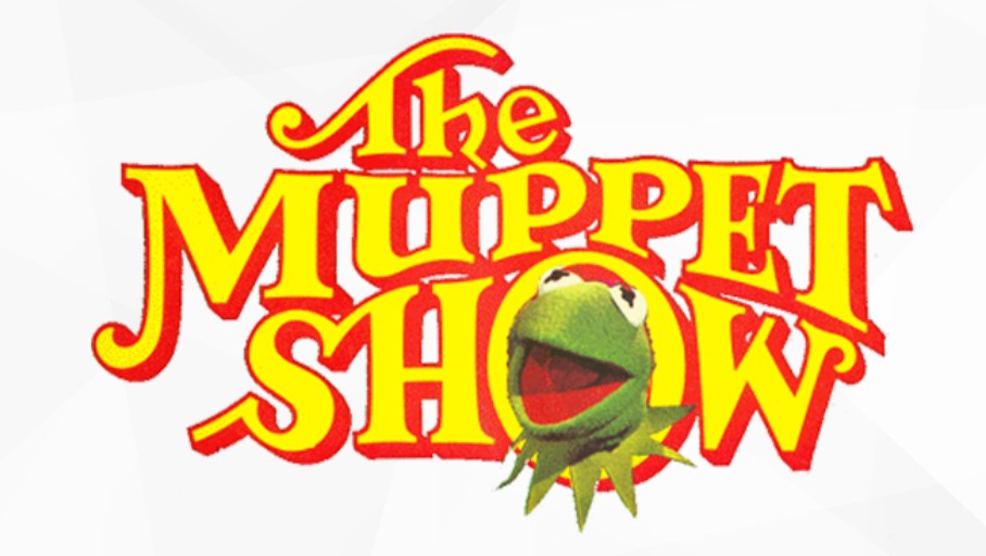
17. Muppet Show
The title of the show represents a variety of Muppet characters, with various fonts mixed with chaos, all characters in unique style and size. This eccentricity quickly attracts interest and creates an atmosphere of unexpected comedy and various performances of the show. The Muppet Show logo, full of playfulness and fun elements, perfectly captures the essence of this famous variety show. In contrast to the large number of serious TV channels and program logos.
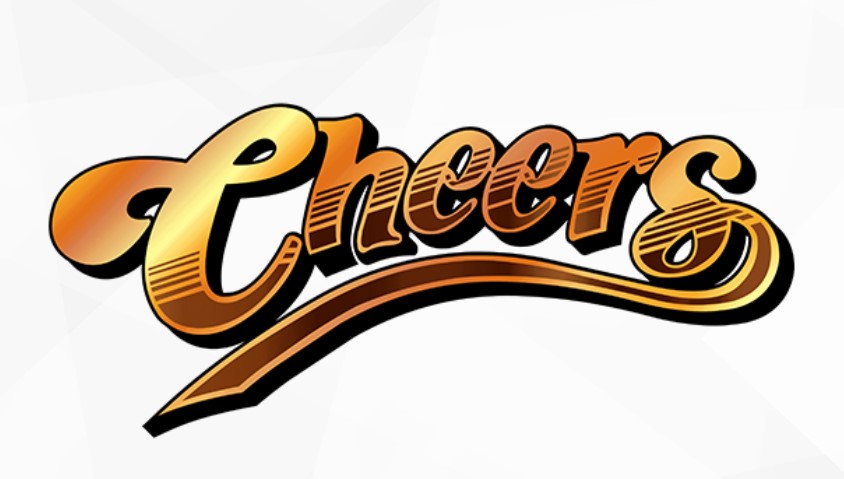
18. Cheers
The Cheers logo gives a warm and hospitality feel, effectively expressing the essence of TV programs beyond this era. The bright yellow sun becomes the background of the program title, and it is displayed in a warm and rounded font, making you feel peace and nostalgia. The font has been used in numerous television logos and program logos over the years, creating warmth and friendliness. This basic but efficient design has become widely known as a popular TV show logo linked with pleasure and fun.
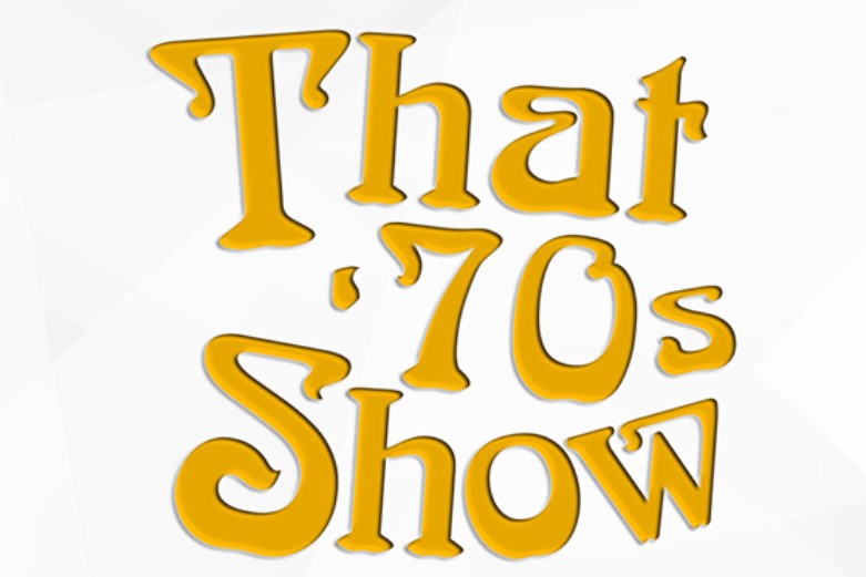
19. That 70s show
The logo of the show is a nostalgic explosion from the past that perfectly captures the light essence of the 1970s. The cool, trippy font with curvy edges and bold colors brings viewers back to that era in no time, a sense that many TV stations “logos and show logos aim for. By incorporating a yellow smiley face, the cheerful atmosphere is emphasized, reflecting the emphasis of this series on bonds with friends, mature experiences, and pleasant situations.
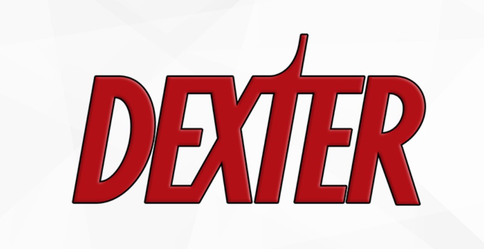
20. Dexter
A subtle line between purity and shadow balances the Dexter logo. The bloody splash design skillfully hides the smile and alludes to the main character of the show, Dexter Morgan, a blood splash expert who is also a serial killer. The use of neat sans-serif fonts reflects Dexter’s seemingly regular lifestyle and increases normative awareness. But the hidden bloodshed reveals the darkness lurking on the surface, perfectly expressing Dexter’s complex duality and the show’s quest for morality and justice.
Part 3: Hidden Messages and Symbolism in TV Show Logos
TV show logos are more than just images; they often have hidden meanings. Many logos include symbols or details that connect to the show’s story. These hidden messages make logos more fun and memorable. They spark curiosity and help fans feel closer to the show. Even small choices, like fonts or colors, can add extra meaning.
Logos with Secret Meanings
Some TV show logos have hidden symbols that make them more meaningful. These symbols relate to the show’s narrative, characters, or themes in intelligent means. They might include hidden messages, unusual designs, or lettering colors that make them fuller. These morsels of information transform logos into more than images—they become more closely aligned with fans.
How Subtle Design Choices Impact Audience Perception
Small design choices, like letter shapes and spacing, can change how a logo looks and feels. These details help people connect with a brand. A slight change in font style can make a logo feel modern or classic. Adjusting spacing can make a design look balanced or cluttered. Colors also influence how a logo is perceived—bright colors feel energetic, while dark colors feel serious. Even small elements can have a big impact.
Part 4: How TV Show Logos Shape Pop Culture and Merchandise
TV logos are more than they represent—part of the large scope of pop culture. Viewers adore putting them on posters, wearing them on shirts, and stocking up on merchandise. A powerful logo makes a show stay current long after its last episode airs. Here we’ll examine the way TV logos affect fashion, advertising, and merchandising. From mugs to sweatshirts, they move off the screen and into the world at large.
Logos as Fashion Trend
TV logos are ubiquitous—on T-shirts, hoodies, phone cases, and the like. Viewers enjoy sporting them to demonstrate their allegiance to their favorite programs. It’s an easy means of feeling affiliated with a program they love. Some logos prove so popular that they become fashion trends. From a timeless sitcom to a prime-time drama, these logos ensure the show continues to live in daily life.
Logos in Merchandise Promotion and Sales
A good logo sells merchandise and keeps a show trendy. Shows such as “Friends” and “Stranger Things” earn millions by placing their logos on T-shirts, mugs, and posters. People enjoy collecting such items to support their favorite shows. The more well-known a logo is, the more it sells. Here, we shall see how TV logos increase merchandise sales and why they contribute so much to a show’s popularity.
Part 5: Trends in Contemporary TV Show Logos
TV show logos changed with time, keeping up with new fashion and technology. Most of the contemporary logos consist of a simple and minimalist design, with some having bold and intricate elements. Streaming websites also pioneered animated and dynamic logos to maximize viewer interaction with programs. TV logos can get even more interactive with rich media and 3D in the coming years. Here, we outline the present trends that dominate TV logo design.
Minimalism vs. Intricate Designs
TV logos now come in different styles of types. There are the classy and clean, which apply minimal designs in order to provide a sophisticated look. There are also the gaudy ones with complex components, which incorporate special features depending on the type of program. Streaming program websites have also mastered the style by incorporating movable and animated logos.
Use of Animation and Dynamic Logos
Streaming services such as Netflix and Disney+ employ moving or changing animated logos to get attention. Animated logos give a show a fresh and exciting vibe. Animation could involve glowing light, color changing, or changing shapes. It makes streaming platforms stand out and keeps the audience interested. Logos for TV shows in the future could even be more interactive, with responsive effects based on viewer behavior or changing according to the theme of the show.
Future Trends of Logo Design in TV Shows
With advancing technology, TV logos can become more interactive and engaging. We can expect logos with 3D effects, animations, and even dynamic features that respond to viewer interaction. These new logos can be more attention-grabbing and improve the viewing experience. Streaming platforms and digital media are already at the forefront of this transformation, making logos more dynamic.
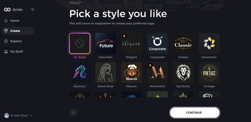
Part 6: Arvin AI – Your AI Partner for Intelligent Logo Design
Designing a TV show logo may be time-consuming, but Arvin AI is the best solution for this. With the AI tool, users can easily create professional logos that fit the theme of their show. Arvin AI generates instant logo ideas, and there is easy customization with real-time previews. For a bold or simple design, Arvin AI brings it all to reality. In this chapter, we’ll discuss how Arvin AI operates and makes the process of creating logos faster and easier.
Key features of Arvin AI
- AI-Driven Logo Ideas: Creates innovative logo concepts in an instant, and you can choose the perfect one for your show.
- Simple Editing: Change colors, fonts, and design features to personalize the logo.
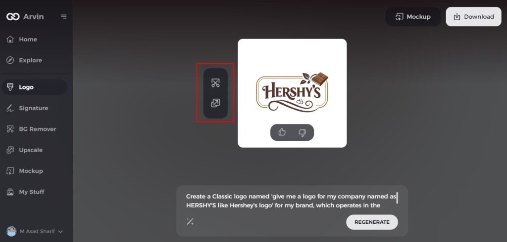
- Real-Time Visualizations: Get instant visualizations of your logo without having to complete the design.
- Simple-to-Use Interface: Made with simplicity in mind, making logo design easy for all.
- Multiple Style Options: Select from numerous templates that suit various themes.
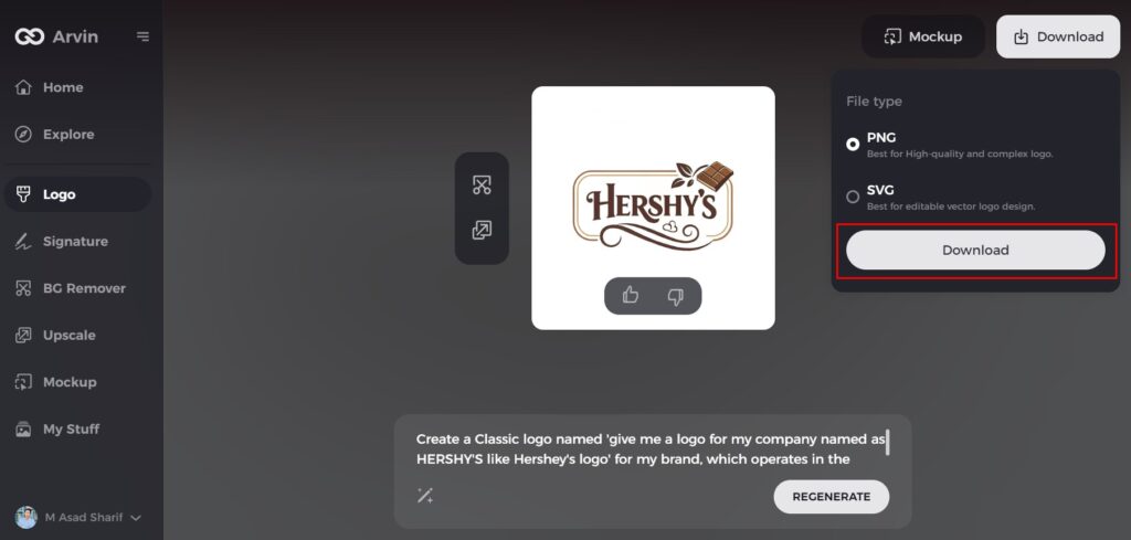
- High-Quality Output: Produce professional-quality logos that are ready for use within minutes.
Steps to Use Arvin AI for making Logo
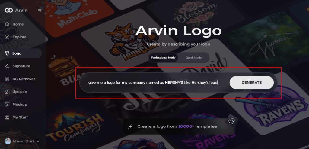
Step 1: Visit the Arvin AI Website
Open your web browser and explore Arvin AI logo maker to discover the story behind its iconic logo.
Step 2: Learn About the Brand’s Origin
Delve into the history of Arvin, including its founding and the development of its brand identity. Understanding the roots provides context for its logo’s evolution.
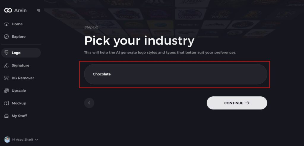
Step 3: Explore the Industry Context
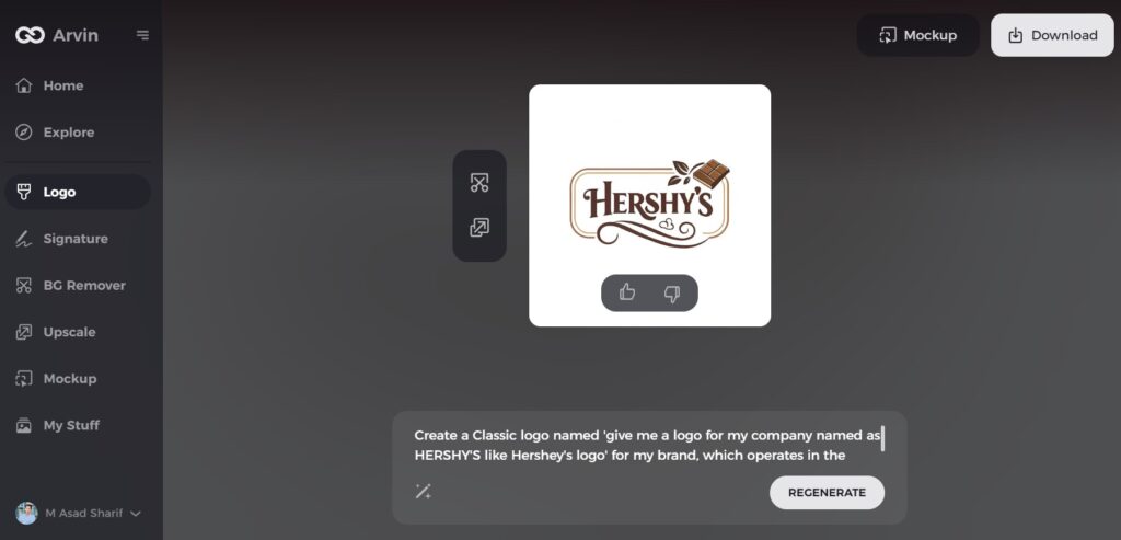
Discover Hershey’s role in the confectionery industry and how it has influenced the design trends of its logo over the years.
Step 4: Examine the Logo Styles
Review the different logo styles Hershey’s has adopted throughout its history. Notice how these styles reflect the brand’s changing vision and market trends.
Step 5: Analyze the Evolution
Learn about key changes in Hershey’s logo designs, from font choices to visual elements, and how these updates align with the brand’s growth and consumer expectations.
Step 6: Reflect on Personalization
Consider how Hershey’s personalized its logo to resonate with its audience, incorporating elements like its iconic chocolate bar design or bold lettering.
Step 7: Appreciate the Modern Logo
Examine Hershey’s current logo, which maintains a balance between tradition and modernity. Note its formats, such as digital-friendly versions, used on packaging, websites, and marketing materials.
Conclusion
TV show logos make people identify and recall a show in an instant. A good logo catches the eye, lingers in the brain, and appeals to viewers. Logos, over time, have evolved from plain text to innovative and animated logos. Tools like Arvin AI simplifies logo development into a simple process. Artificial Intelligence tools assist designers throughout their entire procedure by generating logos and personalized design elements and automatic creative preview creation.
FAQs for TV Show Logos
Why are TV show logos important?
TV show logos help viewers identify a show instantly and create a lasting impression. A well-crafted logo builds branding and connects with viewers.
How have TV show logos evolved over time?
TV logos have evolved from simple text-based logos to creative, animated, and digital logos. Modern logos use colors, fonts, and motion to build branding.
What makes a TV show logo memorable?
An easily remembered logo is simple, unique, and ties into the show’s theme. The recognition ability of logos depends significantly on their color combinations and typefaces together with secret visual elements.
How can AI help in designing TV show logos?
AI programs like Arvin AI provide instant logo ideas, fast editing, and real-time previews. They help designers craft good logos quickly and efficiently.
