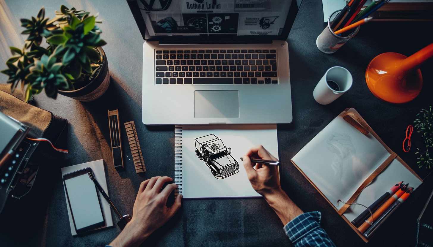
In the trucking industry, the logo is not just a picture. All trucks, business cards, and ads on your tracks are what customers see. The readers might wonder what a logo is and why it’s such an essential part of the trucking industry. Powerful trucking logo design symbolize important qualities in the trucking industry: reliability, professionalism, and speed. Making your own trucking logo is possible. In this article, you will learn how to design a logo for your trucking brand or business and what kind of logo really stands out.
Part 1: Why a powerful logo is important to the trucking business?
Your trucking logo design should be integrated into all aspects of the company, from trucking marketing strategies to uniforms worn by drivers. Here’s how your logo can contribute to a strong business structure:
Role of logo in business structure and marketing strategy:
- Brand awareness: The distinctive trucking logo design helps customers remember your company. Often, it is your brand that is first associated with the logo.
- Professionalism: A well-designed trucking logo design indicates that you are serious about business and sticking to quality.
- Marketing: The trucking logo design should be at the forefront of all marketing materials, from print ads to online campaigns, and strengthen brand identity.
Part 2: Designing the Perfect Trucking Logo
The trucking logo design of the well-designed trucking industry is the fusion of iconography, typography, logo colors and layout. Let’s break down these important elements:
Choose the right icon for your trucking logo
The icon used for the trucking logo design is an eye for brand identity. It must be relevant and easy to recognize in the trucking industry. Symbols often used in trucking logos include:
- V-shape icon: Chevron is often reminiscent of movement and direction, meaning progress and progress.
- Dump Truck: If you are specializing in construction or material transportation, the dump truck icon may be suitable.
- Semi-truck silhouette: a classic choice that clearly conveys the essence of your business.
Part 3: Famous examples of trucking logo
A successful trucking logo design gives you inspiration and insight to make your logo effective. Here are some of the famous examples that have had a significant impact on the industry:
FedEx
The FedEx logotype is just a marvelous invention, yet so subtle. That probably not too many people notice the arrow between “E” and “x.” Thus, it gives an image of speed, exactness, and moving forward. Clean and simple type leaves an impression as modern and expert. A figure so simple provides more recognition of the company name, and it’s truly very efficient. It offers a powerful identity with purple and orange or other color options.
UPS
UPS’s logo contains a shield. The universal symbol for protection and trust is the shield. It features brown and gold as representing dependability, warmth, and professionalism. This color scheme is evolved and has stayed classy for so long. It extends promise from the shipping of customers into the delivery service. The proud history and experience of brand icon UPS is expressed through referring to service standards.
Maersk
Behind the logo that Maersk employs, there is a clean sharp typeface combined with the unique seven-point star. The meaning of the latter is direction towards reliability and navigation. The blue color symbolizes trust, stability, and its association with the ocean. Simple yet striking, the logo is instantly recognizable worldwide. This indicates the long-term presence of Maersk in the shipping sector.
Schneider National
A lot of vigor seems to talk straight from an extremely strong orange on-cap strong-looking logo at the same time the bright vibrant look of its high visibility even as it streams long on a long highway while standing out can bring out high points of great logistic and trucking companies – at least good professional typography. The simple design ensures Schneider never runs out of time. Orange also represents safety and visibility, which is an essential feature of trucking.
Swift Transportation
The logo of Swift Transportation features simple, clean typography with the sweeping motion on the lettering. The italics bring the feel of movement and swiftness and efficiency to it. It has a blue and gold color scheme, signifying trust and dependability. The design is simple and very modern, and it makes the iconic logos very visible. As one of the largest trucking companies in North America, Swift’s logo supports its reputation.
J.B. Hunt
The J.B. Hunt trucking logo features a bright yellow and black background. Its big, bold, rectangular bordered letters give the appearance of a firm and strong impression. Yellow colors represent energy and positivity, whereas black provides it with professionalism. The design is simple yet obvious from afar. Being a freight transportation giant, the J.B. Hunt trucking logo seems to complement the company’s policy of reliability in its service.
Old Dominion Freight Line
The Old Dominion has a circular badge with the shade of green and white colors. The intertwining “O” and “D” alphabets present unique and distinctive visuals. Green emphasizes growth, trustworthiness, and a healthy environment; modern trucking could well appreciate all these attributes. The circle, in its view, stands for unity and ceaseless service. Old letter style represents the aging of the trucking business that has grown. It represents respect in transportation.
Peterbilt
Peterbilt is the symbol of quality for trucking around the world. The red oval logo says it all. A great visual identity is the elegant white script font inside a red background. It has not changed much over the years, and that is why it is timeless. Being red, it symbolizes energy and passion, and the cursive letter will give an elegant touch. Peterbilt is one of the greatest truck makers and, therefore its logo represents robustness and good performance.
Kenworth
The Kenworth logo contains a red vertical emblem with “KW” in white on the left, right-center. It is simple yet potent, thus making the logo stand out. Red symbolizes power, and the silver touches make sure that a style is reflective of the company. In most cases, it is at the front side of the trucks, thus keeping the quality. The brands under Kenworth being a leader in truck manufacturing indicate innovation and reliability. The new design is surely going to be noticed on highways.
Volvo Trucks
The Volvo logo is a sleek, modern circular symbol with an upward-pointing arrow. The product comes in the blue and silver color scheme closely related to professionalism, strength, and innovation. Volvo is basically associated with the safety-oriented approach, and its logo tells of the excellence of engineering. It represents forward thinking and designing something that means progressing. All these trucks and the vehicles sport the same logos giving it the essence of branding consistency.
Freightliner
A simple metallic word mark on a solid black background would be Freightliner’s logo fonts. It’s strong, rugged, and heavy with modern technological inputs. Indeed, ‘Modern Truck Leadership’ is what the company aims at all times in terms of product and image, as the lustrous look of metallic quality is industrialized and high-performing. Any glance, whether from the highways at breakneck speeds or close up, allows easy recognition as its name makes one remember: reliability and effectiveness in freight hauling.
Mack Trucks
The logo of Mack Trucks is that of a bulldog. This bulldog conveys strength as well as toughiness. Using a combination of black and silver tones gives out an impression of authority and resistance. This is the bulldog of the hard-working, big, muscular trucking workhorse of Mack in the delivery of power. The clean but bold type makes it readable. One of the oldest trucking brands in the world, Mack’s identity had been the same since then although evolved. That represents reliability in heavy-duty trucking.
Yellow Corporation
Yellow Corporation’s logo is simple yet effective as it has bold black lettering in a yellow background against bright contrast from surroundings. The visibility on the road is high, especially because it has the yellow color that evokes energy and movement, quite appropriate for trucking and logistics companies. A blocky font represents stability and trust in services offered. With changes in name, the main branding has stayed the same recognizable throughout.
Ryder
The Ryder logo is a red swoosh with its name in strong, black typography. The swoosh represents movement, speed, and efficiency, three attributes that are very important to the trucking and logistics business. Red is a color of energy and urgency, while black is a color of reliability. It is simple yet modern, so it’s recognizable at first glance. Innovative transportation solutions form the core of Ryder’s branding.
Penske
Inside a yellow rectangle is written in bold, uppercase black lettering, Penske. The strong blocky font evokes reliability and strength, and the yellow represents energy and forward movement. That way, the logo will easily be noticed and recognized. The company is also associated with truck rentals and logistics services, which the logo can reflect the scope. Simplicity will also ensure that the design will last long and still be effective.
Part 4: Color palette and correct message transmission
Logo colors evokes emotions and affects how customers perceive your brand. When choosing your trucking business or brand logo color, think about the message you want to send:
- Blue: Often reminiscent of professionalism and reliability.
- Green: Eco-friendly or can represent growth.
- Red: a color that means urgency or energy.
Part 5: Layout and configuration of trucking logo
The placement of elements of the trucking logo design should be balanced and scalable:
- Balance: The icons, typography, and colors are harmonious and aesthetic.
- Scalability: The logo must maintain its integrity, whether it is a business card or a track aspect.
Part 6: Investigate and understand the target audience
Learn about the values associated with the target readership, their preferences and transportation services. By understanding the target layer, you can design logos that resonate with their hearts.
Simplicity keys
Make the trucking logo design simple and easy to understand. Avoid messing with unnecessary details. The refreshing and easy-to-understand design remains more impressive.
Use professional design services
If you don’t have design skills or want to create a unique and impactful trucking logo design, consider asking a professional logo designer. They can create custom logos perfectly aligned with your brand identity.
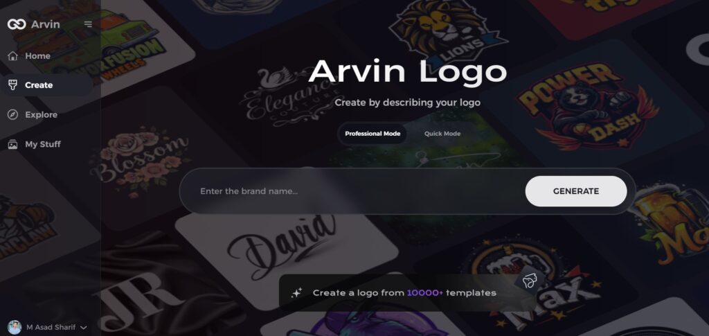
Part 7: Arvin AI – The Best Logo Creator for Trucking Business
A solid trucking logo design is just one of the most important ingredients of branding for any trucking business. They communicate professionalism and build trust through recognition in an industry that becomes very competitive over time. Arvin AI has a great solution for the ease of logo creation. This AI-powered tool offers intelligent design recommendations, the most extensive customization options, and templates that conform to any industry.
Key Features of Arvin AI
- AI-Logo Generation: It uses smart algorithms to study your business requirements and produce unique, professional logo concepts.
- Large Templates Library: Pick a design from multiple supplied designs created specifically for the trucking industry.
- Customization Tools: Just tweak the icons, fonts, and colors to suit the identity of your company.
- Industry-Specific Icon: Suitable icon and font recommendations in line with trucking industry branding standards.
- Color Palette Recommendations: Best Color Schemes to match your brand consistently with expert curation.
Steps to Use Arvin AI for making Logo
Step 1: Visit the Arvin AI Website
Begin by opening your web browser and navigating to the logo creation page on logo.arvin.chat to start crafting your bird-themed logo.
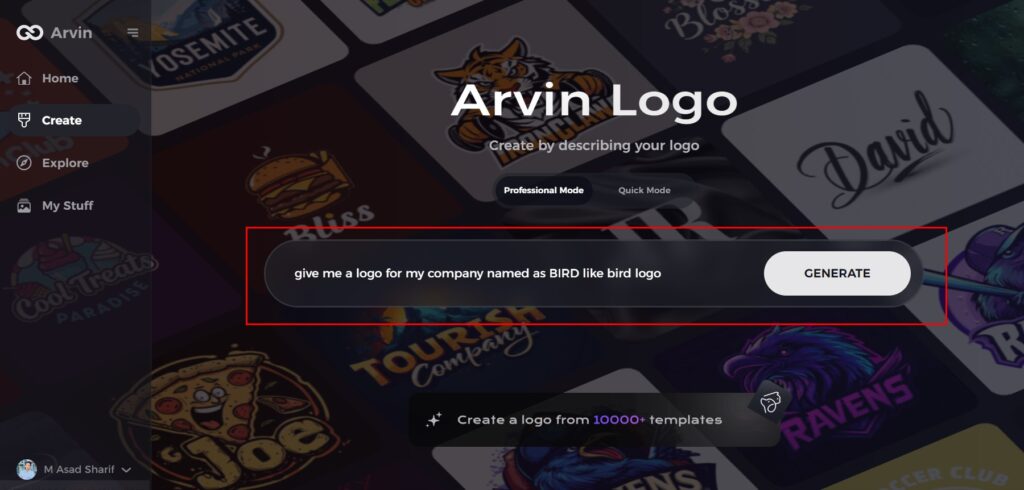
Step 2: Enter Your Business Details
Provide essential business information such as your company name and industry. This step helps the AI generate logo designs tailored to your brand’s identity.
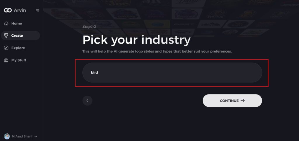
Step 3: Select Your Industry
Choose the relevant industry from a list of options. This allows the AI to narrow down design styles and offer ideas that best match your sector.
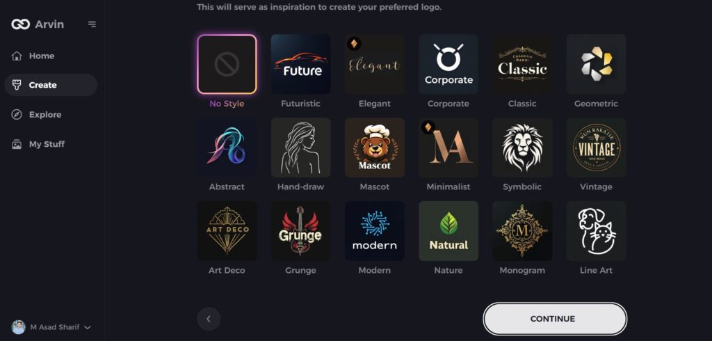
Step 4: Choose a Style
Browse through the available style options and select one that aligns with your brand’s vision. If you’re unsure, simply skip this step, and let the AI suggest a style based on default preferences.
Step 5: Explore Logo Concepts
The AI will generate a variety of bird-inspired logo concepts based on your inputs. Review the designs that resonate with your brand’s image and goals.
Step 6: Customize Your Logo
Personalize your selected design by adjusting elements such as colors, fonts, icons, and layout to make the logo truly your own.
Step 7: Download Your Logo
Once satisfied with your customized bird logo, download it in formats like PNG or SVG, ideal for use on websites, social media, and print materials.
Conclusion
A trucking logo design is very important for a good and recognizable brand. The good design of a logo helps to establish trust and bring in customers through making your business stand out as different from the rest. It should be simple, professional, and versatile to use on any kind of marketing material. Arvin AI lets trucking businesses easily come up with great logos without design skills. It has smart design suggestions, customization options, and industry-specific templates. Investment in a memorable logo today will make your brand stronger and more supportive of long-term business success.
FAQs
Why is a logo important for a trucking business?
A good trucking logo design will help you build brand recognition, create trust, and make your business look professional in the competitive trucking industry.
What colors are best for trucking logos?
Blue (trust), red (energy), black (strength), and green (growth) are commonly used to convey reliability and professionalism.
Can I create a trucking logo without design experience?
Yes! You do not need design skills to make a professional trucking logo design from the tools you find, which include Arvin AI.
What will I be required to pay for a trucking logo?
It depends; Arvin AI is cheap on a startup’s budget, whereas professional designers require more money if you want any custom designs made.
