A brand’s logos represent its face and identity and value in one single visual element. For Subway, a fast-food chain recognized around the globe, its logo represents more than a symbol; it is an expression of its philosophy and brand journey. Founded in 1965, Subway is one of the largest franchises in the world, growing from a single sandwich shop. Subway’s logo plays a significant role in this growth. This article delves into the history, meaning, and impact of the Subway logo as well as inspiration for brands looking to create iconic logos using tools such as Arvin AI.
Part 1: History and Evolution
The visual identity of the subway we know today established in 1968 and only slightly modernized to date. But also an original version designed for the company founded in 1965 under the name Pete’s Super Submarines.
1965 – 1972
The first advertisement of the brand was made up of bright and vivid letters of light blue and red on the white background. The left side of the emblem was a large letter of “Pete’s” in a traditional, thick sans-serif type face, while the right side was a handwriting clear lines and edges with two upper letters of red.
1972 – 1973
A new logo was launched in 1972 as the brand name became Subway. By this time, it was a sans-serif typeface, smooth, and modern with the tail of “S” and “Y” curving elongately. The stylized yellow “Subway” used a thin and delicate arrow for character. This was the only symbol on which the subway’s visual identity is based; it was in use only for one year.
1973-2002
In 1969, the logotype line was thicken and color scheme changed to white and yellow and the brand name visually divided into two parts. The new logo is stretched horizontally and put in a rounded black solid banner. Later on, two more color scheme options for the badge have been presented: the green background is white and yellow and the white background is green and yellow.
2002 – 2016
In the 2002 restyling, Subway changed the logotype typeface to be bold, also turning it italic sans-serif, and glued letters to other characters. The letters, still expressed in white and yellow, became thin but showed a confident green outline instead of having a dark background.
2015 – 2016
This typeface, created in 2015 for the brand, is the same as the old logo, but the line of green letters was thinned out and space was left between the symbol and the symbol. A friendly and bright image reminiscent of joy and happiness.
2016 – Present
The logo, designed for the subway in 2016, modernizes all previous emblems, with inscriptions set in a thick, rounded sans serif typeface with yellow solids on the left and green on the right. The arrows at the end of S “and” Y “become a little heavy and sharp, adding advanced and powerful to the image of the entire company.
Font
Since 1965, corrections have been made to the shape and proportions of the letters. In addition to “Y” and “S,” one of the most distinctive characters in the word mark is “W.” For much of the company’s history, this character depicted a slightly different curve. From 2002 to 2017, sharp angle versions were used.
Color
The current subway logo is yellow and green. Though it is a very vibrant color, it cannot be said that it is too bright or forceful.
Part 2: Meaning Behind the Subway Logo
The Subway logo is more than just a design. It is a visual representation of the brand values. Its elements, such as arrows and colors, carry deep symbolism and strategic intent.
Symbolism of the Arrows
The arrows in the Subway logo are the most iconic part. They are dual-purpose, in that they serve both purposes:
- Entry and Exit: In the context of Subway, the arrows illustrate the idea of movement-its fast, effortless service, and easy access.
- “Eat Fresh” Philosophy: Dynamic arrows fit well with Subway’s direction in emphasizing freshness, an on-going journey towards a fresher, healthier, option.
Color Psychology
Subway uses green and yellow intentionally as follows:
- Green: It has freshness, health, and all-natural ingredients, which also goes in with Subway’s freshness of produce and healthier alternatives.
- Yellow: That color evokes energy, warmth, and optimism for the cheerful experience Subway aims to provide to customers.
Part 3: Subway Logo Impact on Branding
A good logo is important for the success of a brand, and Subway logo is a perfect example. A perfect design makes the logo to be recognized even globally and will have shaped up the perceptions from customers around the globe.
Brand Recognition
Due to the consistent application of colors, typography, and arrow elements, the Subway logo appears everywhere around the globe. A strong visual identity has helped:
- Improve brand recall, where customers can spot Subway in a crowded market more easily.
- Be an integral part of marketing campaigns; it served as a visual anchor for promotions like “Five Dollar Footlong.”
Consumer Perception
The logo helps shape consumer perceptions of Subway:
- Customer Loyalty: The clean and approachable design fosters trust and reliability.
- Differentiation: The arrows and vibrant colors set Subway apart from competitors, making it synonymous with fresh and fast food.
Part 4: The Subway Logo in Popular Culture
Subway’s logo has left a mark on popular culture, appearing in media and inspiring trends in the fast-food industry. Its design transcends marketing to influence broader cultural aesthetics.
Appearances in Media and Pop Culture
Subway’s logo frequently appears in movies, TV shows, and other media, often as a symbol of accessible healthy eating. It has become a notable appearance in shows like Community and in movies where it is depicted showing characters grabbing an easy, healthy bite.
Influence on Other Brands
Subway’s arrows and bright colors inspired other fast food brands to follow a dynamic and fresh design in logos. This fact underlines the fact that Subway was a forerunner in using design as a means to communicate brand values.
Part 5: Arvin AI: Empowering Brands with Unique Logo Creations
Arvin AI is one of the innovative tools that have made making logos for businesses an easy task. Using advanced AI technology, it avails intuitive features that help in making professional logos which are unique and customized for your brand identity. Whether it is a new startup or a well-established firm, Arvin AI ensures the logo stands out in the marketplace.
Key Features of Arvin AI
- Customization: Tailor fonts, colors, and icons according to your requirements.
- High Quality Output: Export in multiple formats and resolutions
- Flexibility: Digital as well as Print-Ready Design
- Ease of Use: Everyone can create logos
- AI-powered Suggestion: Ideas created based on the identity and value of your brand
Steps to Use Arvin AI for making Logo
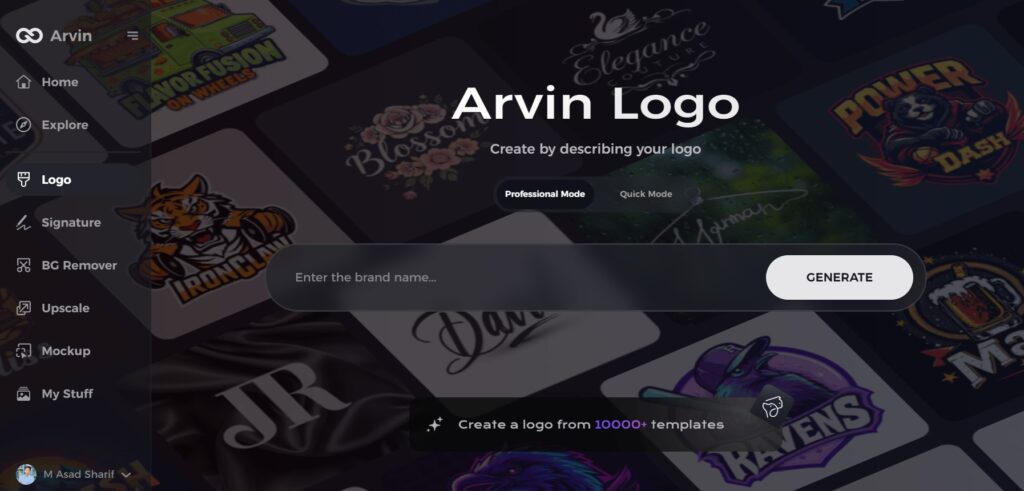
Step 1: Create an account and log in on Arvin AI
Visit the website of Arvin AI open an account, and log in for the logo design feature.
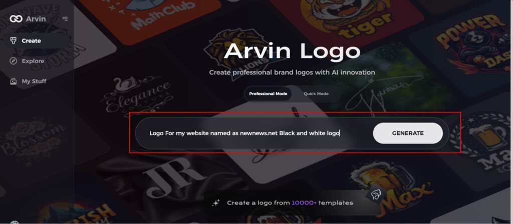
Step 2: Input your brand information and preferences
Input your brand name, slogan, and industry. Specify all your design preferences, which may include font styles or images themes.
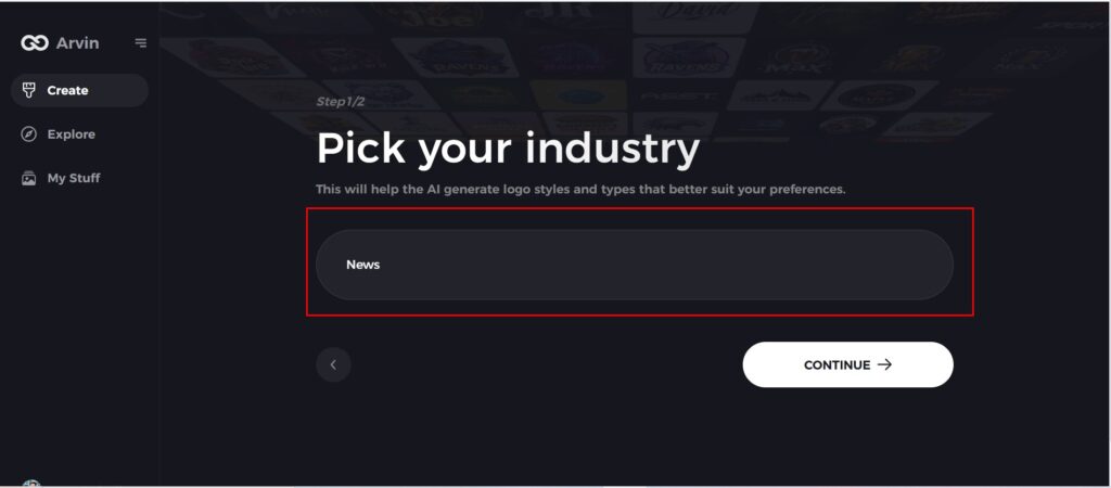
Step 3: Pick your industry:
Now select your industry related to your niche. This will help the AI generate logo styles and types that better suit your preferences.
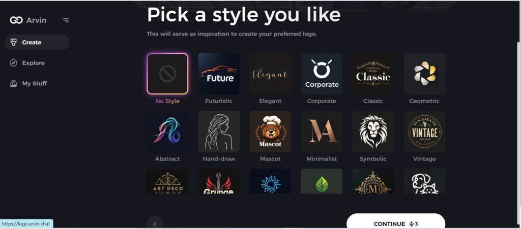
Step 4: Select Style:
Now select a style which you would like and continue. This will serve as inspiration to create your preferred logo.
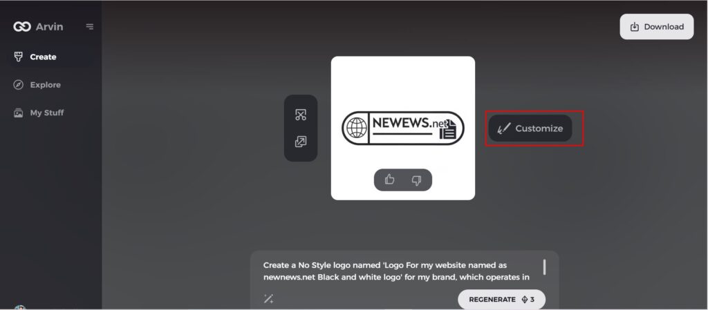
Step 5: Design Personalize through the tools of Arvin AI
After Arvin AI gives create your logo, you can customize those logos with the tools that have elements such as font style, layout, and the positioning of symbols. Experiment on different designs until you like what you see.
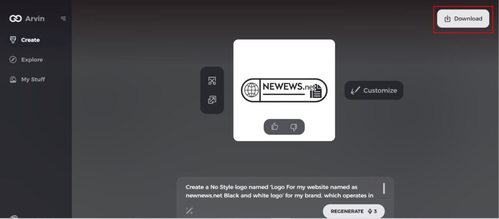
Step 6: Save and download the final logo
Preview the finished logo and save it in a high-resolution format for both print and digital uses.
Conclusion
It’s just one example, but the evolution of the Subway logo from an easy, straightforward design to becoming a symbol that is used throughout the world clearly shows why there is value in thoughtful branding. Its arrows and color scheme tell the story of its promise: fresh and convenient. For companies that want to create an impactful logo for their brand then tools such as Arvin AI logo maker provide modern solutions to make their design work. A well-designed logo is more than just a piece of design work; it forms the core and essence of brand recognition.
FAQs About Subway Logo
What is the meaning behind Subway logo?
The arrows in the letters S and Y of the “SUBWAY” indicate the quick entrance and exit from the store, so you can enjoy your food on the way.
Why did Subway modify its logo in 2016?
The Subway brand was rebranding for 2016 with a newer, clean design that met digital needs as well as trendy looks.
How have the Subway logos changed through time?
Since its introduction, the Subway logo has changed over time, from a simple to a dynamic arrow and a color scheme.
Can I design a similar logo to Subway with Arvin AI?
Yes, Arvin AI provides tools and customization options to design logos inspired by top brands such as Subway, which would ensure a unique and professional result.
