Subaru logo is a name which means safe cars and high technology, making it a favorite on roads of most regions around the world. However, this beautiful logo from one of the best car companies symbolizes much about their sense of identification as well as ideals. Find here how that symbolic representation brings people closer to brand heritage. In this article, we will talk about the success story and branding of Subaru logo. Its meaning and how it came about, how its design represent various symbols.
Part 1: The Meaning Behind the Subaru Logo
After World War II, when the automotive industry became literally one of the main areas of economic power and economic realization for Japan, Subaru Brand emerged. The munitions industry was removed. However, because of the automobile industry, they were able to create jobs, and its products became known worldwide.
What is the true meaning of Subaru?
In 1953, five Japanese companies merged to form Fuji Heavy Industries. Eventually, he called himself Subaru. The name SUBARU choose because it translates as “unity” in Japanese. This is just the right name for a brand built through five small companies integrating. Well, you might think, “It’s an interesting story, but then you can’t explain the stars.
The Story Behind the Stars in Subaru’s Logo
It may be hard to believe, but Subaru is also a Japanese name for the Pleiades cluster. In fact, if you compare photos of the Pleiades star cluster with the Subaru logo, you will notice some similarities. Also, the dark blue background of the Subaru logo is very similar to the night sky! Of course, this is not a coincidence.
Part 2: The History of the Subaru Logo
The history of Subaru logo is not well known. If you close your eyes, you may think of Subaru’s emblem, but you may not know why Subaru chose its iconic image as a brand mark. Subaru’s symbol mark is simple, effectively expresses the brand aiming for stars. The design highlighted “Oushiza” and derived from the company name.
1953 – 1980
Subaru badges are always based on the same image, although they differ in color and expression depending on the year. The first badge, made in 1953 painted with a monochrome, with a sharp four-pointed star surrounded by a narrow but distinct horizontal ellipse frame.
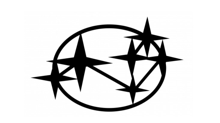
1953 – 1958
Another badge that appeared in the same year was a three-dimensional single-color star badge. Made of shiny metal, the silver gradient and the lines of all elements are thicker and smoother. This badge attached to the bonnet of the Subaru car and it reflects in any background color.
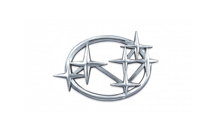
1958 – 1959
In 1959, Subaru’s constellation logo evolved again, and this time it became more colorful. The primary color of the logo is still metallic silver. However, a bold red was given to the background of the silver star. This red color expressed the passion and movement for progress during this period.

1959 – 1970
In 1959, the logo became more colorful. A star of the same color as the silver frame was drawn on the red ground. The new Subaru color palette in this era expressed the brand’s passion for advancement and movement.
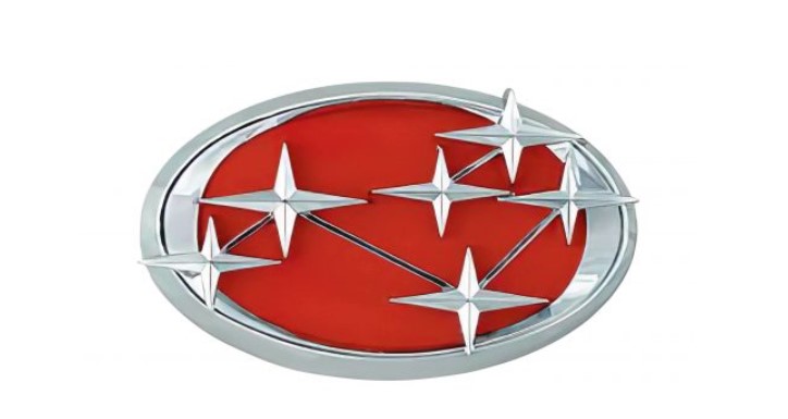
1970 – 1980
In the 1970s, Subaru simplified the previous emblems and presented them in black. This was an interesting contemporary upgrade for the brand, and the new Subaru logo was used for about 10 years until the black background was discontinued in the 1980s.
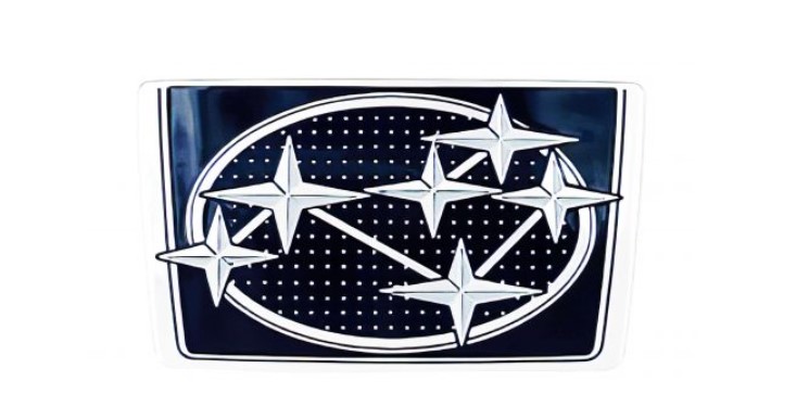
1980 – 2003
The base of the now popular Subaru logo was designed in 1979. It is an emblem with stars on the same ellipse, but the color is changed. Silver star in deep blue. The shape of the pattern is refined, with a gray gradation like a star shining in the night sky.

1999 – 2003
In 1999, the Subaru logo was reborn as modern again. The outline of the ellipse became thicker and stronger, the color of the background became gradient, and the three-dimensional feeling was added to the emblem. Stars are expressed in a more refreshing, thick line, similar to the outline of an ellipse.
2003 – Present
In 2003, a word mark was added to Subaru’s emblem. It is a traditional sans-serif typeface based on black. A simple, bold line of wordmarks balances the emblem with its vivid decoration to highlight the brand’s visual identity.
Part 3: The Symbolism of the Stars
As already mentioned, the symbolism of the logo is visible Pleiades (six stars). Blue in the background simultaneously expresses “sky” and “sea”. It preaches the need to set ambitious but achievable goals so that there is a Japanese proverb that “when a star is reflected in sea water, a star is felt more familiar”.

Emblem
When deciding the basic shape of the emblem logo, the designer deliberately distanced himself from the crest structure and the circle, which were familiar to Europeans. It has an elliptical shape with a special characters for Japanese culture. It is harmony and stability (including respect for the highest traditions) and longing for perfection.
Part 4: Design Elements of the Subaru Logo
The Subaru logo is a beautiful synthesis of art and symbolism that signifies the brand identity and values. Every detail from the six stars that make up its structure to the oval frame gives off a symbol that says this is where it comes from, its vision, and its perfection. This section will look into the design elements that made the Subaru logo such an easily rememberable and extraordinary features in the world of automobile industry.
Font
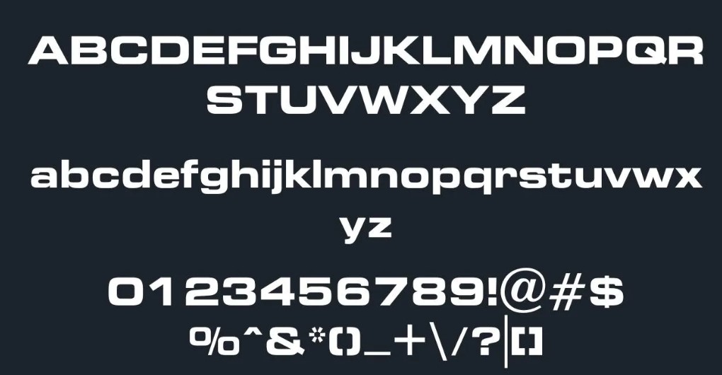
The function of fonts in the Subaru logo is to emphasize symbolic images and clarify information about names in the most comfortable way for consumers. Even those font logo who do not know the brand Subaru can easily read the fonts used in this design configuration. It is an image that conveys the most important information, including primary and symbolic information.
Font Information
| Name | Subaru Font |
| Type | Logo |
| Designer | Aldo Novarese |
| Foundry | Bitstream |
| File Format | Opentype & Truetype |
| License | Free for Personal Use Only |
| Paid/Free | Free Version |
Color
The main part of logo color is blue. On the other hand, the sky is reminiscent of water. In addition, blue interpret as a mysterious and supernatural color in Japanese culture. The second most important color is white. The color of light and sun is the color of the imperial family. Black used in fonts mainly appeal to European culture and symbolically refers to nobility and majesty.

Part 6: Unlocking Automotive Insights with Arvin AI
The basic idea of Arvin AI is to advance your knowledge about the automotive success. It is not difficult to use, friendly in nature, and accessible to automotive enthusiasts, students, or other curious minds with a desire to learn more about the history and technologies behind logos of automobiles. There are some good design features Arvin AI depicts to show these interesting facts. Arvin AI makes learning the history and artistry of cars interesting and approachable.
Key Features of Arvin AI
- Real-Time Information: Get instant information about auto brands and car logos.
- Timeline Insights: Get to know the evolution of the automobile logos as well as design.
- Logo Search: Upload photos to know the meaning of what a car logo symbolizes.
- Comparative Visuals: Observe several different car brands along with their car logos to discern what similarities as well as relation exist.
- Experiential Graphics: Discover the design element of logo designs in great graphic detail.
Steps to Use Arvin AI for making Logo
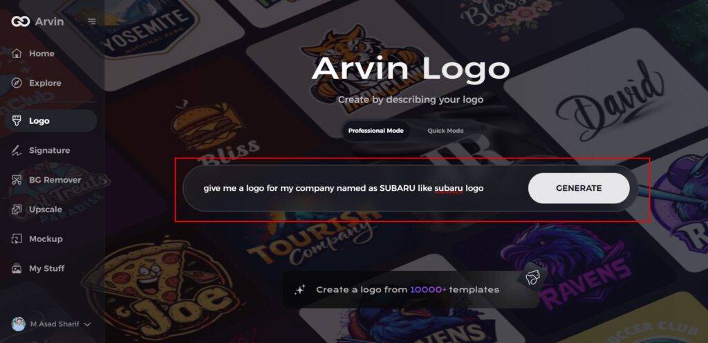
Step 1: Visit the Arvin AI Website
Open your web browser and navigate to the logo design page at Arvin AI. This is where your journey into logo exploration begins.

Step 2: Provide Relevant Information
Input essential details about your interest, such as the Subaru logo or other logos you’re curious about. This step helps the AI tailor its insights to your needs.
Step 3: Select the Industry
Choose the “Automotive” category to focus on logos related to car brands like Subaru. This narrows the scope and refines the AI’s responses for an in-depth exploration.

Step 4: Choose a Style or Let AI Decide
Browse through available styles or skip this step to let the AI present its interpretations. This feature is perfect for analyzing the Subaru logo’s unique design elements.

Step 5: Discover Logo Insights
The AI will create detailed insights into the history of the Subaru logo, as well as symbolism and design development. Review those in order to delve deeper into this topic.

Step 6: Personalize Your Experience
Customize the exploration by adjusting focus areas, such as the symbolism of the stars or the significance of the oval shape in the Subaru logo.
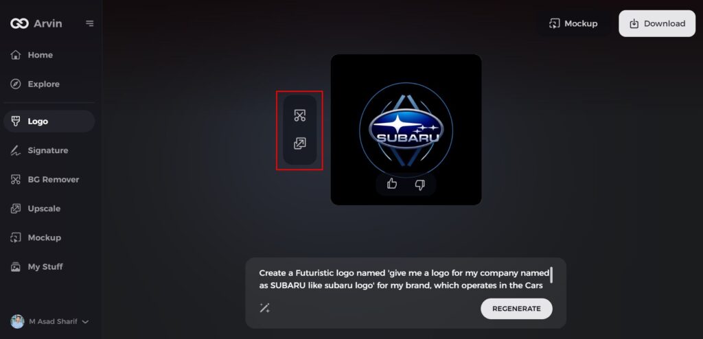
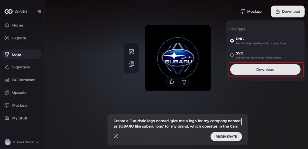
Step 7: Save and Share Your Findings
Download your insights or share them in formats like text or graphics. These outputs can be useful for presentations, discussions, or personal learning.
Conclusion
The Subaru logo is a symbol with an identity which simply it to remember. It symbolizes the journey, values, and a connection to the Japanese culture to Subaru logo. From its history to the design of today, the logo signifies Subaru’s unity and ambition in one package. Using tools like Arvin AI, one can learns much about logos in the automotive industry and the exciting stories behind each one. The Subaru logo serves as an inspiring example that how design and symbolism can shape a brand’s identity.
FAQs
What is the meaning of the Subaru logo?
“SUBARU” signifies a Japanese word meaning “unite,” as well as a term identifying a cluster of six stars, which the Greeks called the Pleiades – part of the Taurus constellation. According to Greek mythology, Atlas’ daughters turned into this group of stars.
Has the Subaru logo changed over the years?
Yes, the core design of the logo has remained the same, but updates to color and typography have kept it modern.
Why is the Subaru logo important?
In essence, this is the living embodiment of the values of Subaru: unity, innovation, and quality. Such a connection with heritage and aspiration is what this brand stands for.
How can I use Arvin AI to learn more about the Subaru logo?
Find more detailed insights about the logo’s history, design elements, and cultural significance on Arvin AI and develope a design which signify your brand identity.

