
State Farm’s logo is a much-known symbol in the insurance sector, associated with trust and dependability. State Farm has used branding to uphold its credibility since it founded in 1922. The State Farm logo has undergone quite a number of redesigns over the years, staying up to date while maintaining its identity. The three-oval and red and white color scheme of the logo has placed it as one of the most identifiable logos in the financial sector. This article covers its history, importance, and over the years evolution.
Part 1: The State Farm Logo Meaning and History
Over the decades, the State Farm logo has evolved and developed while still retaining its essence. From early designs to contemporary modifications, every adaptation indicates the growth, dedication, and resilience of the firm in the competitive insurance market.
State Farm Logo Origin and Initial Designs (1922 – 1936)
The State Farm logo initially emerged in 1922 when the company established as an automobile insurance company. The original logo was a horizontal oval badge with heavy typography. In the center of the badge, there was a monochromatic car symbol, representing auto insurance. The logo included the words “Service, Satisfaction, Economy.” to reflect the promise of the company to provide quality insurance policies.
The Three-Oval Design Makes its Debut (1936 – 1953)
In 1936, the State Farm logo incorporated the three-oval design that would become its most iconic attribute. The new design consisted of three red ovals stacked on top of each other, symbolizing auto, life, and fire insurance—the three primary services offered by State Farm. The logo’s vibrant red color made it attractive and stand out from other brands. This design evolved over time but maintained the three-circle idea as a fundamental aspect.
Development into a More Contemporary Form (1953 – 2006)
During this time, the State Farm logo underwent substantial improvements. The three red ovals were contained in a square with rounded corners, thus enhancing the structured nature of the design. The company’s name was also included in bold capital letters over the emblem, with the word “Insurance” written below. The redesign enhanced brand recognition and made the logo more practical with regards to usage in advertisements, office signage, and printed materials.
Simplification and Modernization (2006 – 2012)
The State Farm logo was altered by 2006 to look neater and more modern. The square logo remained but was positioned on the left side of an italicized wordmark. The font for the name of the company was modernized to a crisp, sans-serif font. The change reflected State Farm’s shift towards a more digitally friendly brand identity without abandoning the traditional red color scheme.
The Existing State Farm Logo (2012 – Now)
The most recent redesign of the State Farm logo, which was unveiled in 2012, eliminated additional details and left only the three red ovals. This minimalist logo is more versatile for mobile use, websites, and online advertising. The wordmark remained, but the emblem itself was a separate visual identifier. Chermayeff & Geismar & Haviv designed this version, which provides high visibility on all branding materials.
Part 2: Symbolism Within the State Farm Logo
Besides being easily recognized, the State Farm logo means much more. From its trio of ovals to its intense red hue, every aspect has a function of presenting the firm as dependable, with various protection plans and firmly rooted in the insurance industry for generations.
The Significance of the Three Ovals
The State Farm logo has always included three ovals, which symbolize each of the key services: car insurance, life insurance, and fire insurance. The design is simplistic, making it easy to understand yet powerful in showing an imagery of the company’s extensive coverage. The concept of three circles has remained unchanged for decades, with the provision of branding consistency and making it easy for customers to relate the logo to full coverage insurance services.
The Color Choice of the State Farm Logo
State Farm’s logo dominate by white and red, colors that have a strong psychological influence. Red represents energy, confidence, and dependability, whereas white reflects honesty and transparency. Both collectively assist in the creation of a fearless but reliable brand image. Utilizing red as the color of the logo increases visibility to make it notice in advertisements, billboards, and digital media, thus boosting State Farm’s brand recognition.
The Typography Employed in the State Farm Logo
The typography of the State Farm logo is important to create a professional yet friendly brand image. The italic sans-serif typeface applied in the logo creates a perception of movement, responsiveness, and efficiency—values that are most important for an insurance company. The layout is also designed to be legible on different media like digital and print media so that the brand is consistent wherever the logo appears.
Part 3: Why the State Farm Logo Excels Within the Insurance Company Sector
State Farm’s logo is more than an ordinary signpost—it’s an influential marketing device. With its elegance, consistency, and versatility, it has risen to become one of the most popular and iconic logos in the insurance industry, ranking higher than those of its competitors.
Brand Awareness and Uniformity
The State Farm logo has not changed for almost a century, and it is among the most recognizable logos in the insurance industry. While competitors change branding constantly, State Farm has refined its image only slightly. This uniformity promotes customer trust and ensures the logo’s association with quality service and reliability, thus qualifying it as an elite insurance firm.
Simplicity and Effectiveness
One of the most important reasons why the State Farm logo is so effective is that it has a simple but meaningful design. The three-oval design dispenses with unnecessary complexity, so it is easy to remember. The lack of complex details means it can be more easily adapted across different media. Whether it is on a website, business card, billboard, or mobile app, the logo remains clear, so customers can recognize it instantly.
Adaptability Across Different Platforms
In the age of social media, logos must be evergreen, and State Farm’s logo is just that. The simplicity of the three-oval design makes it ideal as social media icons, mobile app icons, and billboards without sacrificing its punch. Whatever the size – on a small smartphone screen or a massive billboard – the logo is clear. Such versatility has contributed to State Farm’s consistent visibility both online and offline.
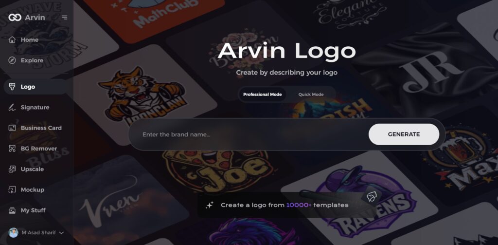
Part 4: Design Your Professional Brand Logo
If you wish to design a logo similar to the State Farm logo, Arvin AI is the ideal option. Arvin AI is a robust AI-powered logo creator that makes the design process easy. As a business owner or a designer, Arvin AI offers professional logo templates, editable color palettes, and intelligent design recommendations to assist you in designing a distinctive and memorable brand identity without requiring advanced design expertise.
Key Features of Arvin AI as an AI Logo Maker:
- AI-Driven Design: Automatically generates unique logos based on brand preferences and industry trends.
- Easy Customization: Modify colors, fonts, and layouts with an intuitive interface.
- Extensive Template Library: Access a wide range of professional logo templates.
- Versatile Export Options: Download logos in high-resolution formats like PNG, SVG, and JPEG.
- Brand Identity Support: Receive design recommendations that stick with your brand’s vision and industry.
Steps to Create a Logo Using Arvin AI
Step 1: Visit the Arvin AI Website
Go to the Arvin AI logo maker page using your web browser to start designing your logo.
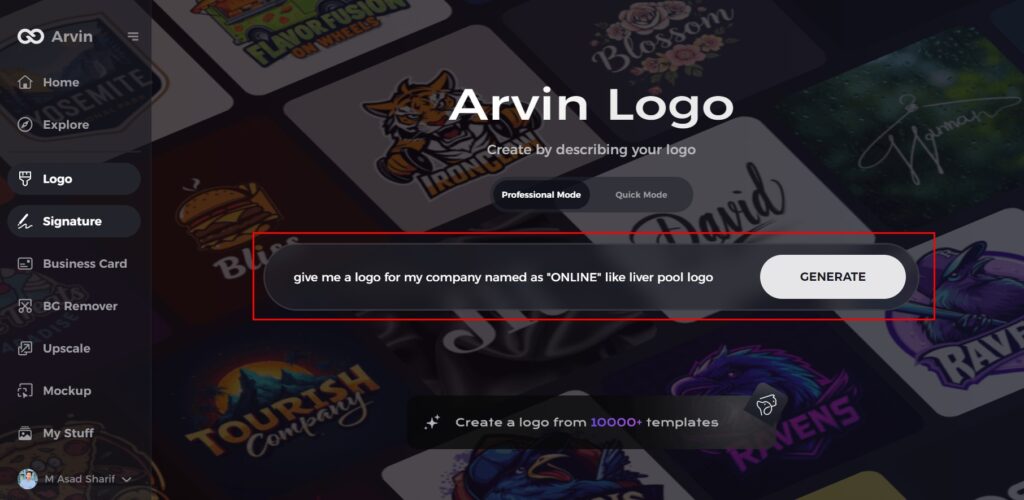
Step 2: Enter Your Business Details
Provide key information like your business name and category. This helps the AI generate designs tailored to your brand.
Step 3: Choose Your Industry
Select an industry from the given options. This helps the AI refine the logo styles to match your business type.

Step 4: Select a Style
Browse through the available styles and pick one that fits your brand’s vision. If you’re unsure, skip this step, and the AI will choose a default style.

Step 5: Explore Logo Ideas
Arvin AI will generate multiple logo concepts based on your inputs. Review the options and choose the ones that best represent your brand.
Step 6: Customize Your Logo
Adjust colors, fonts, icons, and layout to match your brand identity. Make changes until you satisfy with the design.
Step 7: Download Your Logo
Once finalized, download your logo in PNG or SVG format for use on websites, social media, and printed materials.
Conclusion:
The State Farm logo has evolved over the years while keeping its core identity strong. Its three-circle design symbolizes the company’s key insurance services, making it a recognizable and trusted emblem in the industry. The logo’s bold red color and simple yet effective layout have helped it stand out for decades. If you want to create a logo with a similar professional touch, Arvin AI is the perfect tool. With smart design features and easy customization, Arvin AI helps you craft a unique and memorable logo. Try Arvin AI today and build a strong brand identity effortlessly!
FAQs About the State Farm Logo
What are the 3 circles in the State Farm logo?
They represent the company’s three main insurance services: auto, life, and fire insurance, which show its extensive coverage.
Who designed the modern State Farm logo?
The 2012 redesign created by Chermayeff & Geismar & Haviv, a top branding agency known for iconic logo designs.
Why is the State Farm logo red and white?
Red conveys trust and reliability, while white represents clarity and transparency, reinforcing State Farm’s values.
Can I create a logo similar to the State Farm logo?
Yes! Use Arvin AI to design a professional, unique logo tailored to your business needs.