Starbucks has deeply changed coffee consumption, becoming the king in the industry. But there is indeed one key reason that is at the core of such success-story- it’s an iconic star-studded logo which is symbolic enough for quality community and the identity of the great brand name. Logos are part of branding storytelling; they are that visual anchor that communicates about a company. Therefore, the Starbucks logo is one well designed since it has adapted itself to appeal many around the globe. We are going to explore about Starbucks logo and branding how did Starbucks manage brand identity.
Part 1: The Origin of the Starbucks logo
A logos often can be considered a window to the soul of a brand. The Starbucks logo is one of the most recognizable logos in the world. A history of adventure, quality, and exploration based on a great maritime past, it was the vision of its founders. The logo of Starbucks originates from the firm’s history and is bound to the sea. Established in 1971, the company used the name “Starbuck” after the first mate in Herman Melville’s Moby Dick. The original brown logo looked rustic and detailed to be able to capture the sense of artisanal coffee created by the founders.
Part 2: Evolution of the Starbucks logo
The logos of any brand should change with time and their brands. With the decades that have passed, the Starbucks logo had many faces that have made a mark on the growth of the company. If you want to create a logo you must read about Logo Shapes and Impact on Brand Identity. Let’s get a closer look at how it evolved.
1971: Birth of the Original Logo
The original Starbucks logo was a circular design featuring a brown color palette, which indicated authenticity and warmth. At the center of this design was a woodcut-style siren with the words “Starbucks Coffee, Tea, and Spices” written around it. This design underscored the brand’s promise of quality and its offerings beyond coffee.
1987: Modernization Begins
With the takeover by Howard Schultz in 1987, the brand underwent a dramatic shift. The logo adopted green color scheme — for growth, freshness and prosperity. The siren lost more detail but kept her two tails. The circle began with “Starbucks Coffee” across it, which marked that the company’s core interest is in coffee drinks.
1992: Fine-tuning and Universal Acceptance
As Starbucks was set to have its initial public offering, the logo became even more streamlined. The details of the siren were removed to make the image clean and modern. This makeover intended for the logo to be versatile and suitable for use in a global marketing campaign as well as being readily iconic in a wide variety of media.
2011: Minimalist Revamp
For its 40th anniversary, Starbucks unveiled a simple logo that eradicated the text. The green siren now became the singular universal symbol of the brand. It was a very bold move though as it said Starbucks was so confident in the global recognition of the brand as they started to veer away from being a simple coffee brand and begin to become a lifestyle brand of sorts.
Part 3: Evolution of Starbucks Logo Fonts & Color Schemes
Explores how the brand’s visual identity has transformed over time. From the initial use of Pindarots to modern fonts like Gibson, and a color shift from brown to green, Starbucks has carefully crafted its logo to evoke trust, sustainability, and a connection to its coffee roots.
Starbucks Fonts
In 1971, the Starbucks logo used a free font called Pindarots, which is powerful but not bold in terms of its font weight. Bolder fonts tend to express a stronger sense of stability, thus making the brand seem more trustworthy and reliable.
- Previous Starbucks font – free Pindarots
- Current Starbucks font – free Starbucks font
The Starbucks font resembles the Gibson and Santana Black fonts:
- Gibson Font (Cost:$48.00)
- Santana Black font(no cost)
Starbucks Color Schemes
Consistently, Starbucks logo designs adopt color schemes pertaining to its theme, related to that of coffee colors such as Brownish, Green, Black as well as White colour.
Here is a color table of Starbucks Logo Colors (for Duplication):
| History Starbucks Logos | Color Schemes |
| 1971 Starbucks Logo Color | 562F1E – Brown FFFFFF – White |
| 1987 Starbucks Logo Color | 000000 – Black 087752 – Green FFFFFF – White |
| 1992 Starbucks Logo Color | 007654 – Green 000000 – Black FFFFFF – White |
| Present Starbucks Logo Color | 007042 – Green FFFFFF – White |
Part 6: Marketing Lessons from the Starbucks Logo
One of the strongest symbols in the world today is the Starbucks logo providing valuable learning to a business wanting to have a strong, built to last brand. Here’s what can be learned from Starbucks’s approach:
Consistency and Adaptability in Branding
Starbucks is an example of balance between consistency and adaptability in branding. Although its logo has changed with time, it has retained a core element such as the color green and the siren icon. Successful brands evolve while not losing their core essence. Consistency in visual identity is important, but it is adaptability that will make it relevant. Read here the guide to make your circle logo design stand out.
Establishing Emotional Connections
The Starbucks logo evokes a strong emotional tie to the customers. Comfort, community, quality is what it means. Coffee isn’t just a brand, it’s a place to connect. Therefore a logo should have an emotional touch point that supports you emotionally with customers and creates loyalty and long term relationship.
Lessons for Startups and Small Businesses
As a small business, the Starbucks Logo teaches something. How to create a meaningful logo that tells you about where your brand is headed. Timeless, scalable logos have to be developed by startups which aligns perfectly with long-term vision as well as growth.
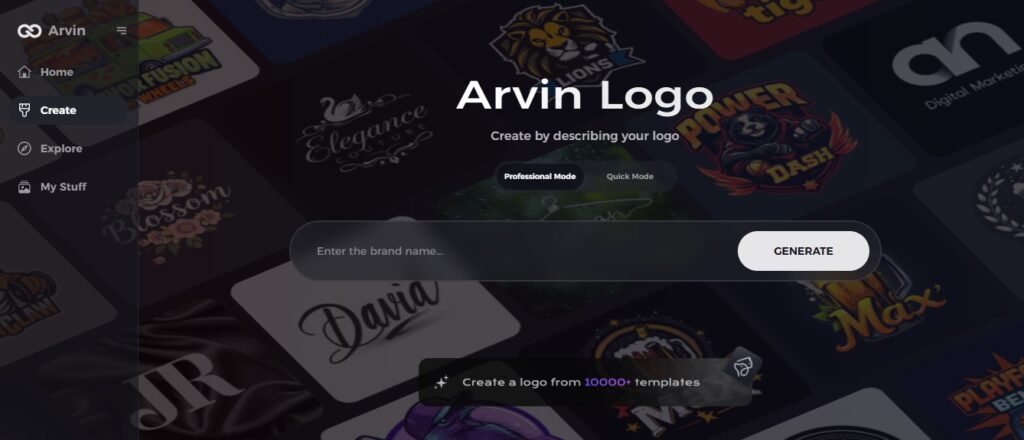
Part 7: Create Your Own Coffee Logo with Arvin AI for Branding
A good logo is important factor for any brand to survive. Arvin AI is innovating on a platform to help businesses in creating unique logos including coffee logo, with various available themes, and options regarding the font styles and vibrancy of the colors applied in the logo designs. Hence, it would be rather easy and effortless to bring your vision alive, in order to achieve effective, long-lasting branding with help of Arvin AI.
Key Features of Arvin AI
- AI-Driven Design Ideas: Arvin AI bases its ideas on the industry trends that your brand has. When you use this approach, your logo ideas will be creative, yet still appropriate for your target audience.
- Customizable Templates: Select from a variety of templates for your logo, all based on professional designs. Take these templates and mold them in the light of your brand’s identity and vision.
- Color Palette Recommendations: Utilize scientifically curated color combinations that evoke the desired emotions from your audience.
- Market Analysis Integration: Be at the top of the game by understanding market trends and audience preferences.
- User-Friendly Interface: Arvin AI provides an intuitive interface through which anyone can design professional logos easily. Both for a beginner or a professional designer, this interface makes it easier to think creatively.
Steps to Use Arvin AI for Coffee Logo Design
Step 1: Register and Log in
Access the Arvin AI website, register an account, and log in to reach the logo design platform.
Step 2: Fill in Your Brand Details and Preferences
Input details about your brand, such as the name, slogan, and industry. Provide specific preferences like font styles, themes, or other design elements to guide the AI.
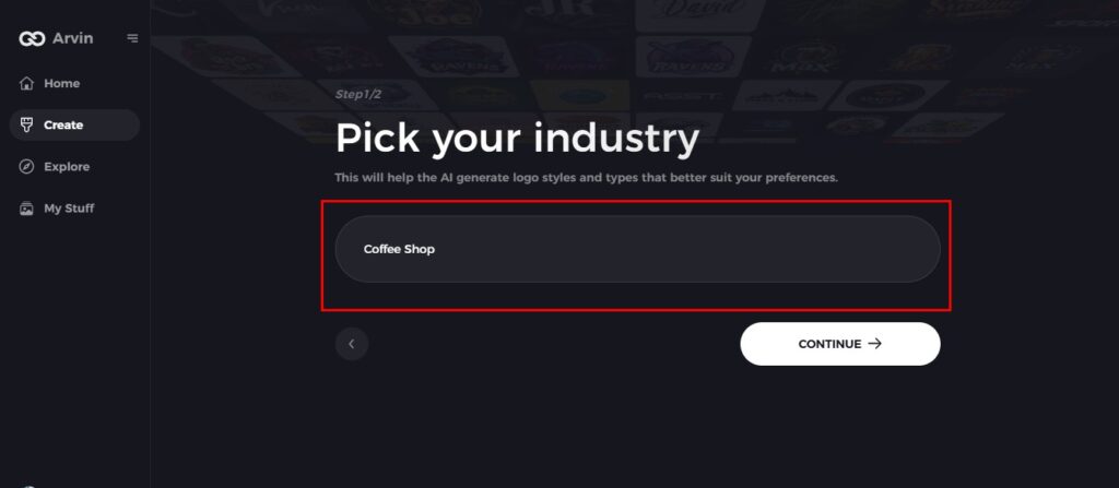
Step 3: Select Your Industry
Select the industry that best fits your brand niche. This will enable the AI to come up with logo styles that resonate with your sector and audience.
Step 4: Select a Logo Style
Surf through and choose a style that best suits your vision. The selected style will inspire the AI to come up with a logo that is tailored to your preference.
Step 5: Personalize Your Design
After Arvin AI has come up with initial logo ideas, refine them using the platform’s tools. Customise font styles, layouts, symbols, and other design elements until the logo reflects your brand identity.
Step 6: Save and Download Your Logo
Review the final design and download it in high resolution, ensuring it’s ready for both digital and print applications.
Conclusion
The journey of Starbucks logo, from a maritime-based design to the minimalist global icon shows the strength of strategic branding. Tools like Arvin AI make it easier than ever to create impactful logos including coffee logo. Whether you are an entrepreneur or a small business owner, using such tools could help you craft a visual identity which resonates with your audience as well as time.
FAQs
What does the twin tailed siren mean?
The siren, in this case, symbolizes attraction, uniqueness, and the wild pull of a good coffee experience, inspired by the maritime origins of Starbucks. From European myths and alchemy, her two tails represent dualities, such as earth and water, or body and soul.
How has the Starbucks logo changed over time?
The logo has changed from a more detailed, text-intensive icon in 1971 to a simple, text-less icon in 2011, following the trend in modern branding.
What makes the Starbucks logo so recognizable?
Because it is so simply, green, and has such a siren image, it has become recognized internationally.
Can I create a logo as impactful as Starbucks?
Yes, you can develop a logo as powerful as that of Starbucks by focusing on a design by tools like Arvin AI to help polish your creative process and make sure your logo stands out.
Read More
Purple Logos: The Perfect Choice for Unique Branding
Logo Shapes and Impact on Brand Identity: Design Trends and Tips
