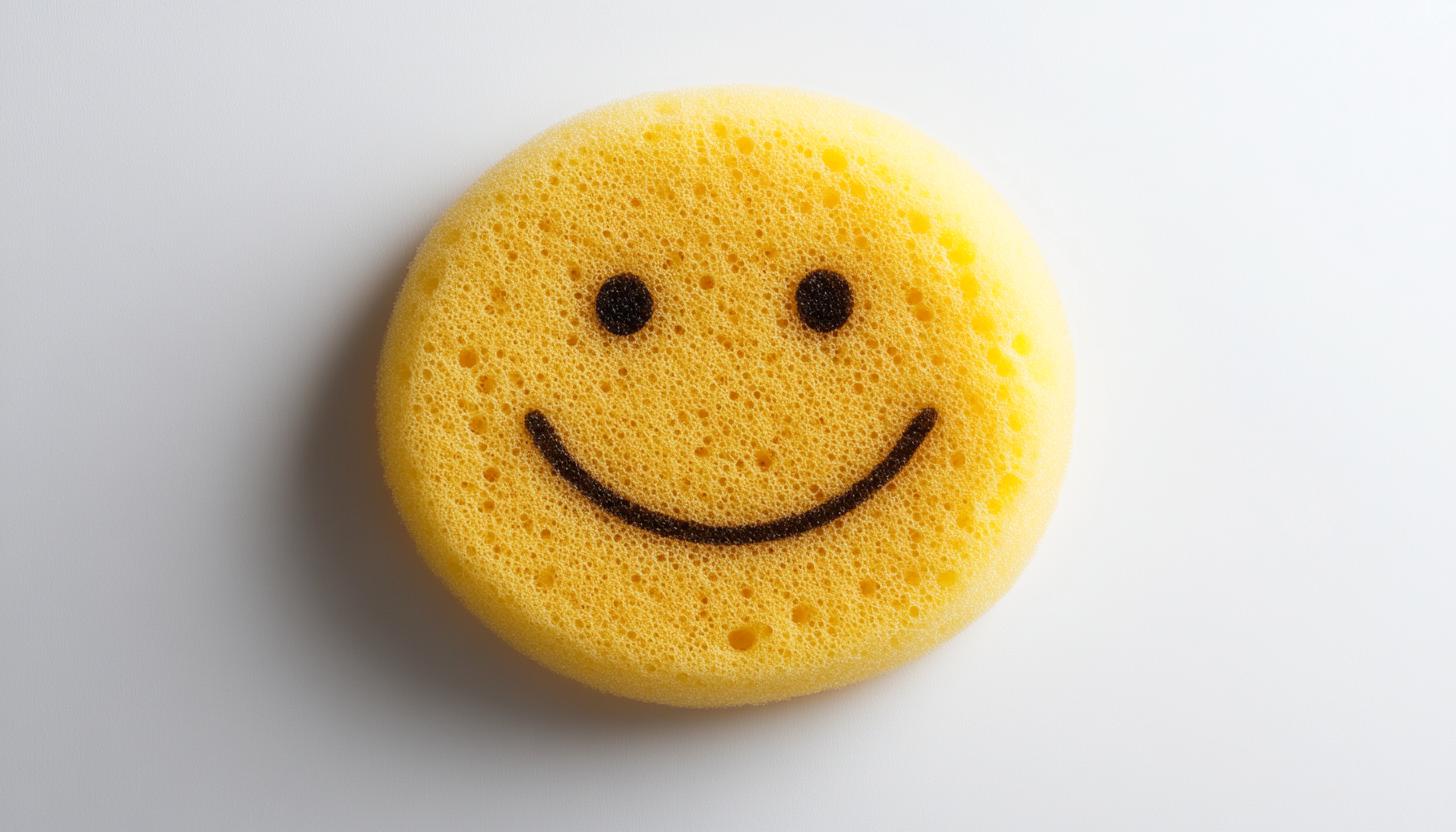
Scrub Daddy logo is a cleaning brand pioneer known for its flexible smiley face sponges that change texture due to water temperature. Originally renowned for its “shark tank,” its innovative products have now swept homes around the world. The company now offers a variety of cleaning solutions beyond the sponge boundaries. Although it is popular in North America, its market size has been steadily expanding internationally. The founder, Aaron Kraus involved in management with the support of investor Lori Griner.
Part 1: The most successful company in Shark Tank
At the beginning, Klaus appeared on TV shopping channels such as QvC, raising the name of the product and gaining television experience from the founder. After that, Klaus thought that the experience could be utilized in another place, and applied for Season 4 of the American reality business show Shark Tank.
Scrub Daddy’s Remarkable Journey
In 2012, Scrub Daddy appeared in Shark Tank, installing a $200,000 deal from investor Lori Griner. Today, the company regarded as the most successful company to appear on the show, with sales exceeding US $30 million (US $41 million) and over US $170 million.
Scrub Daddy in Australian Market
Klaus is currently in Australia and has begun discussions with Coles, Woolworths and the IGA to get the local supermarket to place the sponge. He said Australia is a large and sophisticated market for scrub daddy and has great expectations for the brand’s growth. “In Australia, we have already sold 100,000 items for TV shopping, and we have a dedicated distributor.
Part 2: Meaning and History Scrub Daddy Logo
In the early 2010s, entrepreneur Aaron Kraus developed Scrub Daddy. His work was a smiley face sponge that was hard in cold water, soft in warm water, and changed in feel by water temperature. These two textures made it possible to clean a variety of products, making them unique in the market. This is one of the iconic logos which lead your branding industry. Let’s take a brief look at this:
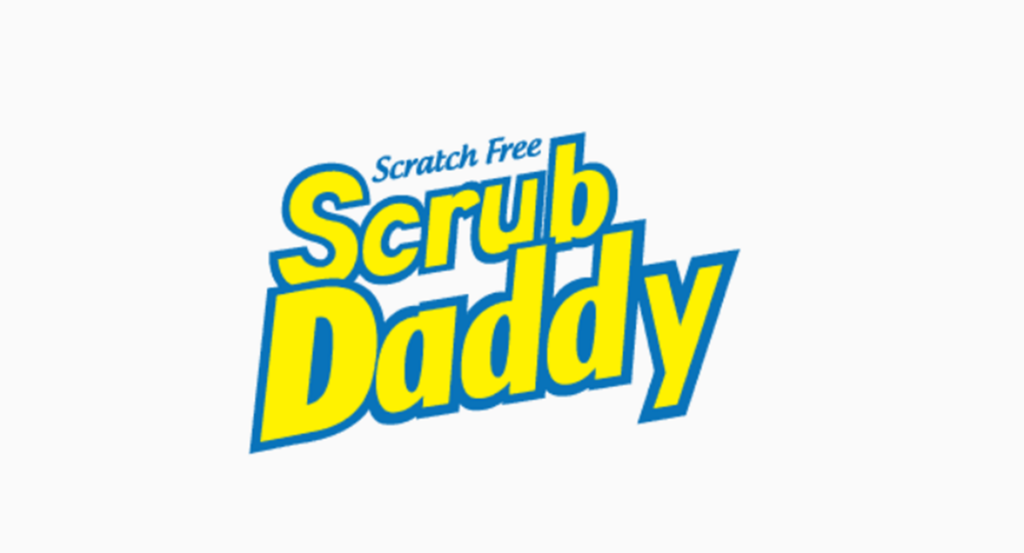
2012 – 2016
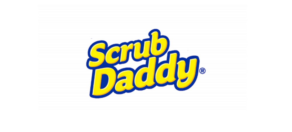
This emblem expresses the phrase “Scrub Daddy” in a bold and dynamic font. Painted in bright yellow and deep blue shadow, the typography gives you a playful yet authoritative energy. Above the brand name is written “scratch-free” with more delicate and contrasting characters, suggesting the gentle efficiency of this product. The whole design placed on a pure white background, and the color is attracting the eye of the viewer with pop.
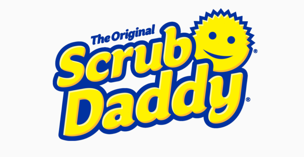
2016 – Today
The emblem features two-stage inscriptions surrounded by thick edges. Above the main title is a small phrase called “The Genuine Article.” At the top left of the emblem is a cheerful round symbol mark characterized by jagged upper part. This combination creates a unique visual expression and emphasizes authenticity and originality. The designer skillfully incorporated these elements to convey the identity and value of the brand, making it an impressive and distinctive expression.
Color
Two logo colors, blue and yellow. Yellow used for smiles and nameplates. Blue represents the outline and the wording of the “original.”
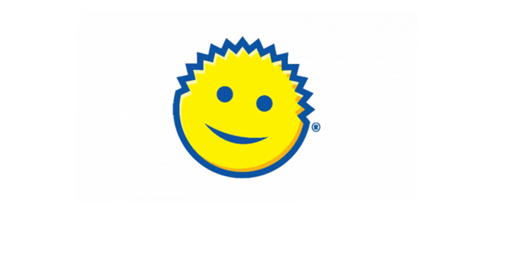
Font
The letters written in a rounded logo fonts. There are no lines, and the spacing between lowercase and lowercase is narrow.
Part 3: Arvin AI: Revolutionizing Logo Design and Branding
A logo is an important component of any company. Through the tool brands reach recognition because their customers develop trust by using it. Organizations who want outstanding logo designs should use Arvin AI as their solution. The system enables fast production of exceptional logos beside performing branding element testing and marketing support functions. The AI logo generation tools serve businesses by generating designs that forge direct audience relationships as well as achieving strong visual impact.
Key Features of Arvin AI
- AI-Powered Logo Analysis: Discover insights about your logo’s design, color palette, and performance.
- Smart Logo Suggestions: Get AI-based suggestions to improve your logo.
- Brand Trend Insights: Keep yourself updated with the newest logo and brand trends.
- Simple-to-Use Design Tools: Design or optimize logos easily without any design skills.
- Flexible File Formats: Obtain high-quality logo files compatible with different platforms and applications.
Steps to Use Arvin AI for making Logo
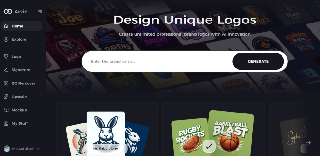
Step 1: Access the Arvin AI Website
Open your browser and visit the design page at Arvin AI to begin creating a logo for your record label.
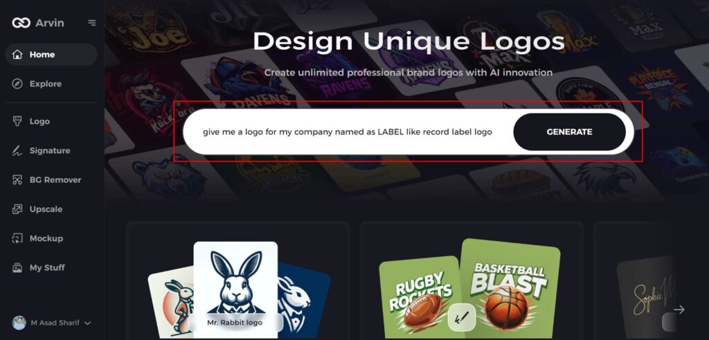
Step 2: Enter Your Business Information
Provide essential details such as your record label’s name and category. This helps the AI tailor designs to reflect your brand’s identity.
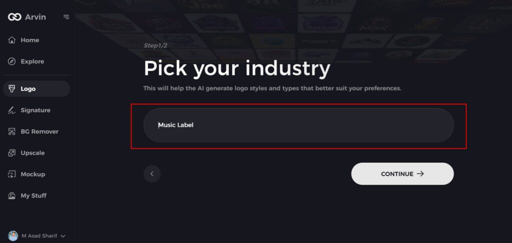
Step 3: Specify Your Industry
Choose “Music” or another relevant industry from the provided options. This helps refine the AI’s focus on logo styles and elements suited to record labels.
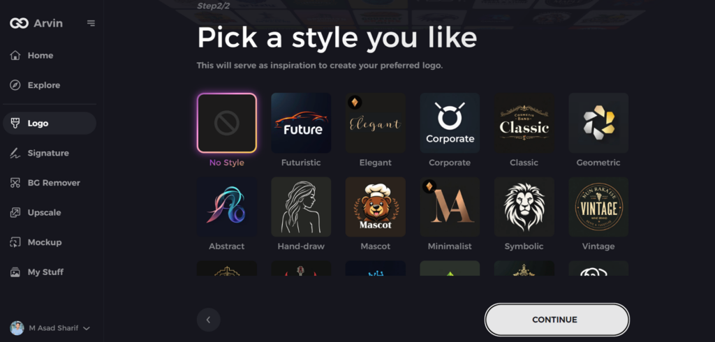
Step 4: Select a Design Style
Explore the suggested design styles and pick one that aligns with your brand’s vision. If undecided, skip this step to let the AI use default inspiration.
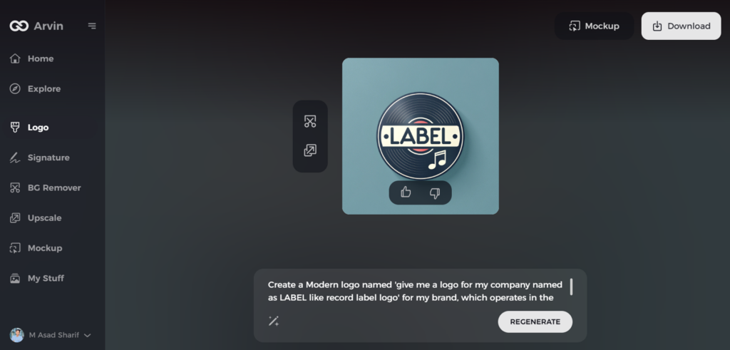
Step 5: Review Logo Ideas
Arvin AI will generate multiple logo designs based on your inputs. Browse through the options to find ones that best capture your label’s essence.
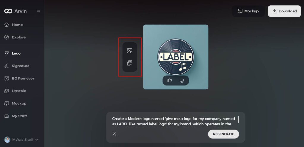
Step 6: Customize Your Logo
Fine-tune your selected design by modifying elements like colors, fonts, icons, or layouts to ensure it reflects your record label’s personality.
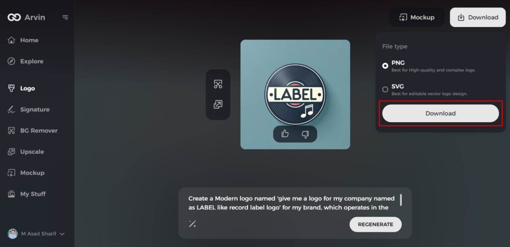
Step 7: Download Your Logo
Once satisfied with your final design, download it in high-quality formats like PNG or SVG. These formats are versatile for use on social media, websites, and merchandise.
Conclusion
The Scrub Daddy logo demonstrates that can recall with simple design. A quality logo is beneficial in identifying and believing in a company, and it is among the most significant factors of success in entrepreneurship. A quality logo can assist in marketing as well since it recognizes the product. For companies intending to find the strongest and most distinctive logo one can get, Arvin AI is ideal. It supplies AI-driven design software to generate logos, execute branding analysis.
FAQs
Why is the Scrub Daddy logo so popular?
The fact that it incorporates a smiley face and use of bright colours makes it instantly memorable and endearing, bestowing on it a warm, friendly, and playful image.
Has the Scrub Daddy logo changed over time?
The design remained largely the same, but refinements occasionally made for it to stay modern and finished.
What does the Scrub Daddy logo symbolize?
It is a cool, creative, and efficient cleaning agent that aims to make home chores enjoyable.
How does Arvin AI help in branding and logo design?
Arvin AI provides AI-based logo tools, brand evaluation, and marketing plans to develop business branding.
