Speaking of the iconic branding in the world of energy drinks, Red Bull logo design is an outstanding example of empathy among people around the world. Whether you are a veteran graphic designer or someone who has just set foot in the field of visual creativity, you often learn from the history and evolution of RedBull logo design. The simplicity, color scheme and symbolism of the Red Bull emblem, is an effective branding lesson from the birth of the 80s to the modern fine-tuning to preserve freshness.
Part 1: History of Red Bull Company
If you are a company with 30 years of history, you should usually update or redesign your logo to some extent. But Red Bull is not. They have a clear vision from the beginning, and they put it perfectly into the infamous logo. Thanks to this foresight, Red Bull has maintained a consistent brand identity since its inception and is now recognized in almost every country.
Global Impact of RedBull logo
In the iconic world of branding, RedBull logo design is remarkable and reverberates worldwide. Whether you’re a veteran graphic designer or a beginner in visual creativity, the history and evolution of the Red Bull logo showcase the essence of iconic logos. From the birth of the 1980s to modern fine-tuning, the simplicity, color scheme and symbolism of this emblem are examples of effective branding.
Part 2: Evolution of RedBull Logo
Most of the logos have evolved, but the RedBull logo has not yet made its way. For 30 years, this emblem has remained untouched. So what does it mean to update the winning logo? And someone might ask! The company continues to believe in hard-working and attractive emblems. Now that you can’t see the danger, let’s explore the RedBull logo further.
1987 – Present
In 1987, the RedBull logo was born. He takes inspiration from Thai culture by expressing the spirit and posture of the two bullfighting heads. The designer painted a fierce bull in red, with a golden circle behind it. Finally, the brand name Red Bull was placed under it. This logo is powerful, simple, fearless, unique and memorable.
The font Red Bull uses
The Red Bull logo has a distinctive character. It is also reflected in the font chosen by the designer. A closer look at the letters R and B shows that the designer used custom logo fonts to draw the attention of the viewer. However, this typeface is similar to Futura SH-Dem Bold. In addition, Avant Garde Gothic and Futura BQ Demi Bold are not separated from these readable typefaces.
Part 3: Red Bull Logo Design Elements
Graphic designers rely on design elements to create attractive logos that will delight their clients. The RedBull logo does not deviate from this principle. The Red Bull logo sends a message to viewers using graphics that align with its emotional qualities and stays consistent with this approach. Traditional features in logo creation along with graphics reflect this design principle.
Red Bull logo shape and symbol
1. Bulls
The Red Bull symbol represents labor ethics. It expresses the hidden emotions of the Red Bull brand. The bull symbolizes strength, confidence, stability and stamina. Other cultures symbolize fertility, agriculture, teamwork, and support. In addition, the two bulls communicate the effect of drinking Red Bull beverages. Undoubtedly, this is a well-chosen graphic element.
2. Circle
Most people look at the golden circle like the sun. In most traditions, people view this as the ruler of the earth. This cosmic element represents life, light, energy, and influence. It is also a symbol of growth, power, health and passion. Finally, the sun means integrity and eternity.
Red Bull Logo Color Scheme
1. Red
Red is the most notable color of the RedBull logo. It symbolizes the horrible characters and wordmarks of animals. This primary color symbolizes love, passion and strength. It is also reminiscent of courage, danger and strength of will. Red represents action, energy and enthusiasm, so it is a color worthy of this brand.
2. Gold Color
Gold is the next important color that evokes the emotion of the logo colors. The designer applied this color to depict both the bull’s background and its outline. Precious metals symbolize wealth as well as represent luxury and express success. The color delivers yellow emotional expressions which include feelings of fresh freshness combined with energetic energy and joyful happiness.
Part 4: Why does the Red Bull logo work
The Red Bull logo has unique value in the brand industry of drinks. Following are the main points why it works:
The logo is unique
The Red Bull logo is a unique trademark in the beverage industry. Ferocious bulls, solar disks, and custom word marks are pulling this emblem away from competitors. These distinctive graphic elements make the logo highly recognizable.
Logo is easy to read
The Red Bull logo is consistent both from a distance and from multiple surfaces. This allows consumers to easily read, identify, and understand emblems. Yes, this trademark satisfies this prerequisite thanks to its readable custom typeface.
Memorable logo
The impressive logo is easy to rest on people’s minds. Bull’s trademark is memorable. It features an unforgettable catchy graphic. Whether you are a potential consumer or a real consumer, you can passionately recall the glorious Red Bull logo.
The logo is classic
There’s a lot less! Do not accept it as a cliché, but as a branding truth. For example, the Red Bull logo gives consumers every opportunity to identify and recall their visual diplomats. To achieve this, designers use only three design elements to effectively evoke the charisma of the brand.
The logo is expandable
Modern marketing channels support simple layout logos. Therefore, the Red Bull logo is adaptable with few graphic elements. In other words, it has a minimal form and has elasticity in multiple Advertising media. In other words, regardless of the channel, the Red Bull logo flows.
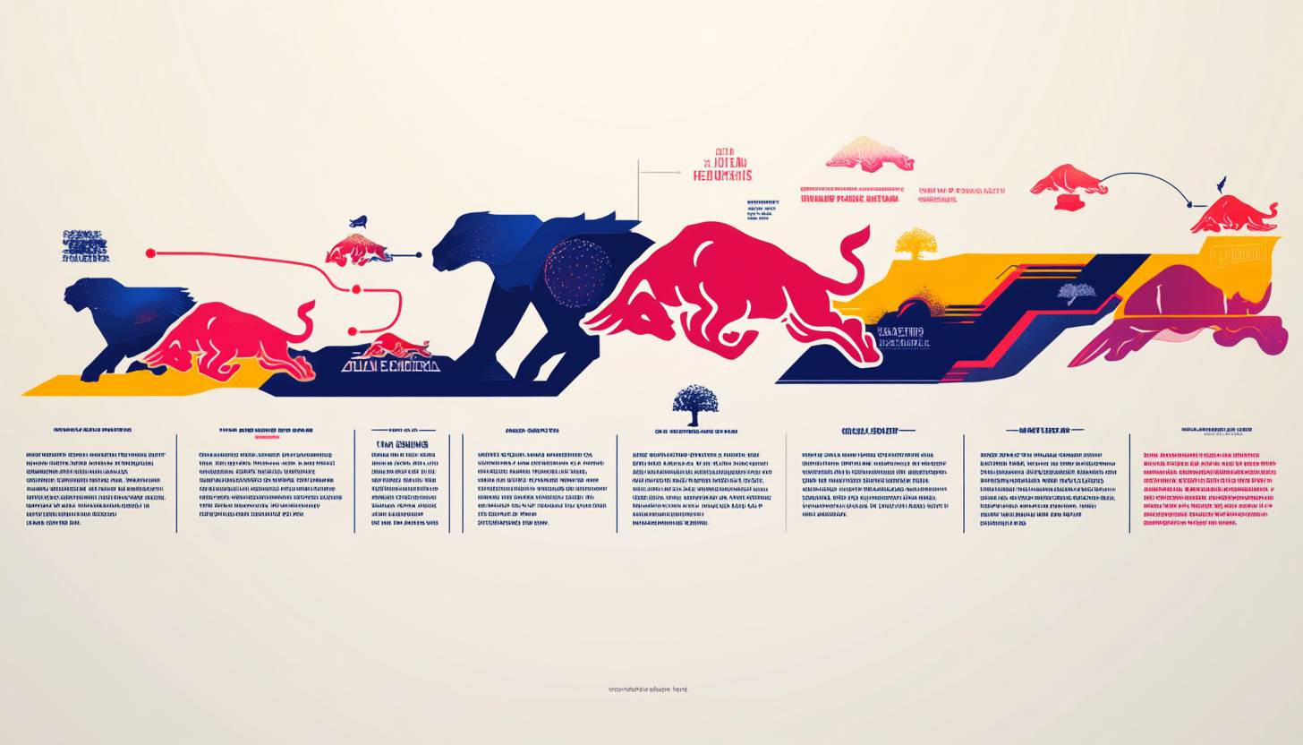
Part 5: Analysis: Evolution of Red Bull logo design
Every graphic designer knows that the logo is not just a visual icon, it embodies the identity of the brand. The exciting emblem that has endured the trials of time is Red Bull’s logo design. The evolution is not just a story of color or form, but rather a story of innovation, adaptability and business sense. The evolution of Red Bull logo design with detailed analysis
Simplicity and consistency
Since its birth in 1987, Red Bull’s logo design has remained true to its prototype. The design of the two Red Bulls colliding against the sun is simple to understand at a glance. This consistency builds brand trust and ensures that the logo is familiar to audiences around the world. Understand what keeps Red Bull flying high.
Symbols of Color
Red Bull logo design color palette is a deliberate choice. Red represents energy and passion and is consistent with the core of the product. The evolution of these colors remains within this theme while maintaining the image of the brand.
Responding to legal and ethical issues
In 2014, RedBull logo design overcame a major storm of lawsuits over slogans. The emblem itself was not changed, but this is a testament to the brand’s resilience. This adaptability in the face of legal challenges reflects the maturity that graphic designers need to learn in overcoming complex branding worlds.
Consistency with marketing strategies
Red Bull is synonymous with adventure, extreme sports and cutting-edge music. The logo evolves in line with these marketing strategies and is a symbol of a high-energy lifestyle. Not only the logo, but also the empathy of the audience as a culture icon, demonstrating the power of design and marketing collaboration.
Versatility with simplicity
RedBull logo design is simple, so it can be used for various platforms and products. Whether it is a race car or a drink can, its essence does not change. The versatility of this design is an indispensable lesson for graphic designers and demonstrates how simplicity can lead to adaptability to diverse media.
Part 6: Philosophy and meaning of Red Bull logo design
Every logo has a story, but some have a story that resonates on a deeper level. A perfect analogy exists in the Red Bull logo design which matches the brand values beyond iconic beauty through its meaningful philosophy. All graphic designers seek a perfect union of visual appeal with substantial meaning. Wearing our imagination cap lets us investigate the philosophy and significance behind Red Bull’s contemporary symbolic logo.
Energy and Vitality
The two Red Bulls in RedBull logo design are not just images, but they represent raw energy and vitality. This is a direct nod to the physical energy enhancement this beverage promises. This visual metaphor fits perfectly with the product, creating an immediate connection between consumers seeking an explosion of energy.
Duality and Competition
The clash of bulls signifies duality and competition, symbolizing battle in sports, work and daily life. A philosophy that reflects the competitive principles of our society and empathizes many people. This is an empathy among the brand’s target audience, especially those involved in extreme sports and high-performance activities.
The sun as the source of life
The golden sun behind the bull symbolizes the source of life and energy. In many cultures, the sun is reminiscent of power and vitality, and it brilliantly reflects Red Bull’s message. Gold color further enhances this image, adding a sense of luxury and superiority to Red Bull’s logo design.
Global Appeal
Inspired by the energy drink “Krating Daeng” in Thailand, the logo to appeal globally was born. They are familiar in various markets without being caught by specific cultures and layers. The universality of its symbolism is an important aspect of the success of this logo, showing how culturally inclusive design can affect a wide range.
Resilience and Adaptability
Red Bull’s logo design philosophy also describes resilience and adaptation. Keeping business spirit faithful to brand roots represents an essential design philosophy which helps brands meet environmental changes. Red Bull’s logo design is not just a picture but a philosophy. Energy, competition, life, global resonance and resilience are woven into simple.
Part 7: What to learn from Red Bull logo design
Designing a logo that is a symbol of a generation is a dream of a graphic designer. The unique logo of Red Bull showcases exact implementation of this vision. A single origin of the emblematic design can be traced back to where? The Red Bull brand logo creates crucial learning opportunities when properly evaluated. Five foundational principles in this section will help your creative processes.
Simplicity keys
Red Bull’s logo design tells us that simplicity often exceeds complexity. This logo, a simple depiction of two bulls and the sun, is not only visually attractive but also memorable. This simplicity improves adaptability to various media and reminds us that sometimes fewer people become more.
Embrace Symbolism
Red Bull’s logo design is meaningful for all elements, from color selection to image. By using symbolism well, you can connect with the audience at a deeper level. This is a lesson to ensure that all design choices resonate with the core message of the brand and the target market.
Consistency to Builds Trust
Since 1987, the Red Bull logo has remained largely unchanged. Heptaxonin A created a long-lasting brand image that fostered trust between the company and customers while establishing brand visibility across markets. Consistent application of this successful design approach by the brand demonstrates its main capabilities as well as assures customers it offers reliable security
Global reach by universal image
The universal appeal of Red Bull’s logo design lies in its image beyond cultural barriers. By choosing a symbol that is familiar to the world, the Red Bull logo is sympathetic in various markets. This universality is an indispensable lesson for designers who aspire to design with a broad appeal.
Consistency with brand value
Red Bull’s logo design perfectly aligns with the brand’s values and marketing strategies. Whether sponsoring extreme sports events or positioning them as premium energy drinks, the logo corresponds to these aspects. Design represents an essential part of the entire brand strategy so it should not operate independently from the rest of the strategy.
Part 8: Arvin AI – Revolutionizing AI for Business and Creativity
Arvin AI serves organizations and marketers as a beneficial program that assists them to advance their positions in the current digital period using innovative solutions. Artificial intelligence technology enables the system to enhance marketing proficiency as well as visual content delivery techniques. Through Arvin AI digital marketing specialty businesses can receive state-of-the-art solutions.
Key Features of Arvin AI
- Easy Branding: It allows companies to create logos and branding in seconds using simple clicks.
- Instant Content Creation: Creates content such as text, images, and marketing documents instantly.
- Improved Digital Marketing: Enriches social media, ad campaigns, and SEO methods.
- Easy to Use: Made for all, including novices. No complex setup or training needed.
- Saves Time: Automates routine tasks so companies can concentrate on expansion. Boosts efficiency.
Steps to Use Arvin AI for making Logo
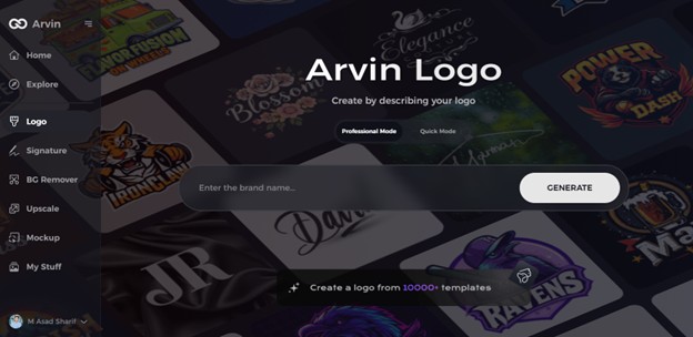
Step 1: Visit the Arvin AI Website
Open your web browser and navigate to the logo design page at Arvin AI logo maker. This is where your journey into logo exploration begins.
Step 2: Provide Relevant Information
Input essential details about your interest, such as the Subaru logo or other logos you’re curious about. This step helps the AI tailor its insights to your needs.
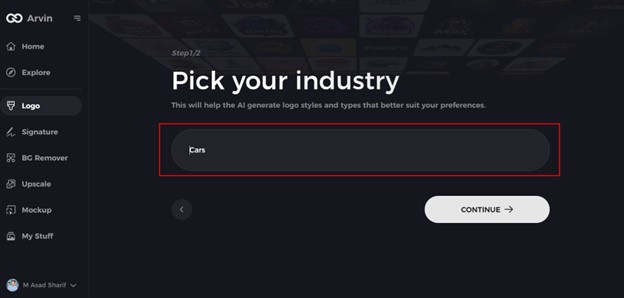
Step 3: Select the Industry
Choose the “Automotive” category to focus on logos related to car brands like Subaru. This narrows the scope and refines the AI’s responses for an in-depth exploration.
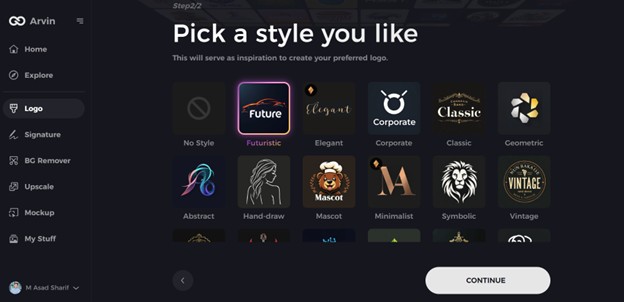
Step 4: Choose a Style or Let AI Decide
Browse through available styles or skip this step to let the AI present its interpretations. This feature is perfect for analyzing the Subaru logo’s unique design elements.
Step 5: Discover Logo Insights
The AI will generate detailed insights about the Subaru logo, including its history, symbolism, and design evolution. Review these to deepen your understanding.
Step 6: Personalize Your Experience
Customize the exploration by adjusting focus areas, such as the symbolism of the stars or the significance of the oval shape in the Subaru logo.
Step 7: Save and Share Your Findings
Download your insights or share them in formats like text or graphics. These outputs can be useful for presentations, discussions, or personal learning.
Conclusion
RedBull logo remained robust and solid throughout the years, assisting in making the company one of the world’s best. It is evident here that an excellent logo can act as an awesome marketing weapon. If you prefer to get your brand an interesting logo, go for Arvin AI. It makes it simple to design logos using easy tools, quick logo-making, and superior designs. If you’re launching your business or your brand needs renovation, Arvin AI assists in creating a remarkable logo.
FAQs
What is the meaning behind the Red Bull logo?
As the symbol for power and vitality the Red Bull logo presents two bull figures to depict these characteristics. Strength alongside rivalry and determination are depicted.
Has the Red Bull logo changed over the years?
No, the logo has remained largely unchanged. Maintaining it unchanged assists individuals in recognizing the brand immediately.
Why is the Red Bull logo so effective in marketing?
The brand uses strong design elements together with bright colors to achieve strong visibility in the market.
How does the Red Bull logo compare to other energy drink brands?
Red Bull’s logo is powerful yet simple. Other companies’ logos lack a clean and timelessness that is easily recognizable.
