Red Bull, the energy drink giant, has carved out a niche market in the world with its adventurous and high-energy branding. This branding is central to the identity of the company and global recognition, and that is the Red Bull logo. This logo is not a mere symbol but representation of the brand value that speaks ‘’vitality, energy, and performance’. In this article, the author also takes a closer look at the historical background of the Red Bull logo, its meaning and development, in order to demonstrate how the emblem has shaped Red Bull’s brand concept and helped the company become an international giant.
Part 1: The Origins of the Red Bull Logo
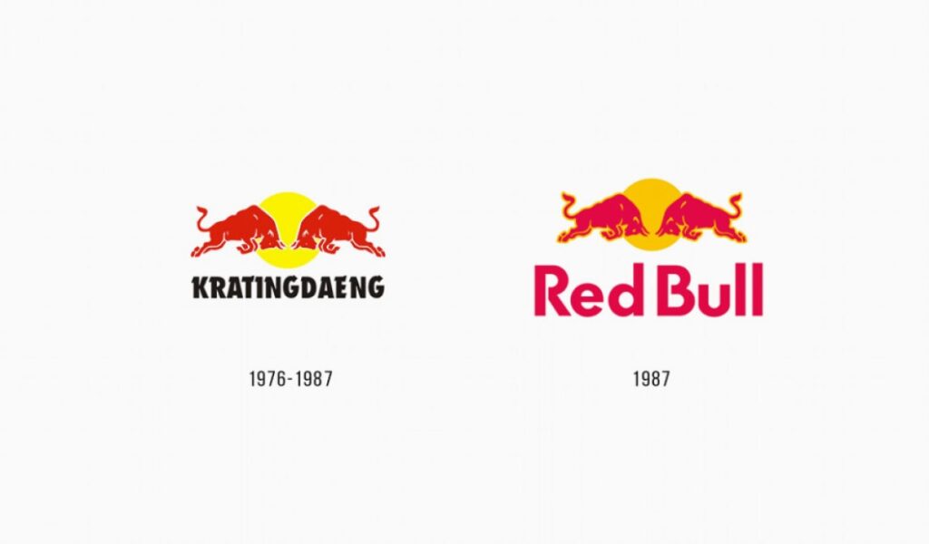
Red Bull was founded in 1984 by Dietrich Mateschitz, who was inspired by a functional drink from Thailand known as Krating Daeng. Now that the brand is ready to enter the European market, it will require a catchy logo to stand out in the newly introduced beverage energy drink market. The logo would sum up the core values of the brand: energy and vitality, in a way that separates it from its competitors.
Early Inspirations and Designs
The Red Bull logo was designed on the theme of symbols representing power and energy. The symbol most associated with power and strength, as well as endurance, is the bull. Sketches initially involved the idea of drawing a bull with dynamic poses representing motion and aggression. These initial ideas became critical in providing the brand visual identity as it was trying to reach out consumers at an emotive level by using attributes that the company wanted the product to project.
The Selection of the Final Logo Design and Its First Appearance
Final design of logo consisted of a charging red bull run toward a yellow sun, in two opposing directions. This design was based on its forceful visual effect as well as being symbolic for power and life force. The Red Bull logo first appeared in the year 1987 when it was first released in Austria. This association of visual identity with brand messaging would have thus put a solid foundation for a presence right from the launch, which eventually led to the now-famous Red Bull logo forming the heart of any global recognition package.
Part 2: Evolution of the Red Bull Logo Over the Years
The Red Bull logo has undergone various transitions since its origin. It experienced several subtle fine-tuning rather than complete makeovers. This development is a result of the urge to maintain consistency with the image while adopting changes in contemporary standards of design. Initial versions were more like a simple, rough, hand-drawn style and slowly evolved into a neater version. Updates included perfecting bull contours and also optimally rearranging color combinations so that it would be more distinguishable on different media forms.
Comparison of the Original Logo with the Current Version
The older Red Bull logo consists of strong lines and contrasting color combinations, therefore, it looked quite rough, but over the ages, it could develop more fluid and slick lines along with a milder color combination which helped to enlarge its application range for print and digital materials. Today’s version is way more balanced visually, carrying some modern aesthetic touches while maintaining a great balance in iconic elements such as the charging bulls and the sun.
Reasons Behind the Design Changes and Their Impact on the Brand
The argument of redesigning the Red Bull logo is that the brand had to remain relevant and attractive to the next generation. When developing new media, the logo needed to accommodate all these forms from classical print to digital screens. All of this helped Red Bull stay as a powerful image at the level while the logo stayed instantly recognizable and resonant.
Part 3: Symbolism and Meaning Behind the Red Bull Logo
The Red Bull logo is much more than a symbol, but it symbolizes deep meanings in culture and psychology. The bull, down to the color, has each element that goes into the construction of the logo, which reflects the brand identity and message conveyed to consumers globally.
The Choice of the Bull and Its Cultural Symbolism
The bull in the Red Bull logo represents power, strength, and energy. It is associated with the energizing product the brand offers. Bulls are symbols of vigor and ferocity across cultures, sometimes related to courage and perseverance in rites and games. Through the use of the bull, Red Bull exploits these international symbols, linking them across borders.
The Significance of the Color Scheme (Red, Blue, Yellow)
Each of the colors used for the Red Bull logo has different symbolic meanings: red, dominant on the logo, is a synonym for energy and excitement and actions, which reflect the brand essence of giving one an energy boost. Blue will give a feel of trust and reliability, and balance the highly energetic impact given by red. Yellow, seen at the sun in the background with the bulls, symbolizes optimism and happiness.
The Psychological Impact of the Logo Design on Consumers
Red Bull logo design consists of very vibrant colors with dynamic imagery and creates a powerful psychological impact among the consumers. The aggressive position of the bulls along with vibrant colors creates powerful feelings of vibrancy and exuberance in consumers. These make the logo easy to identify and remember. This energetic design stimulates consumers to relate Red Bull to action and adventure and, by that, relate to the energy promise of the brand.
Part 4: The Role of the Red Bull Logo in Marketing and Branding
The Red Bull logo is used effectively in marketing or branding strategies of the organization. Dulux’s use in series of platforms and occasions has created its brand image as representing energy and adventure.
How the Logo Contributes to Red Bull’s Marketing Strategies
The essence of marketing, the Red Bull logo, encompasses the overall values of energy, adventure, and dynamism. The consistent use of to the logo in all marketing material build up a strong visual identity; the consumer is associated the logo with the high energy message of the brand. Consequently, it serves a semiotic function as an iconic representation of the promise that Red Bull delivers, and it is fully implicated in virtually all advertising and branding initiatives, promotional events, and sponsorships.
Examples of Logo Usage in Advertising Campaigns and Events
One of the most prominent features of Red Bull’s advertising and events campaigns is its Red Bull logo. The logo is clearly visible, promoting the brand image through it. In high power advertisings with extreme sports action, the presence of the logo subtly communicates the brand’s energetic personality. Such a usage, besides increasing the familiarity level, makes Red Bull synonymous with excitement and experience.
The Logo’s Presence in Red Bull’s Sponsorships and Global Events
The Red Bull logo is embedded in the sponsorship and global events of the brand, which makes the brand energetic and adventurous. The logo is brought out on all sporting equipment and signs during events, thus increasing visibility and association with the brand. By sponsoring global international events, like Formula 1 racing and extreme sport competitions, the logo spreads throughout and gets the brand associated with energy-generating activities.
Part 5: Transform Your Logo Design with Arvin AI
Arvin AI is a revolutionary tool that can transform your approach to logo design. Its advanced AI capabilities will help both new and seasoned designers produce amazing logos in the shortest time possible. With its understanding of brand identity, making tailored recommendations for each case, Arvin AI makes sure that every logo is unique for today’s competitive market.
Key Features of Arvin AI
- AI-Powered Design Suggestions: Creates inspiration based on brand values and preferences.
- Customizable Templates: Lends to a wide range of templates to suit your starting needs.
- Instant Preview: Returns a live preview of how your logo might look and feel across all the media.
- High-Resolution Exports: Offers exportation of logos in various resolutions to print and digital media.
- User-Friendly Interface: Drags along an intuitive interface to make the design process less complicated.
Steps to Use Arvin AI for making Logo
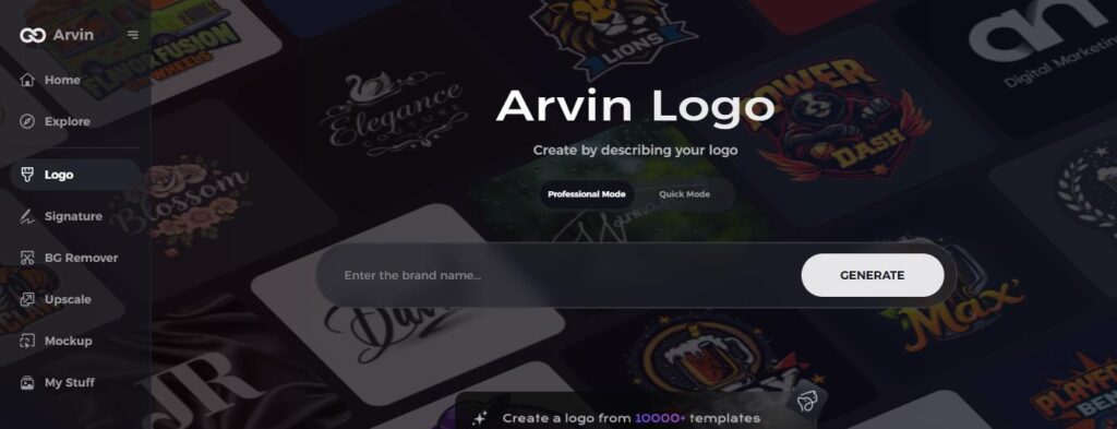
Step 1: Create an account and log in on Arvin AI
Visit the website of Arvin AI, open an account, and log in for the logo design feature.
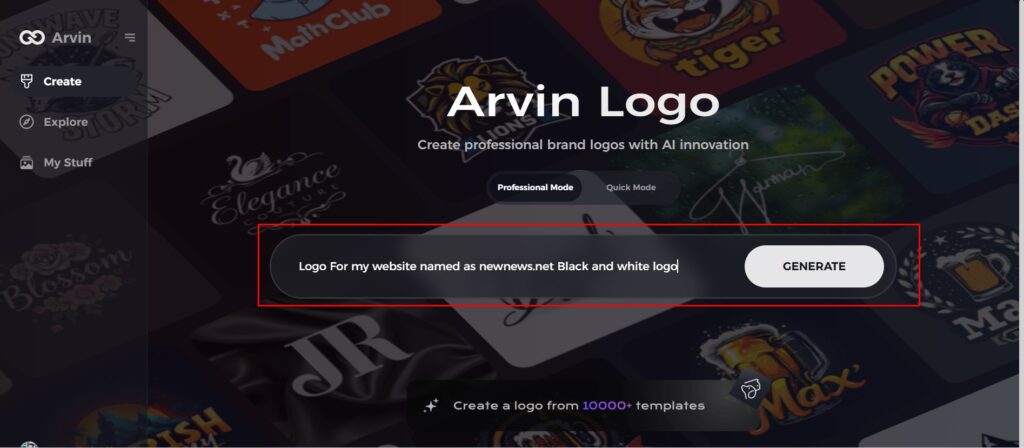
Step 2: Input your brand information and preferences
Input your brand name, slogan, and industry. Specify all your design preferences, which may include font styles or images themes.
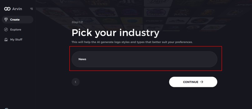
Step 3: Pick your industry:
Now select your industry related to your niche. This will help the AI generate logo styles and types that better suit your preferences.
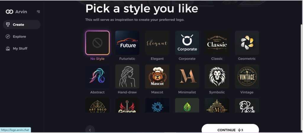
Step 4: Select Style:
Now select a style which you would like and continue. This will serve as inspiration to create your preferred logo.
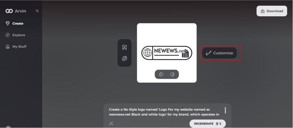
Step 5: Design Personalize through the tools of Arvin AI
After Arvin AI gives create your logo, you can customize those logos with the tools that have elements such as font style, layout, and the positioning of symbols. Experiment on different designs until you like what you see.
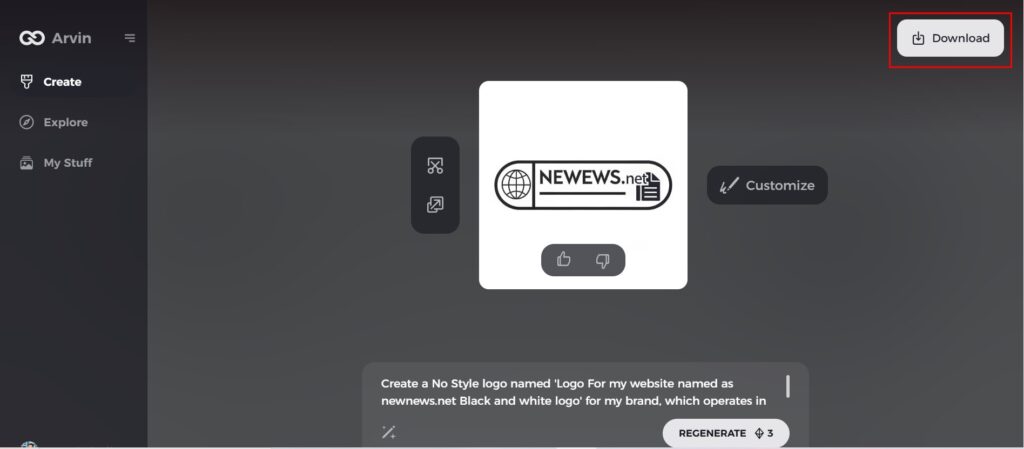
Step 6: Save and download the final logo
Preview the finished logo and save it in a high-resolution format for both print and digital uses.
Conclusion
Red Bull logo evolution is perhaps one of the best examples that show just how significant a logo can be in defining the whole intent of the brand. Little has been done to minimize the masculinity as the design is big, powerful, and is representative of energy. It is possibly one of the most identifying logo in the entire world. Every company interested in transforming its logo into a signification people can rely on in their day to day life has to digest a lot of thinking. Arvin AI tools enable one to create a logo that not only represents his personality but also the business communicating with its target audience on the same page as the business.
FAQs
What does the bulls logo mean?
The official emblem features two humped bulls (in fighting position) in front of a golden halo in Bull Logo – a perfect depiction of action, strength, and stamina.
Is the Red Bull logo different today than it was in the past?
Yes it can modify to remain relevant while retaining major features of the current logo.
Why is the Red Bull logo so successful in marketing?
Its perhaps the simplest design, unique colors, and highly powerful imagery that make it easily recognizable and memorable for the purpose of brand imaging.
How could I make a logo like Red Bull’s using Arvin AI?
Arvin AI provides tools that walk you through designing a logo, and all these things are so professional and impactful.

