Real Madrid is one of the most prominent football clubs recognized all over the world for success and history. The logo is a symbol of a club, and it portrays some values and tradition that stand at a universal level. Indeed, the change and evolution of time depict the same sense of pride and excellence. The history of change and evolution, importance of the logo in terms of its growth alongside success, and existence all over the world of the Real Madrid logo is going into detail within this article.
Part 1: The Origins of the Real Madrid Logo
Real Madrid was establishe in 1902, and the first logo represented the club’s initial years. It featured a crown, which signified the connection to the Spanish monarchy. The letters “M” and “C” were use to abbreviate “Madrid” and “Club,” respectively and these were very essential to the club. The colorful logo used were simple but had deep meanings to represent the values of the club.
Part 2: Evolution of the Real Madrid Logo through the Years
Over the years, the logo of Real Madrid has undergone changes to fit with the growth of the club as well as in the world of football. In this section, we take a glimpse of how it evolved from an early design up to the modern one we have today, as well as other important moments during its transformation.
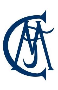
1902 — 1908
The first Real Madrid logo was design in 1902 with a monogram of “MFC,” meaning the Madrid Football Club. In a deep blue gothic style, a custom serif font was used with sharp points at each end of the letter. C “and” M “With a clear linear outline,” F “was smooth and curved.
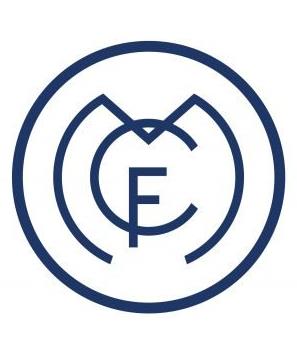
1908 — 1920
The original logo was create in 1908. Although it was still a monogram of “MFC,” it was surround by circles in a modern unique style. The largest character of the emblem, “M,” repeats the outline of the circular frame and “C” is slightly smaller and placed inside “M,” crossed at the top of it. The smallest letter “F” crosses the lower end of “C” with a vertical bar. The emblem is the same blue and white tone, representing reliability and basic attitude.
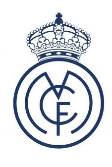
1920 — 1931
The club was given the royal title in 1920, and a famous crown appeared in the emblem. It remained a badge from 1908, and although the outline of the letters was slightly modified, a large decorative crown was placed on a circle. It was also painted in blue and white, and it was a powerful and balanced design.
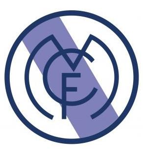
1931 — 1941
In 1931, the crown was removed from the logo, and a wide slope of purple was placed inside the circle of the logo. It honors the Castile region and repeats its flag. The logo of the 1930s was the last without a crown, and this was the case because the use of symbols related to the monarchy was forbidden during its historical period.
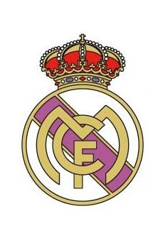
1941 — 1997
The crown was restored in 1941, and the entire logo was redrawn. The composition of the symbolic monogram surrounded in a circle and placed a huge crown on it remained intact, but the color palette was changed and the line was modified. The crown was decorated with several colored stones in gold and red tones. The main badges are white and golden, with light purple on the diagonal.
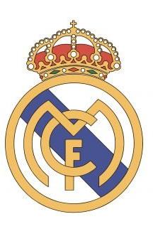
1997 — 2001
In 1997, the color tone was changed to a brighter and fresher one, the purple color changed to a calm blue color, and the golden frame with the letters became yellow and brighter. The crown was also recreated, making it more delicate and elegant.
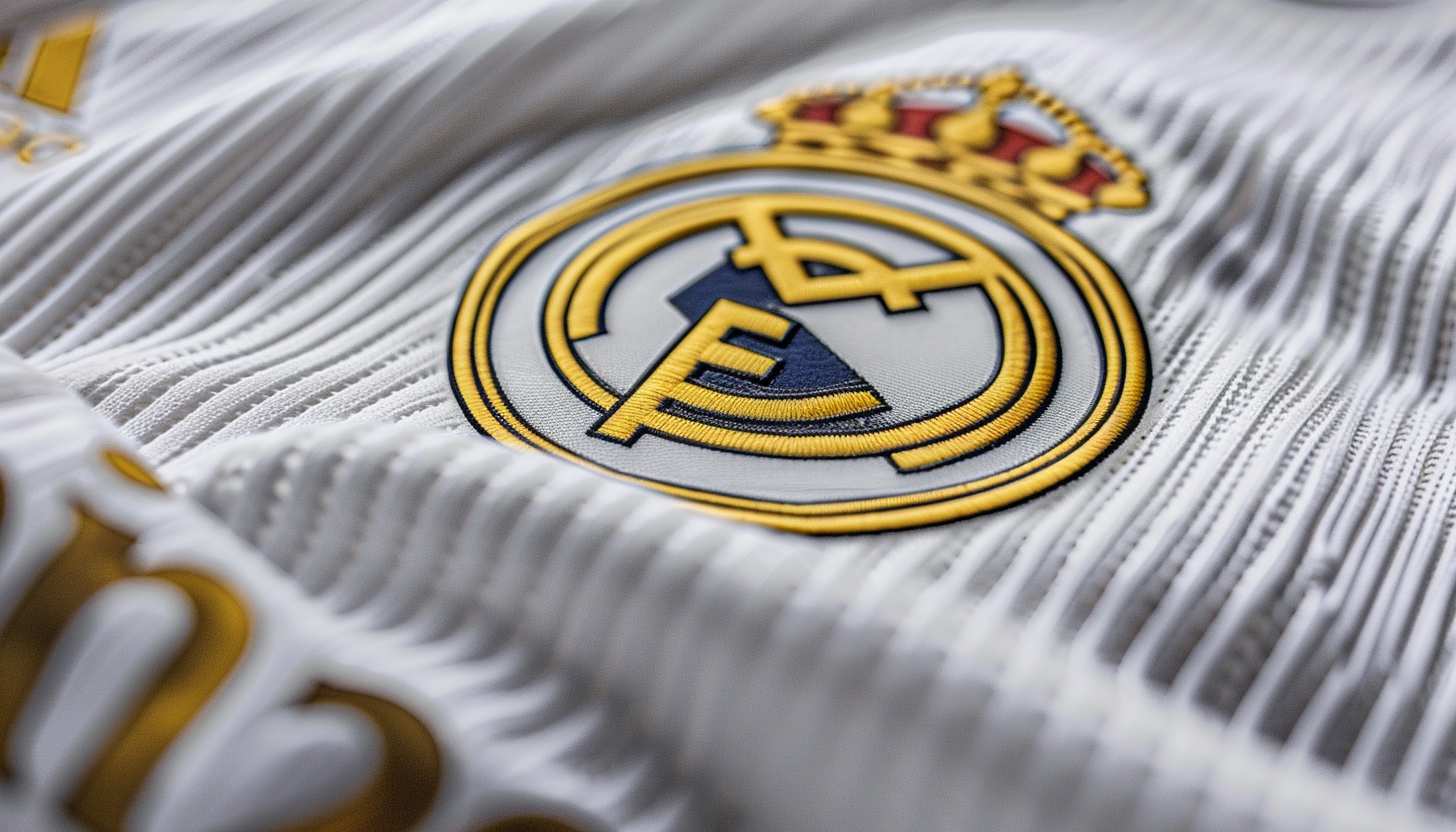
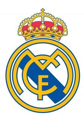
2001 — Today
In the 2001 redesign, the logo became flat again, the letters were placed on a single plane, and the outline became a common blue outline. The yellow frame of the emblem is the same bright blue outline, perfectly balancing the entire logo. Real Madrid’s visual identity is based on the minimalist and stylish emblem of the club’s founding.
Part 3: Interpretation of the Symbolism from the Real Madrid Logo
The Real Madrid logo is more than just a design. It has meaning down to its core and represents who the club is. There is some significance to each part of the logo, symbolizing the values and history of the club. Let’s break down what these key elements may symbolize.
- Meaning of the crown: The crown in the logo represents the royal status of Real Madrid. It was added to honor the club’s special connection with the Spanish monarchy, as the king granted them the title of “Real” (meaning royal). It shows that the club has always been seen as prestigious and powerful.
- The importance of the “M” and “C”: The letters “M” and “C” represent “Madrid” and “Club,” which will give the essence of the club. These letters prove the point that the logo does represent a football team but then it represents the city of Madrid and its proud football culture. They do make a difference in what Real Madrid represents.
- Color significance: The usage of white and purple in the logo is symbolic. White stands for purity, excellence, and fair play on the part of the club. Purple is a royal color with prestige, which reminds one of their royal connections. In a word, all the colors bring to mind its rich tradition and noble character.
- Circular design: The roundness of the logo actually epitomizes unity and wholeness. It gives the impression of unification because Real Madrid is not just a club but a world community of supporters, players, and fans. Everything fits and is part of something greater in the circle.
Part 4: The Role of the Real Madrid Logo in Club Branding
The logo of Real Madrid is much more than an image. Club branding gets influence from this element while maintaining its position as an essential facet of club-fan communication across worldwide territories. Now let’s study how the logo presents the identity of the club along with great reputation.
Real Madrid as excellence and success
Instantly recognizable, the Real Madrid logo symbolizes excellence in football. All the years have reflected the club in a very significant manner, establishing it as the best title-winner and also the best to perform at any level. The logo is rich with its meanings and history; it represents a hard-working success that has brought Real Madrid one of the most glorious places in football.
Logo connects fans
Fans use the Real Madrid logo as an excellent means to consolidate their relationship with the club. It is not just about the design but what it represents—pride, success, and a long tradition of greatness. For the fans, wearing the logo or seeing it on merchandise gives them a feeling of belonging to something special. This strategy helps a club build dedicated fan bases because its supporters associate with both club principles and victories.
Logo and trophies connection with club
The logo of Real Madrid is also so much attached to the heritage of the club by winning the titles. With each major title the team wins, the logo symbolizes all that hard work that went into bringing home that particular victory. It is always the mark of proud heritage that exists from the club, Champions League titles, La Liga trophies, and many more accolades. This logo symbolizes not only the tradition of yesteryear but also challenges the club to thrive in the future.
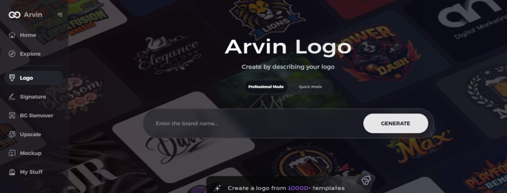
Part 5: Use of Arvin AI for logo design
Arvin AI is a tool developed to help businesses in the brand analysis and logo design processes. The AI system offers the company logos fitting their identity and needs. It does not matter whether you are establishing a new brand or just refreshing an old logo. With Arvin AI, this becomes much easier because it analyses trends and styles and provides creative ideas. It is a good option for those who want an easy and effective way to design a unique logo for their business.
Key Features of Arvin AI
There are following key features of Arvin AI:
- Simple interface for easy logo design: User-friendly design tools to make logo creation hassle-free.
- Instant feedback and revisions: Quickly make changes to your logo until it’s perfect.
- Wide range of logo styles to choose from: Offers various styles to suit different business needs.
- Compatible with all business sizes: Whether you’re a startup or a large company, Arvin AI fits your needs.
- Supports multiple file formats for download: Get your logo in different formats for print or digital use.
- Creative design suggestions: Stay up-to-date with the latest logo design trends.
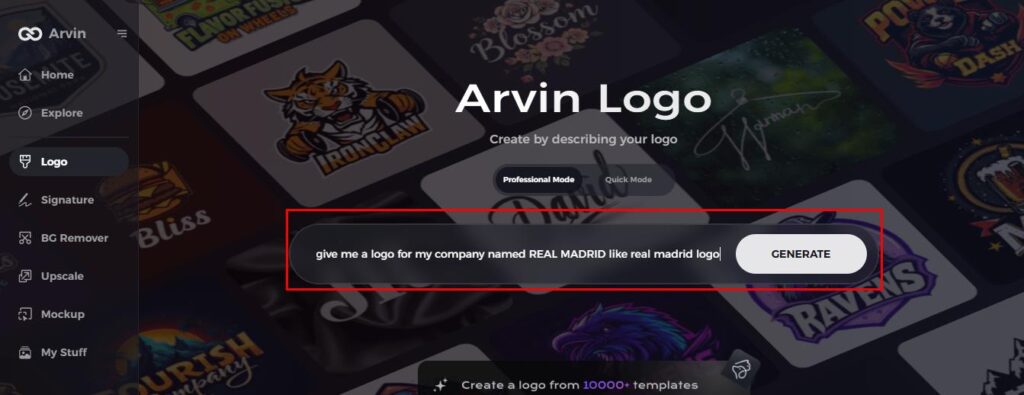
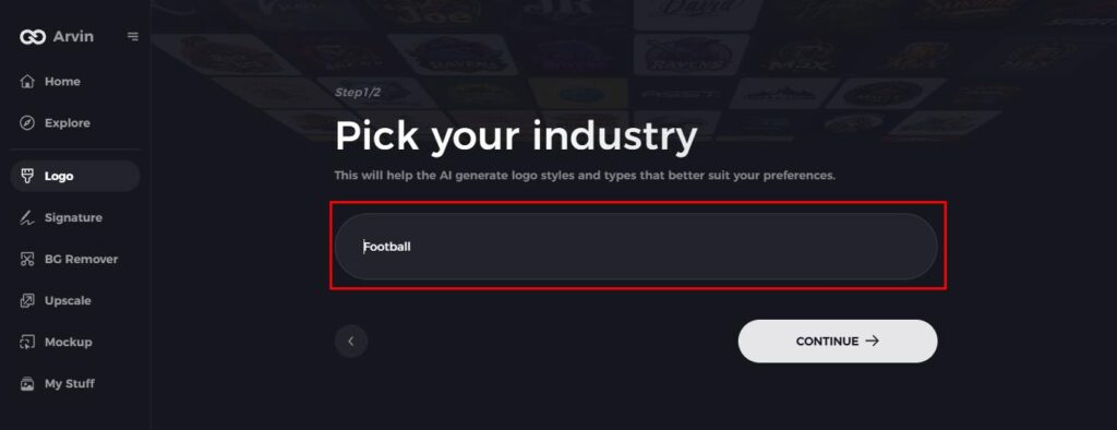
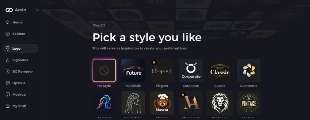
Steps to Design Real Madrid-Inspired Logo with Arvin AI
Step 1: Sign up and log into Arvin AI
Open the Arvin AI logo maker website, sign up, and log in to begin designing your logo.
Step 2: Fill your brand details and preferences
Insert your brand name, slogan, and industry. Give the AI a bit of direction by informing it of your design preferences, including font style or image themes.
Step 3: Select your industry
Select your industry, such as sports or football, so the AI can generate logo styles suited to your brand’s niche.
Step 4: Select a style
Select a style that appeals to you. This will inspire your logo creation, focusing on your desired aesthetic and overall vibe.
Step 5: Personalize your logo with Arvin AI tools
Once Arvin AI has produced a logo for you, you can refine it further by altering the font style, layout, and symbol position. You will have to go through various designs until you’re satisfied.
Step 6: Save and download your final logo
Preview your Real Madrid-inspired logo and save it in a high-resolution format, ready for both print and digital use.
Conclusion
The Real Madrid logo has been the most powerful symbol of the long, prosperous history of the team. Through its evolution over the years, it might resemble the growth and prestige of the club. Brands that wish to connect with their audience through their identity should use logos for powerful introductory communication. Those who want to design impactful logos should use Arvin AI for producing banner elements that create brand resonance with specific audience segments.
FAQs
Why does the Real Madrid logo feature a crown?
The crown shows that the Spanish monarchy supports the club, therefore high status and prestige.
What are the basic design elements of the Real Madrid logo?
A crown letters “M” and “C” for the Madrid Club and a circular shape, with the colors white, purple, and gold representing purity, royalty, and tradition, respectively.
How has the Real Madrid logo changed over the years?
The development of the club’s influence became visible through its changing logos starting with basic designs and evolving to sophisticated ones.
How might Arvin AI be helpful with logo design?
Arvin AI is a tool that gives design proposals for businesses or individuals. It’s used to make logos by giving ideas on brand analysis and very accessible features to achieve the perfect logo for your business.
