Brands with iconic slogans are part of brands with iconic logos, and Pringles is no exception. Since its founding, Pringles has been loved and loved by consumers. It is also difficult to find a chips brand that brings the same joy as when opening the chips tube by looking at Mr. Pringles on the label. There is a story on the other side of every logo, and I will dig into it in this blog. Pringles has a story until the birth of its iconic logo, which we can all learn. Read on to learn the history of the brand and how the most widely recognized potato chips logo created.
Part 1: Evolution of Pringles
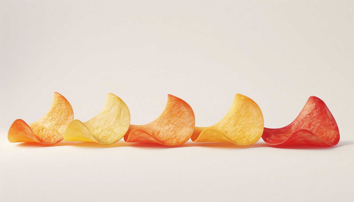
The journey of Pringles is a fascinating tale of innovation, marketing brilliance, and global popularity. From its unique saddle-shaped design to its iconic cylindrical can, Pringles has revolutionized the snack industry.
1956: Pringles Idea
Prior to Pringles’ development, chips had a strong image of being greasy and fragile. In 1956, Proctor & Gamble began to find a solution so that chips enthusiasts could continue to eat chips in a way that was not greasy and difficult to break. To create the perfect chips for a fragile and appropriate package, Proctor & Gamble invited chemist Frederick J. Bauer.
1965: Pringles Dawn
Bauer first began making the saddle-shaped chips we know today in 1965, about 10 years after Proctor & Gamble had helped him. The design of the chips was his idea, but he could not finish the chips that consumers wanted to eat.One of his achievements, however, was the creation of a tube-shaped can still used in chip packaging. This package was crucial to the design to ensure that the chips never broke.
1968: Proctor & Gamble finally starts selling Pringles
After Bauer failed to make a delicious recipe for chips, another researcher at Procter & Gamble, Alexander Leapa, realized this. Alexander was a chemist who created the taste of chips, so the patent lists his name instead of Bauer. In 1968, with chip sales ready, Proctor & Gamble began selling chips in Indiana after a targeted marketing campaign. Soon after, Pringles became available throughout the United States.
1980s: Pringles’ breakthrough
After a marketing campaign entitled “Enthusiasm for the flavors of the Pringles” and a TV commercial featuring Brad Pitt, it began in the 1980s. With the support of this new Pringles fan, the brand renewed its logo.
1991: Pringles grows internationally
After gaining popularity in the United States, Pringles Brand entered the international market and began to expand globally. By 1995, Pringles was available in Europe, Latin America and Asia. Along with these new markets, new flavors have emerged to appeal to the new tier. These new flavors were not bound by existing concepts such as Prawn Cocktail, Seaweed, Serrano Ham, and Blueberry.
2008: Bauer passed away
Bauer was not the person who developed chips, but the person who developed cans. When Bauer passed away in 2008, his bereaved family buried his ashes in a can of Pringles and honored it just as he had designed it a few years earlier.
1991: Pringles grows internationally
After gaining popularity in the United States, Pringles Brand entered the international market and began to expand globally. That year, Pringles released the catchy slogans “Once you pop, the fun don” t stop “and” Once you pop, you can “t stop. By 1995, brands began selling Pringles in Europe, Latin America and Asia. These new flavors were not bound by existing concepts such as Prawn Cocktail, Seaweed, Serrano Ham, and Blueberry.
2013: Pringles Chips
It has been 47 years since it was developed, but people are still discovering new ways of eating. In 2013, for example, a video showing how to slide the chips all at once by sandwiching paper on the side of the Pringles tube swept the web. In addition, videos of Pringles lovers making Pringles’ “Ringle” (made Pringles independent with a ring) became popular.
Part 2: Meaning and history of Pringles logo
No matter which version of the Pringles logo you see, it is a cheerful and joyful logo. The first version introduced the brand’s mascot, Mr. Julius Pringles, and the mascot still associated with the brand today. This mascot may not be well known, but there is a back story. When making colorful logos, some features intentionally added to have a hidden meaning. For example, the oval shape of the early version of the face imitated the brand’s identity, potato chips.
1967 – 1986
The first Pringles logo still used a face for the emblem, but its face was different from the current one. This early work depicted a black thick outline of a man’s face. This oval outline depicted red and black hair and mustache, with red and white stripes on the cheeks. The brand name placed under the outline. This first version introduced the brand’s mascot, Mr. Julius Pringles, an outline man.
1986 – 1996
About 20 years after the first logo was announced, the logo updated and the shortened brand name “Pringles” and Mr. Pringles design were added. Mr. Pringles’ face is round, eyes round, mustache soft and rounded. The logo was different from the first for consumers, and the new look and font selection made the logo feel a new and fun energy.
1996 – 2002
The second version attracted a pleasant audience, but this updated version lasted only 10 years. When the logo was renewed again, Mr. Pringles was placed diagonally, and the color used was brighter. The rounded features of Mr. Pringles’ face removed, and earth color brown introduced. Also, the selection of fonts was devised, and more refreshing fonts were selected. By combining these features, the logo became more stylish.
2002 – 2009
The past two versions of the logo conveyed a fun and stylish atmosphere, but Pringles wanted to redesign the logo again to make it a more fancy and contemporary logo. As a result, Mr. Pringles’ hair and mustache color was updated to a bright brown logo colors, eyebrows were removed from the emblem, and a red bow tie was attached.
2009-2021
In the fifth version of this logo, only a few updates were made to the logo design. Pringles’ brand name now includes white edges to further emphasize the shadow of the word mark. The bow tie that officially included remained, but it became brighter and white as incorporated. Each element of this logo helped convey a childlike energy, capturing the nostalgia of those who have long loved the Pringles brand and the hearts of a new generation of Pringles enthusiasts.
2021 – Now
To cope with the evolving era, Pringles announced a new logo in 2021. Mr. Pringles is similar to avatars found in the virtual world by many consumers. Stylistically, Mr. Pringles became bold, his eyes small and bearded, and his eyebrows more dramatic. The logo redesigned by a new design studio, Jones Knowles Richie (JKR), and Pete Matthews led the design as the brand design manager for the Pringles.
Part 3: Design Elements of Pringles Logo
The Pringles logo is a well-known symbol in the snack world, instantly recognizable for its playful design and bold look. Featuring a memorable mascot, eye-catching typography, and vibrant colors, it reflects the fun and unique appeal of Pringles chips. While the logo has evolved over time, it has kept its distinct identity.
Pringles Logo Font
The Pringles logo fonts specifically designed for the brand. This font is similar to the Bodega Sans Medium font in the sans serif typeface. The font designed exclusively for the brand, and Thompson created this iconic typography by incorporating geometric elements into the design.
Pringles Logo Color
Throughout the year, Pringles are faithful to certain color schemes. Red was chosen to convey passion and excitement in the color that has been a staple of the brand for many years. Another standard is yellow, a bright color that conveys youthfulness. Other colors used in the logo are white, brown and black. These colors respectfully convey purity, reliability and elegance. The choice of these colors is deliberate, and both draw the attention of the audience.
Pringles Logo
The same logo always greets you when you pick up the Pringles canned food. “Julius Pringles” the name associated with the face of the anime. Julius is the face of the Pringles, with a black bow tie with eyebrows in 2002. The 3D version of the logo designed by Lewis R. Dixon and can now be found on a bow tie.
Part 4: Psychology of Pringles Logo Design
Study the origin of the Pringles logo along with psychological and design elements responsible for its success.
Awareness and consistency
One of the key factors that the Pringles logo boasts is its outstanding awareness. Whether you’re walking in the snack aisle or scrolling through social media, Pringles’ distinctive lateral face can be identified immediately. This high awareness is due to Pringles’ unwavering commitment to consistency in branding. Even after various changes in the logo, the core elements such as the shape of the horizontal face.
Simplicity and Memory
Another important factor in the success of the Pringles logo is its simplicity. This brand created a visually impressive and memorable logo by narrowing the design to the most necessary elements. The simplified Pringles icon is a perfect example of practicing this principle with a clean line and bold colors. Easy to recognize, remember, and reproduce, this design is a triple signature of the logo design.
Emotions and Personality
The original Pringles Man, with its friendly facial expressions and slightly exaggerated features, conveyed warmth and friendliness and contributed to bringing the brand to all age snack lovers. Even the more sophisticated and modern logo version maintains playfulness and personality, making Pringles distinct from its more serious competitors.
Part 5: Pringles Mustache: Case Study of Outstanding Branding
Pringles’ mustache is an outstanding branding case study. IVisual simplification eventually transforms into an essential brand identity component which substantially drives business achievement. The path from mustache to cultural icon from mere logo components demonstrates the power of consistent creative branding. Pringles’ mustache not only recognized but also loved.
The cultural impact of Pringles’ mustache
The cultural impact of Pringles’ mustache is not limited to marketing. Movie directors and creators frequently use this item for reference in their productions while social media platforms frequently create memes about it too. The mustache represents more than a food product because it encapsulates the essence of liberation and the creative spirit in life.
The mustache of the Pringles
From being a logo component in its infancy to being the cultural icon that it is now, mustache has been a part of the company’s history. Pringles’ lighthearted, revolutionary and always-smile-providing personality distilled. As Pringles grows and develops, mustache will certainly be along with it at its center.
Part 6: Lessons from Logo Design
So what can we learn from the lasting success of the Pringles logo? Here are some important lessons that can be applied to your logo design:
- Emphasize awareness: Making logos that can be understood at a glance, from a distance or small. It is important to consistently use the core design elements.
- Simply: Narrow down your logo to the elements you need most. The symbolic logo is often minimal.
- Create personality: Give your logo personality and emotion. Whether it is a friendly expression, a playful color scheme, or a whimsical touch, the logo can gain audience empathy by adding personality.
- Embrace evolution: Revamp your logo regularly to alter trends and preferences. However, maintain a consistent and strong visual identity in the process.
- Think of the whole picture: Remember that the logo is part of a more important brand identity. Let’s amplify it according to the overall personality and values of your business.
Part 7: Arvin AI: The Future of Logo and Brand Analysis
Arvin AI an innovative design platform tailored to simplify the process of creating impactful university logos to attract thinking. With its advanced features and user-friendly interface, it empowers users to craft Pringles logo that are visually stunning and deeply aligned with institutional values. Whether you’re a seasoned designer or a novice, Arvin AI helps transform ideas into professional-grade university logos effortlessly.
Key Features of Arvin AI
- Smart Design Templates: Arvin AI offers an expansive library of templates specifically for the branding of a university.
- Elements Which Can Be Edited: You may change each aspect of your logo based on the requirement of the institution-be it color palette.
- AI Suggests: This feature saves time because the logo automatically aligns with the institution’s identity.
- Scalability Optimization: The logos created using Arvin AI are vector-based, meaning that no matter what size or format.
- Collaboration and Feedback Tools: This platform includes features for real-time collaboration, to review and provide input on the design in real time.
Steps to Use Arvin AI for making Logo
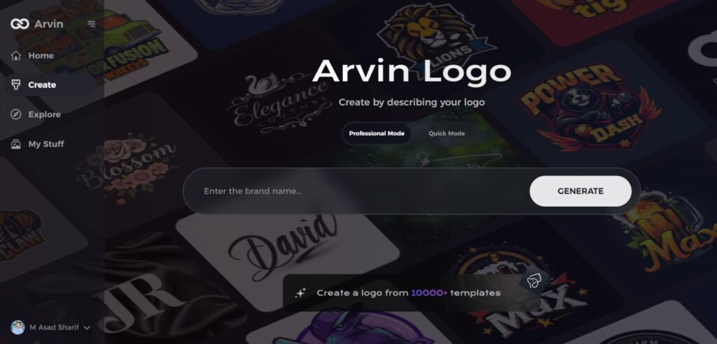
Step 1: Visit the Arvin AI Website
Open your web browser and navigate to the logo design page at Arvin AI to begin crafting your emblem logo.
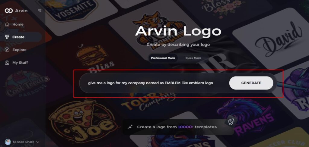
Step 2: Enter Your Business Details
Provide essential information about your business, including your business name and category. This helps the AI tailor designs that aligned with your specific brand identity.
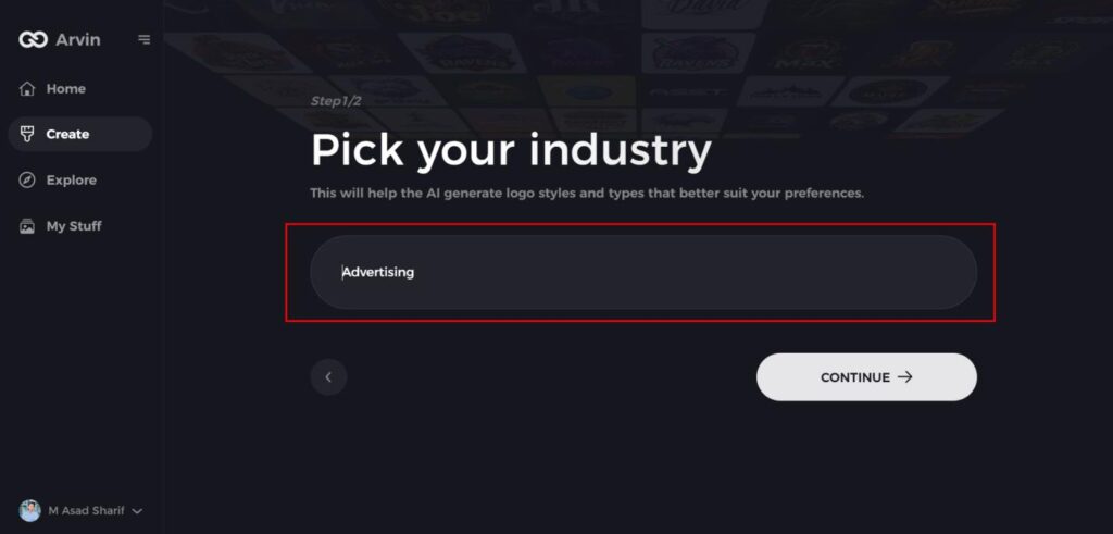
Step 3: Select Your Industry
Choose the industry your business operates in from a list of options. This step ensures that the AI refines the logo styles to match the trends and aesthetics relevant to your field.
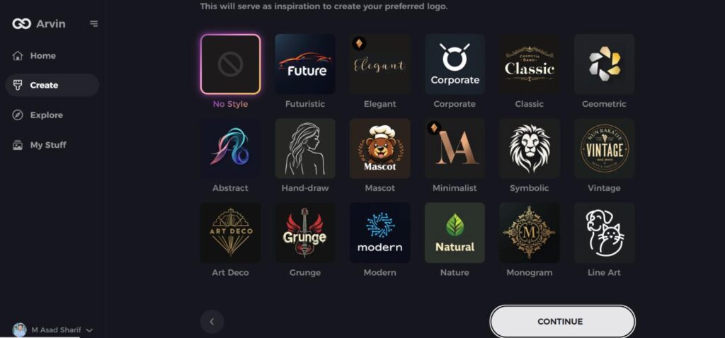
Step 4: Choose Your Design Style
Browse through the available design styles and select the one that best represents your brand’s vision. If you’re unsure, you can skip this step and allow the AI to generate logo ideas based on default inspirations.
Step 5: Review Logo Concepts
The AI will generate a selection of emblem logos based on the details you’ve provided. Take your time to explore the options and select the ones that best reflect your brand image.
Step 6: Customize Your Logo
Fine-tune your chosen logo by adjusting elements such as color scheme, font, icons, and layout to perfectly match your brand’s style and tone.
Step 7: Download Your Final Logo
Once you satisfied with your emblem logo, download it in high-quality formats like PNG or SVG. These formats ensure your logo is ready for use across websites, social media, and print materials.
Conclusion
The logo of Pringles changed with the passage of time, yet Mr. P remains a ubiquitous figure in the logo. Each revision kept the logo fresher, more simplified, and consumer-friendly. The logo stands out amidst a crowded marketplace of snacks and leaves an impression. Smooth overhauls throughout the years, like the adoption of stronger colors and ideas, updated the logo to modern standards. With tools like Arvin AI, businesses now have the privilege of being able to make logo choices based on facts.
FAQs
Why did the Pringles logo change?
Pringles redesigned its logo to appear more modern and minimalist. The transformation made the company stand out further in online environments and in line with today’s design trends.
What does Mr. P represent in the Pringles logo?
Mr. P symbolizes fun, pleasure, and snackability. His facial hair and mustache make Pringles a welcoming and down-to-earth brand.
How has Pringles’ logo evolved over time?
The logo has transitioned from a complicated design during the early years to a minimalist and clean design in 2020. Each transition made the logo more modern and effective for branding.
How can Arvin AI help businesses with their branding?
TorBridge enables smart logo evaluation in addition to trend prediction and design suggestion generation for businesses. The tool enables businesses to generate powerful logos which people can easily recognize.
