The PlayStation brand, born at the turn of the 1990s when Sony introduced its new vision in the gaming market, became one of the game changers. In reality it would indeed be a banner child for innovativeness and entertainment of huge crowds worldwide. Beyond its aesthetics, the logo has been central in making PlayStation one of the few global brands. Whose name is directly associated with top-notch gaming experience. This paper explores the very interesting history of the PlayStation logo. From how it was designed to how it has evolved with time.
Part 1: Origins of the PlayStation Logo
In the early 1990s, Sony ventured into the gaming sector as it wanted to come up with a very innovative console, which would make home entertainment unique in the short run. The earlier initiated partnership between Sony and Nintendo failed to gain momentum; it propelled Sony to develop its own game console. Its vision about PlayStation was aggressively high, and the company meant it to be attractive for not only ordinary players but professional players as well.
The Role of Ken Kutaragi
Known to the world as the “Father of PlayStation,” Ken Kutaragi was the brains behind bringing the PlayStation to life. His leadership didn’t stop there, though – it extended beyond the hardware, as he actually helped shape of logo the visual identity of the brand. According to Kutaragi, a logo should convey the essence of PlayStation: innovative technology combined with creative entertainment. The branding process had to be directed according to the vision of Sony to establish PlayStation as a forerunner in the gaming industry.
Part 2: The Design Process Behind the Logo
One of the graphical artists at Sony and responsible for creating the icon was Manabu Sakamoto. He came inspired by his vision of having the console look forward to much better features by producing an idea with a combination of both simplicity and futurism. The obstacle in this endeavor was to amalgamate the multidimensional letters “P” and “S.”. With his innovative artistry and technical knowledge, Sakamoto produced a logo that communicated the dynamism and versatility of PlayStation.
Logo Variations and Proposals
The concepts proposed in the design phase included a variety of representations of different aspects of the PlayStation brand. In the earlier stages, bold typographical use, abstract shapes, and varying color schemes were experimented upon. The stylized “P” and “S” interlocking in vibrant colors were finally used for the simplicity of innovation to make the logo a timeless symbol of the PlayStation brand.
Part 3: The Iconic PlayStation Logo – A Deep Dive
The PlayStation logo is more than a visual identifier; it represents gaming innovation and the symphony of technological advancement spanning across decades. Introduced way back in 1994, the logo has been an evolution with the gaming industry and kept the core identity of brand in place. In this section, we will continue to explore what the logo says, its detailed design, and how it has evolved over the years, functioning as a brand identifier and also as a cultural icon for millions of fans.
Meaning Behind the Design
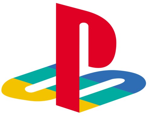
The lettering of the PlayStation logo with bright colors was intentionally selected to signify innovation and openness. The solid “P” and flowing “S” join together in such a manner that they create a 3D logo impression; it means dimensionality and it’s interactive. Red is passion, blue represents trust and stability, green for growth, and yellow for optimism. The clean modern font used here speaks of access and technological advancement, thus balancing simplicity and complexity, appealing to a global audience, and helping it last longer as a style that transcends time in a rapidly changing industry.
Symbolism of the “P” and “S” Elements in the Design
The promises to deliver engrossing play are portrayed in the logo for PlayStation. Where the “P” and “S” wrap around each other. The tall “P” portrays the characteristics of progressiveness and vision. The curved shape of “S” depicts lying down, which symbolizes flexibility and elasticity. In tandem, they reflect a cohesive and innovative story in harmony. This 3D illusion also mirrors the dynamic and interactive nature of PlayStation’s games. The logo’s clever simplicity ensures instant recognition, while its design depth intrigues viewers. Which make it a powerful emblem that resonates across generations.
The Evolution of the Logo Across Generations
The PlayStation logo has been subtly changed through the generations, keeping up with the technological and aesthetic trends of the time. The original PS1 logo was very vibrant, 3D, and bold in color, representing the excitement of a new era in gaming. As PlayStation entered the PS2 era. The logo took on a more minimalist style with a monochromatic color scheme, signaling sophistication and innovation. With each new console—PS3, PS4, and PS5—the logo retained its core elements. But evolved in texture and shading, reflecting the advancements in graphics and branding while staying true to its roots.
Highlight Updates in Color, Style, and Branding
Updates of the PlayStation logo in color and style are reflected in the gaming industry and the evolution of consumer expectations. The original multicolor design was flashy and vibrant and reflected the vibrant energy of youth in the 1990s. These developments were not mere facelifts; rather, they represented PlayStation’s growth from a pioneering gaming console to becoming a cultural and technological leader. Each new version reinforced brand identity while appeasing changing consumer tastes. Which ensured that the logo remained current in an ever-changing landscape: innovation and excellence in gaming.
Part 4: Marketing Impact of the PlayStation Logo
Beneath this visual beauty of the PlayStation brand is the key to Sony’s worldwide marketing framework. The dramatic and instantly noticed design of PlayStation has sealed its status among ordinary American households and market leaders in parlance for game. Moving next, we detail how the brand allowed for the building of a world-conquering identity. And consequently, explain the way the logo of the PlayStations has actually shaped an identity. That cemented its position within the most phenomenal logotypes that exist within all of entertainment.
Building a Global Brand Identity
The PlayStation logo has been a major player in the success of Sony globally. It is the one that broke cultural and linguistic barriers to reach people universally. The constant presence of the logo on the consoles, games, and even promotional materials ensured brand loyalty and recognition. Each console startup, advertisement, and merchandise item helped reinforce the PlayStation identity, making gamers feel familiar and trustworthy. This helped PlayStation establish itself as a global leader in gaming.
Its Presence in Advertisements, Consoles, and Merchandise
Nothing is comparable to the scale that this brand has accomplished with the embedding of the PlayStation logo within its individual ecosystems. Starting from the bigger placements in TV commercials to the small print in limited-edition merchandise, the logo is a reminder of the experience of PlayStation at all times. The logo on the startup screen is that one iconic moment that shows excitement and anticipation in those gamers. Often, limited-edition consoles and accessories do display unique versions of the logo, adding exclusivity and appeal.
The Logo in Gaming Culture
PlayStation logo is now part of public? Culture, and is considered to be familiar to people who do not have much to do with video games. Its futuristic appearance and years of existence give fans a spectacular base for creating fan artwork and funny internet content. We can see its reflection in movies, TV shows, music videos, thus the logo took its place in the epoch of games. To gamers it is not just a symbol of brands or company but rather icon of gaming experiences, achievements and progression of Gaming.
Instances Where the Logo Became a Symbol of Nostalgia
Millions of gamers can remember years and formative memories associated with the PlayStation. Any views of the logo accompanied by the startup sound of the PS1 remind its viewers of simple days. It becomes a product of nostalgia, to be celebrated in retrospective campaigns and anniversaries. These nostalgic associations help the PlayStation preserve an emotional connect with the audiences and ensure the logo is just more than just a design- it is an entry to relived memories in gaming history.
Part 5: Arvin AI – Enhancing Creativity in Logo Design
Arvin AI is that high-tech, latest platform by which the making of logos takes place. Bringing together creative elements and innovative technology, a spectacular result occurs. Perfect for businesses, designers, and creators, it uses advanced AI algorithms to make the design process easier while still offering endless possibilities for customization. Arvin AI empowers users to create professional logos suited to their unique brand identity, no matter how experienced they are at designing.
Key Features of Arvin AI
- AI-Powered Logo Creation: Arvin AI creates original logo designs by analyzing your brand details and preferences, ensuring every creation meet your requirements.
- Wide Customization Capabilities: Alter colors, fonts, and layouts with ease in order to fully personalize your logo, creating an ideal design that fits into your brand image.
- Bank of Design Inspirations: Get a large base of templates and styles to awaken creativity for different design solutions.
- Live Designs Feedback: Get immediate recommendation and refinement courtesy of the AI, allowing it to work through your final logo to make it polished as well as professionally produced.
- Native Export Options: Downloaded logos from one format to others in resolutions make them work correctly in digital to branding and even print applications.
Step 1: Go to the Arvin AI Website
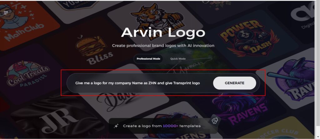
Open a browser window and head over to Arvin Logo Maker for designing your new, unique, and how to make a logo transparent company logo.

Step 2: Fill Up Your Company Details
Just enter the name of your company and pick its category and ask for transparent logo. All the details enable the AI to find the designs that would serve your needs and are representative for your company.
Step 3: Choose Your Industry
Pick an industry that best suits your business. This process guarantees the AI is making styles and themes that align best with your brand’s core value and niche in the market.

Step 4: Style Select
Pick a design style from the available ones. Leave it to “no style” if you’d want the AI to surprise you. The selected style shall provide a guideline for the final logon designs created.

Step 5: Explore Logo Concepts
Arvin AI will produce different types of logo designs according to the information provided. Simply scroll through the suggestions for a design that matches your brand identity.

Step 6: Finalize the Logo
Fine-tune the chosen logo by adjusting colors, fonts, and icons to meet your brand personality and aesthetic. This way, your final logo is perfect and completely in line with your brand’s personality and style.

Step 7: Download Your Logo
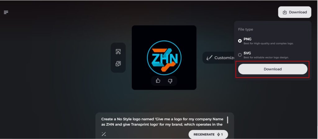
Once satisfied with your final design, download your logo in versatile formats such as PNG or SVG that would be perfect for various media. Websites, social media, print, and so much more-these logos will give a professional look across every platform.
Conclusion
The design of the PlayStation logo represents a marvelous journey. From being conceptualized by Manabu Sakamoto into the modern, iconic symbol status in gaming culture. Through these many years, its subtle evolution has transformed it into its timeless simplicity yet innovation. Therefore, this evolves to signify creativity in design is important for branding success. New designers can take inspiration from the legacy of the PlayStation logo. Then use tools like Arvin AI to bring their design visions to life. Use the power of design to create logos that relate to people and endures the ages.
FAQs About the PlayStation Logo
Who is the designer of the PlayStation logo?
The designer of the PlayStation logo is Manabu Sakamoto, a renowned Japanese master graphic designer. His vision in solving creativity was very sharp, blending simplicity and originality so that the logo can stand tall to this day.
What is the meaning behind the PlayStation logo?
The lettering for “P” and “S” innovatively as representing the name for the brand and brings the elements of simplicity. With innovation showing its pioneering feature within gaming and entertainment.
Did the logo for the PlayStation ever evolve over time?
Yes, though basic design is in line, PlayStation has evolved. In terms of color schemes and styling, to the new generations of consoles and technologies. It shows that it is flexible without losing its identity.
Can I generate a logo that is similar to that of PlayStation?
Absolutely! With Arvin AI’s advanced tools, one can easily create professional, innovative logos. Whether it is a personal project or branding, Arvin AI enables the users to design with creativity and precision.

