Pink is more than just a color—it’s a statement. Such variability of the color pink is an adaptability in conveying both a playfully warm sense or even sophisticated and powerful overtones, which can bring significant exposure for any brand: not just those in fashion, beauty, technology, but healthcare. Whether it’s a soft pastel shade for elegance or a bold neon for energy, pink helps create a strong visual identity that resonates with your target audience. In this article, we’ll explore why pink logos work, share successful examples, and offer tips on using this impactful color to elevate your brand identity effectively.
Part 1: 5 Categories of Companies using Pink Logos
There are number of companies using pink logos. But here are five categories of companies that often use pink logos:
1. Beauty and cosmetics
Many beauty and cosmetic brands use pink on their logos to evoke emotions such as femininity, refinement and elegance. Because pink is reminiscent of beauty and care, it is popular with make-up, skin care and fragrance companies. The colors range from soft pastel colors to bold pink depending on the brand’s image and target market.
2. Fashion and Apparel
In the fashion industry, pink is often used to convey playfulness, youthfulness and trend feeling. Apparel brands specifically targeting young people use pink in various shades to create fashionable logos that appeal to the visual. Pink can be adapted to different styles by brand identity, from casual wear to high-end fashion.
3. Toys and children’s supplies
Pink is very popular for companies that produce toys and children’s commodities, especially for girls. It is a color evoking sweetness, innocence, and fun, so it can be used on products associated with childhood. Toy makers, children’s clothing brands and baby goods manufacturers often use the pink logo to make warm and attractive appeals. Here is How to Make a Logo Transparent: Online & Software Tools.
4. Breast cancer awareness and healthcare
Pink is widely recognized as a color associated with breast cancer awareness. Many medical institutions, hospitals and non-profit organizations that support women’s health use the pink logo to support breast cancer research and advocacy activities. In addition, companies in the broader healthcare sector may use pink to convey a sense of compassion, care and wellness.
5. Non-profit and charitable organizations
Various nonprofits and charities may choose pink logos to symbolize compassion, empathy and consciousness, regardless of their particular focus. Pink not only associates with the health-related activities, but also with broader compassion and support. A charity organization working in relation to women, children and other local welfare may adopt the pink logo for communicating dedication to their activities.
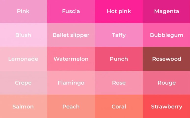
Part 2: Different shades of Pink Color
As with any color in the palette, pink has many shades and tints. It has a significant impact on marketing and advertising, so you need to know some of them. With these shades you can choose the best one for your company logo. Pink has more than 50 shades. Here the 50 Cool Logos And Free Cool Logo Maker for Your Brand.
Part 3: Pink logo color combination
Pink can evoke specific emotions and reactions from the target user by blending well with other colors. These combinations are highly recommendable for creating a pink logo. Here are some of the most popular color combinations in marketing campaigns. Beside these if you like Wordmark Logo: Design Principles for Brand Success here the complete guide.
Pink and Purple
This combination is very chic and fashionable, so it is perfect for female viewers. The majestic touch of purple brings out the warmth of pink. In this style you can combine pink with purple for purplish-shade which is more unique.

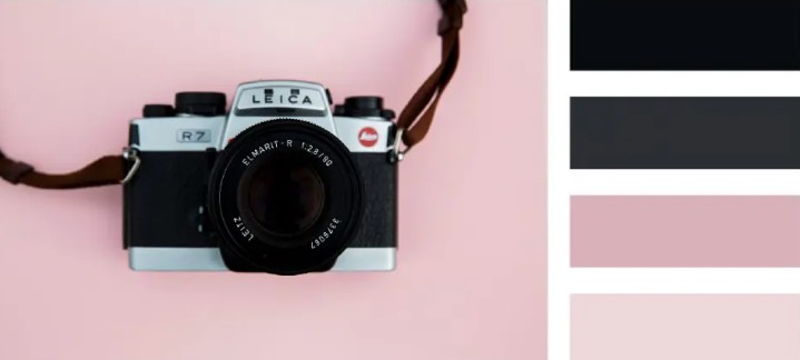
Black and pink
Black and pink have high contrast and are the perfect combination for logo. The black in the corporate logo symbolizes confidence, intelligence, power and refinement. This color is compatible with any color.
White and pink
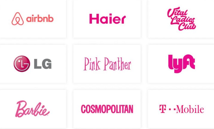
Pink youthfulness and playfulness in bright shades are emphasized by the neutrality and simplicity of white. This combination is often used by companies seeking a straight but powerful logo. They prefer highly saturated shades to make the brand name visually stand out. This approach can be found in the Barbie, Dribbble, Lyft, and T-Mobile logos.
Blue and pink
Blue and pink are also visually attractive combinations. It is one of the colors widely used in logo production because it means trust, loyalty and reliability. To attract more people visually, mixing a little pink shades in blue can evoke happier emotions.

Pink and Pink
The contrast between dark and light colors is never boring. This technique emphasizes a combination of pink saturated shades and more pale and subtle shades of pink. Such a combination strikes customers from a distance.
Orange and pink
The combination of orange and pink is also interesting. These two colours are similar, so it goes very well together. When these two colours get put together, it gives warmth, energy and earthiness. The intensities of both colors are appealing and effective in brand marketing.

Pink and Gold
This combination would probably be the most elegant, elegant and sophisticated pair in this list. Gold has been a symbol of luxury in the past. This is in great harmony with the refined colors of pink. The fusion of these two colors is very attractive and impressive.

Part 4: 12 most Popular Pink logos
Barbie
The Barbie brand will forever be linked to a bold and bright pink color. This color is fun and cheerful. Besides, strives to combine femininity with beauty and the image of an obstinate and courageous girl who is not afraid to stand out and defy new things.
Beach Bunny
Beach Bunny is an elite beachwear brand that leads beach fashion trends around the world. A combination of lovely writing fonts and vivid pink creates a sexy and sophisticated image. Wearing a Beach Bunny bikini allows women to flaunt their bodies, immerse themselves in an elegant, non-aphrodisiac, confident and fun mood.

Breast Cancer
The pink color of this logo symbolizes all girls and women at risk of breast cancer or already facing breast cancer. Pink is full of peace, kindness, compassion and sympathy. Vivid colors attract attention and are easy to connect with women.
Care Free
Pink is used in the logo of this brand not only because the product is made only for girls and women. The brand also wanted to reflect the kindness and politeness of the product. This brand is designed for women who value delicate and comfortable.
Cure Bowl
The Cure Bowl is an annual American college football bowl game. This match promotes awareness about breast cancer and provides all proceeds for breast cancer research. Therefore, not only symbolize all women, but also pink color reminiscent of pink breast cancer ribbon is used.
Feet Finder
FeetFinder offers the simplest and safest site for selling foot photos. It became even more prominent among thousands of other logos because of the choice of color palette. The bright color palette gives a fun and cheerful feel.
Food Panda
FoodPanda is a global food delivery ordering service in more than 50 countries. FoodPanda’s sister company, Foodora, has a distinctive pink color. Foodora owners believe FoodPanda can stand out from their rivals.
Freeform
The FreeForm app was created to make it easy for users to create materials of various properties, from serious documents to fun drawings. The pink color of the logo looks very creative and enhances its uniqueness. This color also excites people with projects in FreeForm.

Reckitt
Reckitt Benckiser manufactures and sells hundreds of household chemicals and pharmaceuticals. Projects that try to depict the value of health are mostly colorful. Even if vivid greens are the most common choice, there is no reason not to use vivid pink to show that your brand can bring health to consumers.
Reverse Health
A 12-week weight loss coaching program called Reverse Health is designed to prevent weight gain and lower metabolic rates. Because it is exclusively for women, it adopted feminine pink. It also relieves fatigue, enables you to believe in yourself, and is exactly what reverse health users want.
Twisted Sister
Twisted Sister is an American gram metal band from New York. The pink shade of the band name creates a neon effect. The logo was bright, bold, catchy and romantic. It expresses the band perfectly and will never be trendy.

Vineyard Vines
Vineyard Vines is an American clothing and accessories firm. Smiling whales aside, it instantly reminds one of Martha’s Vineyard, but should also incite the customer to a good life. The color of pink in the whale reflects the attire of the people of Martha’s Vineyard.
Part 5: Create Professional pink Logos with Arvin Ai
Arvin AI is an AI-powered tool that revolutionizes the way brands create and manage their identities. With advanced algorithms and creative insights, AI-based tools help businesses build an impactful pink logos and branding element that really connects with audiences. This fusion of technology edge and design expertise can guarantee that your brand can stand the ground in the very competitive marketplace.
Key Features of Arvin AI
- Custom Logo Generation: Create unique, eye-catching logos tailored to your brand’s identity and values.
- AI-Driven Color Suggestions: Get expert recommendations for color palettes, including shades of pink, to evoke desired emotions and brand perceptions.
- Brand Consistency Tools: Maintain a cohesive visual identity across all platforms with Arvin AI’s branding templates and guidelines.
- Market Insights: Access data-driven insights on color trends and industry preferences to ensure your brand stays relevant.
- User-Friendly Interface: Easy-to-use tools that make professional branding accessible to businesses of all sizes.
- Logo Testing and Feedback: Instant feedback on the performance of logos based on engagement and perception by the target audience.
Steps to Design a Pink Logo with Arvin AI
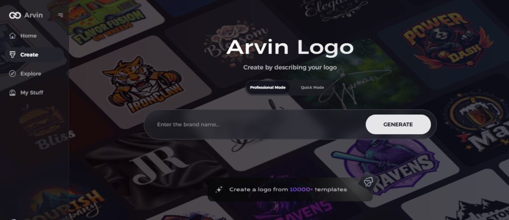
Step 1: Open the Arvin AI Website
Open Arvin Logo Maker to begin creating your individual pink-themed logo.
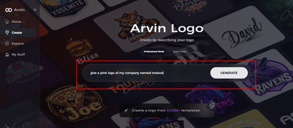
Step 2: Add Company Information
Input your company name, category, and indicate a pink logo. This will allow the AI to create designs suited for your requirements.
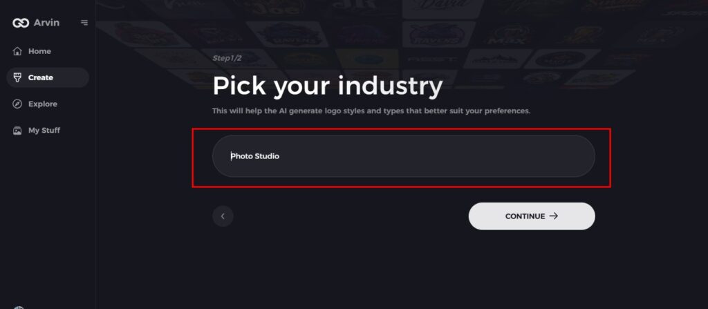
Step 3: Choose Industry
Select the industry relevant to your business so that the design is tailored to fit your niche.
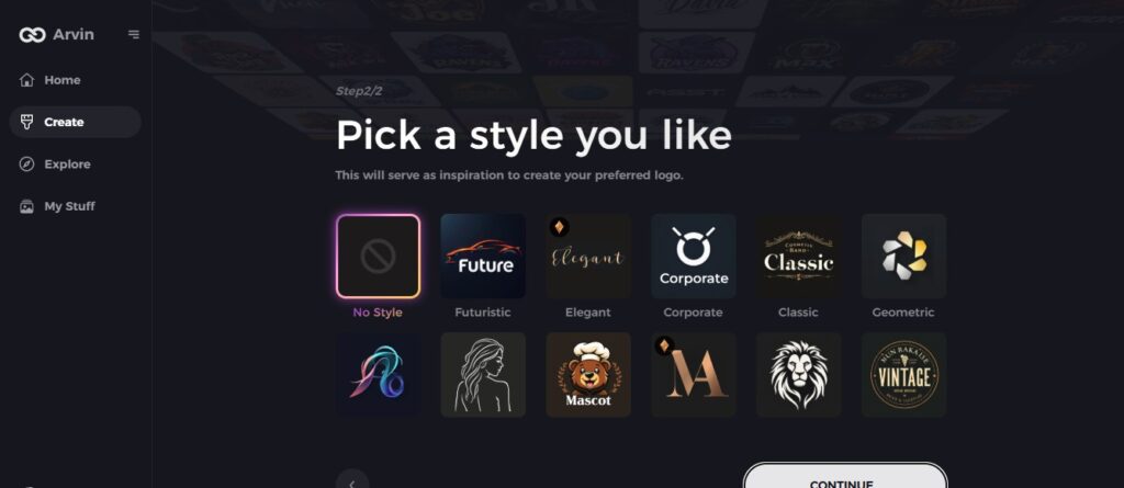
Step 4: Choose Style
Select a style or choose “no style” to let the AI surprise you with creative ideas.
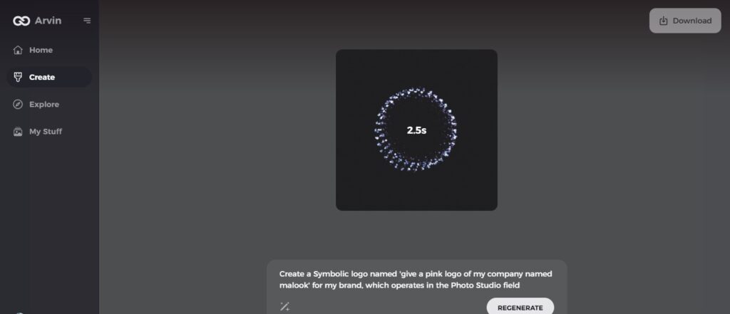
Step 5: Explore Designs
Surf through pink-themed logo concepts that the AI will generate and select one that suits your brand.
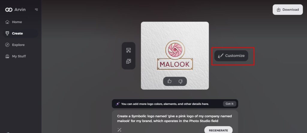
Step 6: Customize the Logo
Adjust colors, fonts, and icons to perfect your logo’s look and align it with your brand.
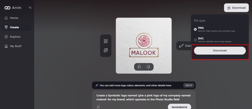
Step 7: Download Your Logo
Download the final design in formats like PNG or SVG, ready for use across platforms.
Conclusion
Incorporation of pink logos can upgrade the emotional connection of branding and increase market appealability. With Arvin AI, creating a distinctive pink logo has never been as easy. Its innovative ability is what empowers the business to craft the memory of branding with what they believe in. Whatever be the size, of your business, Arvin AI ensures that your branding is as impactful as is your vision.
FAQs
Why do I need to consider using the color pink in my logo?
Pink is an adaptable color, representing emotions of compassion, energy, and sophistication. It is thus appropriate for most industries.
Can Arvin AI recommend different shades of pink for my brand?
Yes, Arvin AI offers customized color recommendations. This will ensure you have the right pink shade that suits your branding needs.
Is Arvin AI suitable for small businesses?
Absolutely! This makes Arvin AI usable for businesses of all types and sizes due to their friendly tools and affordable plans.
Can I preview my logo design before confirming it?
Yes, at Arvin AI, you can test your logos and get feedback on designs that will resonate with your target audience.
Read More
