Peugeot, a French car brand, has a long and rich history that dates back to the early 19th century. Over the years, it has turned into a worldwide name in the automobile world. The company started from making bicycles and then gradually stepped into cars, earning their reputation as well as their creativity in it. The Peugeot logo, over the passage of time, has evolved as the brand evolved with the times and so did the automobile world. Today, Peugeot stands for stylish as well as dependable cars worldwide.
Part 1: Emergence of Peugeot Logo (1810-1858)
The Peugeot logo was conceptualized between 1810 and 1858 when the brand required a sign to represent the growing business at that time. The lion was the symbol chosen by Peugeot, because it stands for strength, power, and durability. All these qualities were something that Peugeot wanted to reflect with its products.
Part 2: The Evolution of the Peugeot Logo over Time
The Peugeot logo has changed dramatically over the years, each design reflecting the growth and values of the company. Let’s look at how the logo evolved.
1858 – 1889: More refined design
In this stage, the Peugeot logo became more defined, moving away from a simple symbol. It became more refined and took on elements of heraldic designs, which are often used in coats of arms. This made the logo look nobler and represented the company’s focus on quality and tradition.
1889 – 1910: The lion on the arrow
In 1889, Peugeot changed everything with the addition of a lion that was placed on an arrow. Both strength and speed were essential features for a car company, which is why they were put in the logo. The arrow also pointed forward; this symbolized progress.
1910-1925 Volumetric redrawing
It was during the early 1910s when the logo gained a more modern appearance. The lion and arrow design became three-dimensional with the use of shading effects that added depth to the logo. The new look of the logo reflected the company’s search of innovation as it now appeared more dynamic and energetic.
1925 – 1936: Addition of a banner and bold wordmark
The company redesigned the logo in mid-1920s with a more professional and serious appearance. The lion had a banner added behind it, and the name of the company was written in a strong and bold font. This change distinguished Peugeot as a trusted, established brand in the automotive world.
1936 – 1948: Experiments with color and crest shape
From 1936 to 1948, Peugeot experimented with various colors and shapes for its logo. They attempted various color combinations and crown designs to make the brand look more modern and stylish. This experimentation helped the company come up with a logo that would be easily recognizable and visually appealing to customers.
Part 3: Modernization of the Logo
As time passed, Peugeot kept improving and changing its logo to suit the current times. Here is how the logo changed in more recent decades.
1948 – 1955: Shield-style frames and heraldic inspirations
Peugeot also began to surround the lion symbol with a shield-shaped frame during this era. Shields have been one of the main features in coats of arms as an indication of strength and heritage. The use of a shield surrounding the lion therefore gives it the appearance of safety.
1960-1980: Sleek, Streamlined Shapes – Simplicity
From the 1960s until the 1980s, Peugeot took the route to a simpler, cleaner logo. The designs continued to become simplified and less complex as the time of simplicity in design spread. This is how the simpler logo became instantly recognizable and also more modern than before, presenting the brand to be more moving forward with things and up to date with changes in design trends.
1980 – 1998: Incorporation of the modern blue square logo
In the 1980s, Peugeot made a huge change by incorporating a blue square with bold and simple text. The new design was all about clarity and strength, using solid color and a readable font. This was when the brand would try to bring a logo that was not only modern but strong and professional at the same time.
Part 4: Modern Redesigns (1998 – Present)
Peugeot’s logo has remained quite sophisticated in the 21st century, with more of a modern feel. Here’s how the logo changed in recent years:
1998 – 2010: Focus on 3D effects and metallic tones
In this stage, Peugeot focused on making the logo appear more modern and high-tech. They added 3D effects to the lion and other aspects of the logo, which were now more alive and dynamic. Metallic tones like silver and chrome were added to give the logo shine and a more premium look to reflect the quality and innovation that the company possesses.
2010 – 2021: Exaltation of elegance with fine details
From 2010 up to 2021, Peugeot further polished its logo and made it elegant and sophisticated-looking. The finer details were in place, and the overall design was cleaner and would look polished. It is all about giving an impression of luxury, professionalism, and forward-thinking design to correspond to the company’s modern image, with its high-quality vehicles they produce.
2021 to date: Use of the black crest and stylized lion portrait
Starting in 2021, Peugeot made another major change by introducing a shiny black crest behind the lion. The lion itself was redesigned into a more natural portrait, giving it a bold and modern look. The black background added strength and contrast, while the stylized lion symbolized Peugeot’s modern vision and its focus on creating innovative and stylish cars for the future.
Part 5: The Meaning behind the Peugeot Logo
The Peugeot logo is around the lion. The lion, in this context, symbolizes a lot. Lion represents power, the strength of the brand and its vehicles. It also represents loyalty or how much the company has engraved in the minds of the people about trusting the brand. Lion is not an image; it is a representation of the legacy that Peugeot has left in this world of automobiles.
Part 6: Peugeot Badge as a design icon
This Peugeot symbol has emerged and become one of the timeless logos in the history of automotive business. Over years, it appeared simple but quite powerful design until it becomes noticeable to many throughout the world. The lion has represented strength and reliability, helping the brand have an easily recognizable identity. Peugeot’s logo is not only a company symbol but also a design icon of a company with many years of history within it and quality cars to produce.
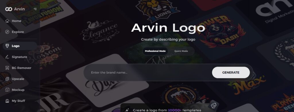
Part 7: Use Arvin AI for Designing a Logo
Arvin AI is a very powerful tool that has been designed to make creating logos as easy as possible. This makes it ideal for car fans looking to design a symbol. If you are looking to design a logo for a car brand or simply exploring ideas, Arvin AI has the features to help modernize the process. It is an easy interface, meaning it is used to create fast logos with professional results; thus, the tool is the best for anyone in the automobile industry looking for a logo that has a good appeal and will also be memorable.
Key Features of Arvin AI:
There are following features of Arvin AI:
- Easy-to-use Interface: Arvin AI has a simple design that makes it easy for anyone to use, even if you’re new to creating logos. Its clean layout helps you navigate through the tools quickly.
- Customizable Designs: You can customize each and every aspect of your logo, from colors to shapes, to make it perfectly match your brand.
- Fast Logo Creation: Arvin AI enables you to create logos in a matter of minutes. It saves time by providing ready-made templates that you can easily adjust.
- High-Quality Outputs: Arvin AI makes sure that your final logo will be of professional quality and in high resolution so that it is suitable for all types of uses, whether online or print.
- AI-Driven Suggestions: The tool gives you intelligent suggestions based on your inputs so that you come up with great design ideas fitting your brand style.
- Accessible Anywhere: You can use Arvin AI from any device with an internet connection, so it’s convenient to design logos on the go.
Steps to Use Arvin AI for Creating a Peugeot-Inspired Logo
Step 1: Create an account and log in on Arvin AI
Visit the Arvin AI website, sign up, and log in to access the logo design feature, perfect for crafting a logo inspired by Peugeot’s history.
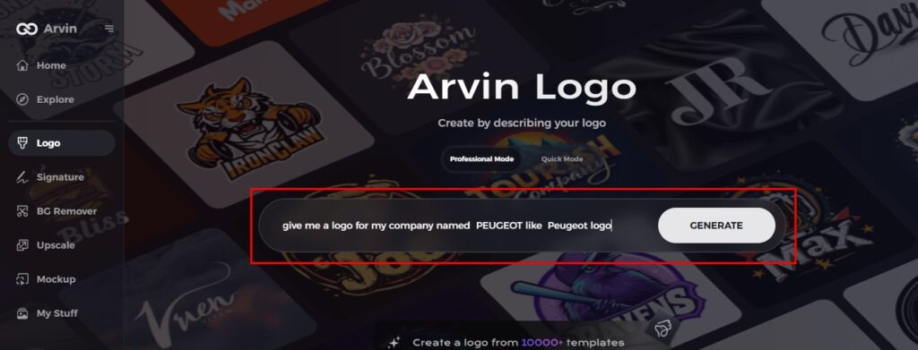
Step 2: Enter your brand details and design preferences
Provide your brand name, slogan, and industry. Also, specify design preferences, such as fonts or themes that reflect the essence of Peugeot’s style.
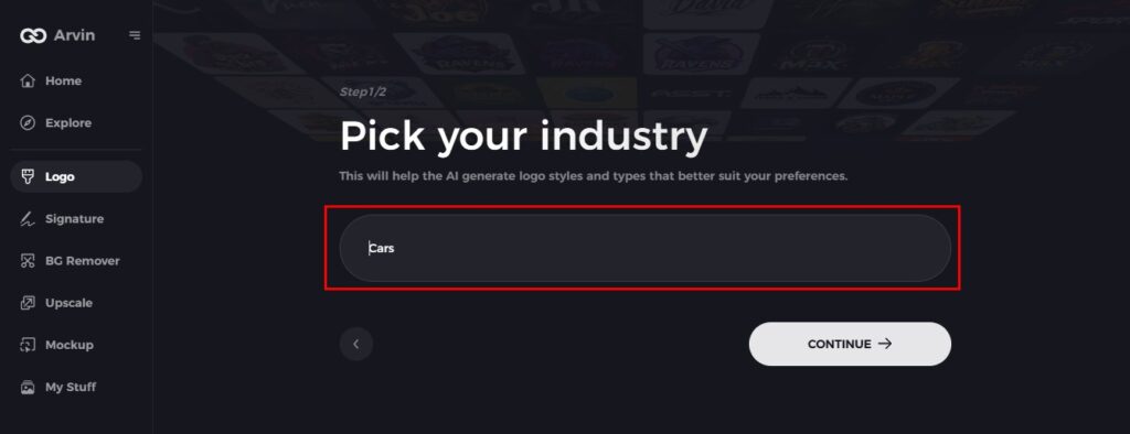
Step 3: Choose your industry
Select the industry related to your business. This helps Arvin AI generate logo styles that align with your vision, similar to Peugeot’s iconic design.
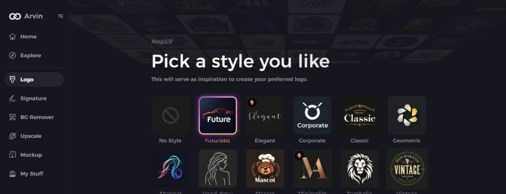
Step 4: Pick your logo style
Choose a logo style that appeals to you. This will serve as inspiration to create a design resembling Peugeot’s evolution.
Step 5: Personalize your design using Arvin AI’s tools
After Arvin AI generates your logo, customize it by adjusting elements like font style, layout, and symbol placement. Experiment with different looks until satisfied.
Step 6: Save and download your final logo
Once you are happy with the logo, preview it and save the design in a high-resolution format for both digital and print use, much like the modern Peugeot logo.
Conclusion
The Peugeot logo has undergone several changes from its lion symbol in the early days to the modern shiny design. Change for each has come to reflect growth in the brand, as well as a strong commitment to quality. The logo expresses the power of the brand along with reliability in the automotive business and innovation too. If you have interest in learning about automobile history, you can find many tools through Arvin AI to design a logo of your choice.
FAQs
What does the Peugeot logo represent?
The lion in the Peugeot logo represents strength, courage, and loyalty, just like the brand’s values of reliability and power.
Why is the Peugeot logo a lion?
He therefore asked a goldsmith from Montbéliard, Justin Blazer, to create an emblem. The goldsmith was inspired by the qualities of Peugeot’s flagship product of the time: the saw. Speed, flexibility and bite: it is the lion that is the emblematic figure of the brand.
What is Arvin AI, and how can it help with automotive research?
Arvin AI is a learning tool to understand more about cars, such as history concerning car logos and brands with helpful information.
Why did Peugeot choose the lion as their logo?
This stands for strength and durability on the steel product of Peugeot, and it reveals that the company comes from France, with the origin and history.
