
Pepsi is a leading American carbonated beverage brand whose logo is as well-known as the sweet bubbles of famous beverages. Interestingly, the Pepsi logo has changed the design many times, completely changing the concept and feeling as the brand grows. However, even those who do not drink carbonated beverages (like cola!) can quickly identify the Pepsi logos and know what it represents. Let’s see how the Pepsi logos evolved from its first design in 1898 to the current mark that became loved around the world.
Part 1: Evolution of Pepsi Logo
One of the most famous beverage brands in history, Pepsi owns the iconic logos. The combination of red, white, and blue in the sphere looks surprisingly attractive by the “smile” effect produced by the white swirl in the sphere.
1893 – 1898
The legendary beverage invented by American businessman Caleb Bradshaw, who ran a pharmacy in North Carolina. The drink was to help rescue people suffering from morphine addiction and had two significant ingredients called Pepsin, a digestive enzyme, and Cola nuts.
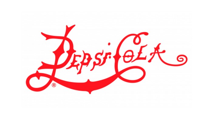
1898 – 1903
The name of the carbonated beverage changed to Pepsi Cola reflecting its ingredients. The logo was also renewed to express the new brand. The red character of the script, drawn with elongated curves, became the main and only element of the product’s visual identity.
1903 – 1904
The 1903 Pepsi logo which contain cool logo design was only active for a few months. The red script lettering combines wishbone details with elongated lines, and a thick red ribbon and white additional wordmark. The characters of the main logotype separated from each other and were quite clumsy.
1904 – 1905
In the 1904 redesign, the outline of the fancy characters of the Pepsi logos refined and the lines were thick and clean. The characters approached each other and became more confident and professional badges.
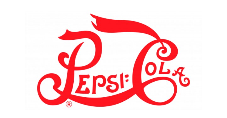
1905 – 1907
The logo redesigned again in 1905 to resemble the habitual identity of Coca-Cola, the brand’s main competitor. It is a bold script character based on red, the long tail of the letter “C” curves, the lines “P” and “C” connect, the whole logotype is emphasized, and it is a double loop pattern.
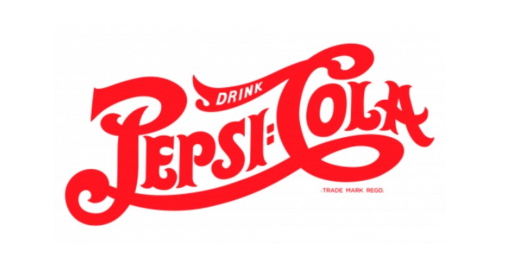
1907 – 1934
The concept, published in 1904, was revived into a Pepsi badge in 1907, and the contours of all elements were modified, making it more confident and cleaner. All characters became thicker and red characters appeared stronger and stronger.
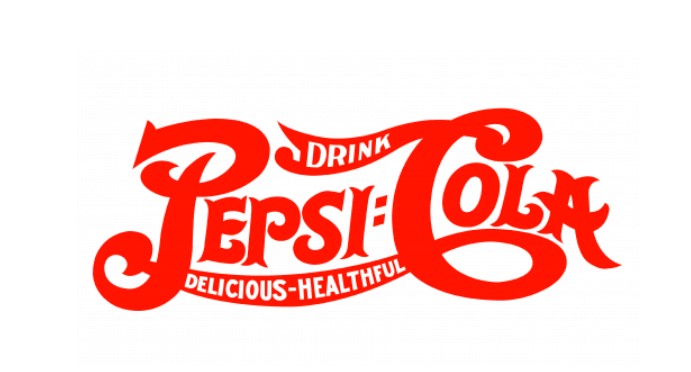
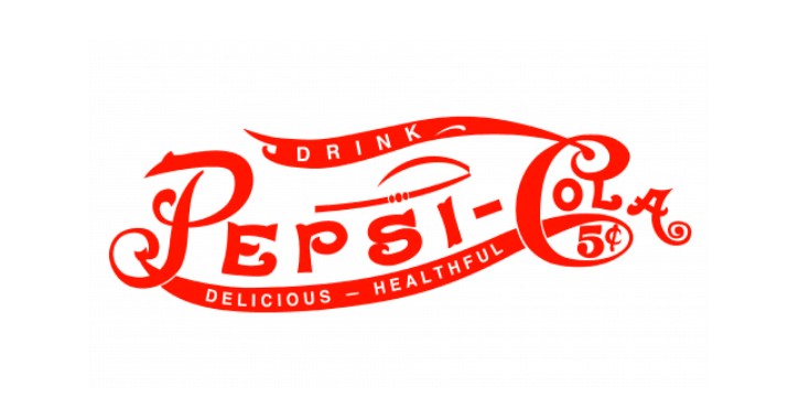
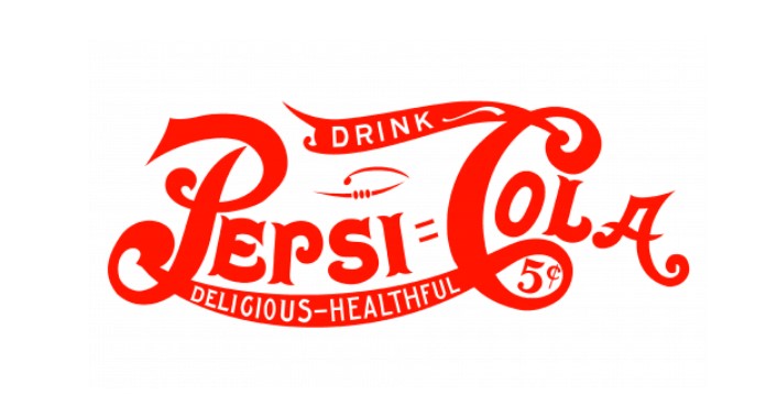
1934 – 1951
In 1934, the red letters refined and the delicate and thin “Drink” letters added to the top of the “C” characters. This logo drawn with a thicker line than the previous version, giving a more confident and solid impression.
1950 – 1962
The 1950 design change made the logotype more professional and modern. All the extra lines removed, and the inscription was thicker and easier to eat. The last version of the minimalist color tone based on red and white.
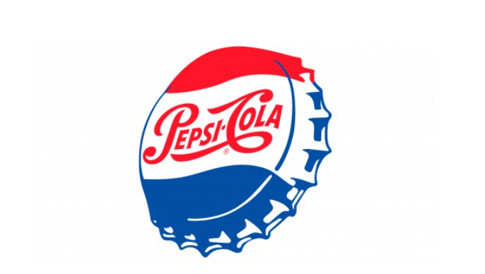
1951 – 1962
The prototype of the next-generation Pepsi logos published in 1951. It is an image of a metal bottle cap colored in red, white and blue, and the white part of the cap was arranged with the red script character of the previous version.
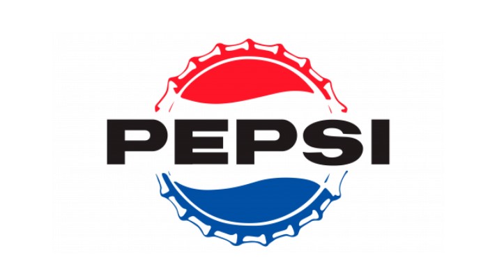
1962 – 1969
In the 1962 redesign, the logo concept introduced in the 1950s was simplified and modern. The bottle cap of the logo colors became straight, and the blue script changed to a bold capital letter of the black San serif. The badge used by the brand for over seven years.
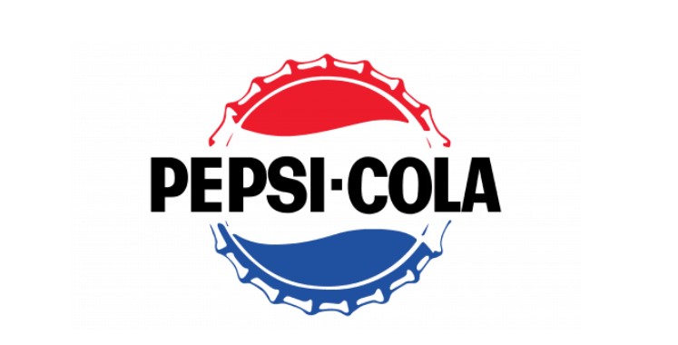
1965 – 1969
The tricolor-colored cap, which took over the main theme of the 1965 visual identity, inscribed black and thick with “Pepsi” in all capital letters of the simple sans-serif typeface, and the character “S” modified.
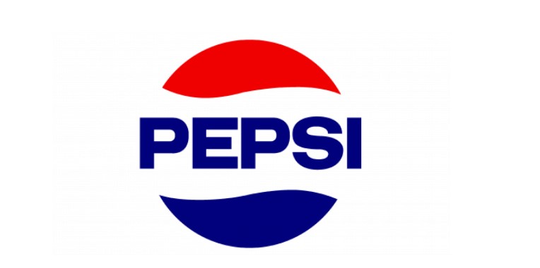
1969 – 1971
In 1969, Pepsi’s badge redesigned and the previous logo version modernized. The outline of the Pepsi gloves was clean, minimized, and the letter “Pepsi” changed to deep blue.
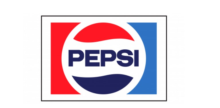
1971 – 1987
A more contemporary visual identity was designed in 1971. A thick white circle was placed in a rectangle of a white frame. The left side of the rectangle was red and the right side was blue.
1987 – 1991
In 1987, the white frame of the logo was removed, and the letters were enlarged. The typeface also changed to smooth and smart, and the corners of the letter “E” became round.
1991 – 1996
In 1991, the nameplate placed outside the circle. The structure of the logo changed, the inscription was also red, the rectangle was placed horizontally under it, and the red and blue circles were drawn with a thick white curve on the right and center of the rectangle.
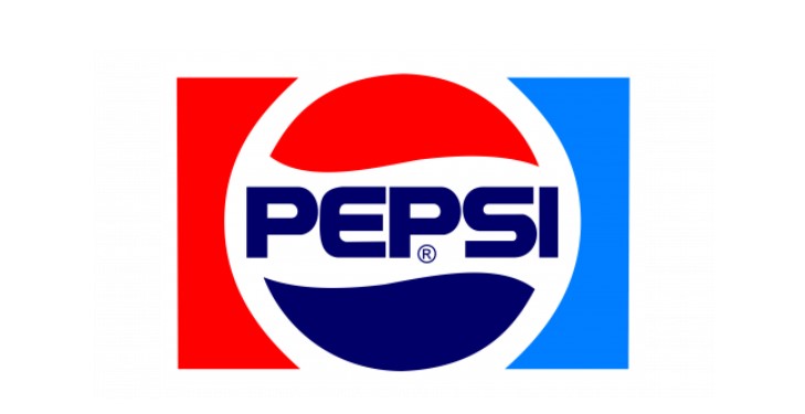
1996 – 2003
In 1996, the visual identity of the famous Sodusting was simplified. The white word mark with a bold sans-serif typeface with smooth lines and slightly italic characters features a thin blue outline and shadow.
2003 – 2006
The emblem painted in gradient color, and it became a glamorous and vivid impression. The logo only used for three years, but is still used in several countries around the world.
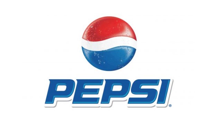
2006 – 2008
In 2006, the word mark was placed under the emblem. The emblem drawn with clearer lines, and the volume increased with a texture like a droplet, making it look real.
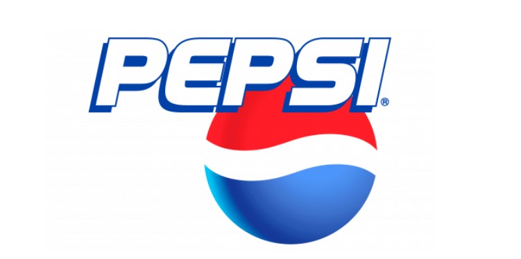
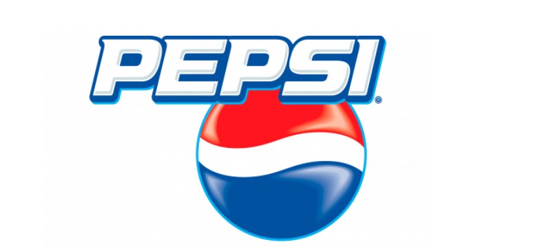
2008 – 2014
In 2008, the Pepsi logo renewed. The emblem is drawn in 2D and the letter is lowercase. The iconic “globe” white lines arranged diagonally and feature thin double outlines composed of white and blue.
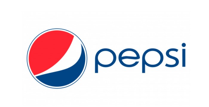
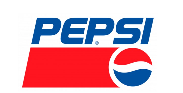
2014 – 2023
The Pepsi emblem, designed in 2014, is the most minimal of Pepsi’s history. The emblem placed on the left side of the wordmark removed with a modern, solid impression.
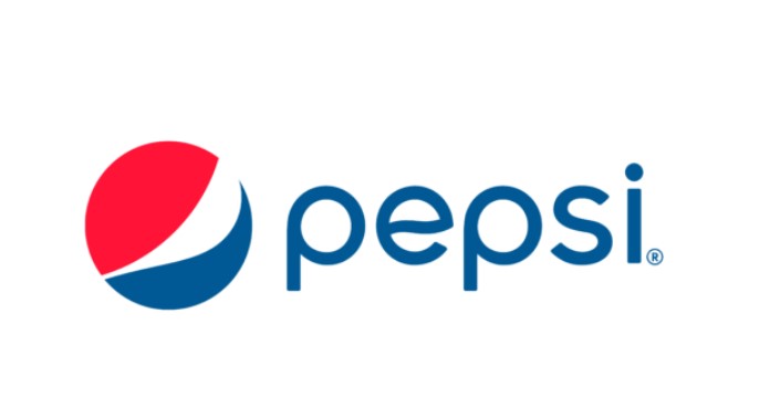
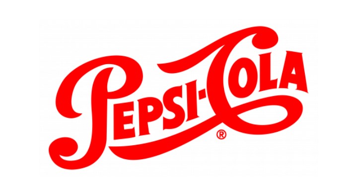
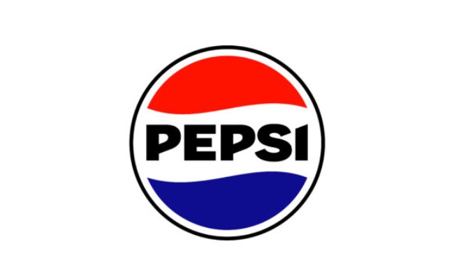
2023 – Today
Pepsi did not invent a new logo in celebration of its 125th anniversary. The emblem released in 1987. I added a black outline around the round area to stand out in any background.
Part 2: Design Elements of Pepsi Logos
Design elements are the main portion for the branding of a good-looking logo. Following are the main elements of a good logo:
Font
A bespoke italic Roman script logo fonts called Pepsi logos Light. If you’re looking for a more popular typeface close to the Pepsi emblem, try the Harry Plain font.
Color
Pepsi logos combination of colors symbolizes the core emotional value of the product. According to a consumer survey, the dark royal blue used in the original beverage conveys the idea of “cool.”
Part 3: Arvin AI – Enhance Logo Design Through Technology
In the existence of digital media, logo branding is one of the most critical aspects when trying to establish an identity. Good logos convey values related to a brand, attach a brand to the audience, and create recognition that lasts longer. Although traditional methods are efficient in terms of logo design, tools such as Arvin AI add a notch higher to logo creation, not only making it faster and smarter but also more intuitive.
Key features of Arvin AI
There are following key features of Arvin AI:
- AI-Inspired Design: It gives brand-based logo designs.
- Customizable Design Options: Select color schemes, shapes, and fonts for customization.
- Team Collaboration Tools: Enable smooth team collaborations for final design tweaks.
- Scalability: Scalable design for any usage from a website to a packing material.
- Cost-Effective Solutions: High-grade designs with affordable costs unlike regular design service firms.
Steps to Use Arvin AI for making Logo
Step 1: Visit the Arvin AI Website
Open your web browser and access the design page of the Arvin AI logo maker site to start creating your logos.
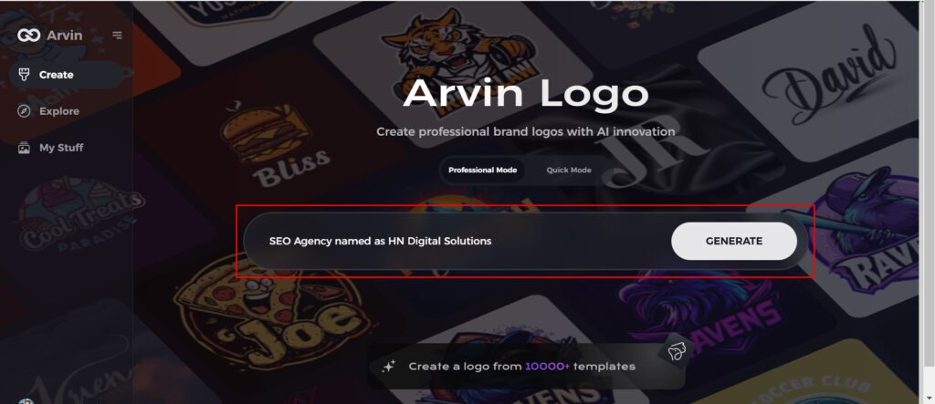
Step 2: Fill out Your Business Information
Fill in necessary business details like your business name and category. This information allows the AI to create designs specific to your brand.
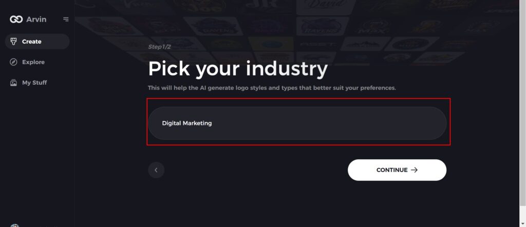
Step 3: Give Industry Name
Select an industry from the list provided. This process narrows down the logo styles and types for the AI to fine-tune based on your choice.
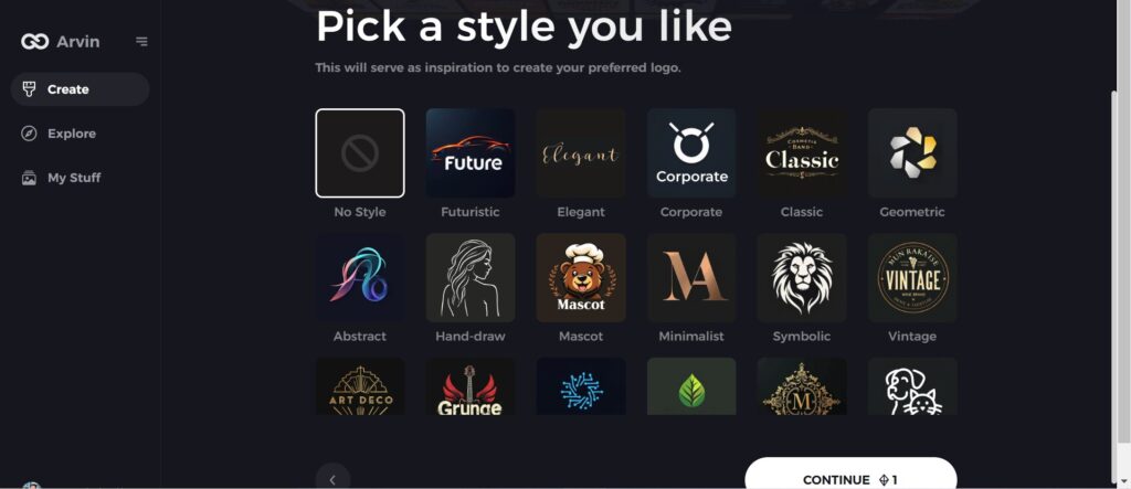
Step 4: Pick the Style
Browse through the style list presented and choose one that is relevant to your brand’s vision. If you still don’t like it, just skip this step and let the AI take its default inspiration.
Step 5: Logo Ideas
The AI will create various logo designs according to the inputs provided by you. Review the ideas that appeal to your brand image.
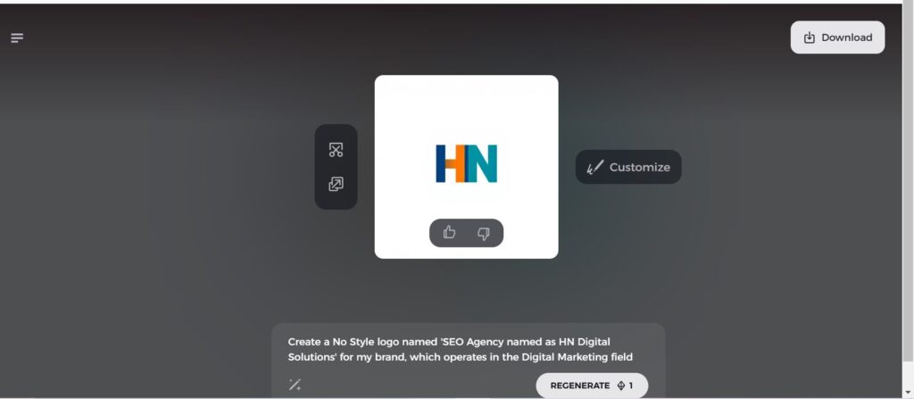
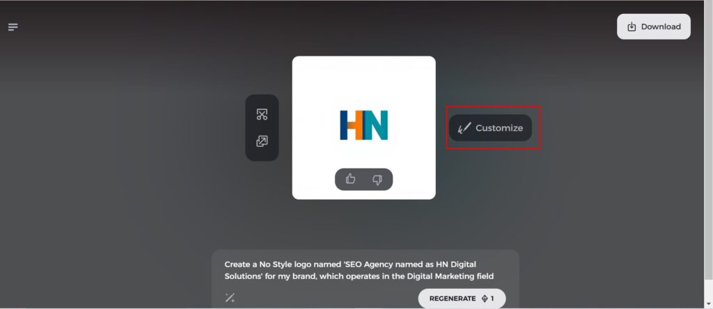
Step 6: Personalize Your Logo
Refine your chosen design by making some changes such as colors, font, icon, and layouts to resemble your style.
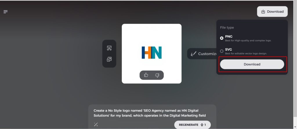
Step 7: Download Your Logo
Once you’re satisfied with the final design, download your logo in formats like PNG or SVG. These formats ensure compatibility for use on websites, social media, and print materials.
Conclusion
The Pepsi logos are one of the main examples of effective branding. The design has come from a very simple past into the present to match the changing tastes of the consumer and the market. With every new design, Pepsi logos have been relevant and a global icon today. With time, the world is going to keep on moving forward, and branding will have to include logos in the forefront. Just like Pepsi, if you ever need a perfect logo for your brand, you can use Arvin AI, which is your best bet at creating a personalized design.
FAQs
What is the Pepsi logo and their meaning?
In 2008, Pepsi splurged 1 million dollars on a new logo with a secret meaning. The design of the new emblem channels the ideas of the golden section, Earth’s magnetic field and gravitation, fengshui, and other fields of knowledge.
Why did Pepsi change its logo again?
Pepsi changed its logo to modernize its brand image and appeal to younger consumers. The redesign aimed to reflect evolving consumer tastes and cultural trends while maintaining brand recognition. Such updates demonstrate Pepsi’s commitment to staying relevant in a competitive market.
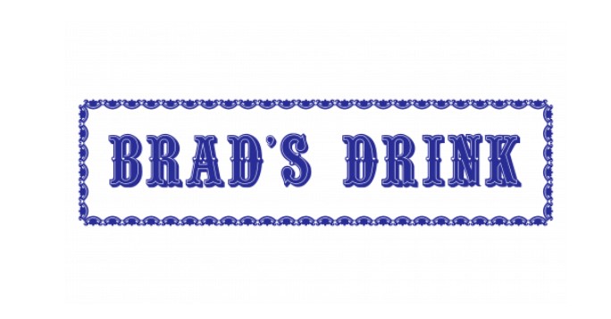
What was Pepsi’s original logo?
The Brad’s Drink logo was a blue wordmark against a white background. The font was bold and fairly ornate, a characteristic the Pepsi logo would hold on to for a while, even after changing colors and becoming known as Pepsi-Cola.
Can I do a custom-made logo like for Pepsi with Arvin AI?
Yes, Arvin AI has the ability to produce professional-grade logos for its users.
