
The Oscars, or Academy Awards, are one of the glitziest events in the world of entertainment. It has been honoring excellence in film for nearly a century, and it fills an important cultural role for people worldwide. One of the primary elements of its brand identity is the Oscars logo, a recognizable image associated with the organization and which has helped to build its brand identity over the years. This article traces the history of the Oscars logo and the path it has taken to evolve and stay relevant while remaining true to its roots.
Part 1: The History of the Oscars Logo
The Oscars, initially presented by the Academy of Motion Picture Arts and Sciences in 1929, were quickly associated with Hollywood’s finest in film. The official logo of the Oscars appeared for the first time when the ceremony debuted. It was straightforward, with minimal graphic imagery usage. Logos back then were not so much about creating aesthetically pleasing brand marks but about conveying seriousness and gravitas, as was the positioning of the Academy in its early days as a serious institution.
How the Early Designs Reflected the Academy’s Vision
Simple Oscar logos projected professionalism and elegance in line with the Academy’s mission of honoring artistic excellence. The initial logo of the late 1920s was text-oriented, used a traditional serif font, and carry an air of seriousness characteristic of the stature of the awards. The design had a traditional feel, without much embellishment, symbolizing the elegance and seriousness of the occasion. The focus was on the written word instead of a graphic, which was typical of early 20th-century branding.
Key Changes in the Logo from the 1920s to the Present
The Oscars logo has been alter several times throughout the years. Some of the most important changes are:
- 1930s-1940s: During these decades, the Academy began experimenting with the utilization of imagery. The statuette for the Oscar itself began appearing more frequently in the logo, a move that emphasized the award itself rather than just the event.
- 1950s-1960s: The use of additional stylized typefaces and the utilization of gold—alluding to the golden sheen of the Oscar statuette—began to position the logo as an emblem of success.
- 1970s-1980s: The logo was redesign several times, one of the most significant being the addition of the distinctive “Oscar” lettering in a more stylized, serif typeface.
- 1990s-Present: In more recent years, the logo has streamlined and made simple, relying most often on the visual power of the Oscar statuette itself. This is a reflection of current branding trends as the trend now is towards simplicity and recognition upon first glance.
Part 2: Key Design Elements of the Oscars Logo
The most iconic element of the Oscars logo is the silhouette of the Oscar statuette itself. The gold knight figure with a sword in hand symbolizes the ultimate achievement in the world of movies. The silhouette is instantly recognizable and has become synonymous with the awards ceremony. The use of the statuette as a component of the logo is both an image of the actual award and a nod to the classic definition of the Academy and for excellence in films overall.
Typography and Font Choices Over the Years
The typography of the Oscars logo itself has evolved a great deal since its launch, with a lot of attention given to convey the dignity and prestige of the awards. The early logos had been using traditional serif fonts, which conveyed formality and elegance, in line with the Academy’s focus on recognizing artistic merit.
Post-War Changes: Stylized and Modern Fonts
As design trends changed during the 20th century, more modern and stylized fonts began to emerge, consistent with a post-World War II preference for a sleek and modernist aesthetic. The font type, in the 1980s and 1990s, grew bolder and more legible, so that the logo could be seen more easily amidst an expanding saturation of media. The typefaces employed generally featured crisp angles and clean lines, a mix of classic and modern.
The Shift to Sans-Serif Fonts
In more recent times, the Oscars logo has employed clean, sans-serif font. This shift towards minimalism is consonant with broader movements in logo design where legibility and cleanliness are increasingly value, especially for digital media. The font is now neat, elegant, and extremely readable on a range of platforms from television screens to social media posts.
The Use of Color Schemes and Their Evolution
Color has play a key role in establishing the visual identity of the Oscars, with gold being the most prominent color used to represent the awards. Gold reflects the color of the Oscar statuette itself, symbolizing achievement, success, and honor. Over the years, the Oscars logo has predominantly followed a gold and black color scheme, which not only represents luxury and sophistication but also ties back to the golden age of Hollywood.
The Role of Gold and Black in the Oscars Identity
In earlier versions of the logo, gold was more used as a highlight color, highlighting the statuette or the words. With the evolution of the Oscars’ brand, the use of gold was even more common, with the majority of the logos having gold as a main color for the typography and background. Black, as a contrast color, gave it a balancing element to avoid making the logo dull and imposing.
Temporary Introductions of New Colors
Though the overriding color is gold, secondary colors have also been included in variations of the logo, typically as a response to trends or special releases. For example, white and silver have at times been use for background or text during the 1990s in an attempt to signify modernity and high-tech style. These changes are fleeting, however, and gold remains the focal point that ties the Oscars logo back to its roots and heritage.
Part 3: Major Redesigns and Their Impact
There are several turning points in history that are notable for the redesign of the Oscars logo, reflecting broader shifts in branding and design trends. Some of the most significant redesigns are:
1930s: Incorporating the Statuette
The Oscars logo first incorporated the silhouette of the statuette, breaking away from text-based branding to more image-driven identity. This change helped to further reinforce the connection between the award and the statuette.
1970s: Bold and Modern Typography
The logo was more stylized, with cleaner, more modern fonts and bold, golden colors. This period was a dramatic change in the brand of the Oscars, as Hollywood entered a new, flashy era of film-making.
1989: Dramatic Overhaul
One of the most visible developments occurred in 1989 when the Oscars incorporated a more vibrant, angular script for the words “Oscar” that conformed to increased speed of digital media and the entertainment industry’s drive towards modernity.
2000s: Digital Adaptation
With the digital age and internet, the Oscars logo first properly evolved digitally. It involve a more flexible design that could be scaled down for web and social media use.
2010s-Present: Simplification and Digital Flexibility
More recently, the Oscars logo has been redesign to be more minimalist and adaptable for various platforms. The logo now consists of clean, minimalist fonts and the iconic golden statuette in various formats to adapt to the digital age.
The Reasoning Behind These Redesigns
The redesigns of the Oscars logo have been driven primarily by the need to keep the brand modern while maintaining its heritage. All of the redesigns have been inform by broader design trends, with particular emphasis on the way the logo will be read in various mediums, especially in an increasingly digital world.
Modernizing to Stay Relevant
For instance, the 1989 re-design was motivate by the requirement of the Academy to modernize the brand in a larger cultural shift in Hollywood. The typography was dynamic and angular to reflect the quick-paced, evolving entertainment world and quicker pace of media.
Contemporary Minimalism: A Love-Hate Response
The shift to cleaner designs in the 2000s and beyond has also been contentious. There are those who think that the simplification of the logo represents the Oscars’ ability to adapt with the times, making the brand more accessible and attractive to younger, digitally native generations. Others, being long-time fans, think that the cleaner logos are less grand and elegant than the older logos.
Part 4: The Secret Behind the Oscars Logo’s Consistency
The Oscars logo is a master class in balancing innovation and consistency. The Academy’s design team has successfully managed to evolve the logo over time while maintaining core elements that make it instantly recognizable.
Core Elements That Maintain Recognition
Although the logo has undergone numerous changes, the most symbolic features—gold color palette and silhouette of the statuette—are never far from mind. The use of the golden statuette is most significant, as it has become one with the Oscars and is widely recognize by global audiences.
Strategic Evolution for Modern Design
The logo’s evolution is premise on shifting tastes in design trends, yet it never loses the fundamental features that make it recognizable. With the changing fonts, color schemes, and geometries, the statue component ensures that the brand is consistent with the ceremony’s tradition.
Strategies to Maintain a Timeless Yet Fresh Brand Image
In balancing modernity and timelessness, the Academy used a combination of measures that are equally comfortable with tradition and modernity.
Consistent Iconography
The Oscar statuette, the focal theme, has been consistent in the logo since the 1930s. Its consistency provides continuity and an irrefutable association with the heritage of the Academy.
Minimalist Evolution of Design
In recent decades, the Oscars logo has trended toward minimalism, with cleaner lines and fonts. This evolution makes the logo current and clean while maintaining the refinement that a body like the Academy deserves.
Minimalist Typography with Historical Roots
Although the typography is modernize, there is still a classic sophistication carried through. The use of serif and classy fonts keeps the logo grounded in its rich history, but also presents it in a way that seems new and readable to current audiences.
Infrequent Limited Editions for One-off Events
At intervals, the Academy also releases limited-edition logos to mark specific milestones or events. The limited editions introduce a touch of novelty, but they stay true to the overall design philosophy.
Comparison with Other Leading Award Logos
The Oscars logo stands out compared to other leading award logos like the Emmy Awards, Grammy Awards, and Golden Globe Awards, mainly due to its consistency and iconic nature.
Part 5: The Oscars Logo in the Digital Era
The advent of digital media has significantly impacted the design of the Oscars logo, with the Academy having to revisit how its iconic brand looks on modern media platforms.
Adapting for Digital Screens
With the transition from print to digital, the Oscars logo need to be made more flexible. It needed to be scalable and legible on various screen sizes, ranging from big television broadcasts to small mobile phone screens. This resulted in a simplifiy design that could be easily duplicated across various digital media platforms.
Maintaining Visibility in Digital Spaces
The logo also had to be scale down to allow for visibility in small sizes, i.e., social media profile pictures and mobile. In this, a detail is crucial, and with its minimalist design, it was able to retain its visual clarity while ensuring maximum effect on the various mediums.
Adaptation for Social Media, Streaming Platforms, and Mobile Interfaces
The rapid growth of social media and streaming platforms has affected the Oscars logo to be more versatile on different digital platforms.
Optimizing for Social Media
Since Twitter, Instagram, and Facebook are now the center of engagement, the Oscars logo needed to be versatile enough for smaller digital real estate. Abbreviate logos, where the statuette or font size is minimized, are usually used for social media posts to provide simplicity and effectiveness.
Adapting to Streaming Services
Streaming sites like Netflix and Disney+ have increasingly become important in the distribution of the Academy Awards. Therefore, the logo needed to be designed to stand on its own on various streaming sites, from desktop monitors to mobile apps.
The Impact of Animation and Dynamic Logo Variations
The digital era has also introduced dynamic versions of the Oscars logo, which is more visually appealing on various platforms.
Animated Logos for Increased Engagement
The Academy has also experimented with animated logos where the statuette can shine, rotate, or even glow. The animations bring life to the brand, transferring dynamism and energy to the online presence of the Oscars.
Dynamic Variations for Different Platforms
Dynamic logos are particularly worth their weight in gold to modern digital experiences. Having the ability to animate the logo throughout different contexts—trailer, promotions, or live streaming—keeps the brand fresh and engaging on different platforms.
Improved User Interaction
Animations also help to create a more interactive viewing experience on streaming websites and digital media. With movement added, the logo is more interactive, optimizing its ability to catch people’s attention in a digital-first world.
Part 6: Arvin AI – The Future of Logo Design
With a combination of innovative constructs, cutting-edge tech, and creative autonomy, Arvin AI is bring open the future of logo design as we know it. This new-age platform uses cutting-edge technology, AI, to design eye-catching logos catered to certain needs, bridging the gap between design and accessibility by speeding things up. Cutting-edge algorithms of Arvin AI browse through design trends, brand character, and user trends and offer recommendations that enable businesses to create logos that are impactful and high-quality.
Key Features of Arvin AI for Logo Creation
- AI-powered design recommendations: Uses machine learning to make recommendations for designs from user input and industry trends.
- Customization and branding tools: Extensive tools to change colors, fonts, and layouts as per brand identity.
- High-resolution and scalable formats: Produces logos in a range of high-definition formats that can readily be scaled and used in whatever manner is necessary.
- User-friendly interface: Simple, easy-to-navigate logo design interface, accessible to professionals as well as newbies.
- Instant previews and iterations: Provides real-time previewing of designs, allowing the user to make immediate adjustments and tweaks to their logos.
Steps to Use Arvin AI for making Logo
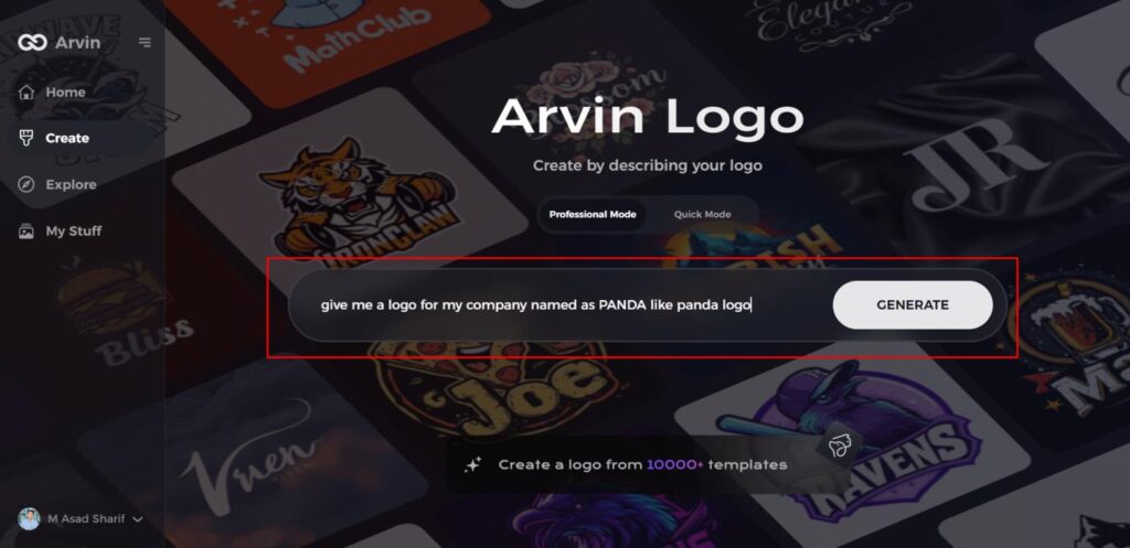
Step 1: Visit the Panda Logo Design Page
Open your browser and navigate to the Panda Logo design page on Arvin AI to begin creating your unique panda logo.
Step 2: Enter Your Business Details
Provide essential information about your business, including the name and category. This helps the AI generate logo concepts that align with your brand.
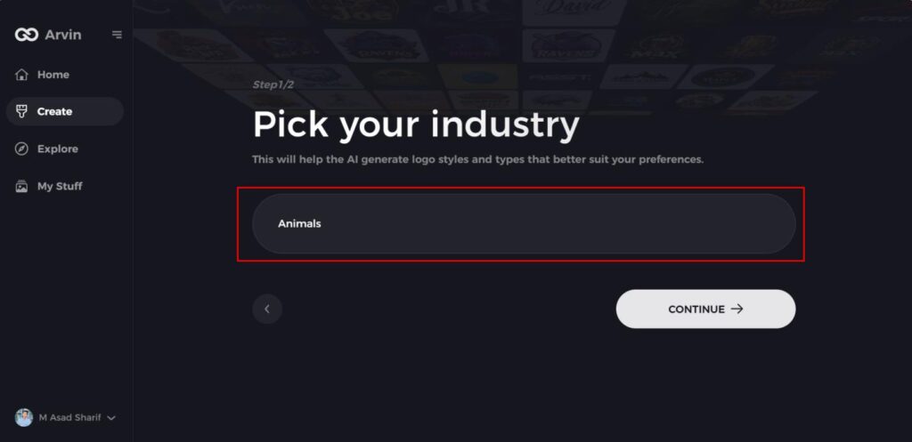
Step 3: Select Your Industry
Choose your industry from the list provided. This step helps narrow down logo style options, allowing the AI to tailor designs specifically for your sector.
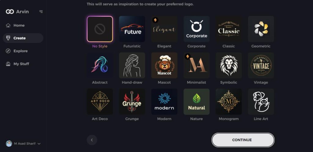
Step 4: Choose Your Preferred Style
Browse through the available styles and pick one that reflects your brand’s image. If none appeal to you, simply skip this step and let the AI suggest a design based on its default inspiration.
Step 5: Review Logo Ideas
The AI will generate several panda-themed logo options based on the details you provided. Take your time to explore the designs that resonate with your brand’s message.
Step 6: Customize Your Logo
Personalize your selected design by adjusting elements like colors, fonts, icons, and layout to match your brand’s aesthetic.
Step 7: Download Your Logo
Once you’re happy with your custom panda logo, download it in formats such as PNG or SVG. These formats ensure your logo works seamlessly across websites, social media, and printed materials.
Conclusion
When we talk about the Oscars logo it indeed strikes a fine balance between traditionalism and progress in keeping with the changing design trends. Over the years, the logo has gracefully adapted to include contemporary elements while keeping its fundamental nature intact and further upholding brand identity and status. Although the future of branding is increasingly being shaped by AI, platforms like Arvin AI allow businesses to generate gorgeous, tailored logos, providing fresh, world-class, cutting-edge solutions that can inject creativity and efficiency in a logo making process.
FAQs About the Oscars Logo
Why has the Oscars logo remained so consistent over the years?
The logo of the Oscars is kept unchanged to uphold brand identity but changes subtly to remain fresh and contemporary.
What is the role of the Oscar statuette in the logo?
The statuette represents filmmaking excellence as a tribute to masterpieces of the world of film.
How does digital branding affect the Oscars logo design?
As the digital media moves to the foreground, the logo of the Oscars has been upgraded to be used more flexibly for online media, social media, and animation.
Can I create a professional-grade logo like the Oscars through Arvin AI?
Yes! Arvin AI provides AI tools and customization services to help the users create high-quality and professional logos that represent their brand in a unique manner.
