
Oracle Corporation has been a leader in database technology and enterprise software solutions for decades. Founded in 1977, Oracle has developed from a small software company into a global giant technology company. Initially, Oracle did not have an official Oracle logo but when rebranding from the Software Development Laboratory to Relational Software, it adopted a bold sans serif word mark. This article outlines important milestones in Oracle’s course and introduces its innovations, acquisitions and strategic transformations.
Part 1: History and Evolution of Oracle Logo
Founded in 1977, Oracle was originally named Software Development Laboratory. Five years later, the company changed its name to Oracle Systems Corporation, creating the need for a new logo. Oracle developed two logos: Oracle Signature and Oracle Red Badge. The Signature Oracle logo contains the company name (red) in the white area. The word mark is similar, but the logo colors are reversed, and the company name is written in white on the red ground.
1979 – 1983
This image seems to be an old logo of digital design, showing the dawn of technology companies. The logo is written in a serif font reminiscent of the typewriter “Relational Software Systems, Inc.,” reflecting the era when computing was still heavily linked to traditional business practices. The color palette is red monochromatic on a dark background and may imply a bold pioneer spirit in software development.
1983 – 1995
This logo is a straight and boldly typographic representation of Oracle Corporation. The name “ORACLE” which is heavily decorated with heavy-weight sans-serif logo fonts, exudes strength and stability. While this design focuses on a bold and professional look, some businesses prefer cute logos for your brand to create a friendlier and more approachable image. The letters of “ORACLE CORPORATION” under the main brand name are small in scale, but they follow the same font style.
1995 – Present
This logo is from Oracle Corporation. The design is simple and bold, and consists on the company name of crisp sans-serif typeface and the vivid and strong red. On the left side of the wordmark, there is an abstract rectangular shape based on red, with a distinctive cutout that looks like a stylized oracle “O.” This geometric form is reminiscent of portals and entrances, suggesting the company’s role as a gateway to technology and innovation.
Symbol Mark
Oracle’s hardware products include a regular Oracle logo and an emblem consisting of two logotypes that acquired by Oracle in 2010 and modified the now-defunct Sun Microsystems symbol mark. The Sun logotype developed by Professor Vaughan Pratt (Stanford University) was orange, but then turned blue and eventually grey. Initially, the square side was horizontal, but rotated in 1983.
Font
The minimalist yet recognizable custom type is one of the contributors to the overall visual appeal of the word mark. The distinct sans serif logo fonts look unique, and the most unusual characters are “E,” “A,” and “R.”
Color
Both versions of the Oracle logo use the same shade of red called Oracle Red (Pantone PMS 485). This red, called Oracle Red (Pantone PMS 485), complemented by white. Black and white versions sometimes used in newspapers.
Part 2: History of Oracle
Oracle Corporation is a multinational technology company headquartered in Austin, Texas. Founded in 1977 by Ed Oates, Bob Minor, and Larry Ellison, it originally called the Software Development Laboratory. In 1979, the company re-branded itself as Relational Software and finally settled on the name Oracle, reflecting ideas of innovation and wisdom.
Achieving Global Recognition
Oracle officially became “Oracle Corporation” in 1995, and soon became recognized in the software industry. By 2020, it became the world’s third largest software company with market capitalization and sales. Today Oracle is famous for its database software, cloud engineering systems, and enterprise software solutions. The last includes corporate resource planning (ERP) tools and customer relationship management (CRM) software.
Part 3: Key Takeaways of Oracle Logo
- The change in the Oracle logo began with the establishment of the Software Development Laboratory in 1977.
- The 1983 rebranding introduced “ORACLE” with a surplus that emphasized professionalism and reliability.
- In 1995, Oracle adopted a modern logo with a bold red design that symbolized energy and innovation.
- The acquisition of Sun Microsystems and others influenced logo design, integrating elements like a rhombic ambigram to create a unified identity.
- The evolution of the Oracle logo reflects its commitment to adaptability, technological advancement and maintaining brand relevance in the tech industry.
Part 4: Branding impact and awareness
Why did Oracle’s logo become such a powerful symbol in the tech industry? Oracle’s history since 1977 is a story of strategic evolution and adaptation. The transformation of the Oracle logo reflects the company’s growth and technological progress. With each design change, brand awareness in the competitive market has increased. The current logo, adopted in 1995, is a bold sans-serif font and bright red (Pantone PMS 485) that gives off energy and authority.
Here’s how the Oracle logo influences and enhances branding:
- Enterprise Software Trust: Oracle’s logo is consistent across all products, making Oracle a reliable provider of enterprise software and cloud solutions.
- Marketing Strategy: The key to Oracle’s marketing strategy, ensuring that Oracle brands are always top-of-mind in the tech industry.
- Strategic sponsorship: Enhancing logo awareness and strengthening Oracle’s position as a leader through participation in major high-tech events and strategic sponsorships.
- Logo evolution: Every time the logo changes, it reflects Oracle’s adaptability to meet new technological advances and market demands.
Part 5: Adaptability of oracle logo in various media
One of the advantages of the Oracle logo is its high adaptability. It works the same on websites, mobile apps, T-shirts, and Billboard. The versatile transition from digital to print and visibility in both small and large formats is proof that this logo is a conceivable design.
Power Black and White
Another notable feature of the Oracle logo is the integrity of the design in the black and white version. Whether it is a monochrome advertisement or just a copy of a fax, this logo is impactful and keeps a recognizable nature.
Part 6: Interesting Facts about Oracle
- The company was originally named Software Development Laboratory in 1977. The company was subsequently renamed Relational Software.
- The company name “Oracle” added in 1995 after a successful CIA project. This is because the code name of the project was Oracle.
- Early ideas for RDBMS development in Oracle were inspired by papers written by IBM researchers.
- Oracle had three founders: Bob Minor, Larry Ellison, and Ed Oates. However, Larry Ellison is the founder.
- Co-founder Larry Ellison spent most of his time sick after suffering pneumonia in nine months. He adopted by his mother by his aunt and raised in a middle-class residence.
- Oracle faced bankruptcy in the 1990s and laid off some employees.
Part 7: Arvin AI’s Impact on Logo Design and Branding
Arvin AI is an easy-to-use browser extension that assists with AI chat, writing, and image generation. It simplifies branding for marketers and designers. Through AI-driven capabilities, users are able to create visuals, enhance content, and summarize information in a timely manner. This tool works well for those who require quick and professional output. Designing logos or perfecting brand content, Arvin AI enhances creativity and saves time.
Key Features of Arvin AI
- AI Image Generator: Assists in logo and other visual content designing, making the branding task simpler.
- Writing Tools: Offers AI-based writing support, enhancing productivity for content creators.
- Web and PDF Summarization: Summarizes content instantly, allowing designers and marketers to access information easily.
- Branding Insights: Offers AI-based recommendations to refine logo designs and brand messages.
- Design Templates: Offers pre-made templates for logos and marketing collateral, reducing effort and time.
Steps to Use Arvin AI for making Logo
Step 1: Access the Arvin AI Logo Maker
Start by visiting the design page of the Arvin AI logo maker using your preferred web browser. This is where your logo creation journey begins.

Step 2: Enter Your Business Details
Provide essential information, such as your business name and category, to help the AI design logos that resonate with your brand identity.
Step 3: Choose Your Industry
Select the relevant industry from a predefined list. This step enables the AI to tailor logo styles and elements specific to your sector.
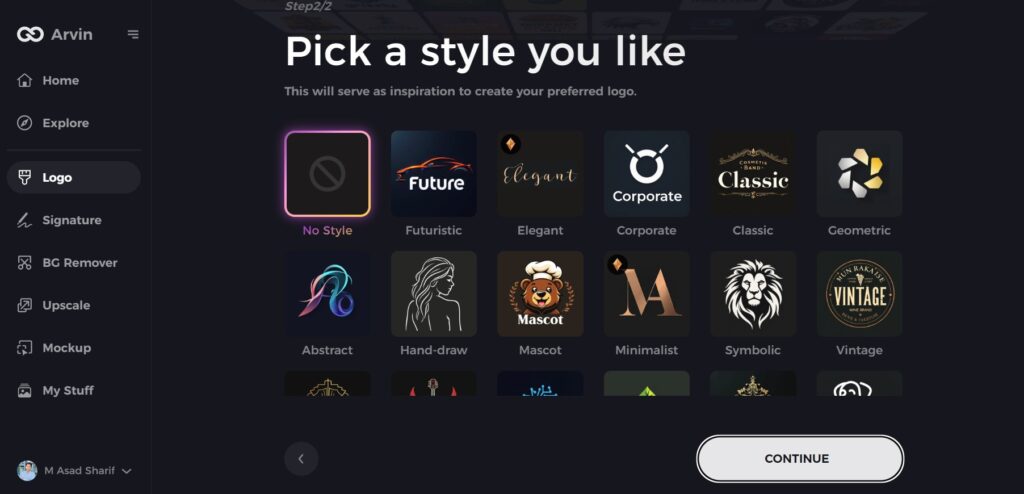
Step 4: Select a Style
Browse through the available design styles and pick one that aligns with your vision. If none appeal to you, skip this step, and the AI will proceed with default suggestions.
Step 5: Explore Logo Concepts
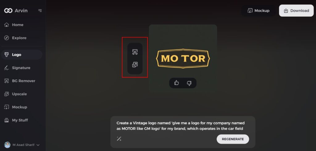
Based on the information provided, the AI will generate a variety of logo ideas. Review the options and choose the one that best represents your brand.
Step 6: Customize Your Logo
Refine your selected design by adjusting elements such as colors, fonts, icons, and layout. Personalize it to match your unique style.
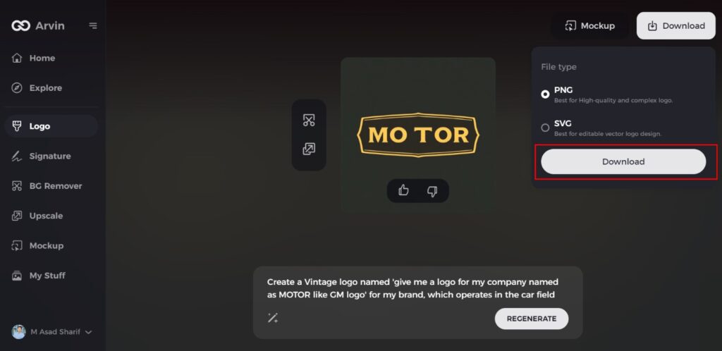
Step 7: Download Your Final Design
Once satisfied with the finalized logo, download it in versatile formats like PNG or SVG, ensuring it’s ready for use across websites, social media, and print materials.
Conclusion
The Oracle logo has evolved over time with the expansion of the company. Its red color and bold letters make it highly visible. The red represents leadership and energy, indicating Oracle’s powerful presence in technology. The minimalist design makes the brand easy to remember. Now branding increasing and playing a crucial role in AI applications such as Arvin AI enable designers and marketers to develop logos and marketing materials easily and swiftly. Arvin AI makes it easy to design professionally without requiring sophisticated skills or additional time.
FAQs
What inspired the original design of the Oracle logo?
The original one was simple, with the utilization of bold letters and the black-and-white color to depict professionalism and stability.
How has the Oracle logo evolved over the years?
The logo has evolved from a basic wordmark to a red bold logo, which indicates the growth and expansion of Oracle.
What does the red color in the Oracle logo signify?
Red represents energy, passion, and action, and these are the same dynamic place Oracle takes in the technology space.
How can Arvin AI assist in logo design and branding?
Arvin AI provides image generation, content writing, and content summarization tools with artificial intelligence to aid marketers and designers in creating good branding content.
