In recent years, the resurgence of old logos and vintage-inspired branding has taken the spotlight. Companies are revisiting their design roots to evoke nostalgia, connect emotionally with their audience, and stand out in today’s minimalist-dominated branding landscape. While modern logos focus on sleek minimalism and adaptability, old logo designs offer a rich glimpse into the past, reflecting the trends, craftsmanship, and storytelling of earlier eras. From intricate hand-drawn illustrations to ornate typography, these vintage designs exude a timeless charm that continues to captivate audiences.
Your perfect logo is just a few clicks away. Use Arvin AI’s Logo Maker to design and download it for free. Let’s get started!
Old Logo Design
What Is an Old Logo Design?
An old logo design refers to a style that harks back to earlier eras, reflecting the trends and branding principles of the time.
These logos are often characterized by their vintage or classic aesthetic, incorporating ornate details, intricate typography, and hand-drawn elements. Unlike modern logos, which focus on simplicity and minimalism, old logo designs lean into elaborate storytelling and visual richness.
For instance, logos from the early 20th century frequently featured serif fonts, detailed illustrations, and textured effects that conveyed craftsmanship and authenticity. Take Coca-Cola’s timeless script logo—it’s a perfect example of how old logo designs can evoke nostalgia while remaining instantly recognizable.
Similarly, Levi’s classic red tab logo taps into its rich heritage, making it synonymous with tradition and trust.
Interestingly, old logo designs aren’t just relics of the past. Many brands today intentionally adopt vintage-inspired styles to connect with audiences who value retro aesthetics. This trend creates a sense of warmth and familiarity, while also standing out in a sea of minimalist modern logos.
Why Are Companies Using Old Logos?
In recent years, many companies have revisited their old logos or embraced vintage-inspired designs, and this trend isn’t just about nostalgia—it’s a deliberate branding strategy. By using old logos, companies tap into emotions, evoke trust, and create a strong connection with their audience.
1. Nostalgia Resonates with Customers
People naturally associate vintage designs with simpler, more familiar times. By reviving old logos or incorporating retro elements, brands tap into this sentimentality. For instance, companies like Pepsi and Burger King have returned to their older logo styles to appeal to customers who grew up with those designs, fostering a sense of emotional connection and loyalty.
2. Trust Through Heritage
Old logos carry the weight of history and tradition. A company that reverts to a past design subtly communicates, “We’ve been here for a long time, and you can trust us.”
For instance, brands like Levi’s and Coca-Cola continue to use their timeless logos to highlight their long-standing reputation, reinforcing reliability and consistency.
3. Differentiation in a Minimalist Era
As modern logos often lean towards minimalism, revisiting old logos or vintage aesthetics helps companies stand out. A richly detailed or retro-inspired logo immediately grabs attention in a world dominated by clean, flat designs.

Take Wendy’s or Miller Lite, for example—both brands have embraced retro styles to carve a unique identity in their markets.
4. Reinforcing Brand Identity
Sometimes, companies revive old logos to re-establish their core identity or signal a return to their roots. This approach often comes during rebrands or product relaunches. For example, Warner Bros. recently reintroduced an updated version of its classic shield logo to honor its legacy while maintaining a modern touch.
5. Retro is Always Trendy
The resurgence of vintage trends across fashion, art, and media has naturally influenced branding. Retro designs feel timeless yet trendy, appealing to younger audiences who view them as stylish and to older generations who feel connected to the past. It’s a win-win for brands looking to bridge generational gaps.
What Are Vintage Logos?
Vintage logos are a style of logo design that draws inspiration from the past, often reflecting the aesthetic trends, typography, and artistic elements of earlier decades. These logos are characterized by their nostalgic charm, intricate details, and handcrafted feel.
Key Features of Vintage Logos
Retro Typography
Typography is one of the defining elements of a vintage logo. Fonts with serif, script, or slab-serif styles replicate old signage, newspapers, or posters, adding a classic flair.
- Coca-Cola’s script font remains a gold standard for vintage typography, with its fluid, hand-drawn style exuding timeless charm.
- Hershey’s chocolate logo uses bold, blocky serif fonts, reminiscent of classic packaging from the early 20th century.
- Campbell’s Soup logo relies on flowing script fonts that evoke traditional product labeling, reminding customers of comfort and home-cooked meals.
Hand-Drawn Aesthetic
Hand-drawn elements bring personality and individuality to vintage logos. These designs feel warm and personal, emphasizing craftsmanship.
- Levi’s maintains a hand-drawn touch in its classic red tab and original two-horse emblem, reflecting its rugged, pioneering heritage.
- Harley-Davidson’s logos often feature detailed illustrations of motorcycles or shields, emphasizing its history as an American icon of freedom and adventure.
- Many modern craft breweries like Anchor Brewing use hand-drawn illustrations of anchors and wheat to give their logos a nostalgic, artisanal feel.
Ornate Details
Flourishes, banners, borders, and decorative patterns add an extra layer of richness to vintage logos, making them instantly recognizable.
- Jack Daniel’s employs intricate borders, serif fonts, and flourishes, conveying its deep-rooted history and craftsmanship in whiskey making.
- Twinings Tea uses ornate frames and a crowned lion, signifying its royal heritage and status as one of the oldest tea brands.
- Small coffee roasters, such as Blue Bottle Coffee, have adopted detailed yet understated designs that feel vintage-inspired while staying modern.
Muted or Earthy Colors
Vintage logos typically use color palettes that reflect the muted tones of old prints, creating warmth and authenticity.
- Starbucks’ Original Siren Logo incorporated brown tones to reflect its connection to coffee and the natural world, before later adopting its iconic green.
- Bass Ale uses earthy reds and golds to evoke tradition and heritage, showcasing its history as one of the world’s oldest beer brands.
- Modern artisans like Fjällräven leverage similar palettes for their vintage-inspired designs, emphasizing durability and quality.
Symbolic Imagery
Vintage logos often incorporate images that represent the brand’s history or industry, creating a direct connection to its roots.
- Guinness features a harp, symbolizing its Irish heritage and long-standing craftsmanship in beer brewing.
- Morton Salt uses the iconic image of the little girl with an umbrella, a design that has persisted for over a century.
- Bakeries and coffeehouses, like Stumptown Coffee Roasters, often use symbols like wheat stalks or coffee beans to reinforce their focus on natural, high-quality ingredients.
Evolution of 13 Famous Old Logos
Old Logos vs New
1. Apple
Old Logo (1976): Apple’s first logo featured a detailed illustration of Isaac Newton sitting under a tree with an apple above his head.
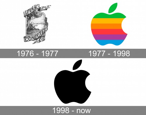
- Old Logo (1976): Apple’s first logo featured a detailed illustration of Isaac Newton sitting under a tree with an apple above his head.
- Now: By 1977, the now-famous bitten apple silhouette replaced the original. Over the years, the logo has evolved to embrace sleek, minimalist designs, shifting from rainbow colors to monochrome gradients.
2. Coca-Cola
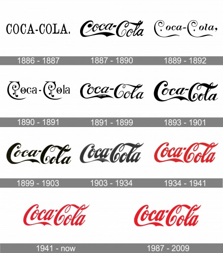
- Old Logo (1886): The original logo featured plain, serif typography.
- Now: By 1893, Coca-Cola adopted its iconic flowing script, which has remained mostly unchanged. Over the years, minor tweaks have polished the logo while retaining its classic red-and-white palette.
3. McDonald’s
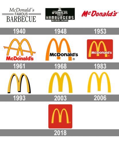
- Old Logo (1940s): McDonald’s early logo emphasized “McDonald’s Famous Barbecue” with a chef mascot.
- Now: The iconic golden arches, introduced in the 1960s, evolved from representing the architecture of the restaurants to becoming the universal symbol for fast food and happiness.
4. Nike
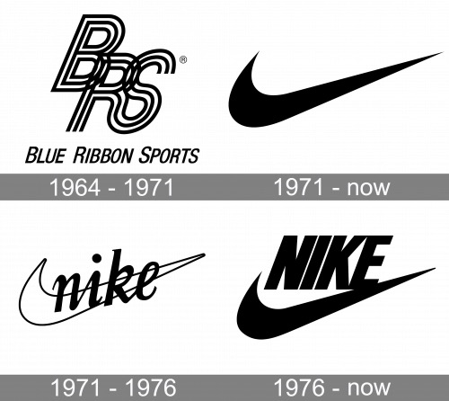
- Old Logo (1971): Nike’s original logo included the swoosh and the brand name written in a bold, blocky font.
- Now: Over time, the font was dropped entirely, leaving just the swoosh.
5. Pepsi
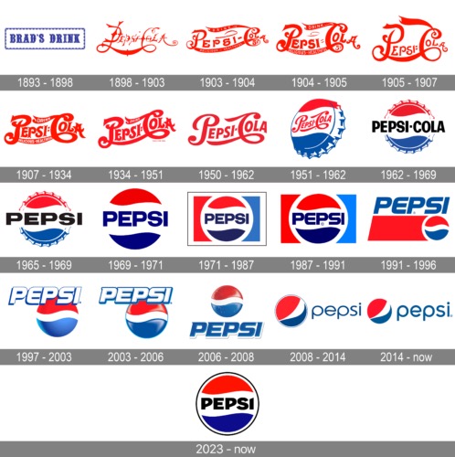
- Old Logo (1898): Pepsi’s first logo was intricate, with elaborate swirls and a focus on typography.
- Now: The logo has undergone numerous iterations, from introducing its red, white, and blue color palette in 1950 to its modern-day spherical design.
6. Google
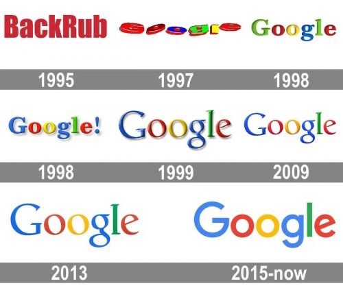
- Old Logo (1998): Google’s first logo had a multicolored, 3D font with an exclamation mark.
- Now: The company embraced a flat design in 2015 with a sans-serif font while maintaining its vibrant primary color palette.
7. Starbucks
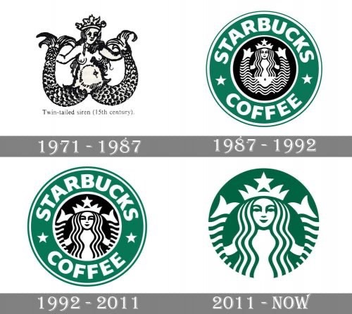
- Old Logo (1971): The original Starbucks logo featured a detailed siren with exposed anatomy in a brown color palette.
- Now: The siren is now more refined and modern, with a green-and-white design emphasizing Starbucks’ connection to sustainability and coffee culture.
8. Microsoft
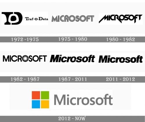
- Old Logo (1975): Microsoft’s early logo had a futuristic, disco-inspired typeface.
- Now: In 2012, Microsoft introduced its iconic four-colored square logo, symbolizing diversity and its ecosystem of products (Windows, Office, Xbox, and creativity).
9. Adidas
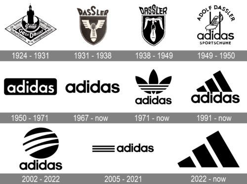
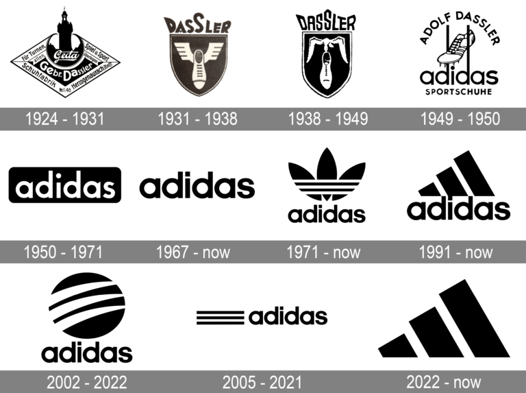
- Old Logo (1949): Adidas’ original logo featured a spiked running shoe hanging between two flowers.
- Now: The logo has evolved into its iconic three stripes, used in different forms (trefoil, mountain, and circular). The stripes symbolize performance, resilience, and simplicity.
10. Burger King
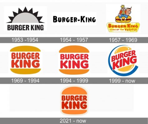
- Old Logo (1954): The original logo showcased a royal king sitting on a burger.
- Now: The current logo takes a retro-inspired approach, resembling its 1969 version.
Famous Old Logos
1. Ford Motor Company
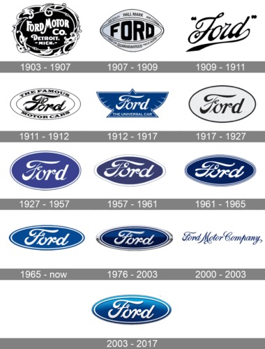
Ford’s first-ever logo was an elaborate black-and-white design, characterized by intricate borders and ornate serif typography. The crest-like emblem resembled a Victorian seal, which was common for industrial companies during the early 20th century. Notably, the decorative styling emphasized craftsmanship and precision, qualities Ford wanted to highlight during the dawn of the automotive age.
As the industrial revolution was reshaping society, this detailed design resonated with consumers who were looking for reliability in a rapidly changing world. Over time, this intricate logo evolved into the sleek and minimal Ford oval we recognize today.
2. Walt Disney
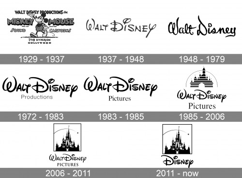
Disney’s early logo was as whimsical as the brand itself. Featuring a circular design with Mickey Mouse at the center, the logo brought to life the playful and magical qualities that defined Disney’s animated creations. The hand-drawn details, from Mickey’s cheerful expression to the circular frame, perfectly reflected the charm and artistry of the era.
This logo, deeply tied to the early days of animation, set the tone for the enchanting world Disney would create. Over the years, the design shifted to reflect modern aesthetics, but its spirit of wonder remains intact.
3. Volkswagen
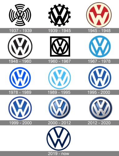
Volkswagen’s original logo combined a gear-like border with the now-iconic “V” and “W” letters arranged in a circular formation. The industrial design was deliberate, as it represented the brand’s engineering expertise and focus on precision. At the time, cars were becoming more accessible to the average person, and this logo emphasized reliability and innovation.
By integrating mechanical elements into the design, Volkswagen communicated its mission to create vehicles that were both functional and cutting-edge. As the company evolved, the logo was streamlined, but its strong industrial roots remain evident.
4. IBM (Pre-Modern)
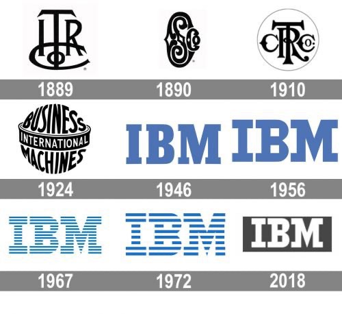
Before it became IBM, the company was known as the Computing-Tabulating-Recording Company (CTR). The original logo featured bold serif typography surrounded by intricate decorative flourishes, which were hallmarks of early 20th-century design. This highly ornate logo reflected the sophistication of the company’s machinery, which was revolutionizing data processing at the time.
As IBM moved into the tech industry, the logo evolved into the clean, modern stripes we associate with innovation today.
5. NASA
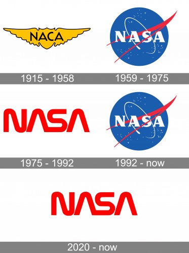
NASA’s first logo, known as the “Meatball,” was a bold and futuristic design that captured the excitement of the space race era. The blue circular background symbolized the Earth, while the red vector cutting across it represented aeronautics and the ambition to push boundaries. The white stars scattered throughout added a celestial element, emphasizing exploration.
This logo perfectly encapsulated the optimism of the 1950s and the belief in technological progress. Though NASA introduced a more streamlined logo later, the “Meatball” remains a beloved symbol of space exploration.
6. Kodak
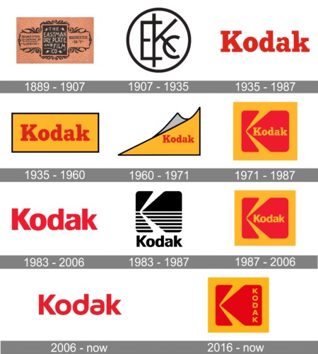
Kodak’s early logo was encased in a circular frame with decorative detailing, a popular choice during the Victorian era. The bold serif font within the emblem emphasized the brand name, reflecting its authority and innovation in photography.
At a time when photography was becoming more accessible, this logo symbolized premium quality and craftsmanship, helping Kodak establish itself as a leader in the industry.
Old Logos of Famous Brands
1. Kellogg’s
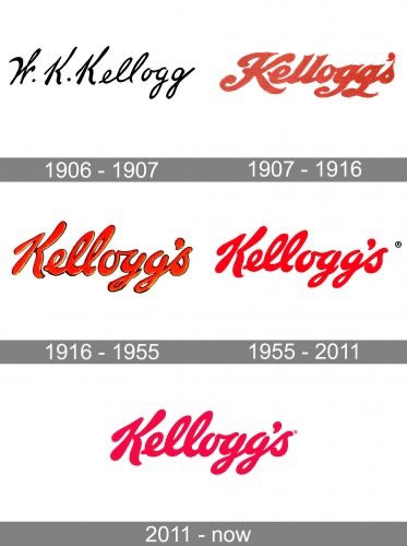
The first Kellogg’s logo featured a text-heavy design with serif fonts and intricate borders, proudly displaying the full name: “Battle Creek Toasted Corn Flake Company.” This ornate design mirrored the trends of the early 20th century, where businesses used logos to provide as much information as possible.
The detailed styling emphasized the formality and trustworthiness of the brand, which was entering the rapidly growing packaged food market.
2. McDonald’s

The original McDonald’s logo highlighted “McDonald’s Famous Barbecue” with a cheerful chef mascot named Speedee. The design’s playful typography and colorful mascot reflected the casual, family-oriented nature of the restaurant.
This logo, which focused on barbecue before McDonald’s became synonymous with fast food, was a reflection of the brand’s early identity.
3. Heinz
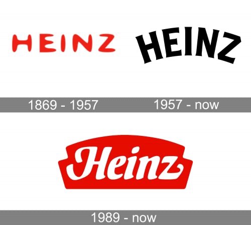
Heinz’s first logo, introduced in 1869, embodied the ornate Victorian design aesthetic of the time. It featured decorative, intricate typography with the brand’s name encased in a detailed banner.
This early design conveyed elegance and trustworthiness, qualities Heinz sought to associate with its high-quality condiments and canned goods.
4. Hershey’s
Old Logo (1900): Hershey’s original logo was simple, featuring bold serif letters spelling out “Hershey’s Milk Chocolate.”
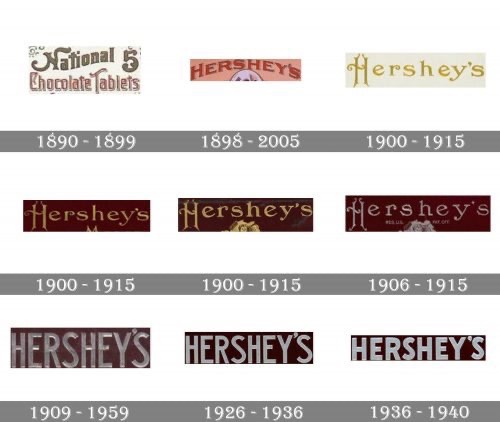
Hershey’s original logo was all about simplicity and clarity. Featuring bold serif letters that spelled out “Hershey’s Milk Chocolate,” the logo avoided decorative elements, opting instead for a straightforward approach.
5. Nabisco
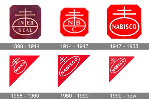
Nabisco’s original logo was a triangular shield filled with intricate patterns and serif text. The triangle symbolized strength and stability, while the decorative details reflected the craftsmanship associated with Nabisco’s baked goods.
This regal and authoritative design helped distinguish Nabisco in the competitive food market of the early 20th century. While the modern logo has shifted to a simpler design, the triangle remains a subtle nod to its origins.
Vintage Fashion Logos
1. Chanel
Chanel’s first logo, introduced in 1925, featured the now-iconic interlocking “C”s that stood for the initials of founder Coco Chanel. Unlike the modern minimalism it embodies today, the original design leaned slightly more towards traditional typography, with intricate strokes and a hint of Art Deco influence.
2. Louis Vuitton
The Louis Vuitton monogram logo debuted in 1896 as part of the brand’s canvas pattern to combat counterfeiting. It featured an interwoven “L” and “V” flanked by floral motifs and geometric designs. The pattern itself was heavily inspired by the ornamental trends of the Victorian era, with its intricacy hinting at the detailed craftsmanship of Louis Vuitton’s leather goods.
3. Gucci
Gucci’s original logo, created in the 1930s, showcased a knight in shining armor, complete with a suitcase and bags. The intricate depiction of the knight was surrounded by decorative embellishments, capturing the grandeur of Florence, the brand’s birthplace.
4. Prada
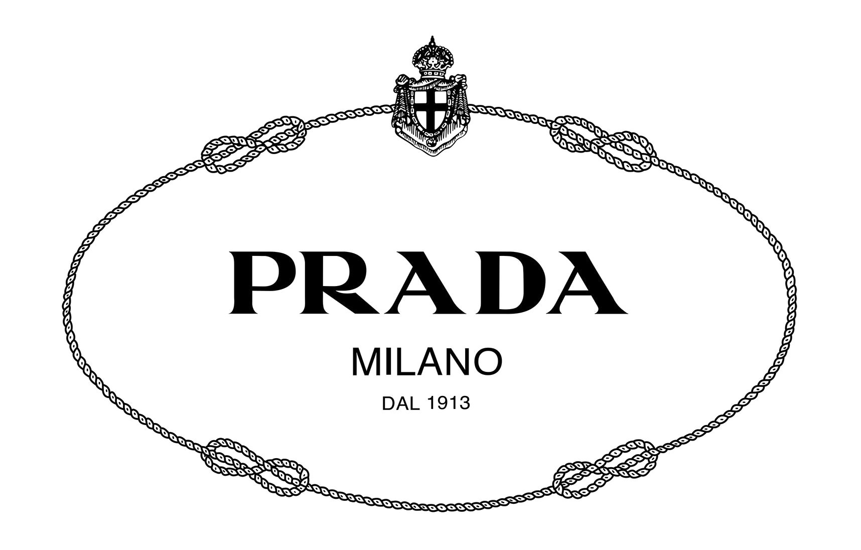
Prada’s first logo was an ornate coat of arms, featuring an elaborate shield flanked by heraldic details and scrollwork. At the center of the design, the words “Prada Milano Dal 1913” highlighted the brand’s Italian origins and legacy.
5. Burberry
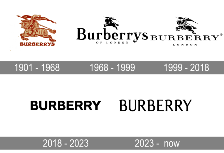
In 1901, Burberry unveiled its first logo featuring an equestrian knight clad in armor, holding a banner inscribed with “Prorsum,” Latin for “forward.” The knight was surrounded by meticulous details, including a shield and intricate linework. This design reflected the prestige and quality associated with Burberry’s raincoats and outerwear, cementing its association with British heritage.
6. Levi’s
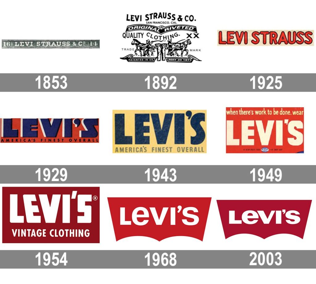
Levi’s first logo, known as the “Two Horse Pull,” debuted in 1886 and illustrated two horses pulling apart a pair of jeans. The design was highly detailed, showcasing the horses’ strength and movement, as well as the stitching and durability of the jeans. This hand-drawn logo embodied the rugged spirit of the American West, where Levi’s was a staple among workers.
7. Versace
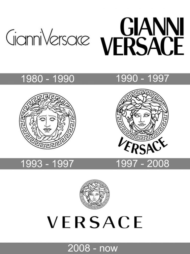
Versace’s inaugural logo was centered around the mythological figure of Medusa. The hand-drawn design featured her face surrounded by intricate geometric patterns inspired by classical Greek art. Medusa’s striking gaze was brought to life with fine detailing, while the surrounding patterns added depth and texture to the overall design.
8. Hermès
Hermès’ first official logo, adopted in the 1950s, featured a horse-drawn carriage as a nod to the brand’s origins as a maker of high-quality saddlery and harnesses. The logo included delicate details, from the intricate wheels of the carriage to the reins of the horse, making it a testament to the craftsmanship Hermès was known for.
9. Adidas
Adidas’ earliest logo featured a spiked running shoe suspended between two flowers. The design focused heavily on the technical aspect of sportswear, with the spikes prominently displayed to emphasize functionality. The flowers added a decorative touch, reflecting post-war European design trends that favored organic elements.
10. Calvin Klein
The first Calvin Klein logo used a serif font with bold, clean lines, representative of the formal typography popular in the late 1960s. It was straightforward and text-focused, with no additional imagery or embellishments, aligning with the minimal yet formal aesthetic of its time.
Old Logos of Apple
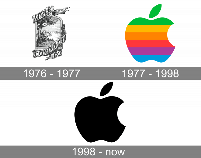
The Original Logo (1976)
Apple’s very first logo, introduced in 1976, was a detailed illustration created by Ronald Wayne, one of the company’s co-founders. It depicted Sir Isaac Newton sitting under an apple tree, with a single apple hanging above him—symbolizing the legendary story of Newton’s discovery of gravity.
The intricate logo featured a banner reading “Apple Computer Co.” and a frame with ornate details that gave it a vintage, hand-drawn aesthetic. While this design represented Apple’s intellectual and innovative roots, its complexity made it less practical for branding, especially as the tech industry moved toward simpler, more versatile designs.
The Rainbow Apple (1977–1998)
Just a year later, in 1977, Apple introduced a radically different logo that would become one of the most iconic symbols of the 20th century. Designed by Rob Janoff, this new logo featured the now-famous bitten apple silhouette, filled with horizontal rainbow stripes.
The bite was included to distinguish the apple from a cherry or other fruit while symbolizing knowledge (a nod to the biblical story of Adam and Eve). The vibrant rainbow colors reflected Apple’s positioning as a creative and innovative company. At the time, Apple was one of the few companies producing computers with color graphics, making the rainbow logo a perfect fit for its forward-thinking identity.
The Monochrome Apple (1998–Present)
By 1998, Apple was undergoing a significant transformation under the leadership of Steve Jobs, who had returned to the company. To reflect its streamlined and modern approach, Apple introduced a simplified monochrome version of the bitten apple logo.
This minimalist design, which dropped the rainbow stripes in favor of a sleek, single-color look, aligned with the clean aesthetics of Apple’s groundbreaking products like the iMac G3. Over the years, the monochrome logo has been adapted with subtle variations, including gradient effects and metallic finishes, to complement the sleek designs of Apple devices.
Oldest Logos in the World
1. Stella Artois (1366)
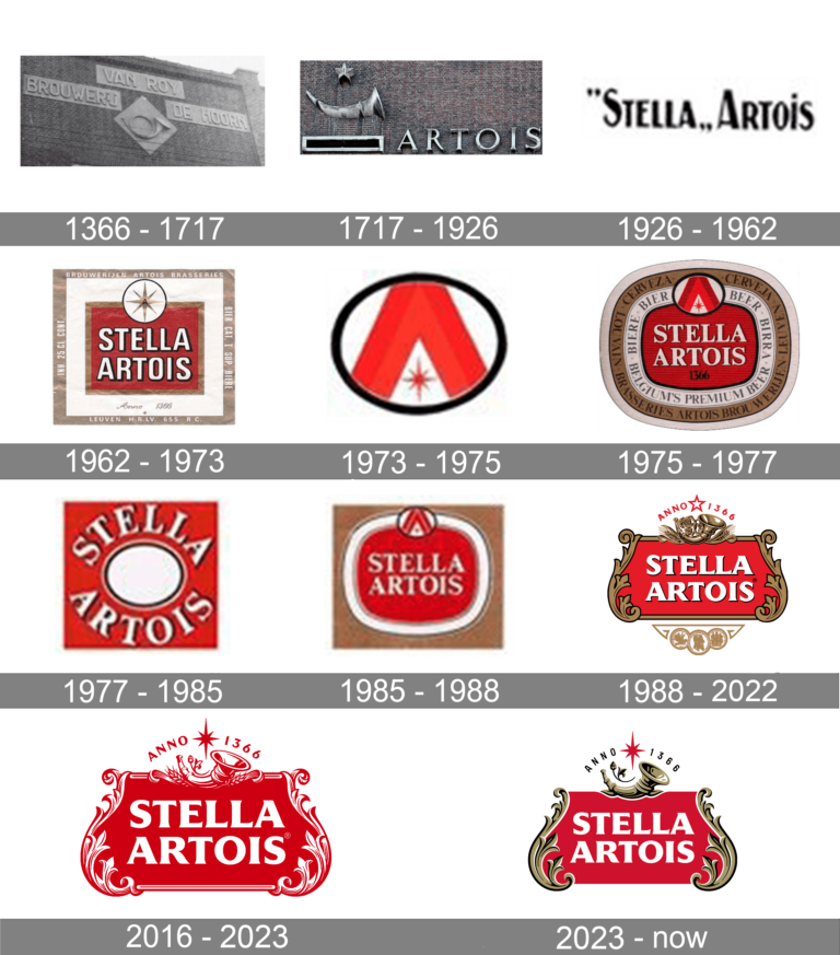
Stella Artois, one of the oldest beer brands in the world, traces its roots back to the Den Hoorn Brewery in Leuven, Belgium. As early as 1366, the brewery used the red star and a horn to symbolize its craft. The red star, a medieval symbol of quality brewing, and the horn, representing traditional European guilds, were both integral to the brewery’s identity.
When the brewery was rebranded as Stella Artois in 1926, the logo retained the horn to honor its origins. Over time, the design incorporated elegant typography and a refined red and white color palette. Today, the Stella Artois logo remains a symbol of heritage, quality, and tradition in the beer industry.
2. Johnson & Johnson (1886)
Johnson & Johnson’s logo is a classic example of branding that has remained virtually unchanged since its inception. The handwritten signature of co-founder James Wood Johnson became the company’s logo in 1886, reflecting a personal touch that emphasized care and trust.

The flowing script, with its distinctive loops and curves, evokes a sense of warmth and reliability, perfectly aligning with the brand’s focus on healthcare and family products. Over the decades, Johnson & Johnson has kept this iconic logo intact, making it one of the longest-running logos in continuous use. Its consistency has contributed to the brand’s enduring reputation for quality and trustworthiness.
Final Words
Logos are not just markers of identity—they are a reflection of time, culture, and innovation. Old logo designs remind us of the artistry and storytelling that once defined branding, and their continued relevance proves their enduring power. In today’s world, where every brand seeks to make a memorable first impression, old logos inspire us to blend tradition with creativity. If you’re ready to create a logo that combines modern innovation with classic charm, explore the possibilities with Arvin’s Free Logo Maker. Start designing today and craft a logo that tells your unique story—because great branding never goes out of style.

FAQ
Yes, websites like Logo Design Love, Brands of the World, and 1000 Logos allow you to explore old and vintage logos.
Apple, Nike, McDonald’s, Coca-Cola, Google, Starbucks, Amazon, Adidas, Microsoft and Facebook (Meta).
Companies use old logos to tap into nostalgia, evoke trust, and reestablish their heritage. Retro designs often resonate emotionally with customers, making brands feel familiar and authentic. Additionally, vintage-inspired logos stand out in a world dominated by minimalist trends, helping brands differentiate themselves.
Vintage logos are designs that evoke the aesthetics of a bygone era, often characterized by ornate typography, hand-drawn elements, and muted color palettes. They reflect authenticity, heritage, and craftsmanship, making them popular among brands that value tradition or wish to appeal to nostalgic audiences. Examples include the intricate designs of Levi’s Two Horse Pull logo or Jack Daniel’s vintage label.


