New Ford Logo has always produced cars that people trust and admire. The logo of a company is essential because it shows what they stand for. The New Ford logo for the company was in 2024 unveiled on one of its best-selling F-150 trucks, a great move by the company. With that, the firm indicates it’s adapting with the current changes in terms of design alteration in order to be up-to-date with modern demand. Now, let us try to go a little further in terms of their evolution regarding their logo and designs.
Part 1: The Evolution of the Ford Logo
Ford’s story began with the vision of Henry Ford in 1903, leading to major changes in the automobile industry. Meanwhile having found its rooted base within Detroit, it unfolded rapidly enough to become the leader of a T-type model, which affordable and reliable cars were a prevalence of mass production.
What is Henry Ford?
Henry Ford is a name that many will recognize, he was an American who set up the Ford car manufacturing company. H. Ford was born in 1863 and died in 1947.
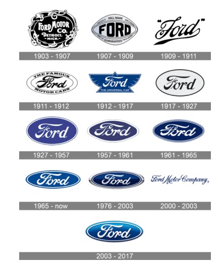
1903 – 1907
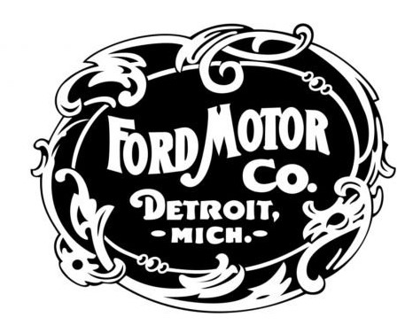
The Ford Motor Company’s first logo was a rounded, decorative badge in a frame with leaves and curves. The badge colored black, with white letters engraved on it and a white frame attached. The letters arranged like waves in arc, and the catchphrase “Detroit, Michigan” written in bold sans-serif typeface. The traditional emblem logo design of the time was very elegant and simple.
1907 – 1909
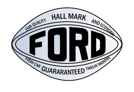
In 1907, Ford decided to change the style to modern and powerful. In the center of the rhombus with a rounded and smooth angle is a bold black “Ford” letter, with additional characters above and below. The entire logo looked exquisite because of the eye-like shape of the new badge giving the total setup a professional and a progressive look and feel with metallic gray and black tones giving professional and a progressive look and feel.
1909 – 1911
In 1909, the automaker adopted Henry Ford’s signature as a visual identity. This sign modified in the new color palette, and today remains the core of the Ford overall concept. Script lettering characterized by the elongated tail of the letter “D,” but deleted in future versions.
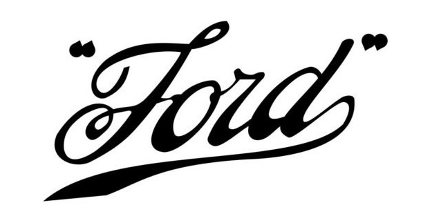
1911 – 1912
The New Ford Logo renewed in 1911. Enclose the founder’s sign with a double horizontal ellipse and put the character “The Famous Motor Cars” around it.
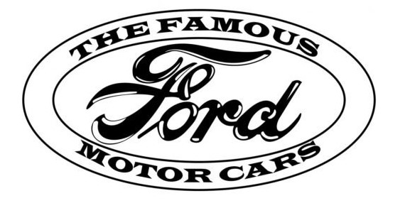
1912 – 1917
Most interesting is the 1912 version. The name plate is the same style, but placed on a blue badge imitating birds. All details expressed in white, with the delicate and strict catchphrase “The Universal Car.” This design remained in the company for five years, and is the only one in this unusual shape.
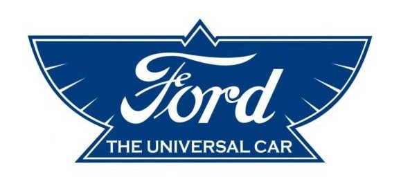
1917 – 1927
In 1917, New Ford Logo decided to return to minimalism and improved the 1911 logo. Henry Ford’s sign entered a white ellipse surrounded by a thin frame. This was a simple yet very elegant logo that lasted for ten years.
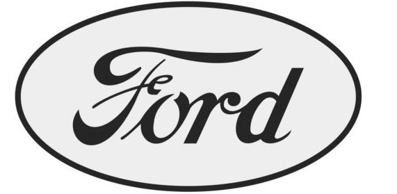
1927 – 1957
It changed to blue and white In 1927. The frame is also slightly changed, and the thick white line and the thin blue line are double. This New Ford Logo became the prototype of the current logo.
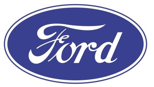
1957 – 1961
In 1957, New Ford Logo redesigned the badge. The ellipse was enlarged, the letters were thick, and the lines were elongated. The blue background has a new strong shade, and the frame consists of two thin white and two blue lines. This design did not last long, but it served as a logo design inspiration.
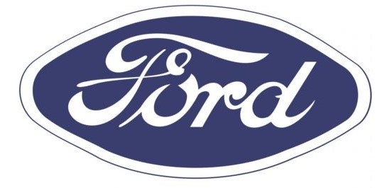
1961 – 1965
The New Ford Logo was designed in 1961 and was used as the main emblem for 15 years, but is still used as a secondary emblem. In the center of the blue ellipse, surrounded by a thick white frame, is a nameplate of a white script. Simple and elegant design, you can see it at a glance.
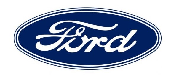
1965 – Today
The badge was introduced by this legendary automaker in 1965 and is still used by most of the company’s vehicles. This badge is a horizontally elongated oval, based on smooth blue, characterized by a simplified double outline of blue and white, and a polished and emphasized white inscription in the center of the banner. This badge version along with its logo colors also became the base for voluminous badges created for the brand in the early 2000s.
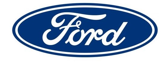
1976 – 2003
In 1976, Ford decided to use a three-dimensional version, changing the white to silver and adding gloss to the surface of the badge. The blue here is darker and gradient.
2000 – 2003
For only two or three years in the 2000s, American automakers used writing-based logos. The full name of the brand expressed in a sophisticated typeface with decorations, and the bold and playful lines of the letters used dark, bright shades of blue, and the background was pure white.

2003 – 2017
The 2003 version is similar to the 1961 version, but has more volume and light. The character has a delicate shadow and the background is gradient blue. The outline of the inscription refined and gives a timeless and sophisticated impression.
Part 2: The Design and Concept behind the New Ford Logo
Ford’s new logo is not just a simple change but a reflection of where the company is headed. Now let’s discover on the concepts of the new logo and what makes it so unique.
Detailed breakdown of the design elements of the new logo
The new logo is less complex and even simple in a modern, clean design way. It carries the same classical oval shape as the old logos but with even less detail, resulting in a highly modern look.
Lines made smooth, making the whole piece look fresh yet without losing anything from the real iconic Ford.
Color, font, and symbolism
The new logo has bold, strong colors that stand out. Font is more modern and readable. Oval still commands a symbol of unity and strength, while the simplicity in design shows that Ford is forward-looking. It is a logo which also focuses on issues to do with trust, quality, and innovation. The logo fonts are very essential for this kind of logos.
Designers and creative influences behind the new look
A team of talented designers worked on the new logo, drawing from Ford’s long history while also looking forward. The concept was to create something that feels familiar but new. It was derived from the desire to reach out to today’s customers and technology which was not an overturn from the traditional values that Ford has always had.
Why Ford decided to make this change and the vision for the future
As part of their broader plan to look towards the future, Ford decided to update the logo. Since change in technology and design is moving very fast, the new logo is an indication of this core competence. They want to prove both that they are eager to meet new challenges and that they are oriented to the future, at the same time claiming their historical roots.
Part 3: How the New Ford Logo Affects the F-150 and More
Contrary to a usual practice of changing logo from time to time, the new one introduced by the Ford was not just a symbol. This was as part of a shift of how the brand engages its customers as a whole. Now let us find how this new number impacts the signature F-150 and the other Ford vehicles.
How the new logo was implemented on the 2024 F-150
The new logo first came out on the 2024 F-150, which happens to be Ford’s best-selling model. It was highly positioned, thus becoming a focal point on the truck front grille and other parts of the truck. This is what made the new logo have that strong first impression before people could say Ford was taking a new step into a new era with its best-known vehicle.
Logo use in other Ford products
While the F-150 was the first to sport the new logo, Ford was quick to deploy it on other models. The new logo popped up on trucks, SUVs, and even electric vehicles such as Ford Lightning. Uniformity across different vehicles made it feel like part of Ford’s overall lineup instead of one model.
Consumer responses and comments about the new logo on the F-150
It was not a positive reception when the new logo appeared on the F-150 for the first time. Some were comfortable with its modern, clean look, and thought it updated the truck; others did not know what to think, having grown accustomed to the old logo.
The importance of logo placement on the cars in Ford’s marketing campaign
The placing of the new logo is a part of Ford’s strategy to ensure that it will be seen and noticed. It puts the logo in places that are easily noticed by the customer so that the new design can be noticed. It is also a smart marketing play because it shows commitment to modernization but also reminds the people of its heritage. Exposure on various models can strengthen the Ford identity and, by extension, be more closely linked to customers.
Part 4: The role of logos in modern automotive branding
Logos are a huge player in how automobile brands are viewed by customers. In today’s competitive world, the difference one logo can make is huge. Let us then explore why the role of the logotype is that important in auto industry and well as in the place of Ford newly designed logotype?
The Importance of Logos in Today’s Automotive Industry
In the automotive world, a logo is not a mere symbol; it is an aspect that will distinguish a company from others, which will tell everyone what it represents. A great logo makes a brand identifiable and inspires the trust of customers. A logo can also represent the values of a company and its style or even innovation connected to the target audience. This shows that colorful logos for visual easiness.
How other car manufacturers are evolving their logos
The list of car brands updating their logos is long. Ford is just one example of a company updating its logo. Many car manufacturers are doing this in order to remain updated with the changing times. For instance, BMW, Audi, and Mercedes-Benz have also changed their logos, most of which have become more simplified designs in order to look more modern and recognizable.
The influence of design trends on automobile logos
The automobile logos influenced by current design trends. Most car brands prefer minimalistic and clean designs nowadays. This is because the modern customer prefers simple and clear ideas. Flat geometric shapes and straightforward fonts are also becoming popular since they suit our tech-driven world.
How does the new Ford logo compare to other iconic automotive logos
Ford’s new logo is clean and modern, similar to other logos of iconic car brands. While retaining the oval shape, it is more simplified than the older versions. In comparison to the logos of Toyota or Volkswagen, Ford’s new design is more in line with the trend of simplifying and refreshing logos to make them more versatile and future-ready.
Part 5: AI Logo Maker: Simple Logos that will have a Significant Impact
Arvin AI is a perfect tool that make logos in a really short time using artificial intelligence. And this is very great as they can support anyone from small businesses to big companies make their professional logos without specific skills for design. It analyzes your brand and picks out suitable logo styles according to your needs. With AI logo makers, you can even have many ideas and produce high-quality results within just a short period. They make the logo design process simple, fast, and affordable for everyone.
Key Features of Arvin AI
There are following key features of Arvin AI:
- Faster Logo generation: Producing the logos based on your preference, within a matter of time
- No experience required: Design a professional looking logo without an experience in designs
- Variation: Several design options are in place to create perfect look
- Brand Alignment: Design logos that reflect your brand’s values and identity.
- Cost friendly: Saves precious time and dollars by not requiring a designer’s services.
- Exploration of styles: This helps to discover different styles and ideas that could be creative.
Steps to Utilize Arvin AI for Creating a Logo Inspired by Ford’s Bold Design
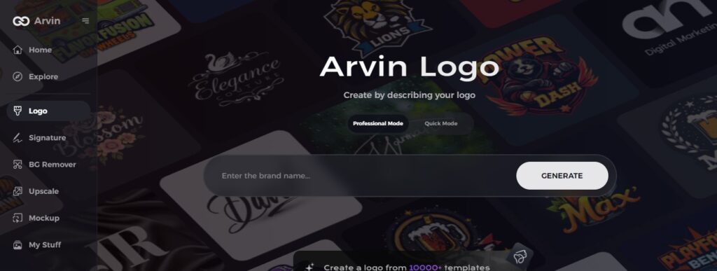
Step 1: Create an Account and Log In
Visit the Arvin AI website, create an account, and log in to access the logo design feature.
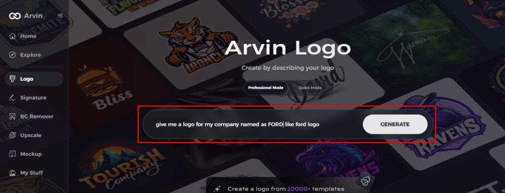
Step 2: Provide Your Brand Information and Preferences
Enter your brand name, slogan, and industry. Specify your design preferences, such as font styles and image themes.
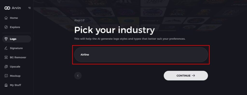
Step 3: Choose Your Industry
Select your industry to help Arvin AI generate logo styles that match your brand’s niche and needs.
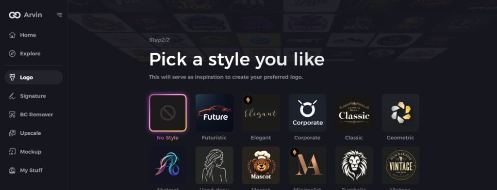
Step 4: Pick Your Style
Choose a design style that resonates with you. This will guide Arvin AI in creating a logo that aligns with your vision.
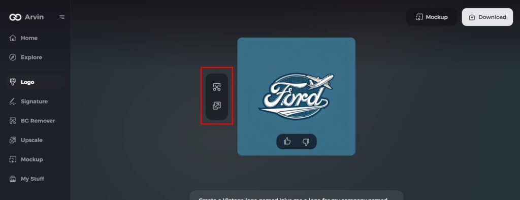
Step 5: Personalize Your Logo with Arvin AI Tools
Once your logo finish, you can use Arvin AI’s customization tools to modify elements such as fonts, layout, and symbol placement until you get the result you want.
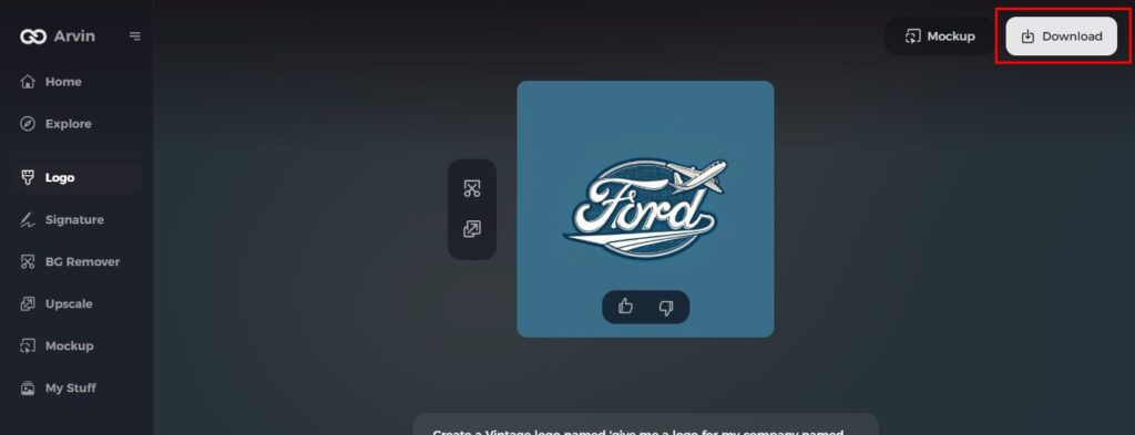
Step 6: Save and Download Your Logo
Preview your final logo design, then save and download it in a high-resolution format suitable for both print and digital use.
Conclusion
The new Ford logo is suggestive of a huge dive for this company and shows the magnitude of that is at stake for Ford as regards contemporary, progressive platform. It indicated that the manufacturer was open to change and evolution to keep up with the pace of time. Logos, in themselves, form what people believe about a particular brand and its opinions. As brands like Ford grow. Create your unique logo effortlessly with Arvin AI Logo Maker today! Your brand identity deserves to stand out—start designing now and leave a lasting impression!
FAQs about The New Ford Logo
What is Ford’s new logo?
The new emblem is simpler than before, with Ford removing the thin silver oval outline that sat inside the badge. The “Ford” script has now grown bigger to fill the space. The chrome border around the outside and the script are now finished in white, giving a slightly retro appearance.
When did the Ford logo change?
Now that Ford had a logo design that the public responded positively towards, they made one final update to the design. This logo iteration unveiled in 1976 has remained part of the brand today.
What is different from the previous version of the new Ford logo?
The new one is much more simple and cleaner than the former ones. There is still a retained oval, but with much fewer details for a more modern look and it is easier to recognize.
How do I utilize Arvin AI for logo designs and other creative projects?
Begin with Arvin AI by filling out your brand information and preferences. Then it will give you some unique ideas for logos which you can alter and refine for better suitability towards your taste. It is a user-friendly platform, easy for beginners and experienced designers.

