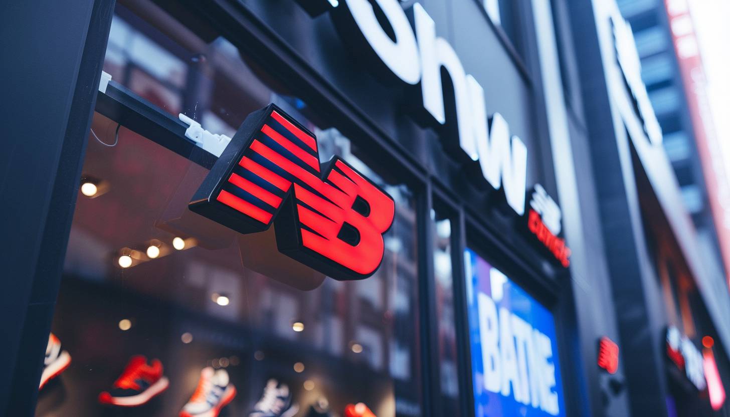
The New Balance logo shares a familiarity that conveys quality, innovation, and athletic performance. The bold typography alongside the dynamic shape has helped it to become a leading logo within the sportswear arena. It has remained true to its visual identity and has slightly updated its logo from the one that first appeared decades ago. A hallmark of excellence and a preeminent label for footstep and apparel, the brand designed with imports to make high performance goods available to athletes and consumers globally. This article explores its history, evolution, branding impact, and why it remains iconic logo in the sportswear industry.
PART 1: New Balance Logo Meaning and History
Over the decades, the New Balance logo has changed but always remained true to itself. Its path is a story of the brand’s growth, innovation and dedication to high-performance footwear. As its history comes into focus, though, it’s easy to see how and why it remains a potent, recognizable symbol.
The Origins of the New Balance Logo
The New Balance logo is tied to the company’s establishment in Boston in 1906 when it was known as the New Balance Arch Support Company. At first, it devoted to designing progressive arch support solutions intended to enhance footwear balance and comfort. This included producing shoes in the 1960s, at which point it became important to have a unique logo for brand recognition purposes. The logo must convey movement, speed and high-performance athletic products.
First Major Logo (1972 – 2006)
Jim Davis acquired the company in 1972 and the New Balance logo was introduced. This version incorporated the letters “N” and “B” fused together with a stylized crest, along with twelve speed streaks cutting across the “N.” The dynamic layout imbued a sense of motion, consistent with the brand’s performance orientation. The brand name “New Balance” positioned below the logo into a clear, bold typeface that was highly legible. This iteration was in use for more than 30 years.
Logo Evolution (2006 – 2008)
In 2006, a more modern logo was created, retaining its famous elements. Speed marks were also reduced from twelve to seven, resulting in a cleaner and more balanced design. At the same time, the color scheme updated, with the “NB” symbol’s in red and “New Balance” word mark’s in black. It retained the core identity but made it simpler and more compelling.
The Modern Logo (2008 — Today)
The New Balance logo you see today has become an emblem of the New Balance brand, first updated in 2008 with some more refinements to simplify and modernize the look of the logo. Five speed marks had been, and the logo appeared more structured and minimalistic. Today, the logo used in two main variations: the standalone “NB” symbol and the full logo, featuring the “New Balance” word mark. This new design reflects the brand’s consistent dedication to performance and innovation.
Part 2: Who Is Behind the New Balance Logo?
A classic brand identity was built by one of the most popular designers who specializes in creating timeless brands. That’s all due to its typography, structure, and colors. Its long-time creator and decisions on design choices contribute to its enduring influence on sportswear.
The Creator of the Emblem
Terry Heckler, a prolific commercial designer in brand creation for several big companies, designed this logo of New Balance. Heckler is known for his work with Starbucks, Cinnabon, Panera Bread and K2 Ski Equipment. His work on creating simple yet strong logos turned the New Balance logo into one of the most recognized in the sportswear world. His design philosophy revolved around simplicity, motion and brand identity.
New Balance Logo Font
New Balance printed logo is a typeface very similar to ITC Avant Garde Gothic Demibold, which is a modern and variously and highly visible typeface. This logo font was selected to help provide a clean and professional aesthetic that helps make the logo more readable in any branding application. Typography slanted and bolded, evoking motion, making it an ideal aesthetic for an athletic brand. This unique typography provides excellent brand recognition and versatility across different formats.
The Colors in New Balance Logo
New Balance is one of the companies that have the best looking logos in the world and their logo has been using only three main colors throughout history — black, white and red. To symbolize professionalism and dependability, the initial logo was monochrome. Red introduced into the palette as well, giving the logo a strong and sports-like personality. The most usual is the red and black color pallet and it gives the logo a contemporary and neat look. It is this limited palette that makes the logo easy to remember and visible.
PART 3: The Logo of New Balance and its Influence on Brands
A good logo speaks to a brand’s identity, and the New Balance logo is no different. Ensuring it gets recognized, its simplicity, speed marks and modern appeal also reinforce brand. Unpacking its branding prowess shows the way it affects trust and loyalty among consumers.
A Look That Is Timeless And Familiar
Another major component contributing to the New Balance logo success is its timeless and easily identifiable design. Some competitors update their logos frequently, but New Balance has held fast to its core design for decades. The dynamic shapes of the speed marks emphasize movement and liveliness, consistent with the brand’s emphasis on performance. Its simple yet dynamic look gives it the versatility to work across product types, from shoes, to apparel to marketing materials.
Logo’s Role in New Balance’s Success
The New Balance logo is essential for differentiating New Balance as a sportswear brand from its competitors like Nike and Adidas. It is utilized to be equal to performance, comfort, and innovation and to solidify the brand’s excellence reputation for goods. The logo is regarded as a symbol of reliability and excellence and the brand has been able to create a loyal customer base. New Balance’s global success attributed greatly to its logo’s strong visual identity.
Logo Plays Its Part in Product Authenticity
The New Balance futures marketplace and logo offer consumers clear indicators of product authenticity, preventing counterfeiting of information and ensuring that consumers receive what they pay for. Fake products also fail in the details — they will have an irregular logo, fonts or bad printing quality. One way to check for authenticity is by matching the serial numbers found on the labels located within the sneakers. Ultraviolet light is another method, as there are UV watermarks within genuine New Balance items. Proper logos play a significant role in recognizing authentic products.
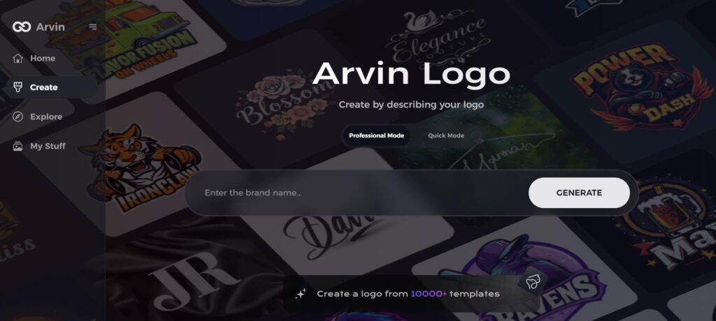
Part 4: Design Your Professional Logo
The New Balance logo is very popular, and if you want a professional logo inspired by the New Balance logo, Arvin AI is a high-powered tool that allows you to create a logo with ease. Nova shirts uses an AI-Powered Logo Maker to create stunning, high-quality logos catering to your preference so this is perfect for any business in need of a unique sportswear logo. Powered by sophisticated machine learning technology, Arvin AI generates professional quality designs with zero graphic design skills.
Key Features of Arvin AI
- Design Options: Users can customize fonts, colors and layouts to cater their unique brand identity.
- High-Resolution Formats: Logos are available in SVG or PNG formats for use in digital and print.
- Industry Trends: Based on industry trends, the system suggests modern and professional logo styles.
- Easy To Use: No design skills needed, anyone can create an attractive logo in minutes.
- Instant Editing and Tuning: Logos can easily be adjusted to meet the desirable nuances in an organization image.
Steps to Use Arvin AI for making Logo
Step 1: Visit the Arvin AI Website
Start by opening your web browser and navigating to the logo design page at logo.arvin.chat. This is where you can begin creating your custom beer brand logo.
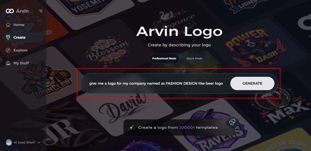
Step 2: Enter Your Brand Information
Provide essential details about your brand, such as the name and category. This help the AI generate logo designs that tailored to your specific brand.
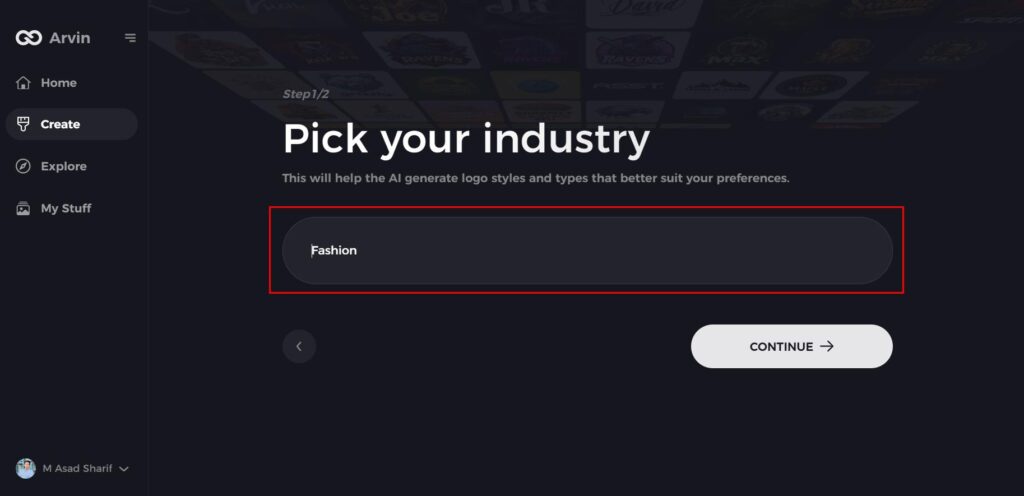
Step 3: Choose Your Industry
Select the beer or beverage industry from the list of options. This ensures that the AI will focus on logo styles that are relevant to the beer market.
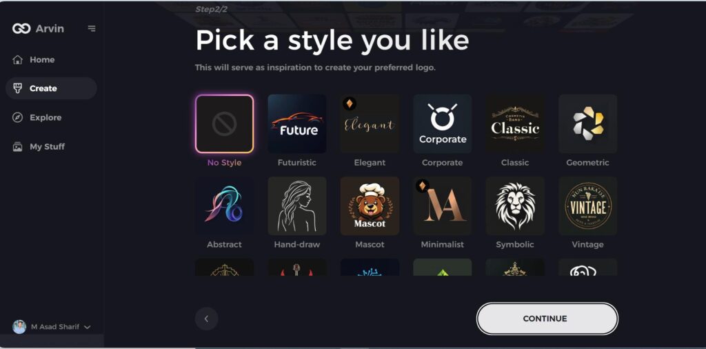
Step 4: Pick a Design Style
Browse through the available design styles and pick one that aligns with your beer brand’s identity. If none of the styles suit you, simply skip this step and let the AI create something unique based on its default design inspiration.
Step 5: Review Logo Concepts
The AI will generate a selection of logo ideas based on your inputs. Take the time to review and choose the designs that best reflect the essence of your beer brand.
Step 6: Customize Your Logo
Refine your chosen logo design by adjusting elements like colors, fonts, icons, and layout. This is your opportunity to make the logo truly representative of your beer brand.
Step 7: Download Your Logo
Once you’re happy with your final design, download your logo in high-quality formats such as PNG or SVG.
Conclusion
New Balance logo is a powerful image of movement and performance, and therefore one of sportswear’s most iconic images. Its straightforward yet robust form has stayed the same through the years, keeping the company on as symbol of quality and innovation. For those who need to design a professional logo with inspiration from this legendary design, Arvin AI provides an easy solution. Design your professional sportswear logo using Arvin AI in minutes today and create your customized logo instantly with ease.
FAQs
What does the New Balance logo stand for?
The New Balance Logo: It symbolizes motion, speed, and athletic performance. The slanted design and speed marks strengthen the perception of this high-performance sportswear brand and reinforce an idea of movement.
Did the New Balance logo change over time?
Yes, the New Balance logo changed but only through slight refinements. Fewer speed marks and character colors changed from black-and-white to red and black.
How do I know if my New Balance shoes are real?
The shoes come with display cards that must align information like logo, serial numbers, and UV watermark inside the sneakers for authentication. Fake products might have logos printed irregularly or step missing security attributes.
Can I design a New Balance-like logo using Ai?
Yes! Arvin AI — create professional logos inspired by New Balance logo using AI tools It offers high-resolution customization & branding options.
