Among the most iconic and recognizable symbols in the world of sports and branding is the NBA logo. It stands for more than just a basketball league; more for what the world has witnessed and been so highly influenced by for millions of fans, players, and businesses worldwide. The article is going to take you on a complete journey of history in the NBA logo. You are going to read about the history, the change of times, and the stories of its iconic design. From humble beginnings in 1946 to today’s status of a global brand, the NBA logo has become an eternal emblem of basketball excellence.
Part 1: 1946–1953 – The First NBA Logo
The National Basketball Association established in 1946 as the Basketball Association of America. For its first few years, the league required an identity that would mark the business as a distinct unit amongst other sports business ventures. The original cool logo of the NBA consisted of a circular, full basketball design.
Description of the Circular Emblem
The logo features a moving basketball, with clear lines signifying the seams of the ball. The text is strong and to the point, as it features bold letters “BAA” (the name was changed to “NBA” in 1949). The use of colors was also limited to shades of brown and white to symbolize the game as simple during those times.
Meaning Behind the Colors and Typography Used
The brown and white color palette reflected the traditional color of a basketball as it focused the league on basketball itself. Bold typographies used and reflected the feeling of power and stability; here, the NBA had firmly planted its existence as a prime league for basketball. It was the first design, but it still echoed the idea that the league focuses on the game. Not so matured compared to the latter, it set a stage for visual branding by the NBA and offered a platform to transform from which it came into being.
Part 2: 1953–1962 – A New Direction
By the early 1950s, the NBA had become popular and thus required a logo to symbolize its modernization and ambition. The league needed to expand and have branding that corresponded to its newer form of expression. Thus, in 1953, the NBA came up with a new logo, emblematic of the major change in its branding strategy.
Red Basketball and Bold “NBA” Lettering.
The new logo was a red basketball with bold, capitalized “NBA” lettering superimposed on it. The color red symbolized energy, passion, and excitement, in accordance with the ambition of the league to increase its fan base and develop a dynamic brand identity. Typographically, it was clean, modernist, reflecting the aspiration of the league to project as a modern organization.
Foundation for Future Changes
This new design paved the way for further transformations, as manifested in later years. Branding itself needed to be simple and strong. The red basketball was now the central element of the NBA visual identity, opening the way to become even more iconic in the following years.
Part 3: 1962–1969 – A Simpler Look
The NBA refined its logo, removing bright colors for a white/grey basketball. A new font helped the league appear more professional as it gained more recognition.
Change from Red to a White/Grey Basketball
In 1962, the NBA redesigned its logo yet again, from the red basketball to a much more subdued white and grey design. The reason for this was the requirement of a cleaner, more versatile logo that would be easily reproduced in print and television.
New Fonts Used and How This Impact Branding
The new logo remained circular but instead used the seams on the basketball for design. The entire ball was not to be used but the seams alone. Typography was made to be in a more contemporary font, in tune with the league’s growth into being a superior sports league.
Logo as League’s Growing Reputation
This marked the first significant shift in the branding strategy of the NBA. The simple design made the emblem pop against the intense competition in a sports market, which further cements the league’s focus on innovation and excellence.
Part 4: 1969–2017 – The Birth of an Iconic Logo
The late 1960s marked a transitional phase for the NBA. With its flashy style and more contemporary branding approach, the American Basketball Association was challenging the NBA in many respects. To gain ground over this strong competitor, the NBA required an outstanding visual identity to catch fans’ and players’ attention.
Introduction of Red, White, and Blue Silhouette Design
The NBA made its most historic logo to date in 1969, which was the red, white, and blue silhouette design created by branding expert Alan Siegel. The logo has a dynamic silhouette figure dribbling a basketball against a circular background. This silhouette inspired by Jerry West, who is a very agile player and a basketball player.
Why Jerry West Became the Face of the Logo
Jerry West’s silhouette is impossible to overstate as an influence on the logo. The NBA’s face, excellence, determination, and athleticism. Instantly they became and helped establish the NBA as probably one of the most recognizable symbols in sports.
Part 5: 2017–Present – The Logo Today
In 2017, the logo was slightly adjusted and only lettering was changed. The characters were characterized by thinner lines and thin letters. This time, the outline of the letters refreshed, each character boldly stood out, and a clear cut made to shape. This made each character stand out and clear. Besides this, all aspects of the design remained the same as the logo familiar today. This logo used today in all NBA marketing materials as a symbol of the NBA. The logo makes its logo immediately stand up and identified in the minds of millions of people, and this inherently implies symbolic aspect of company.
What Was Different in the 2017 Update?
In 2017, the NBA updated its iconic logo. The overall design was not altered, but the typography was modified to make it look more modern and sophisticated. The letters “NBA” were slightly altered to improve the readability and consistency of the same across digital and print platforms.
The Subtle Refinement of the Typography
The updated typography provided clean lines and a more balanced design, making sure that the logo did not lose its appeal in the digital world. This subtle change was a proof of the NBA’s commitment to a timeless and relevant brand identity.
Logo Relevancy in Modern Sports Branding
The NBA logo has successfully adapted to changes while retaining its core identity as a key element of its long-term success. From that point it continued to a symbol of the values the league embodies and a proud symbol of basketball excellence.
Part 6: Who Designed the NBA Logo?
Alan Siegel, a branding expert, and this is one of the most recognizable logos in the world, is the designer of the NBA logo. His work to deliver memorable and influential design helped make him the right person to lead the NBA’s rebranding efforts.
His Inspiration and Creative Process
Inspired by the energetic dynamics of basketball, Siegel sought to create a logo that epitomized the game. His process of creativity included studying photographs of players in action until he finally settled on Jerry West’s silhouette as the perfect embodiment of the NBA values.
Consistency in Branding
Simple and consistent are two main concepts that Siegel emphasizes to make the NBA logo a benchmark for perfect branding. His work demonstrates the importance of creating a design, timeless yet adaptable.
Part 7: Jerry West – The Player Behind the Logo
In this part we will explore the player behind this iconic logo.
Jerry West’s Basketball Career
He is known in the league as “Mr. Logo.” Jerry West is considered one of the greatest NBA players of all time with his numerous achievements with the Los Angeles Lakers, including being a 14-time NBA All-Star and winning a championship in 1972.
His Silhouette Was Chosen for the Logo
West’s silhouette was selected for the logo because of his elegant playing style and iconic pose. He was the perfect man to carry with the spirit of the game that he was well known for.
His Views on Being “Mr. Logo”
Considering being the face of the logo would be an honor, West has been somewhat ambivalent towards it. He often makes light of his role in its creation, focusing on the value of the game instead of personal recognition.
Part 8: Future Redesign
The NBA logo has remained unchanged for decades, but discussions about a redesign continue. Some fans believe it’s time for an update to reflect today’s game.
The Controversy Over updating NBA Logo
There is a recent debate among NBA fans about whether the league should change its logo. After the sudden death of Kobe Bryant back in 2020, most basketball fans have claimed that his silhouette should be used to replace Jerry West’s as the face of the new logo.
Kobe Bryant to Be the New Face of the Logo
Kobe Bryant has influenced the NBA as well as international basketball culture. But as a player, he was a poster child for the league and as such, the ideal symbol of the league.
Challenges of Changing an Iconic Design
It would not be easy to redesign the team logos like NBA logo. One can find some challenges:
- Brand Recognition: The present logo instantly recognized worldwide. A redesign could confuse the fans and would affect the brand.
- Merchandising Costs: The change in logo will require the NBA to update all the merchandise, including jerseys, apparel, and promotional material. This is a costly and time-consuming affair.
- Historical Significance: The NBA logo has been in use for over 50 years. Many fans and players see it as an important part of the league’s history, and changing it could be seen as unnecessary.
- Legal and Copyright Concerns: Using the image of a new player like Kobe Bryant would involve the league in one of the complex legal and copyright concerns with Bryant’s estate and the intellectual property of the NBA.
Even while public debate over the issue of changing the logo persists, one thing is clear: Any decision will likely shake the league, its branding and fans to their core.
Part 9: Creating Your Own Sports Logo Using Arvin AI
Whether a basketball team, the local sports league, or the newest esports brand, a memorable logo can make it truly professional. If you want to design your own sports logo, Arvin AI logo maker is the perfect tool. Arvin AI is the most advanced logo maker that helps people and businesses create a high quality, custom logo with ease. With Arvin AI, you don’t require professional design skills for a stunning sports logo since the platform is very user-friendly and features an AI-powered tool to generate logos according to your preferences.
Key Features of Arvin AI
These are some of the key characteristics that make Arvin AI stand out for creating awesome logos for sports teams:
- AI-Powered Design: Arvin AI uses artificial intelligence to produce unique and professional logo designs based on your input.
- Customization Options: Users can change colors, fonts, and shapes to create a logo that fits their brand identity.
- High-Quality Images: The logos that Arvin AI provides in any merchandise, on websites, or promotional materials due to their high-resolution files.
- Various Style Options: There are always multiple style options at Arvin AI to suit whether a bold modern style or an elegant and timeless one.
- Instant Download: Immediately after creating the logo, download and use it on your team or business.
Arvin AI allows anyone to create a professional logo with ease, not requiring expensive software or design experience.
Steps to Use Arvin AI for making Logo
Step 1: Go to the Arvin AI Website
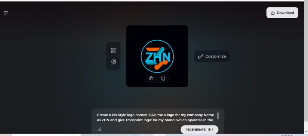
Open a browser window and head over to Arvin AI logo maker for designing your new, unique, and how to make a logo transparent company logo.
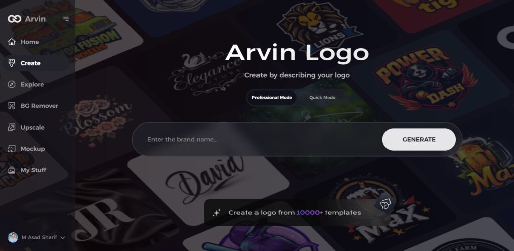
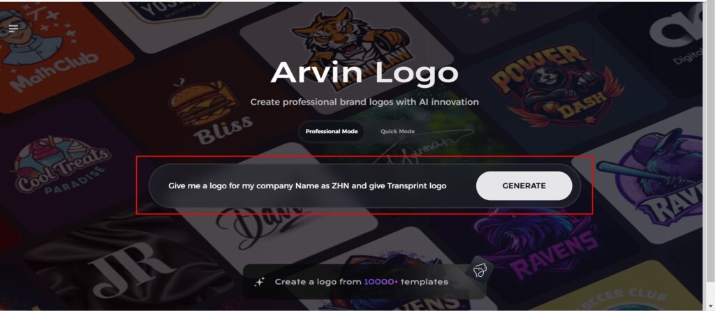
Step 2: Fill Up Your Company Details
Just enter the name of your company and pick its category and ask for transparent logo. All the details enable the AI to find the designs that would serve your needs and are representative for your company.
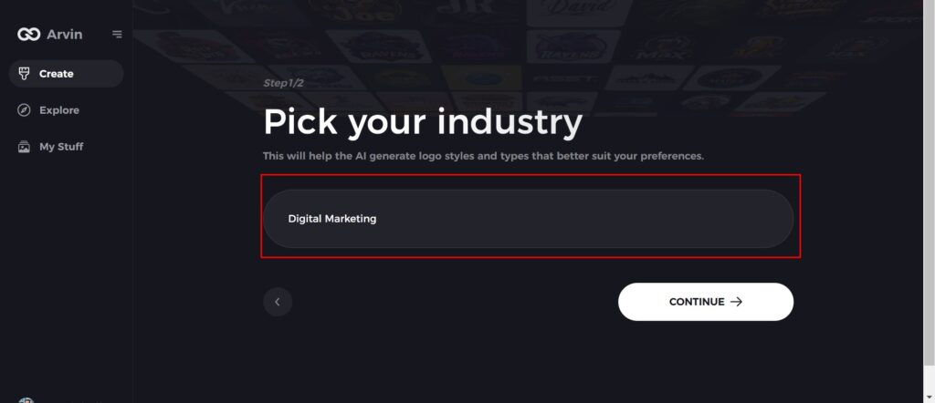
Step 3: Choose Your Industry
Pick an industry that best suits your business. This process guarantees the AI is making styles and themes that align best with your brand’s core value and niche in the market.
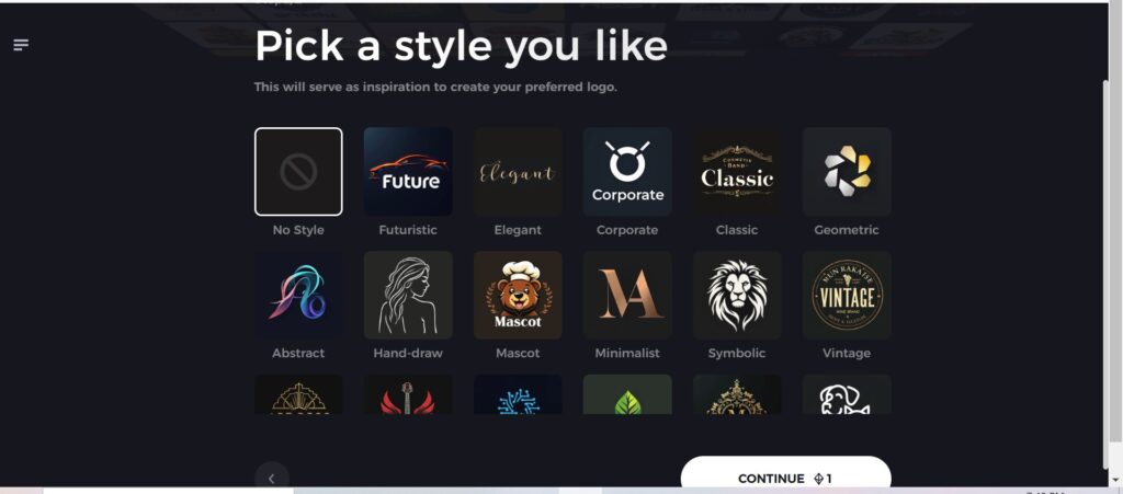
Step 4: Style Select
Pick a design style from the available ones. Leave it to “no style” if you’d want the AI to surprise you. The selected style shall provide a guideline for the final logon designs created.
Step 5: Explore Logo Concepts
Arvin AI will produce different types of logo designs according to the information provided. Simply scroll through the suggestions for a design that matches your brand identity.
Step 6: Finalize the Logo
Fine-tune the chosen logo by adjusting colors, fonts, and icons to meet your brand personality and aesthetic. This way, your final logo is perfect and completely in line with your brand’s personality and style.
Step 7: Download Your Logo
Once satisfied with your final design, download your logo in versatile formats such as PNG or SVG that would be perfect for various media. Websites, social media, print, and so much more-these logos will give a professional look across every platform.
Conclusion
The NBA logo has been synonymous with excellence in basketball for over 50 years. Whether to redesign it is debatable, but the present logo remains the most recognizable logo around the globe. Any sports organization needs a well-designed logo. It also becomes a sign of identification, and in addition, it may help in brand reclaiming as well as linking up with the fans. Be it a professional team, local club, or even an esports brand, it can form a major difference. If you’re looking to create a custom sports logo, Arvin AI is the perfect tool. With its AI-powered design capabilities and easy-to-use interface, anyone can create a professional logo in minutes. Try Arvin AI today and bring your vision to life!
FAQs
Which player is on the NBA logo?
Siegel drew inspiration from a photograph of the iconic Jerry West, then a superstar player for the Los Angeles Lakers, captured mid-dribble. The silhouette of West, dribbling with precision and grace, became the foundation for the NBA logo.
Why does the NBA not change its logo?
The imagery of the NBA logo among well recognized in the world of sports. The branding and merchandising of the league affected by it. Thus, the league maintained it as such for strong identity.
Can I make a sports logo like the NBA logo?
Yes! With Arvin AI, you can easily design a professional sports logo. The platform allows you to customize designs to fit your vision.
Who designed the current NBA logo?
Alan Siegel, a branding expert, designed the iconic NBA logo in 1969. His design has remained largely unchanged for over five decades.
