Movie logos deeply reflect the genre of the film through their design. Each genre has its own visual language that informs the typography, colors, and composition of its logo. Horror films, for instance, often use jagged or distressed fonts to hint at unease, while comedies lean toward bright, rounded letters that feel approachable and fun. Science fiction frequently opts for clean, geometric designs to convey modernity and otherworldliness, while historical dramas often feature serif fonts to evoke tradition and authenticity.
This blog explores how movie logos evolve across genres, diving into the artistic and technical choices that make them so effective.
Crafting a logo that reflects your story—whether it’s for a movie, business, or brand—doesn’t have to be daunting. Tools like Arvin’s AI Logo Designer simplify the process, making professional logo design accessible to everyone.
Who Designs Movie Logos?
Surprisingly, small-name designers with limited time and resources often create movie logos.
Often, they are the result of razor-thin margins and incredibly tight deadlines. Here’s a look behind the scenes at the process, according to u/saucehoee on Reddit.
First, the timeline is tight: designers typically have one day to create movie logos. During this time, they produce 6–8 different versions and complete a round of revisions. Designers create fully-realized styleframes that resemble the final product, rather than rough drafts or basic sketches. Designers often pair these logos with mockups of a title card, such as “from director Steven Spielberg,” adding another layer of work. By the end of the day, they typically deliver 12–16 styleframes.
After that, designers spend another day animating, rendering, and inserting the movie logos into the trailer. They then present the logos to the filmmakers for feedback.
Interestingly, movie logos’ design isn’t usually where the major revenue comes from. Trailer houses often include logo design as a “perk” to enhance their pitch for a trailer project. Since the real profit comes from creating the trailer itself, they minimize labor costs for logo design.
To add to the complexity, movie marketing budgets are entirely separate from production budgets. The marketing team manages and approves movie logos and trailers, keeping them separate from the filmmaking team’s responsibilities. This separation often creates an additional layer of approval and decision-making.
Movie Logos With Names
Star Wars
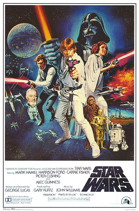
The Star Wars (1977) poster is one of the most iconic in cinematic history, capturing George Lucas’s groundbreaking space opera.
At the heart of the composition is Luke Skywalker, dramatically posed with his lightsaber raised high. The glowing white blade draws attention and evokes heroism, setting the tone for his role in the story. Standing slightly behind him is Princess Leia, confidently holding a blaster, which embodies both her strength and resolve. Together, their positioning at the forefront of the poster underscores their importance as the story’s central figures.
The upper left corner prominently shows the Death Star, a pivotal plot element symbolizing the Empire’s overwhelming power. X-Wings and TIE Fighters fiercely dogfight in the background, emphasizing action and hinting at thrilling space battles integral to the story. In contrast, the lower portion of the poster showcases supporting characters like C-3PO, R2-D2, and Chewbacca. Their placement helps ground the image in the ensemble nature of the film while ensuring the epic stakes remain central.
Star Wars Movie Logos
The “STAR WARS” logo at the bottom is bold, blocky, and instantly recognizable, designed to convey strength and timelessness. The font’s sharp edges and tilted letters suggest motion and energy, aligning with the fast-paced action of the movie. The designers rendered this logo in white with a black outline, ensuring it stands out against the colorful background while maintaining visual harmony.
“Make it look fascist” was George Lucas’ design directive to designer, painter, author, and screenwriter Suzy Rice.
Designers placed the credits beneath the title in a clean, serif typeface, typical for movie posters of the era. They meticulously aligned the text, ensuring details like the director, producer, and composer remain legible yet unobtrusive. This layout keeps the visual elements as the primary focal point.
The painted style of the poster evokes a timeless adventure, reminiscent of pulp magazine covers and serialized stories that inspired George Lucas. Luke’s glowing lightsaber symbolizes hope and destiny, mirroring his journey as the chosen hero. Darth Vader’s towering, shadowy figure represents the overwhelming threat of the dark side and the Empire. The contrast between the characters’ vibrant poses and Vader’s looming menace highlights the film’s core struggle between light and dark.
The Godfather
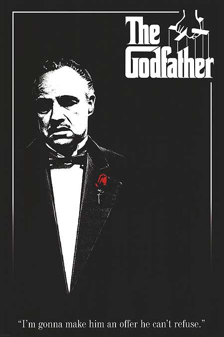
The poster for The Godfather (1972) is a minimalist masterpiece, capturing the essence of Francis Ford Coppola’s legendary film. Based on Mario Puzo’s novel, the movie explores the Corleone crime family’s rise to power in post-World War II America. The story centers on patriarch Vito Corleone (Marlon Brando) and his son Michael (Al Pacino), drawn into the family’s dark underworld.
A black background dominates the poster, evoking a sense of mystery and foreboding. The lone figure of Vito Corleone, wearing a tuxedo with a red rose on his lapel, dominates the lower-left corner. His face is partially illuminated, and the use of chiaroscuro highlights his stoic expression, symbolizing power and moral complexity. The black-and-white palette reinforces the film’s serious and timeless tone, adding depth to the character’s portrayal. The red rose, the sole pop of color, symbolizes loyalty and the violence that pervades the story.
The Godfather Movie Logo
The top-right of the poster features the iconic “The Godfather” logo, which is a crucial element of the design. The typography uses a custom serif typeface with ornate, thick lettering, exuding a sense of tradition and authority. The designers cleverly integrated the image of a puppet hand controlling strings into the “G” above the title, symbolizing the film’s central themes of manipulation, control, and power. This puppet imagery aligns with the movie’s exploration of how power is wielded and the strings pulled behind the scenes. The placement of the title and puppet graphic in the upper right creates a visual balance with Vito’s portrait in the lower left, achieving a clean yet dynamic composition.
Bubba Jackson on Fujita, designer of “The GodFather” Logo:
He made works of art that spoke of the sound and texture and love of the people who were making the music. He felt what they were doing, and he put it on a canvas.
The logo’s serif font, with its sharp edges and traditional style, reflects the timeless hierarchy of the Corleone family. Strings from the puppet hand connect directly to the title, emphasizing themes of control and manipulation central to the story. The white text creates strong contrast against the black background, ensuring legibility and drawing attention to the film’s title. This contrast also symbolizes the narrative’s core dichotomy between good and evil.
Designers positioned the famous tagline, “I’m gonna make him an offer he can’t refuse,” below Vito Corleone’s portrait in a subtle serif font. They kept the tagline understated in size, ensuring it supports rather than distracts from the bold imagery above. Its placement underscores the visual focus on Vito and the logo while adding narrative depth to the poster.
Dune
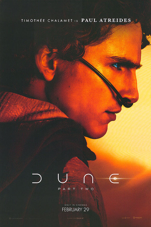
The poster for Dune: Part Two (2024) features a visually striking design that captures the epic and personal themes of Denis Villeneuve’s sequel. The film follows Paul Atreides (Timothée Chalamet) as he embraces his destiny to lead the Fremen and challenge the Harkonnens and the Emperor. The design reflects the high-stakes narrative by focusing closely on Paul’s face, dramatically lit in warm tones that evoke Arrakis’s harsh desert world. This close-up framing emphasizes Paul’s transformation into a leader and invites viewers to connect with the emotional weight of his journey.
The sleek, geometric design of Dune’s logo reflects its futuristic world. With the Arvin AI Logo Designer, you can craft a logo that captures the essence of innovation and modernity.
Dune Movie Logos
In addition to the powerful imagery, the typography plays a crucial role in reinforcing the futuristic and otherworldly tone of the film. The title “DUNE,” displayed prominently at the bottom, uses a sleek and modern sans-serif font with unique geometric features such as broken circular forms in the letters “D” and “E.” This design choice creates a clean and minimalistic aesthetic that complements the sophisticated visual style of the film.
Harry Potter
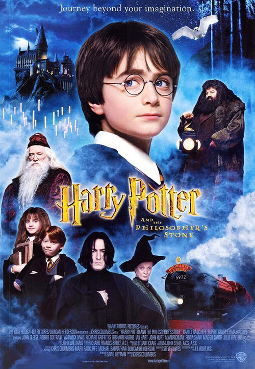
The logo for Harry Potter and the Philosopher’s Stone is among modern cinema’s most recognizable, establishing the franchise’s visual identity. Designers used a custom serif typeface with dramatic, jagged edges resembling lightning, symbolizing Harry’s iconic scar and heroic destiny.
It was Mary GrandPré who came up with making the lightning bolt part of the title, a signature part of the branding to this day.
“Soon after, Mary sent a sketch on vellum tracing paper of the words ‘Harry Potter,’ and it immediately felt right: practically perfect in every way! From the jogged letters that followed their own geometry and logic, to the brilliant touch of adding a lightning bolt to the descender of the capital ‘P,’ the lettering captured the essence of the books in a way that felt correct, like an outfit perfectly fitted and made-to-order,” Saylor says.
Harry Potter Movie Logos
The angular and sharp lines of the letters evoke an air of mystery and magic, tying directly into the film’s fantastical tone. Additionally, the typeface feels both timeless and ancient, reflecting the wizarding world’s deep-rooted traditions and history. The slight elongation of certain letters, like the “H” and “P,” adds dynamism and makes the logo appear as though it is leaping off the screen.
The metallic gold finish enhances the logo’s magical and grandiose feel, adding a touch of elegance and wonder. A subtle gradient, with lighter highlights on top and darker shadows below, creates a glowing, three-dimensional effect. This glow is complemented by a faint magical aura that blends seamlessly into the poster’s misty background. The gold color symbolizes warmth, hope, and connects visually to magical treasures like the Philosopher’s Stone.
Harry Potter’s lightning-bolt-inspired logo is instantly recognizable. With the Arvin AI Logo Designer, you can craft enchanting logos that embody your magical world.
Final Fantasy: The Spirits Within
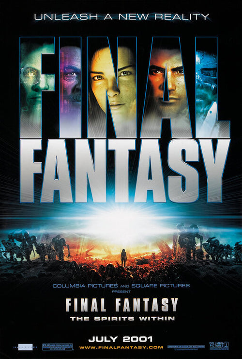
The poster features a striking composition divided into two distinct sections. The top half highlights characters, featuring Aki Ross (voiced by Ming-Na Wen) and others within the translucent title text. Integrating character imagery into the typography adds depth, emphasizing the story’s emotional impact and its visually innovative design. Aki’s face is central, emphasizing her role as the protagonist and grounding the sci-fi spectacle in human emotion. The other characters, positioned on either side, add intrigue and hint at the ensemble cast’s involvement in the narrative.
The bottom half of the poster depicts an apocalyptic battlefield, with glowing orange and yellow light radiating from the horizon. The fiery backdrop contrasts with the cooler blues and greens above, symbolizing the duality of hope and destruction. Silhouetted soldiers, futuristic machinery, and alien-like figures amplify tension and scale, reflecting the story’s high-stakes conflict. A lone central figure walking toward the light embodies heroism and the search for salvation central to the plot.
Final Fantasy Movie Logos
Designers used a bold, blocky sans-serif font with a metallic sheen for “FINAL FANTASY,” emphasizing the film’s futuristic and technological themes. The title’s large size dominates the poster, ensuring instant recognition of the franchise’s name and significance. A gradient within the letters, transitioning from deep blue to lighter tones, adds depth and dimensionality to the design. The subtle reflection and glow surrounding the text reinforce the high-tech aesthetic.
Mulan (1998)
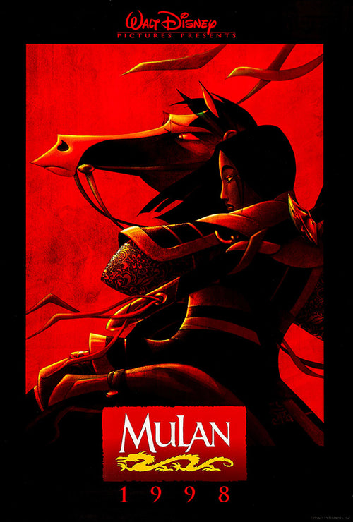
The poster places Mulan at the center, depicted in a dynamic pose that balances strength and grace. The poster depicts her mid-turn, with a soft light partially illuminating her profile to highlight her resolute expression. Her flowing black hair and the elegant patterns on her armor evoke both movement and intricate detail, symbolizing her transformation and internal struggle. The composition emphasizes her duality—her role as a warrior and her personal identity as a daughter and woman.
The background features a textured red panel that is rich in symbolism. Red, a traditional color in Chinese culture, represents luck, prosperity, and strength, which align with the film’s themes. The black framing surrounding the red panel contrasts sharply with the vibrant center, creating focus and evoking the dramatic tone of the narrative.
Mulan Movie Logos
The title, “Mulan,” is displayed prominently on aDesigners prominently displayed the title, “Mulan,” on a red square at the bottom of the poster. The font is a serif style with sharp, elegant lines, evoking both tradition and strength. The white text contrasts starkly against the red background, ensuring readability and prominence. Below the title, a golden dragon motif weaves through the composition, symbolizing Mushu, Mulan’s guardian, and the Chinese dragon’s traditional role as a protector and emblem of power. The logo’s placement within a red box echoes traditional Chinese seals, reinforcing the cultural context of the story.
El Mariachi
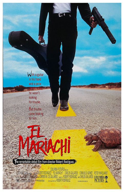
The poster’s bold composition draws focus to the central figure’s lower half, with boots dominating the yellow road stripe. A silhouetted character carries a guitar case in one hand and a pistol in the other, embodying duality. This stark pairing highlights the film’s central conflict: an innocent mariachi mistaken for a dangerous hitman.
El Mariachi Logo
The title, “El Mariachi,” is rendered in a rough, hand-drawn style, with jagged, uneven edges and a vibrant red color that suggests both urgency and danger. The uneven typography mirrors the film’s raw, unpolished energy and independent filmmaking roots. Designers placed the tagline, “The remarkable debut film from director Robert Rodriguez,” beneath the title in a simple, sans-serif font on a black box, ensuring it stands out while maintaining a minimalist style. This line emphasizes the film’s status as an auteur-driven project and its grassroots production story.
The tagline, written in a light, sans-serif font, adds context: “With a guitar in his hand and a price on his head, he wasn’t looking for trouble. But trouble came looking for him.” Its placement and font choice blend seamlessly into the design, complementing the visual focus.
Jaws
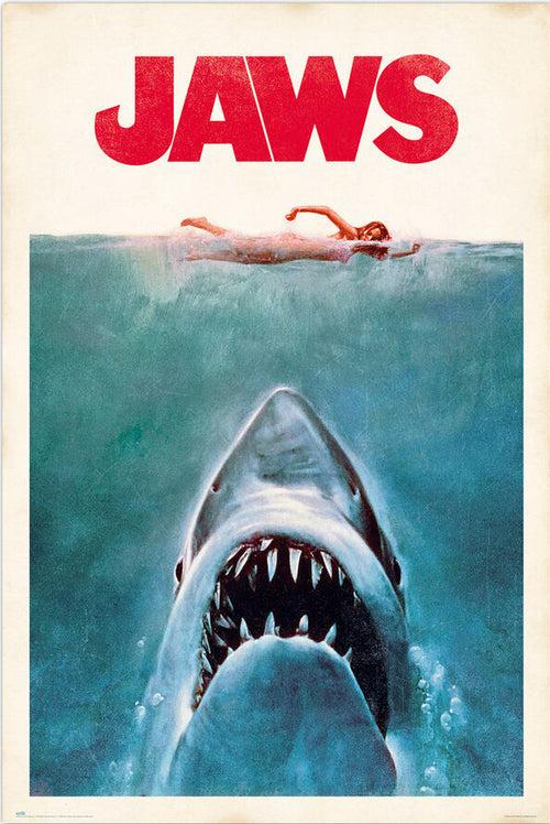
The typography and logo design of the Jaws (1975) poster play a critical role in its iconic impact, seamlessly integrating with the visual elements to create a cohesive and unforgettable design. The title, “JAWS,” is in uppercase, blocky sans-serif typeface, which immediately conveys strength, menace, and simplicity. This bold font mirrors the shark itself—primal, imposing, and unstoppable. The large, oversized lettering ensures the title dominates the viewer’s attention, demanding focus even from a distance.
The bright red title color symbolizes blood, danger, and violence—central themes of the film. This vibrant red contrasts sharply against the clean white background, ensuring visibility and impact. The red tones connect visually to the shark’s gaping jaws, emphasizing lurking danger and violence. This synergy heightens fear and tension, linking bold typography to the terror depicted in the imagery.
Jaws Movie Logos
The title’s placement at the top establishes a clear visual hierarchy, naturally drawing the viewer’s eye first. Positioned as the anchor point, it guides attention downward to the swimmer and then the shark. The horizontal alignment and even letter spacing create balance, harmonizing the vertical composition’s overall flow. This strategic placement ensures the typography complements the dramatic imagery, creating a seamless integration of text and visuals.
The size and scale of the title further enhance its dominance within the poster. The oversized letters ensure the logo remains instantly recognizable, even from afar, competing effectively with the shark’s striking imagery. The bold font emphasizes the predator’s primal nature, while its sheer scale solidifies the text as a central branding element for the film. Its commanding presence ensures that it remains one of the most memorable movie logos in cinematic history.
The Silence of the Lambs
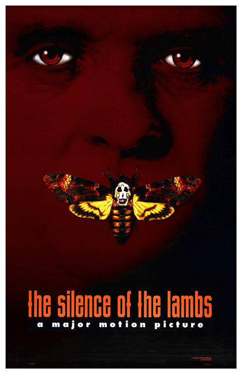
The poster for The Silence of the Lambs (1991) uses haunting minimalism to emphasize the film’s chilling psychological themes. Directed by Jonathan Demme, the movie follows FBI trainee Clarice Starling as she seeks Dr. Hannibal Lecter’s help to catch a serial killer.
The most prominent element of the poster is the Death’s-head hawkmoth, which covers the mouth of a human face. The Death’s-head hawkmoth itself is highly symbolic. The design highlights the species’ skull-like thorax marking through Salvador Dalí and Philippe Halsman’s surrealist photograph In Voluptas Mors. This composite image, formed by arranging naked human bodies into a skull, deepens the poster’s unsettling and symbolic tone.
Designers detailed the moth’s intricate wings with warm yellow and orange tones, contrasting sharply against the dark, blood-red background. The moth, positioned over the mouth, symbolizes silence and repression, directly connecting to the film’s title and hidden traumas.
A shadowy red and black visage in the background subtly reveals intense, watchful eyes, hinting at Hannibal Lecter’s ominous presence. The stark red tones convey danger and bloodshed, while the faintly visible face adds an air of mystery and menace. The design uses negative space effectively, allowing the moth to dominate the visual narrative without overwhelming the composition.
If you want to know more about negative space logos, check out our blog.
The Silence of The Lambs Logo
The typography of the poster is a critical element in establishing its mood and tone. The title, “the silence of the lambs,” appears in lowercase letters using a condensed sans-serif font with tall, narrow proportions. This font choice enhances the film’s eerie, psychological focus, with the lack of capitalization adding subtle unease. Compact letter spacing mirrors the story’s claustrophobic intensity, while the minimalist design keeps focus on the iconic imagery above.
The orange-red color of the title text is both eye-catching and symbolic. The warm tones sharply contrast with the dark black and red background, highlighting the title and evoking dread and violence. The reddish hue subtly references blood, danger, and the underlying themes of death and horror within the film. Designers rendered the tagline, “a major motion picture,” in a smaller, simple sans-serif font in white beneath the title. This understated tagline balances the boldness of the title and reinforces the professional, stark nature of the design.
The haunting imagery of Silence of the Lambs speaks volumes through simplicity. Let the Arvin AI Logo Designer help you design logos with quiet power and impact
Premonition
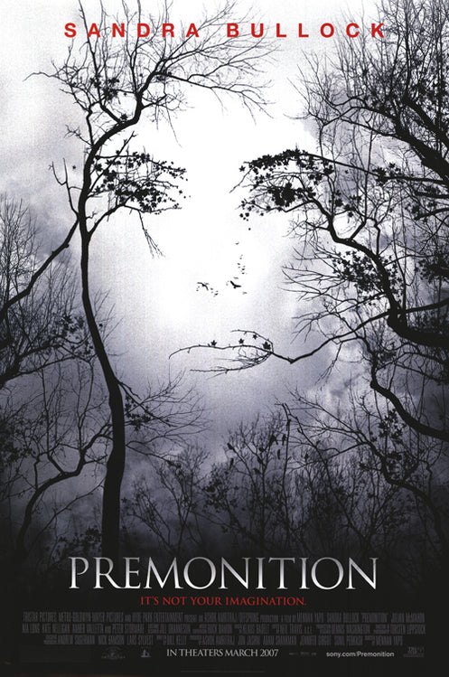
The poster’s central visual element is a face formed by the negative space between bare tree branches. The image initially seems like a simple forest scene, but closer inspection reveals a woman’s haunting visage within the branches. This optical illusion reflects the film’s themes of perception, hidden truths, and distorted reality. The face emerges from the chaotic branches, symbolizing the protagonist’s fragmented experience and her struggle to uncover her husband’s death.
The twisting, leafless trees dominate the composition, their dark silhouettes set against a foggy, gray sky. The organic, erratic shapes of the branches create a sense of unease, as if they are both trapping and concealing something ominous. The stark contrast between the black branches and the pale background emphasizes the mysterious and unsettling tone of the film. The placement of the trees directs the viewer’s gaze to the hidden face, making the illusion the design’s focal point.
Premonition Logo
The title, “Premonition,” is rendered in an elegant serif typeface, combining sharp, angular lines with subtle curves. The font conveys sophistication while hinting at an ominous tone, reflecting the film’s psychological depth. The white title contrasts sharply with the poster’s darker elements, ensuring visibility and aligning with the foggy, dreamlike atmosphere.
Below the title, the tagline, “It’s not your imagination,” appears in a smaller, italicized font in red. The use of red introduces a hint of danger and urgency, reinforcing the themes of fear and suspense. Placing the tagline directly beneath the title unifies the text elements, creating a cohesive design and adding an intriguing layer.
Rocketeer
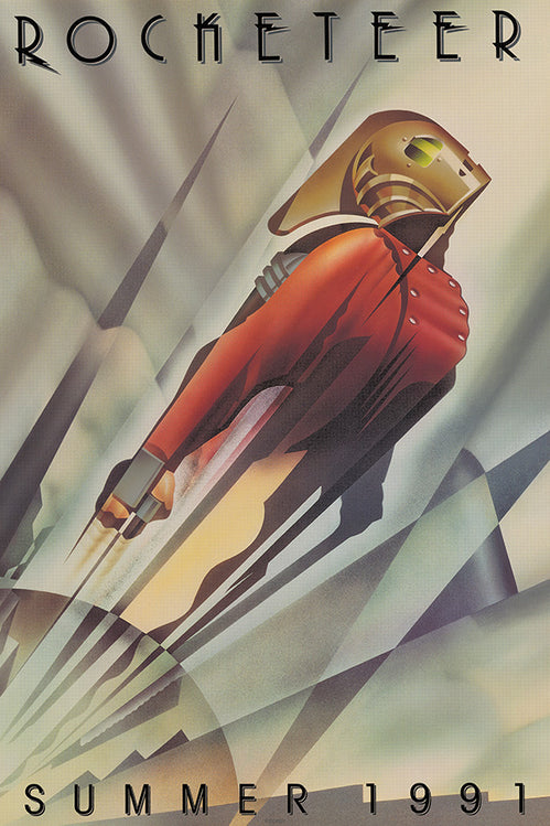
The Rocketeer poster features Art Deco-inspired typography, using a custom sans-serif font with elongated, geometric letters and decorative details. “ROCKETEER”, prominently at the top in bold black text, accentuated by angular embellishments mirrored the character’s streamlined and modern aesthetic. The font’s sharp, clean lines evoke sophistication and innovation, perfectly aligning with the film’s 1930s setting and themes of progress.
The poster’s design is steeped in symbolism, reflecting the film’s core themes of adventure, progress, and the spirit of innovation. The upward motion of the Rocketeer represents human ambition and the drive to reach new heights, both literally and figuratively. The Art Deco aesthetic connects the character to the 1930s, defined by rapid technological advancements and bold futuristic visions. This design perfectly complements the film’s themes of aviation and invention, celebrating progress and innovation during that transformative time.
My Neighbour Totoro
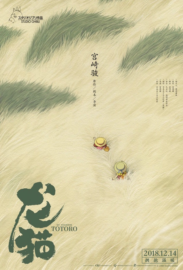
The poster’s focal point is the vast, textured field of golden grass, which dominates the entire design. The grass features exquisite detail, offering a tactile, hypnotic effect that evokes the gentle motion of wind sweeping through a meadow. The vastness of the landscape emphasizes nature’s overwhelming presence and beauty, which is central to the themes of the film. The grass’s flowing, organic lines suggest movement and life, making the environment feel like an active participant in the story.
Nestled within this expansive scene are two small figures, Mei and Satsuki, walking through the field. Their straw hats and colorful clothing contrast with the pale grass, highlighting their smallness and drawing attention to their journey. The girls’ positioning, walking away, evokes curiosity and invites the audience to imagine the adventure ahead. This understated approach mirrors the quiet, introspective tone of the film.
The minimalist composition is immersive, with empty space around the characters emphasizing the peaceful vastness of the setting. The asymmetrical placement of the characters in the lower third creates balance, guiding the viewer’s gaze naturally across the poster.
My Neighbor Totoro Movie Logos
The title, “となりのトトロ” (My Neighbor Totoro), is displayed in bold, brushstroke-style Japanese characters in the lower left corner. The textured, hand-painted quality of the font mirrors the organic themes of the film, creating a connection between the typography and the natural imagery. The deep green color of the text further reinforces this link, symbolizing growth, life, and harmony with nature.
Below the Japanese title, the English translation, “My Neighbor Totoro,” appears in a smaller, modern sans-serif font. The contrast between the organic brushstroke font and the clean sans-serif typeface subtly bridges the traditional and contemporary aspects of the film’s aesthetic.
The Lobster
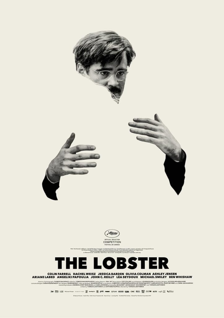
His arms encircle an absent figure, and the blankness where a human body should be evokes a sense of loss and longing. This absence highlights the film’s exploration of isolation and societal pressure regarding companionship.
The use of negative space dominates the composition, creating a stark, minimalist aesthetic that forces the viewer to focus on the disconnection between the character and his emotional state. Farrell’s pensive expression, partially obscured behind his glasses, communicates melancholy and confusion, aligning with the film’s tone. The absence of excessive detail in the background or additional imagery makes the central figure the sole focus, amplifying the feeling of existential emptiness.
The Lobster Movie Logos
The title, “THE LOBSTER,” is rendered in a bold, sans-serif typeface at the bottom of the poster. The thick, blocky font contrasts with the sparse imagery above, grounding the poster with a sense of weight and permanence. The clean, modern lines of the typeface reflect the film’s sharp, clinical tone, while the deliberate placement at the bottom balances the composition by anchoring the design visually.
The cast and credits, written in a smaller, similarly sans-serif font, are arranged neatly beneath the title, maintaining the minimalist style.
Phantom Menance
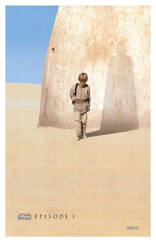
The poster depicts a young Anakin Skywalker, played by Jake Lloyd, standing against the sand and sun-scorched wall of his Tatooine home. The scene is stark, capturing the simplicity and desolation of his life as a slave boy on the desert planet.
The most striking element of the poster is the shadow Anakin casts, which reveals the unmistakable silhouette of Darth Vader, complete with his iconic helmet and flowing cape. This visual connection between Anakin and his future self is haunting and laden with narrative significance. It suggests that the seeds of his transformation into Vader have already been planted, even in his innocent youth. The juxtaposition of the small, vulnerable boy and the menacing shadow of his future self creates a poignant contrast, encapsulating the tragedy of Anakin’s story.
The desert environment, with its vast expanse of sand and a brilliant blue sky, emphasizes isolation and simplicity. The absence of other characters, objects, or distractions keeps the focus entirely on Anakin and his shadow, reinforcing the thematic weight of his journey.
Phantom Menance Logo
The typography at the bottom of the poster is understated, allowing the imagery to dominate. The “Star Wars” logo, a classic sans-serif design with bold, geometric lettering, appears in a subtle gray tone to ensure it doesn’t overpower the visual elements.
Alien
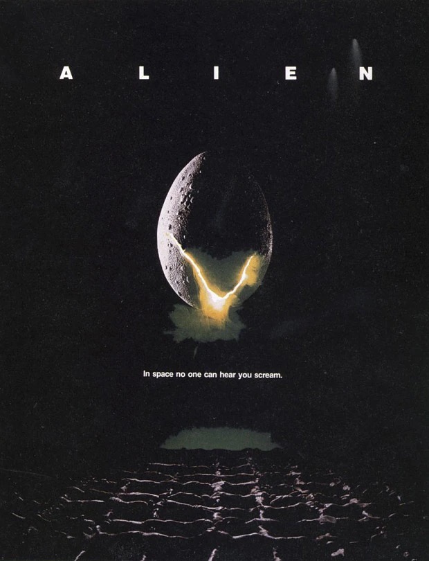
The central visual element of the poster is the cracked alien egg, suspended in a vast expanse of darkness. The egg, with its textured surface and subtle glow, immediately conveys mystery and unease. The fissure at its center emits an ominous yellow-green light, symbolizing the terror waiting to emerge. This imagery hints at the alien lifecycle and serves as a forewarning of the creature’s invasive and grotesque nature.
Below the egg lies a shadowy, abstract surface, which suggests an alien landscape or the floor of a spaceship. The surface is indistinct, giving the viewer a sense of uncertainty, while the faint silhouettes of rows of eggs blend into the darkness, adding a layer of unease. The composition creates a visual hierarchy, leading the viewer’s eye from the glowing egg down toward the cryptic terrain.
The poster’s deep black background amplifies tension by isolating the egg, making it the sole focal point. This void mirrors the film’s setting: space’s cold, empty vastness, as hostile and unforgiving as the creature itself.
Alien Movie Logos
The title, “ALIEN,” is displayed in a clean, modern sans-serif font across the top of the poster. The letters are spaced widely apart, symbolizing isolation and detachment, which are central themes of the film. The simplicity of the font contrasts with the eerie imagery, emphasizing the stark and clinical aesthetic of the poster.
The tagline, “In space no one can hear you scream,” appears below the glowing egg in a smaller, understated sans-serif font. This tagline is one of the most famous in cinematic history, perfectly encapsulating the film’s tone of helplessness and terror. Placed below the egg, it draws attention and reinforces the idea that space’s vastness offers no escape.
The typography is entirely white, standing out starkly against the black background. This choice ensures maximum legibility while also conveying a cold, detached quality that mirrors the film’s atmosphere.
The Thing
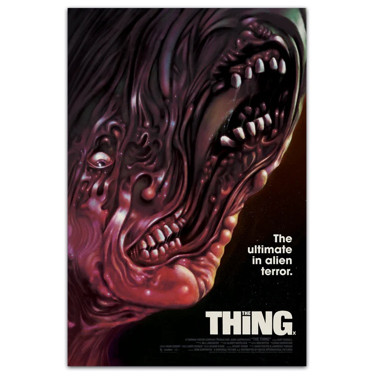
Renowned artist Drew Struzan reflected on his whirlwind experience creating the poster for The Thing over 30 years ago, and his story perfectly encapsulates the challenges and unpredictability of working in Hollywood.
At the time, Struzan was living in Lake Arrowhead, about 100 miles from Los Angeles, far removed from the heart of Hollywood. “I got a phone call—the simplest phone call I ever got—saying, ‘We have a job, we want to know if you can do it. The catch is we need it by tomorrow.’”
The job? A full-color, painted poster for a major motion picture. “So they’re talking about a major motion picture,” Struzan recalled, laughing, “and they wanted it by the next morning. I said, ‘Sure, what is it?’ They said, ‘Do you remember the movie The Thing from the ’60s?’ ‘Yeah, I saw it. Neat movie.’ ‘Well, we’re redoing it. That’s what it is.’ ‘Okay, cool. You need it when?’ ‘Tomorrow morning.’”
Struzan was astonished at the lack of resources provided for such a high-profile project. “They didn’t have any photos, no concept art—just a request to draw whatever I thought would work and turn it into a painting by the next morning. I laughed and said, ‘That’s it? You’ve spent millions of dollars on this thing and you don’t have any reference materials? Just make it however I feel? Sure, I’ll try.’”
The tight deadline pushed Struzan to the limit. “At 9 am, a guy shows up at my doorstep and says, ‘Is the painting ready?’ I had about an hour to go, so I finished it, and he took it away.”
Famous Movie Logos
Superman
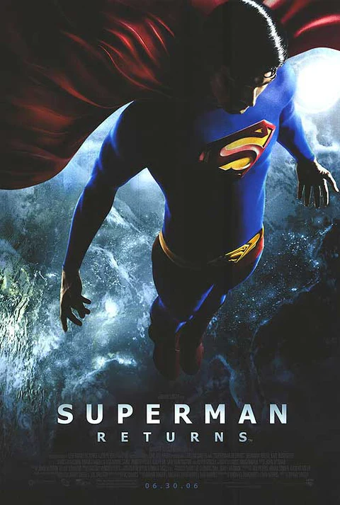
Superman Returns, directed by Bryan Singer, continues the iconic Superman saga with a fresh narrative twist. After a mysterious five-year absence, Superman (portrayed by Brandon Routh) returns to a world that has learned to live without him. Lois Lane (Kate Bosworth) has moved on with her life, and humanity no longer relies on the Man of Steel as its savior. Meanwhile, Lex Luthor (Kevin Spacey) devises a diabolical plan that threatens millions. Superman must grapple with his place in a changed world and rise once again as its protector.
The Iconic Superman Emblem
The Superman emblem—a stylized “S” within a diamond-shaped shield—is prominently displayed on the character’s chest. This logo remains faithful to the original design, using bold geometric forms and a slightly beveled effect to give it depth and dimension. The red and yellow palette of the emblem stands out vibrantly against the darker tones of Superman’s suit and the surrounding poster as a symbol of hope and heroism.
Kirk Kimball of Dial B for Blog eloquently captures the legacy of Ira Schnapp, the original designer behind Superman’s emblem:
Readers — designers — look upon the work of Ira Schnapp, and despair! You will never surpass it! You will never equal it! You will never even come close to it! Try to imagine a world where Schnapp’s work never existed … It simply can’t be done, because Schnapp’s designs are inextricably woven into the very fabric of American pop culture. That is a legacy most designers can only dream of.
Superman Returns Movie Logos
The poster for Superman Returns employs a clean and deliberate typographic approach to complement its dramatic imagery. The title, “SUPERMAN RETURNS,” is rendered in a bold, sans-serif typeface, likely inspired by modern geometric fonts that convey strength, clarity, and timelessness.
The use of uppercase letters creates a sense of authority and gravitas, aligning with Superman’s iconic status as a global protector. The spacing (kerning) between the letters is carefully balanced, providing a clean and harmonious visual rhythm that does not distract from the central image. The white color of the title sharply contrasts against the dark backdrop, ensuring readability while maintaining a minimalistic aesthetic.
The release date, “06.30.06,” is placed subtly at the bottom in a much smaller, thinner sans-serif typeface. This secondary font is unobtrusive, designed to support rather than compete with the primary focus of the design.
Toy Story
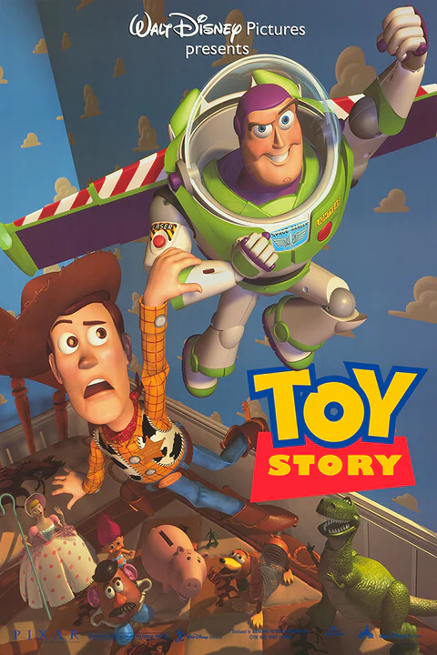
The poster for Toy Story (1995) brilliantly encapsulates the adventurous and whimsical essence of Pixar’s groundbreaking animated film.
Toy Story Movie Logos
The typography is bold and playful, perfectly reflecting the lighthearted tone of the film.
The title “TOY STORY” uses a custom sans-serif font with bright, primary colors—yellow for “TOY” and red for “STORY,” outlined in blue. These colors reflect the film’s childlike wonder and evoke the simplicity and nostalgia of classic toy designs. Rounded, slightly exaggerated letter forms add fun and accessibility, matching the movie’s appeal to audiences of all ages. The title tilts slightly upward, suggesting motion and excitement, while its bottom-right placement balances the dynamic visuals above.
The imagery shows Buzz and Woody in a dramatic pose, highlighting the film’s core conflict and budding camaraderie. Buzz soars upward with extended wings, embodying his overconfident, heroic persona, while Woody clings to his leg, appearing panicked. Woody’s expression hints at his reluctant acceptance of Buzz as an ally, adding humor and tension to the dynamic. Below them, Rex, Hamm, Bo Peep, Slinky Dog, and Mr. Potato Head peer up, emphasizing the story’s ensemble nature. The background features Andy’s iconic blue wallpaper with white clouds, grounding the fantastical premise in a familiar child’s bedroom setting.
Best Movie Logos
Finding Nemo
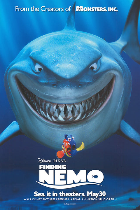
At the forefront of the poster is Bruce, the massive great white shark, grinning menacingly with sharp, glistening teeth. His dominating presence fills the upper half of the composition, immediately drawing the viewer’s attention and establishing a sense of danger and adventure. However, his exaggerated grin adds a layer of humor, signaling the film’s lighthearted tone and appeal to family audiences.
The background features deep blue gradients that mimic the ocean depths, evoking both mystery and serenity. This transition from darker shades at the top to lighter tones near the bottom creates depth and leads the viewer’s eye toward the central characters. The bubble effects scattered throughout add a playful touch while reinforcing the underwater setting. The balance between the large, threatening figure of Bruce and the smaller, vulnerable characters below creates a dramatic contrast that reflects the narrative tension of the film.
Finding Nemo Logo
The title, “Finding Nemo,” is one of the poster’s most distinctive features, combining simplicity with playful design. The typography uses a bold, sans-serif typeface for “FINDING,” which is clean and modern, contrasting with the more stylized “NEMO.” The word “NEMO” is written in a rounded, childlike font, with the “O” cleverly designed to resemble a fish tail, adding a touch of whimsy that ties directly to the film’s aquatic theme. The curved line below the title mimics a wave, further reinforcing the oceanic setting while creating a sense of motion, echoing the characters’ journey.
The logo is rendered in white, providing strong contrast against the deep blue background, ensuring legibility and making it stand out. This clean design enhances its adaptability for various marketing materials, from large posters to smaller merchandise. The placement of the logo near the bottom keeps the focus on the characters and imagery above while anchoring the composition visually.
Grand Budapest Hotel
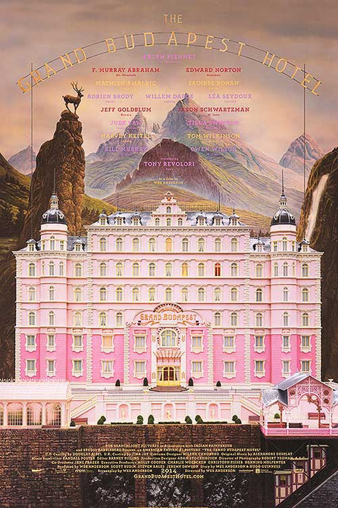
At the center of the poster is the Grand Budapest Hotel itself, rendered in vivid detail and occupying nearly the entire frame. The building’s symmetrical façade, painted in a soft pink hue with white accents, is both playful and luxurious, perfectly capturing the idiosyncratic charm of Anderson’s fictional world. The ornate architectural details, including domed towers, intricate windows, and the prominently displayed “Grand Budapest” signage, evoke a bygone era of opulence and refinement. Surrounding the hotel, the mountainous backdrop features pastel tones and dramatic peaks, symbolizing the isolation and grandeur of the setting, while the warm gradient sky creates a dreamy, nostalgic atmosphere.
The composition is highly symmetrical, a hallmark of Anderson’s visual storytelling. The hotel is centered and framed by dramatic natural elements on either side—a waterfall to the right and a rocky outcrop with a deer statue to the left—creating balance and guiding the viewer’s eye toward the focal point. The tiers of the building draw the eye upward, emphasizing its grandeur and whimsical charm, while the details of the lower levels, including the funicular and entrance, add depth and a sense of scale.
The Grand Budapest Hotel Logo
The typography is an integral part of the poster, reflecting the film’s period setting and elegant aesthetic. The title, “The Grand Budapest Hotel,” is written in a custom serif typeface with subtle vintage influences, its golden-yellow color enhancing the feeling of luxury. The title arches across the top of the poster, mimicking the curvature of the mountain range behind it and adding a sense of grandeur. The font’s slightly elongated and thin structure evokes early 20th-century design, further immersing the viewer in the film’s historical setting.
The names of the ensemble cast are arranged symmetrically beneath the title, using a clean, sans-serif font in a muted gold color to maintain harmony with the overall design. The restrained typography ensures the focus remains on the building while subtly showcasing the star-studded lineup, including Ralph Fiennes, Edward Norton, Saoirse Ronan, and Willem Dafoe.
The Iron Giant
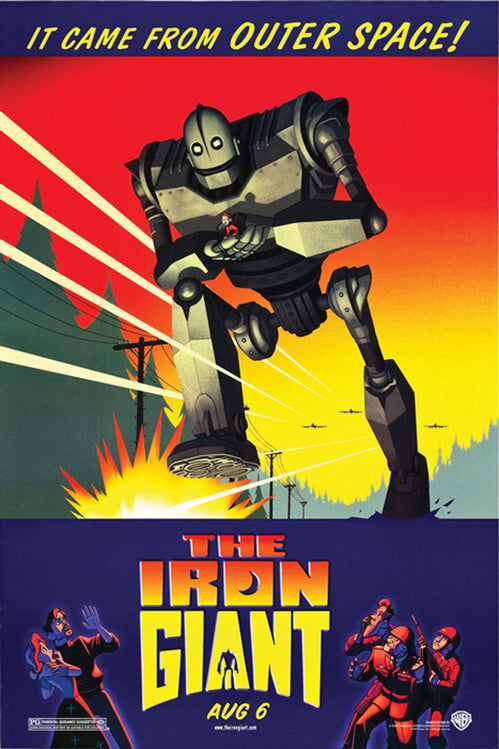
The poster for The Iron Giant (1999) is a stunning homage to 1950s science fiction art, blending retro aesthetics with modern storytelling to encapsulate the heart and themes of the Brad Bird-directed animated classic. The movie follows Hogarth, a young boy, who befriends a massive alien robot (voiced by Vin Diesel) that crashes on Earth. As Hogarth teaches the robot about humanity, government forces misunderstand the machine’s nature, leading to conflict. The poster effectively combines bold design elements, vibrant colors, and vintage-style typography to emphasize the film’s blend of heartfelt emotion and action-packed adventure.
The central focus of the poster is the Iron Giant himself, depicted mid-step with a commanding, almost menacing presence. His massive size dominates the frame, reflecting the awe and fear inspired by his arrival. The beams of light shooting diagonally across the background, along with the exploding ground beneath his foot, create a sense of movement and chaos, underscoring the initial perception of the Giant as a dangerous invader. Despite the dramatic action, the gentle placement of Hogarth on the Giant’s hand suggests the machine’s true nature as a protector and friend, offering a contrast to the destruction around them.
The background features a gradient sky transitioning from fiery red at the top to yellow and green at the horizon, evoking the dramatic palette of classic sci-fi and propaganda posters. The silhouettes of fighter jets and treetops further enhance the sense of scale and danger, as the Giant appears to tower above the landscape. The bottom portion of the poster uses a stark blue backdrop to separate the title and additional action imagery, creating visual balance and grounding the design.
The Iron Giant Movie Logos
The title “The Iron Giant” is displayed in a bold, geometric font that captures the industrial and mechanical themes of the film. The blocky lettering, with its sharp edges and uniform proportions, mirrors the Giant’s metallic construction and emphasizes strength. The two-tone gradient within the text—bright orange on top transitioning to yellow at the bottom—creates a glowing, molten effect, reminiscent of iron being forged, and adds depth to the design.
The silhouette of the Iron Giant is cleverly incorporated into the “A” in “GIANT,” blending the character’s presence with the title itself. This subtle integration ties the logo to the film’s protagonist and reinforces the poster’s cohesive visual identity. Below the title, the release date, “AUG 6,” is rendered in a simple yet bold sans-serif font, ensuring it remains clear without detracting from the logo’s prominence.
The tagline at the top, “It came from outer space!”, is written in a retro, angled sans-serif font with a slight upward tilt, evoking the dramatic headlines of 1950s B-movie posters. The exclamation mark and yellow color further enhance the nostalgic, pulp-inspired tone, signaling the film’s playful nod to classic sci-fi.
Final Words
Movie logos are more than just branding—they’re an art form in their own right. They serve as the first impression, the visual shorthand that distills a film’s narrative, genre, and tone into a single image. As we’ve explored, the design choices behind these logos are rarely arbitrary. Each font, color, and compositional element is meticulously chosen to resonate with the film’s genre, creating an emotional connection with viewers even before the story unfolds.
As movies continue to evolve, so too will their logos, reflecting new trends, technologies, and storytelling approaches. Whether you’re a fan of classic design or modern minimalism, the one thing that’s certain is that movie logos will always remain an integral part of the cinematic journey.
If you are looking for a platform to design your movie logos, try out Arvin AI Logo Designer.
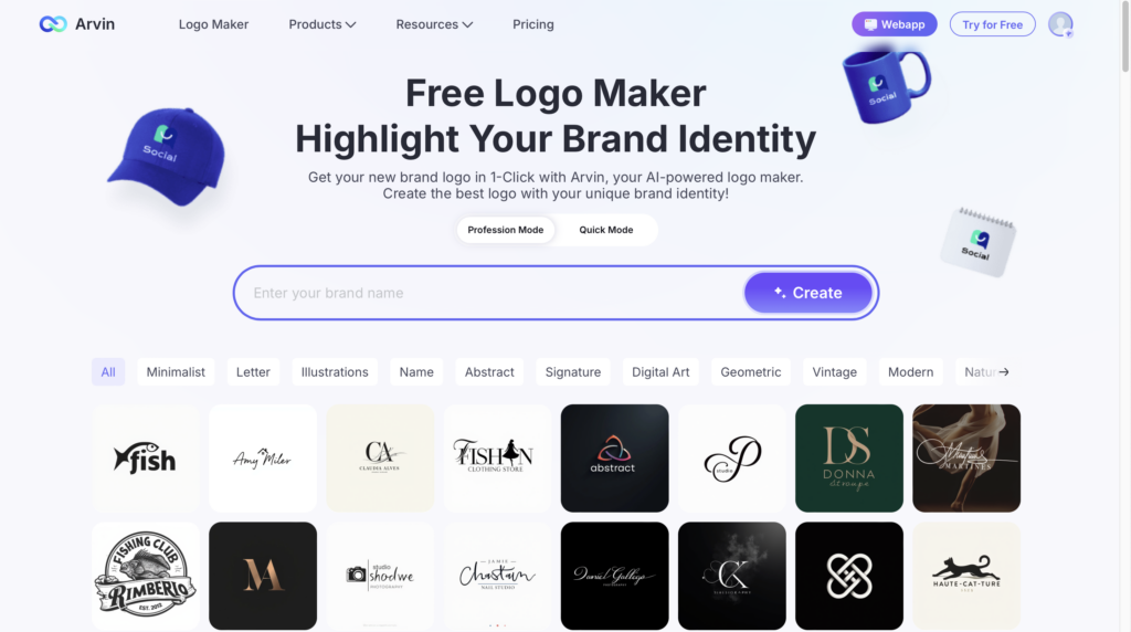
It is easy to use; just enter a brand name, the style you want, and any keyword you like, to get a unique logo in seconds.
FAQ
Rob Janoff is best known for designing the iconic Apple logo, featuring the minimalist apple silhouette with a bite taken out of it.
One of the most famous movie logos is the “Star Wars” logo.
Yes, 3D logos can be effective when used appropriately. They add depth and dimension, making the design stand out and feel modern. However, they might not be ideal for all applications, especially if simplicity and versatility are required for branding.
Vintage logos are designs that evoke a sense of nostalgia and timelessness. They often feature retro typography, ornate details, and muted color palettes to capture the aesthetic of a bygone era, making them popular for brands wanting to highlight heritage or craftsmanship.


