Fonts aren’t just about looking pretty; they set the tone for everything you create. Whether you’re designing a resume, starting a blog, or working on a brand, the right font can make your work feel polished and professional. Plus, modern fonts just make things easier to read—no one wants to squint at swirly cursive on a website.
Your logo is your brand’s first impression—make it unforgettable. Start designing with Arvin’s Logo Maker today!
What Are Modern Fonts?
Modern fonts are the sleek, stylish typefaces you see everywhere these days, from Instagram captions to tech startup logos.
What Makes a Font “Modern”?
1. Sans-Serif Vibes:
Modern fonts usually ditch those little decorative tails (serifs) you see in older typefaces.
2. Clean and Minimalist:
Think simple, uncluttered, and to the point. No frills, no drama—just clean lines that make your text easy to read.
3. Digital-Friendly:
These fonts were basically born for screens. Whether you’re reading a blog on your phone or navigating an app, they look sharp and crisp.
4. Flexible Styles:
You’ve got options! Some fonts go bold and experimental, while others keep it simple and geometric. There’s a modern font for every mood.
Why Is It Important to Choose the Right Modern Font for Your Logo?
Your logo is often the first thing people see when they interact with your brand. A sleek, modern font can immediately signal professionalism, innovation, or creativity—whatever vibe you’re going for. Conversely, the wrong font might send mixed messages or feel outdated.
Imagine a tech startup using a flowery script font—it just doesn’t fit, right?
In a crowded market, your logo needs to stand out. A modern, carefully chosen font makes your logo distinctive, giving your brand an edge over competitors who might stick with generic choices.
Is your logo saying what you want to? Explore our blog to discover what your logo should be!
Modern Fonts Controversy
When Jaguar unveiled its redesigned logo as part of a bold rebranding effort, the reaction was swift—and far from unanimous. The new logo, a sleek and modernized font on the brand’s classic emblem, was meant to symbolize Jaguar’s shift into an all-electric future.
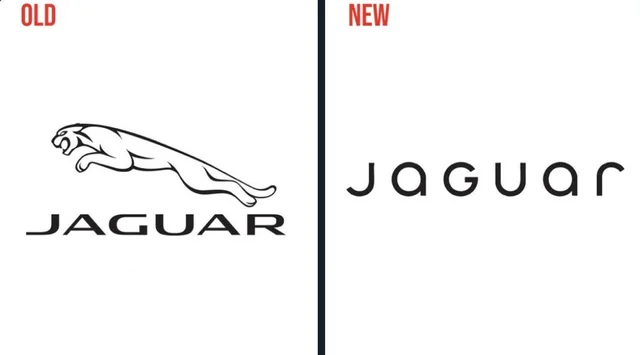
However, the accompanying promotional campaign left many viewers puzzled. Featuring avant-garde visuals and vibrant aesthetics, the ad carried the tagline “Copy Nothing” but conspicuously omitted a key element: the cars themselves. Naturally, this raised eyebrows, with even Elon Musk sarcastically tweeting, “Do you sell cars?” The omission seemed to dilute the message Jaguar hoped to convey, making the rebranding feel disconnected from its core identity.
Best Modern Fonts of 2025
These are some of my favorite modern fonts.
Salted
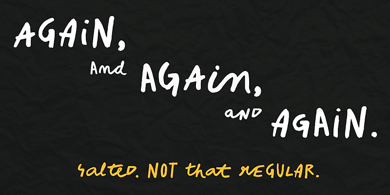
So, “Salted” immediately stood out to me because of its playful, handwritten style. It’s one of those modern fonts that instantly injects personality into whatever you’re working on. To me, it feels like the perfect choice for projects where you want to convey warmth and creativity. Unlike polished, geometric fonts, Salted has this raw, organic charm. In fact, it reminds me of the kind of typeface you’d see on a cozy coffee shop menu or quirky packaging for artisanal goods.
On the other hand, if you’re creating a long document or designing something more formal—like a corporate pitch deck—Salted might not be the best fit. Its irregularity can make longer text harder to read, which is why I’d stick to using it sparingly for moments that need a creative pop.
Fifties
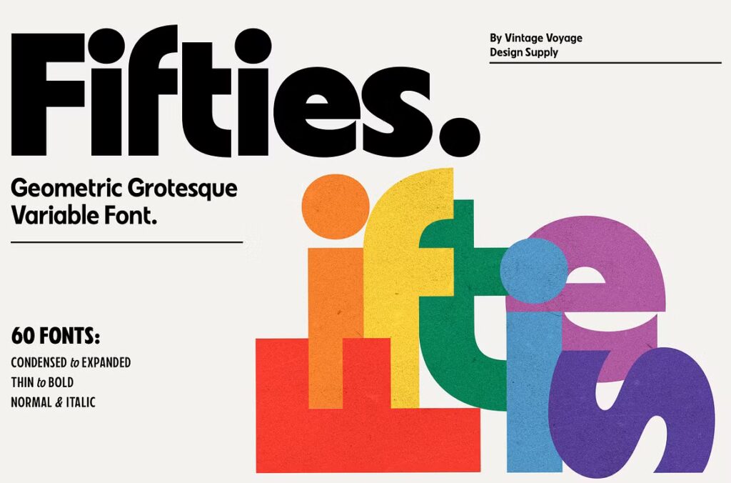
The Fifties font is a perfect blend of retro charm and modern versatility, capturing the bold, geometric style of mid-century design while offering the flexibility of variable weights and widths. Its playful yet impactful design feels nostalgic without being dated, making it ideal for creative projects that want to stand out.
I love how it balances clean lines with soft, rounded corners, giving it a personality that’s both approachable and striking. It works beautifully for headlines, logos, and branding, especially for businesses or events with a vintage-inspired aesthetic, like retro-themed cafes or lifestyle brands.
However, it’s not suited for body text, as its bold shapes can feel overwhelming in dense paragraphs. To make it shine, I’d pair it with a sleek sans-serif font like Avenir or Helvetica Neue, letting Fifties take center stage in standout elements. Overall, this typeface is perfect for adding a touch of nostalgia with a modern twist, and its adaptability makes it a valuable tool for any designer.
ITC Slimbach
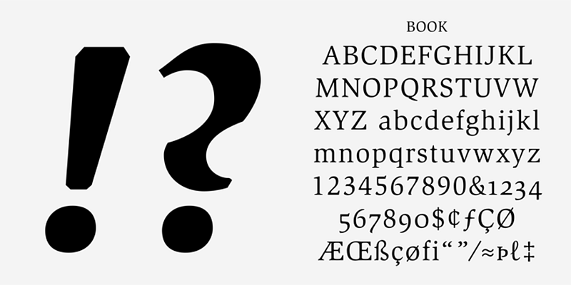
The ITC Slimbach font carries a sense of timeless elegance and professionalism that makes it stand out in formal design contexts.
Its classic serif design, with perfectly balanced proportions, lends itself beautifully to applications like book typography, academic journals, or high-end branding. What strikes me most is how it blends traditional serif elements with a modern sensibility, offering both readability and sophistication.
While it’s highly effective for body text and structured layouts, its polished tone might feel too rigid for playful or casual projects. To create contrast, I’d pair it with a minimalist sans-serif like Helvetica for captions or supporting text.
Linear Grotesk
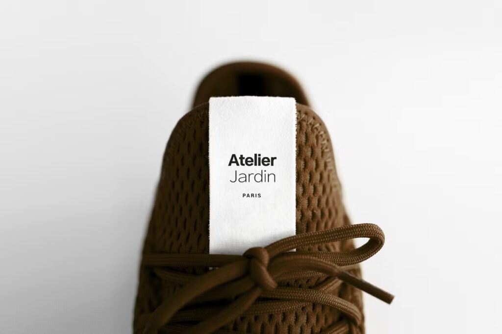
The Linear Grotesk font exudes modern simplicity, making it a go-to for clean, contemporary designs. Its minimalist aesthetic and geometric structure give it a professional yet approachable feel, ideal for branding projects that want to convey sophistication without being overly formal.
What I find particularly appealing is its versatility—it works seamlessly across product packaging, fashion labels, and digital interfaces. For instance, in the image example, it’s used on a shoe tag, perfectly blending subtle elegance with functional clarity.
However, because of its straightforward design, it’s best suited for projects that prioritize readability and modernity over creativity or playfulness. Pairing Linear Grotesk with a bolder, more expressive typeface can create a striking visual contrast while allowing it to anchor the design with its clean lines.
Not all fonts are created equal. Find out which ones work best for your logo in our blog.
Monorama
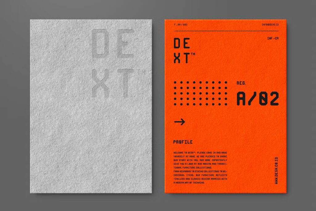
The Monorama font is strikingly modern with a futuristic, modular design that instantly grabs attention. Its rigid, grid-like structure makes it ideal for edgy branding, tech-focused projects, or experimental layouts.
What I love about this typeface is how it feels both retro and forward-thinking, evoking the style of industrial design while still being highly contemporary. It excels in creating bold headlines, standout logos, and layouts with high visual impact.
However, its blocky design might feel too rigid for projects needing a softer, more organic feel. To balance its boldness, I’d pair Monorama with a simple sans-serif font for supporting text.
Ao Dai
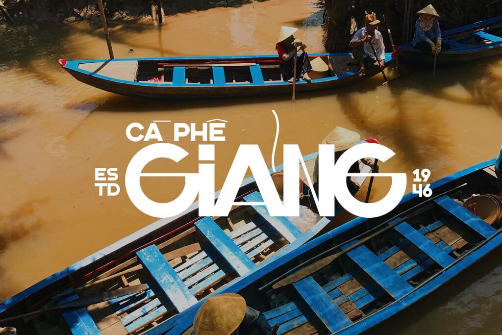
The Aodai Typeface has a distinctive cultural charm that feels both bold and expressive. With its dramatic proportions and creative line work, it immediately draws the eye, making it perfect for branding tied to heritage or storytelling.
This font strikes a balance—it’s striking enough to dominate a headline while still feeling adaptable for branding or signage. Its bold letters have a sense of personality, perfect for logos or designs wanting to evoke tradition with a modern twist.
That said, it might not work as well for more minimalist or corporate projects, where a cleaner font would shine. I’d recommend using it sparingly, perhaps for titles or logos, and pairing it with a neutral sans-serif font for versatility.
LTR Beosans
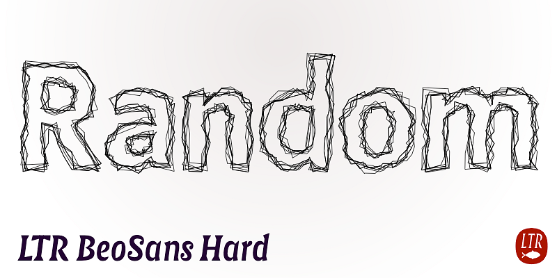
The LTR Beosans Hard font is one of the most experimental designs I’ve seen, with its edgy, hand-drawn appearance making it truly unique. It feels raw, almost like a sketch brought to life, giving it immense personality.
This typeface would be amazing for creative projects, especially ones aimed at an alternative or artistic audience—think album covers, zines, or promotional materials for an indie event. Its chaotic, textured design feels intentional and adds depth to any layout.
However, because it’s so visually distinct, I wouldn’t recommend using it for extensive text or designs needing a polished look. For balance, pair it with a clean sans-serif or a simple serif font to anchor the design while letting Beosans Hard steal the show in titles or accents.
TT Nooks Script
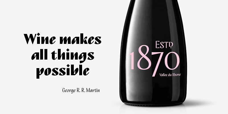
When I look at TT Nooks Script, it immediately feels like a perfect marriage of classic and modern. It’s elegant, sure, but not in a way that feels too stiff or dated. To me, it’s the kind of font that works beautifully on wine labels, luxury invitations, or even branding for boutique shops. The dramatic curves and delicate details give it a sense of sophistication that I absolutely love.
Double Bass
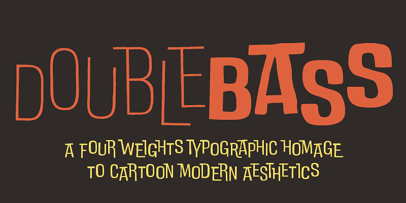
I can’t help but smile when I see Double Bass—it’s fun, bold, and bursting with personality. The cartoon-inspired aesthetic makes it feel like it’s straight out of a retro animation. If I were working on a branding project for a toy store, children’s book, or even a funky restaurant, this modern font would be my top pick. It has such a unique vibe, but I’d definitely use it sparingly.
I mean, it’s eye-catching for sure, but too much of it could overwhelm a design. For the best results, I’d let it shine in headlines or logos and pair it with a neutral font for balance. It’s playful and attention-grabbing, but it knows when to step back and let other elements take over.
Sincopa
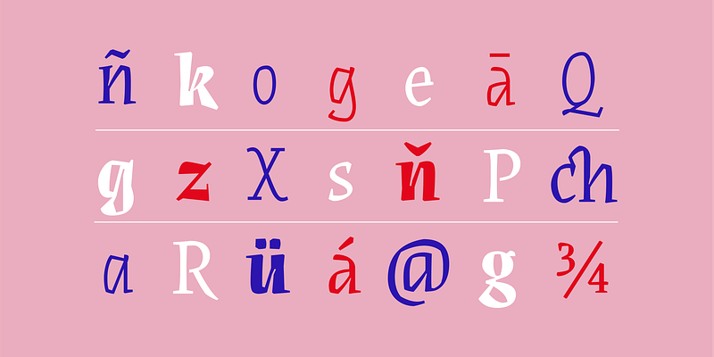
There’s something so dynamic about Sincopa—it feels like it’s constantly moving, almost like a typographic dance. What I really appreciate about this font is how it balances sharp edges with rounded curves, creating a rhythm that’s both playful and elegant.
I’d use it for projects in the arts or music industry, like concert posters or creative brand logos. But I have to admit, its energy might not fit every project. If I were working on something more corporate or minimalist, I’d probably look elsewhere. It’s quirky, bold, and full of life—perfect for when you want to stand out.
Peperoncino
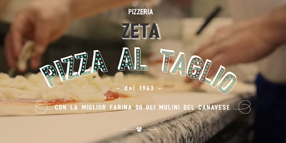
Peperoncino feels like it was made for food lovers. It instantly makes me think of artisan pizza menus or rustic Italian restaurant branding. The slightly hand-drawn look adds warmth, almost like a personal touch from a chef.
I love how approachable it feels—it’s playful without trying too hard. To me, it’s a font that tells a story, and that story is all about good food and great vibes.
Lacquer
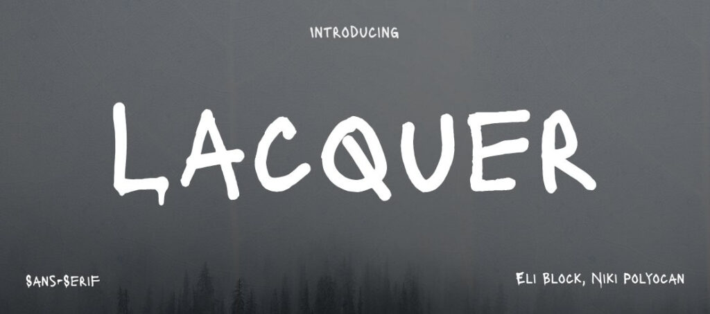
This one has such a raw, gritty energy that I can’t ignore. Lacquer is the kind of font that would be right at home on indie music posters, edgy apparel branding, or anything with an alternative vibe. The hand-drawn quality gives it depth, which I really like, but it also means it’s not suited for smaller text or long paragraphs.
If you pair it with something simple and clean—like Helvetica or Roboto—you’ll create a striking contrast that works beautifully.
Harpagan
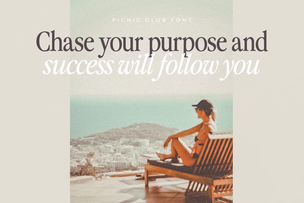
Harpagan feels timeless. It has this understated elegance that’s perfect for high-end branding or editorial layouts. If I were designing for a luxury brand or working on an upscale magazine, this would be my go-to.
I love its subtle curves—they add just enough character without making it too flashy. That said, it’s not a font I’d use for bold or modern designs—it feels more rooted in tradition. To give it a fresh twist, I’d pair it with a minimalist sans-serif font for contrast.
Fleur Display
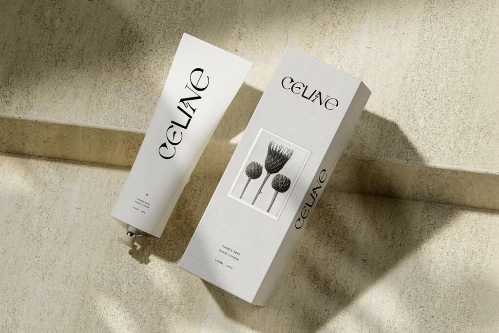
Fleur Display is all about elegance. When I see it, I think of luxury packaging, wedding invites, or anything that wants to feel premium. The floral-inspired details are stunning, but I’ll admit, they make the font less versatile. You’d have to be careful about where you use it—too much, and it might overwhelm your design.
Floora
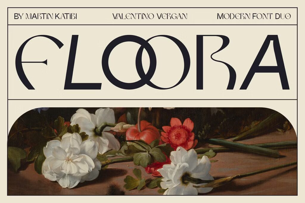
Floora is such a versatile font duo. It combines clean, geometric shapes with artistic details, giving you so much to work with. I can imagine using it for fashion branding, gallery promotions, or even lifestyle blogs. It’s bold enough to grab attention but refined enough to feel professional. What makes it special, in my opinion, is the balance it strikes—it’s creative without being over the top. To make it stand out even more, I’d use the decorative version sparingly for accents and keep the simpler version for body text.
Flank Steak Font Duo
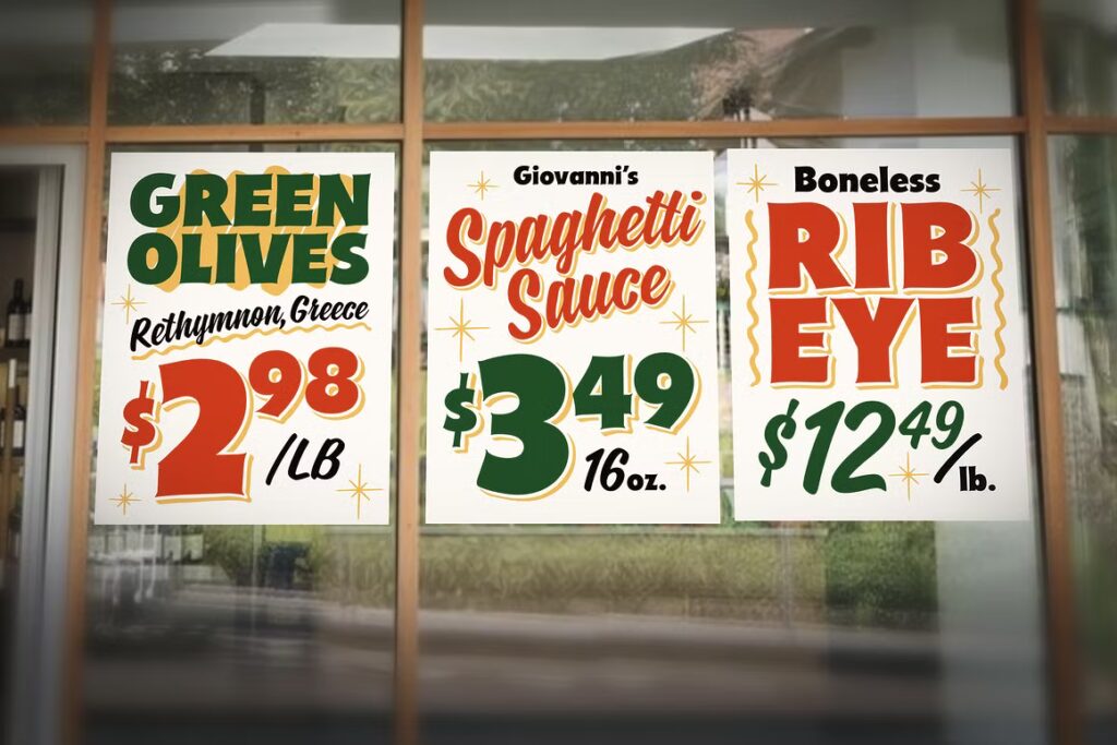
Flank Steak is so much fun—it’s retro, bold, and has just the right amount of nostalgia. I’d use it in a heartbeat for food-related designs, like deli signs, menu boards, or artisan product labels. The combination of chunky and script styles gives you a lot of flexibility while keeping the design cohesive.
New Look Typeface
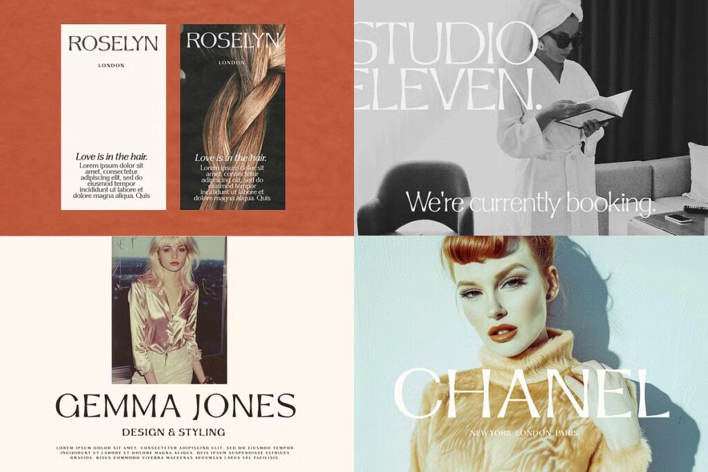
This typeface feels effortlessly chic. I’d use it for branding projects that need to exude sophistication, like fashion labels or high-end service providers. It’s stylish, timeless, and just a little dramatic—the perfect combination when you want to captivate an audience.
Salty Bun
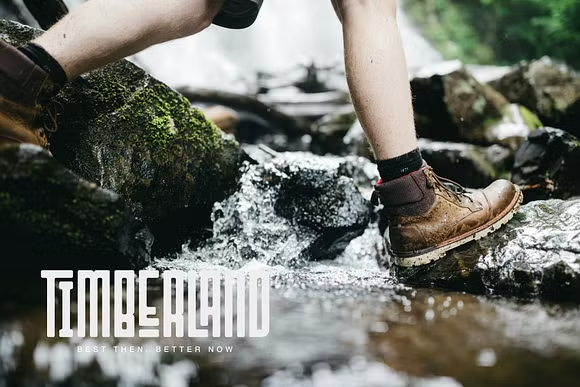
Salty Bun immediately makes me think of adventure. Its rugged, blocky style feels perfect for outdoor brands, gear companies, or anything tied to nature and exploration. I love how it manages to look bold and clean at the same time, making it a great option for logos, especially for brands like hiking gear or rustic cafes.
Raftwork
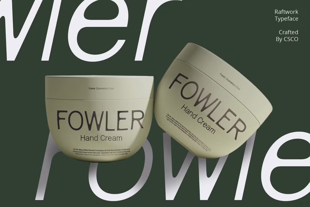
This font is all about subtle elegance. The clean lines and contemporary feel make it a strong choice for modern branding, especially for beauty products or minimal packaging designs. If I were designing for a skincare brand or a wellness company, I’d absolutely go for Raftwork—it gives off a feeling of sophistication without trying too hard. I love how well it stands on its own. It’s simple, classy, and refreshingly modern.
Green
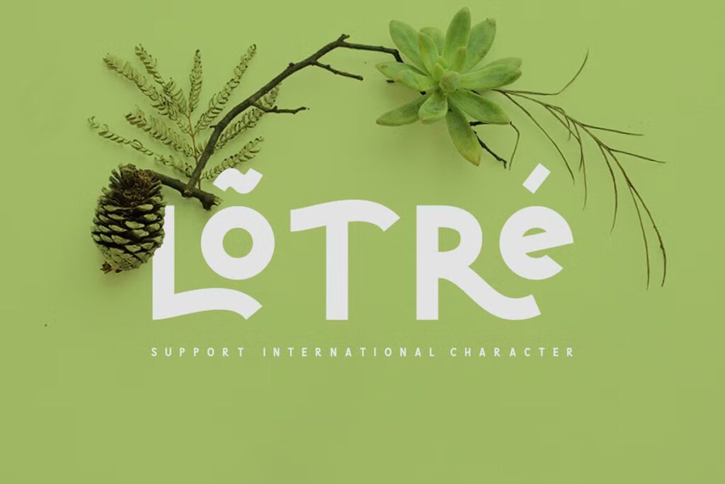
There’s something wonderfully organic about Lộ Tré. It’s soft, it’s approachable, and it’s full of personality. I could see it working well on eco-friendly packaging or even as part of a quirky café logo.
Oblong
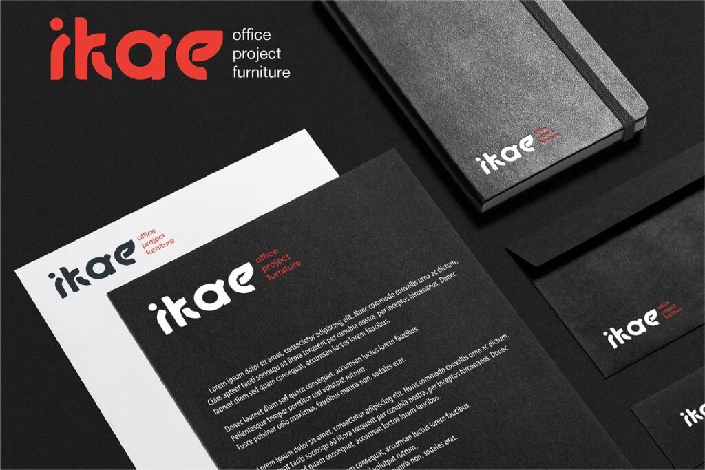
Oblong is sleek, modern, and undeniably eye-catching. Its geometric style makes it a great choice for tech-focused branding or contemporary logo designs. If I were designing stationery for a startup or promotional materials for a modern furniture brand, this would be at the top of my list.
Echowarp
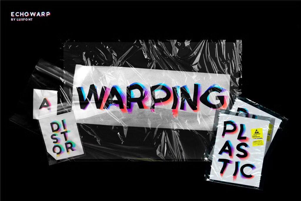
This font is such a statement piece! Echowarp feels experimental and futuristic, with its distorted, almost glitchy design. If I were using it, I’d make it the focal point and keep everything else in the design clean and minimal. It’s bold, creative, and perfect for anyone looking to push boundaries.
Montier
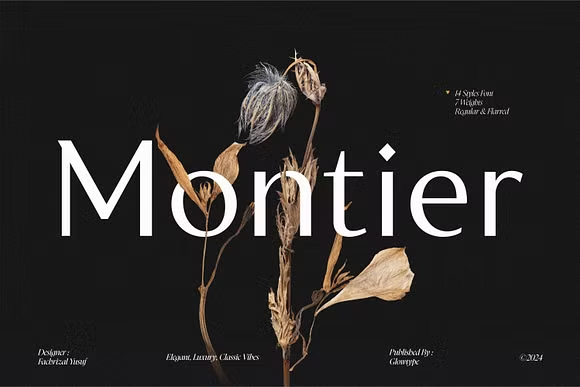
Montier exudes luxury and grace. It’s the kind of font that feels made for wedding invitations. I love how the thin serifs give it a touch of elegance without making it feel overly traditional—it’s modern and classic at the same time.
Pink Zebra
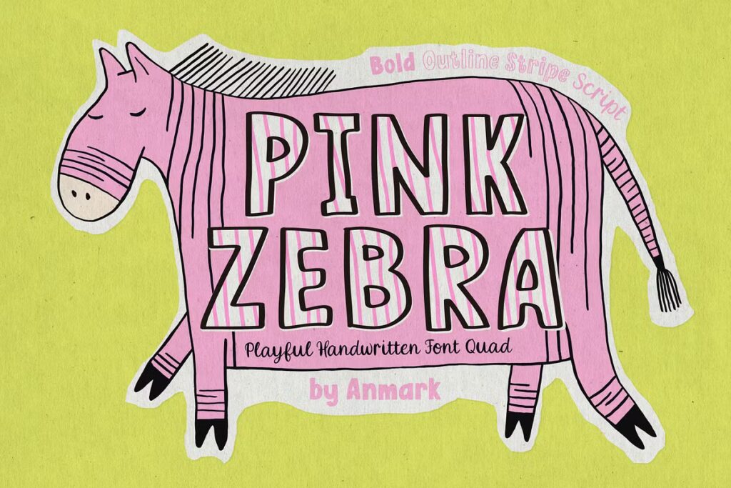
Pink Zebra is just plain fun. The playful, handwritten style makes it feel approachable and creative, like something you’d see on children’s book covers or quirky product packaging. I love how it doesn’t take itself too seriously—it’s bright, bold, and bursting with personality. To make it work, I’d keep the design colorful and whimsical, letting Pink Zebra take center stage.
Not sure which font is right for your logo? Don’t worry—we’ve done the homework for you. Check out the best fonts for logos.
Winter Party
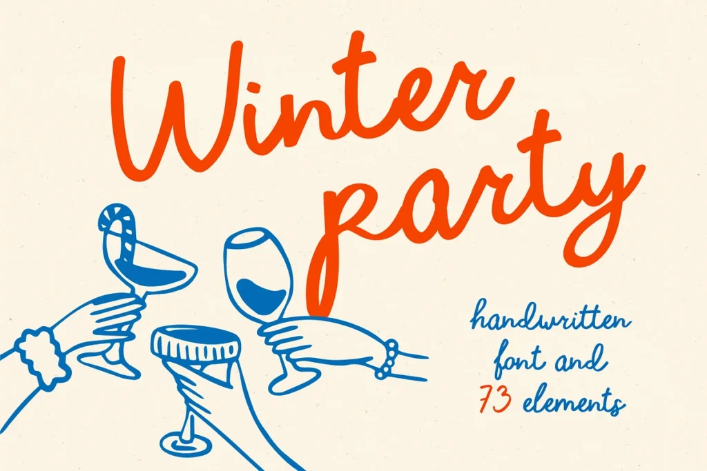
Winter Party feels like it’s made for celebrations. Its handwritten charm is warm and inviting, perfect for holiday cards, event invitations, or even branding for festive products. I love how it captures a sense of fun without losing its polish—it’s casual but still elegant.
French Aperitif
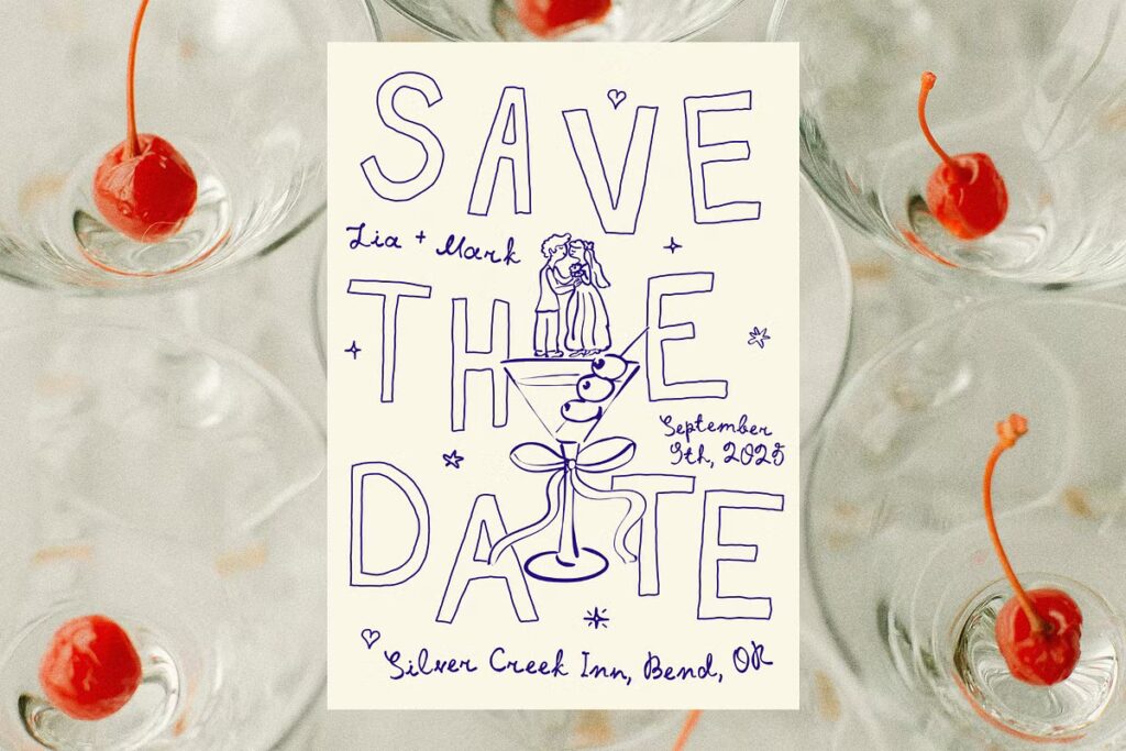
This font is all about charm. French Aperitif feels like it belongs on a chic café menu or a wine bottle label—it’s quirky but refined. I love how the handwritten style gives it a personal touch while still feeling polished enough for professional use.
Conclusion
Choosing the perfect modern font for your logo is like finding the right outfit for a big event—it not only sets the tone but also captures attention and tells the world exactly who you are. Therefore, as you design your logo, think carefully about the story you want to tell and the impression you want to leave. Moreover, pairing fonts thoughtfully or choosing versatile typefaces can help you strike the perfect balance between creativity and clarity. With the right font, your logo can transcend being just a symbol—it can become a bold statement.
Don’t let designing a logo intimidate you. Arvin’s Logo Maker makes it simple and fun—try it now!
FAQ
Modern fonts depends on the purpose of your design. Popular choices include Futura, Avenir, and Montserrat for their clean lines and versatility. Fonts like New Look Typeface or Raftwork are also excellent picks for creative projects that demand sophistication or minimalism.
Modern fonts type typically features clean, geometric shapes and simple lines that focus on readability and contemporary aesthetics. Examples include sans-serif fonts like Roboto, Poppins, and Helvetica, but modern fonts can also include stylish serifs like Montier or experimental designs like Echowarp.
In 2025, trendy fonts lean towards bold sans-serifs with a minimalist edge, such as Figtree or Inter, alongside decorative and experimental fonts like Pink Zebra or Floora. These fonts combine practicality with personality, making them perfect for both branding and digital designs.
Modern fonts for letters typically focus on clean, crisp designs that ensure readability and style. Futura, Avenir, and Arial are timeless options for simple designs, while Fleur Display or Salty Bun offer a more creative and bold approach for standout lettering.

