Minimalist design has become a key element in modern branding and web design. One of the most important aspects of minimalist design would be the choice of fonts because the right font can add finishing touches to your brand’s overall look. This article will discuss what minimalist fonts are, why minimalist fonts are so famous in designs and how to find best one for projects. Then we will be able to understand that what draws people to minimalist fonts, discover the different types and how they influence the user experience.
Part 1: What Are Minimalist Fonts?
Minimalist fonts are fonts which emphasize simplicity and clarity. The fonts that fall into these groups usually do projects without fancy flourishes or too many details, opting instead for large and simple lines and legibility. The minimalist fonts are designed in such a way that all the extra things that might divert from the message are removed. In the minimalist design, the font is one of the key parts in this streamlined look. In this part, we are going to explain what minimalist fonts are, why are they used so much in modern design and offer some good examples that fit different tasks on your projects.
Why Minimalist Fonts Are Crucial in Modern Design
The minimalist fonts are necessary now in today’s design projects as they enforce a simplistic yet functional look. Current audiences are more prone to look at clean, add number in logo designs, especially within digital, where attention is short and brief. That demand is fulfilled by the minimalist fonts because they use fonts that are readable and understandable and not distracting visually.
Examples of Popular Minimalist Fonts
There are several fonts that have become popular in minimalist designs because they are simple but effective. Some of these examples following:
- Helvetica: This is one of the most widely used minimalistic fonts due to the clean lines and usefulness.
- Futura: A geometric sans-serif font that feels modern and crisp.
- Gotham: A clean straightforward font that is often used in branding or corporate design.
- Avenir: A contemporary yet simple typeface used widely in every application.
How Minimalist Fonts Work with Minimalist Design Principles
Minimalist design has very simplicity of functionality and elegance, therefore can be seen in their minimalist fonts. These will work as readable fonts that avoid being cluttered with other aspects but focus on the necessity of communication. Therefore Minimalist fonts used in designs aimed for making the message in clear and communicative terms and ensuring it is visually balanced and appealing.
Part 2: The Appeal of Minimalist Fonts in Design
Minimalist fonts are both functional and aesthetically pleasing. Minimalist fonts are the perfect balance between simplicity and functionality. A simple design can often lend a cleaner look to the page, making everything more organized. These remove extra elements from the font that could easily cause distraction away from the main message being conveyed. At the same time, it retains all functionalities to ensure the message is communicated effectively. Decorations are avoided and minimized; hence, they will ensure legibility on most devices and screens. We now discuss why minimalist fonts work very well and why they would complement any modern, clean, sophisticated look.
How Minimalist Fonts Create a Clean, Modern, and Elegant Look
One of the reasons that minimalist fonts remain popular is that they serve to impart the appearance of a clean and modern look. Minimalism often carries along with an impression of sophisticated professionalism when used in branding, web design, and graphic design. A modern touch without the elegance will be lost on a simple bold font. Such styles suit business ventures that look forward to creating a feeling of innovation and new-age relevance.
Importance in Branding, Logos, and Web Design
Minimalist fonts have high importance in branding since they give way to identity that it is clean and memorable. Companies use these fonts within their logos, websites, and other marketing materials to maintain unity within all their branding campaigns. These have become very versatile and pliable for use in diverse applications. Whether you’re creating a logo for a new product or designing a website for a tech startup, the right minimalist font can help you communicate your message more effectively.
Examples of Successful Brands Using Minimalist Fonts
- Apple: Branding through Apple is centered around simplicity; the use of minimalist fonts like Helvetica and San Francisco aids in retaining its modern and sleek impression.
- Airbnb: In this case, a custom sans-serif typeface is utilized to produce a friendly yet accessible look without sacrificing much in terms of being clean and professional.
- Nike: The “Just Do It” slogan is combined with a strong and simple wordmark, which has become an iconic symbol of the brand.
Part 3: Types of Minimalist Fonts
There are two major categories that minimalist fonts fall into-serif and sans-serif-and understanding the difference between them may help you pick the right type for your brand. Examples of popular fonts in each of these categories are also demonstrated below.
Serif vs. Sans-Serif Minimalist Fonts
Generally, fonts are classified into two types: serif and sans-serif.
- Serif Fonts: These are fonts that have small lines or strokes at the end of the letters. They are often supposed as traditional and formal. Examples of minimalist serif fonts include Playfair Display and Baskerville.
- Sans-Serif Fonts: The sans-serif fonts do not add the extra strokes to the letters. As a result, they appear to be more smooth and clean and therefore are preferably used in minimalist designs. Examples include Helvetica, Arial, and Roboto.
Popular Minimalist Fonts
Following are some of the most prominent minimalist fonts, which find extensive usage in numerous projects across the globe.
- Helvetica: A clean and neutral font type that can be used under a variety of applications.
- Futura: A geometric sans-serif font that is highly readable and modern.
- Gotham: This font is often used in corporate branding and gives a professional and contemporary look.
- Avenir: A versatile and modern font suitable for both digital and print media.
Choosing the Right Minimalist Font for Different Projects
The minimalist font should be chosen according to the nature of your project and the message you want to pass. For instance, serif fonts are very good for brands that wish to evoke a sense of tradition or elegance. In contrast, sans-serif fonts are best for modern, innovative designs. Lastly, readability is crucial. Ensure you test the font on various devices and media to ensure it maintains its legibility.
Examples of Minimalist Fonts and Uses
- Helvetica Neue: For websites and mobile applications this is an ideal font style.
- Lato: Good For Blogs and Webpages to Give a Friendly Touch.
- Montserrat: For creative work; these fonts are mainly applied as heading and logo types
Part 4: How Minimalist Fonts Impact User Experience
In this section, we will see how minimalist fonts contribute to user experience, from readability to overall design of a website or app.
How Readability Is Enhanced with Minimalist Fonts
Minimalist fonts are made to ensure readability. Clean and simple letterforms help users read the text fast and without confusion. Without any decorative elements, the reader is more likely to focus on the content then the visual and therefore not be tired. This is very significant in web and mobile design.
The Role of Minimalist Fonts in Creating an Intuitive User Interface
Minimalist interfaces come easily into shape and result in clear readability by easy elimination of text while creating ease in navigation and accessing headings, buttons, etc., with a more intuitive effect for users. Thereby reducing any confusion or irritation to find the way from the websites and applications, so an effortless user experience increases.
The Psychological Effects of Minimalist Fonts on the Viewer
Minimalist fonts also have psychological effects on the viewers. These help users focus on the essence of a design without being sidetracked by unnecessary details. This is very important for leading users to the actions you intend them to take, which may include purchasing a product or subscribing to a service.
Part 5: Using Minimalist Fonts in Web Design
Web design plays a critical role in how your brand is perceived online. Typography contributes to the user experience, and to communicate your brand message. In this section we will talk about why minimalist fonts are important in web design, how to use them most efficiently, and examples of the sites which use these typefaces without difficulties.
Importance of Typography in Web Design
Typography isn’t merely selecting a beautiful font but is also a balance of the aesthetics, readability, and user experience. Proper typography guides users around a website, underlining the information to them and beautifying the overall look of the site. Web design minimalist fonts are great for providing a clean and uncluttered look that focuses the user’s attention on what matters most. This is also going to improve readability and facilitate an intuitive browse.
Best Practices for Using Minimalist Fonts in Websites
When using minimalist fonts in web design, there are several best practices to keep in mind to ensure your website remains user-friendly and visually appealing:
- Use a Limited Font Family: Stick to one or two fonts, preferably a combination of serif and sans-serif, to maintain consistency and avoid visual clutter.
- Prioritize Readability: Ensure that the font size and line spacing are appropriate for easy reading. Make sure that the text is legible across all devices.
- Consider Hierarchy: Use different weights (bold, regular, light) to create a typographic hierarchy that guides users’ attention to the most important information.
- White Space Is Key: Allow sufficient space around text to create a balanced layout. This makes the text more readable and prevents a crowded design.
- Test Across Devices: Because web design is so often mobile-optimized, make sure your minimalist font is readable on both desktop and mobile screens.
Examples of Websites with Effective Use of Minimalist Fonts
Some websites are masters at using minimalist fonts to create a clean, modern look that’s easy to navigate. Here are a few examples:
- Apple: Apple’s website uses its custom San Francisco font, which is simple and clean and perfectly aligned with the minimalist design philosophy.
- Airbnb: A clear, readable sans-serif font on Airbnb’s website creates a clean and approachable user experience, reflecting its brand’s personality.
- Dropbox: Dropbox also uses minimalist typography to keep its user interface simple and elegant, thus making it easy for users to find what they need quickly.
Tools and Resources for Web Designers Looking to Implement Minimalist Fonts
- Google Fonts: This is a large, free library of minimalist fonts optimized to use for website and easy to implement.
- Adobe Fonts: This offers access to hundreds of typefaces to help take a minimalist design to the next level.
- FontPair: A website that help designers pair minimalist fonts effectively for use on websites.
- FontForge: This is a free open-source font editor. It is used to create custom minimalist fonts specific to your brand.
Part 6: Benefits of Using Minimalist Fonts for Branding
When it comes to branding, typography is what impacts how long the perception of your business will stay with the audience. In this chapter, we are going to see how minimalist fonts can make a stronger impression for your brand and even provide professionalism, giving a long-term impression about your business.
How Minimalist Fonts Create a Strong, Memorable Brand Identity
Minimalist fonts are excellent at creating strong brand identities because they focus on simplicity and clarity. A clean, well-chosen font is instantly recognizable and communicates your brand’s values. By stripping away unnecessary elements, these allowed the brand message to come through clearly and memorably. A well-designed minimalist logo or brand name is easily identifiable and makes a lasting impression on consumers.
The Effectiveness of Simple Fonts in Conveying Professionalism and Clarity
Straightforward text that will not distract the target audience from your message, you are assured that they will clearly understand what your brand wants to communicate. Be it for logos, websites, or even prints, these complicated over-complexity in designs and create the perfect ambiance for transparency-a trust-worthy concept.
Examples of Brands with Successful Minimalist Fonts and Logos
Many successful brands use minimalist fonts to enhance their image and communicate their values clearly:
- Nike: Nike’s iconic logo, combined with a clean sans-serif font, has become synonymous with strength, simplicity, and performance.
- Coca-Cola: Although Coca-Cola’s script font is a bit more decorative, it still adheres to the minimalist principles of a clean, readable design that is easy to recognize.
- Google: Google’s logo uses a simple, sans-serif font in bright colors to convey a friendly, approachable, and innovative personality.
Part 7: Common Mistakes to Avoid When Choosing Minimalist Fonts
Minimalist fonts are great for most design projects. But, there are also some frequent mistakes which can easily destroy the effectiveness of your design. Here in this section, we will show some of them and provide you with suggestions how to avoid them.
Too Many Fonts in One Design
One of the most common mistakes in minimalist design is using too many fonts. This can create visual mess and make the design feel disorganized. Limit the number of fonts you use in a project to no more than two or three. Too many fonts can distract the viewer from the content and make the design feel overwhelming.
Avoid using overly decorative fonts.
In some cases, decorative fonts might seem attractive, they more often create visual noise away from the clean, simple nature of minimalist design. Avoid those with too many flourishes and instead use simpler and more functional typefaces which remain minimalist.
Not Considering the Context and Medium (Digital vs. Print).
Another mistake is failing to consider the context or medium in which the font is used. A font that does very well on a website will not perform so well on print material, and vice versa. It’s always important to see how it performs on other platforms and correct where necessary.
Failing to Prioritize Readability
Readability should always be the first consideration when selecting a minimalist font. Some fonts look great in headlines but are then difficult to read in smaller sizes. Test your fonts in different settings and sizes to ensure they remain readable and effective in all contexts. Avoid fonts that are too thin, condensed, or overly stylized, as they can affect readability.
Part 8: The Future of Minimalist Fonts in Design
Design has not stopped from its transformation and change, minimalist fonts are also one of them. We’ll find out in this section emerging trends about minimalist fonts and how technology like artificial intelligence (AI) is changing the face of font design.
Emerging Trends in Minimalist Fonts and Design
Many designers are beginning to move away from traditional serifs and start to play with geometric forms and custom letterforms. Variable fonts have also experienced a rise; they facilitate the adjustment of the weight, width, and other features of a given font without changing files. It is pretty perfect for making dynamic responsive designs.
How AI and Technology Are Shaping the Future of Typography
Designing is going to be more easily executed and achieved due to AI design tools because they can now create personal fonts based on preference or trends. They let the designer work and experiment with styles that will not be achievable without traditional designs. AI analysis for behavior patterns of users may enable finding fonts that best fit various other forms of platforms.
Continued Popularity of Minimalist Fonts in Different Design Industries
The demand for these will likely increase because businesses and designers look for more functional and aesthetic solutions. The more technology advances, the more versatile minimalist fonts will be in terms of weight, style, and functionality. Minimalist fonts will continue to be the best choice for branding, web design or print.
Part 9: Design Your Perfect Logo in Minutes: Arvin AI Features and Guide
The creation of a professional logo is a part of the process of developing brand identity, but the whole process is lengthy and difficult. That’s why Arvin AI comes in. Arvin AI is a ultimate solution that simplifies the logo-making process with the power of artificial intelligence. Whether you are a business owner or a designer, Arvin AI is an easy way to create logos and other branding materials quickly and efficiently. It is built to aid you in high quality design generation in just a couple of steps, thereby it is approachable for both professional and beginner designers.
Key Features of Arvin AI
AI Logo Creation:
The heart of Arvin AI is the capacity of AI to generate logos. Arvin AI then generates a number of logo variations for you to select. So that, it is an automatic process which will guarantee that the designs are customized and personalized to your requirement.
Advanced Customization Options:
After Arvin AI has generated logo options, you can refine it to suit your brand. Through the platform, you can change the logo’s colors, fonts, and layout. You can fine-tune the elements to match your vision.
Real-Time Preview:
You can preview your logo in real time in various formats, including web, print, and mobile, using Arvin AI. You can see how your website, business cards, social media profiles, and all branding materials will look with your new logo before finalizing the design.
Smart Search & Trend Analysis:
Arvin AI also offers smart search and trend analysis features to ensure your logo is modern and in line with the current design trends. These tools propose design elements and designs in line which is currently trend in the design world and what is appropriate for your business sector.
Personalized Suggestions:
Arvin AI provides personalized logo suggestions based on your business information and preferences. Customizable suggestions help to make the process of logo creation quicker and more in line with your imagination.
Steps to Use Arvin AI for making Logo
Step 1: Visit the Arvin AI Website
Open your web browser and access the design page of the Arvin Logo Maker site to start creating your logos.

Step 2: Fill out Your Business Information
Fill in necessary business details like your business name and category. This information allows the AI to create designs specific to your brand.
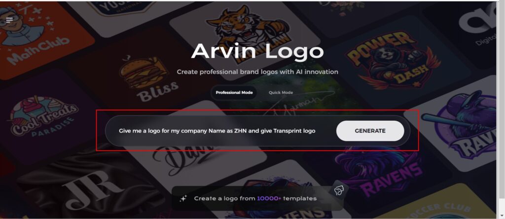
Step 3: Give Industry Name
Select an industry from the list provided. This process narrows down the logo styles and types for the AI to fine-tune based on your choice.

Step 4: Pick the Style
Browse through the style list presented and choose one that is relevant to your brand’s vision. If you still don’t like it, just skip this step and let the AI take its default inspiration.

Step 5: Logo Ideas
The AI will create various logo designs according to the inputs provided by you. Review the ideas that appeal to your brand image.
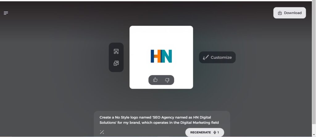
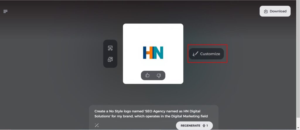
Step 6: Personalize Your Logo
Refine your chosen design by making some changes such as colors, font, icon, and layouts to resemble your style.
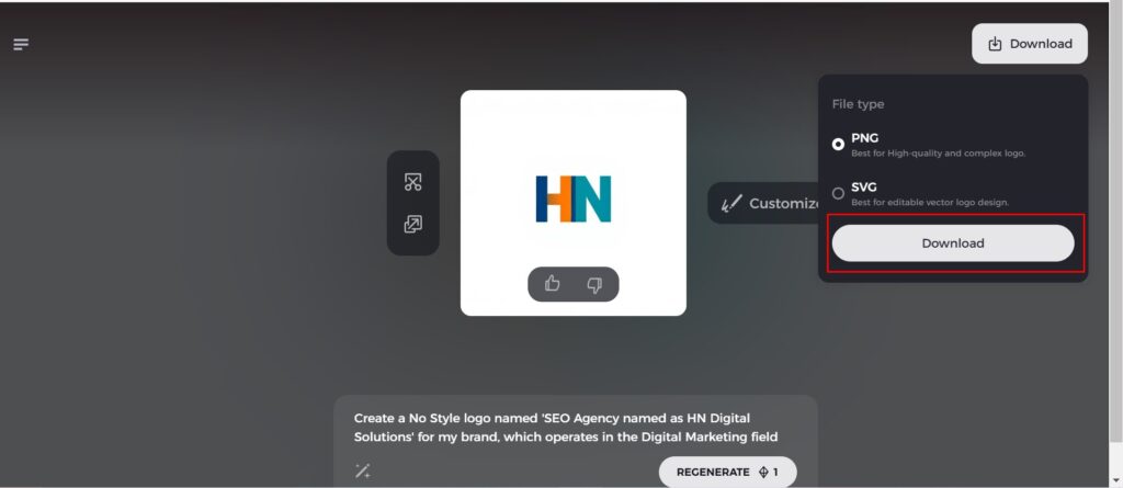
Step 7: Download Your Logo
Once you’re satisfied with the final design, download your logo in formats like PNG or SVG. These formats ensure compatibility for use on websites, social media, and print materials.
Conclusion
Minimalist fonts play an important role in design. Tools like Arvin AI can make it easier than ever to get a professional logo that reflects your brand identity. Whether you want a simple, clean logo or something more complex, Arvin AI AI-driven platform will help you get there in just a few steps. You can experience with minimalist fonts and use Arvin AI to create a logo that will make a lasting impression on your customers.
FAQs
What is the best minimalist font for a logo?
The best minimalist logos’ fonts include Helvetica, Futura, and Avenir. Select a font that is appropriate to your brand’s style and personality.
How can minimalist fonts improve website usability?
Minimalist fonts have made text easier to read and navigate on the site. Fonts with simplicity also load websites quicker, hence improving site performance.
Can minimalist fonts be used for print designs?
Yes, minimalist fonts serve well in print designs, brochures, business cards, and posters. They are quite clean and clear, meaning they are easy to read and comprehend in different print formats.
How do I know if a font is truly minimalist?
Minimal fonts usually show simplicity and elegance by describing simple lines and clean shapes with no excess decorations. Avoid any elaborate font with too much decoration.
