Mascot logos are an iconic part of childhood and remain deeply embedded in pop culture and marketing. Think about the last time you visited a mall and saw a life-sized mascot handing out balloons, posing for pictures, or giving away freebies. That moment likely left an impression—just as great mascot logos do.

Mascots aren’t just fun, animated figures for children; they are an essential component of branding and marketing. They help brands establish a strong personality, create emotional connections, and boost recognition.
Looking to stand out? With Arvin AI Logo Designer, you can easily create a memorable mascot logo that speaks to your audience and amplifies your brand’s identity.
What Is a Mascot in a Logo?
A mascot in a logo is the brand’s personality brought to life. Think about it. When you see Colonel Sanders, you don’t think of KFC, but also his white suit, warm Southern charm, and delicious piping hot fried chicken. Mascots can create a more tangible emotional connection that a simple logo alone can’t achieve.
Even in the tech world, mascots have a way of making things more relatable.
Take Android’s little green robot—it turns an operating system, something complex and digital, into something fun and accessible. That’s why so many brands use mascots to humanize their identity. Whether it’s the Michelin Man, the Pringles guy, or even Geico’s gecko, these mascots give brands a face, a personality, and a voice.
Who Uses Mascot Logos?
Mascot logos are widely used by businesses and organizations that want to create a strong emotional connection with their audience. They are particularly popular in industries where engagement, personality, and relatability are key.
Eagles NFL
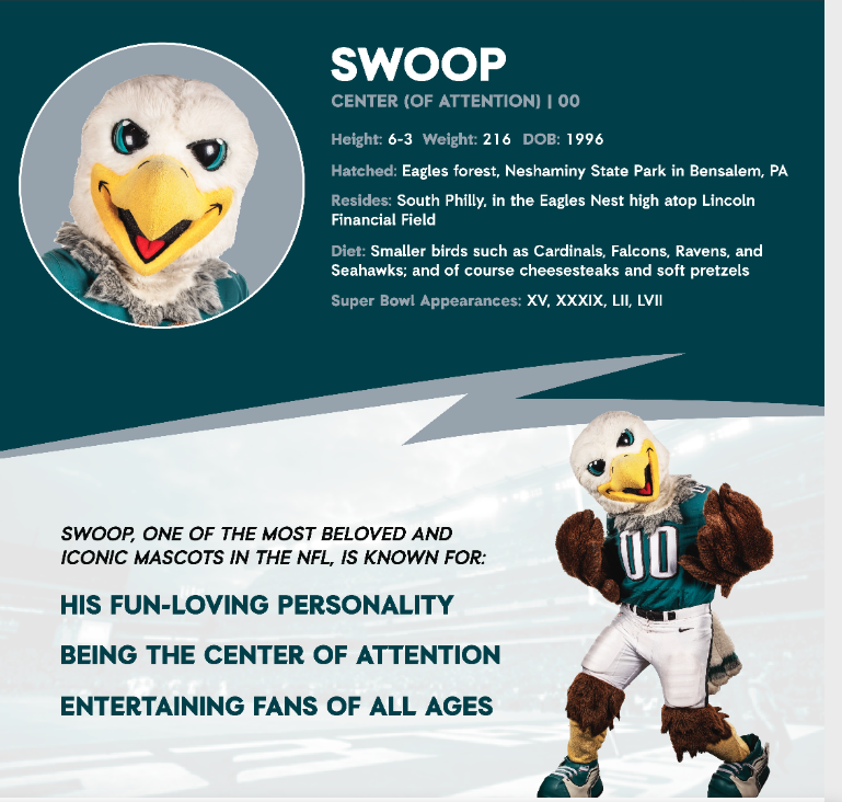
Swoop, the official mascot of the Philadelphia Eagles, is a larger-than-life bald eagle with an energetic and commanding presence. His design perfectly captures the fierce yet charismatic spirit of the team, blending power with fan-friendly appeal. With piercing blue eyes, a sharp yellow beak, and a wide, confident grin, Swoop exudes enthusiasm and determination. His head is covered in fluffy white feathers. This contrasting with the brown feathers that form his wings and body, mimics the natural coloration of a bald eagle.
Dressed in a custom Eagles jersey, typically featuring the number “00,” he proudly represents the team’s colors. In midnight green, black, silver, and white, give him an unmistakable identity.
Emblem Logo
An emblem logo is a type of logo. It is where the text, symbol, or imagery is contained within a single unified shape. It often resembles a badge, crest, or seal. These logos tend to have a classic, authoritative feel and are commonly used by organizations. They often want to convey tradition, strength, and professionalism.
Philadelphia Eagles Emblem Logo
The Philadelphia Eagles logo is a great example of an emblem-style design with modernized elements. Their current logo features a fierce, forward-facing eagle head. It is in white and silver, outlined in midnight green, the team’s signature color.
The eagle’s eye is sharp and intense, symbolizing focus and determination. Its beak is curved and aggressive, representing power and dominance. The sharp, angular lines of the feathers add a sleek, aerodynamic look. It reinforces the idea of speed and agility, qualities essential to both the sport and the team’s identity.
While the Eagles’ primary logo is not a traditional badge or crest, it retains emblem-like qualities through its contained design. The emblem concept is also seen in alternate logos and wordmarks. The eagle head is integrated into a bold typeface, creating a unified, shield-like composition.
Food Mascot Logos
The Pillsbury Doughboy
Poppin’ Fresh was created in 1965 by Rudy Perz, a copywriter for the Leo Burnett agency. Pillsbury wanted a mascot that could humanize baking products. Perz came up with the idea of a friendly ball of dough that comes to life when you poke him.
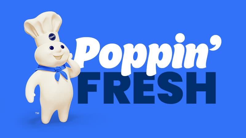
The Pillsbury Doughboy is a soft, white, dough-like character with a plump body and round belly. He wears a tiny white chef’s hat with the Pillsbury logo. He also has big, round blue eyes that evoke warmth and friendliness. His hands are often positioned as if he’s about to giggle or wave, reinforcing his playful and approachable personality. The typography on Pillsbury packaging is typically in a clean, serif font with a deep blue color.
“Hoo-hoo!”
The Pillsbury Doughboy’s signature giggle, which he makes when poked in the belly, became an iconic part of pop culture.
Originally appearing as a stop-motion clay figure, the Doughboy later transitioned to CGI animations while maintaining his soft, rounded features. He has starred in over 600 commercials. Appeared in movies (Shrek 2 briefly references him), and remains one of the most beloved mascots in American advertising history.
Kool-Aid Man
“Oh yeah!” : Kool-Aid Man’s signature phrase, often said while breaking through walls in commercials.
The Kool-Aid Man is literally a giant, anthropomorphic pitcher filled with bright red Kool-Aid, with arms, legs, and a face. His most recognizable features are his wide grin, bold black outlines, and expressive eyebrows.
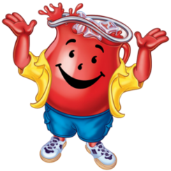
The Kool-Aid Man was introduced in 1954 as a simple glass pitcher illustration on packaging. In 1975, Alan Kupchick and Harold Karp of Grey Advertising Agency brought him to life as a fully animated, walking character.
The Kool-Aid Man became an instant hit and has remained one of the most recognizable mascots in advertising history. Over the years, he has appeared in cartoons, comics, video games, and even parodies in TV shows.
Mr. Peanut
Mr. Peanut was originally designed by a 14-year-old boy named Antonio Gentile in 1916, after winning a design contest by Planters. The character was later refined by commercial artists at the Amedeo Obici company.
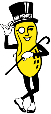
Unlike other mascots, Mr. Peanut retained his classic 1920s aesthetic for over a century. He only receiving minor design refinements to modernize his silhouette. In 2020, Planters “killed off” Mr. Peanut in a Super Bowl ad, replacing him with Baby Nut. Baby Nut was a younger, cuter version inspired by the Baby Yoda trend.
However, he later “grew up” and returned to his classic form. Mr. Peanut is one of the most sophisticated mascots in the food industry. His design features a peanut-shaped body with human-like limbs, wearing a black top hat, monocle, white gloves, and a cane. His slim and upright stance gives him an elegant, almost aristocratic feel, reinforcing the brand’s premium image. The typography used in Planters branding is often sleek and gold-accented, aligning with Mr. Peanut’s refined personality.
KFC Colonel Sanders
Colonel Harland Sanders is one of the most recognizable food mascots in history. But unlike most mascots, he wasn’t just a fictional character. He was a real person who became the face of his own brand.
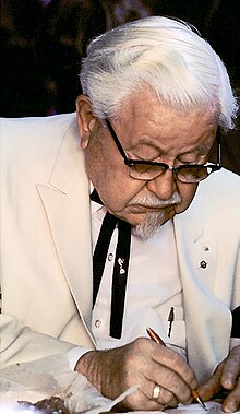
Colonel Harland Sanders’ influence on the brand extends far beyond just his logo. Born in 1890, he perfected his pressure-fried chicken recipe in the 1930s. He began franchising Kentucky Fried Chicken in the 1950s. His persona as a charming Southern entrepreneur became essential to KFC’s marketing, making his image inseparable from the company’s identity.
Over the years, his likeness evolved from a personal signature to a stylized emblem. This made the KFC Colonel Sanders logo one of the most iconic in fast food.
The logo has evolved through multiple redesigns, but a few signature elements have remained consistent. The Colonel’s round glasses, goatee, white hair, and friendly expression.
His white suit and black string tie reinforce his image as a distinguished Southern gentleman. Symbolizing both professionalism and the brand’s roots in home-style cooking. The red and white color scheme plays a significant role in brand recognition, with red conveying energy and appetite stimulation, while white represents freshness and cleanliness. Over time, the typography has shifted from an elegant serif font to a cleaner, bolder sans-serif style.
KFC Logo History
The first version of the KFC logo, introduced in 1952, was a simple script signature that read “Kentucky Fried Chicken.” However, by 1969, the first illustrated version of Colonel Sanders’ face appeared, alongside the now-famous red-and-white striped bucket design. Over the years, his facial features were refined, transitioning from a detailed portrait to a more stylized, cartoon-like representation. The 2006 redesign marked a shift toward a minimalist, modern approach, placing the Colonel’s face against a bold red background without the “KFC” wordmark. The most recent update in 2018 brought back elements of the classic red-and-white stripes, further solidifying the logo’s balance between nostalgia and contemporary branding.
His persona as a charming Southern entrepreneur became essential to KFC’s marketing, making his image inseparable from the company’s identity. Even after his passing in 1980, his character continued to evolve through various advertising campaigns, digital adaptations, and live-action portrayals by actors like Norm Macdonald, Reba McEntire, and Jim Gaffigan. KFC has even experimented with pop culture trends, featuring the Colonel in a dating simulator game (I Love You, Colonel Sanders!) and limited-edition streetwear collaborations.
Michelin Man
The Michelin Man, also known as Bibendum, is one of the oldest and most recognizable mascot logos in the world. First introduced in 1898, the Michelin Man has evolved from an elaborate, almost eerie hand-drawn figure to a friendly, modernized mascot.
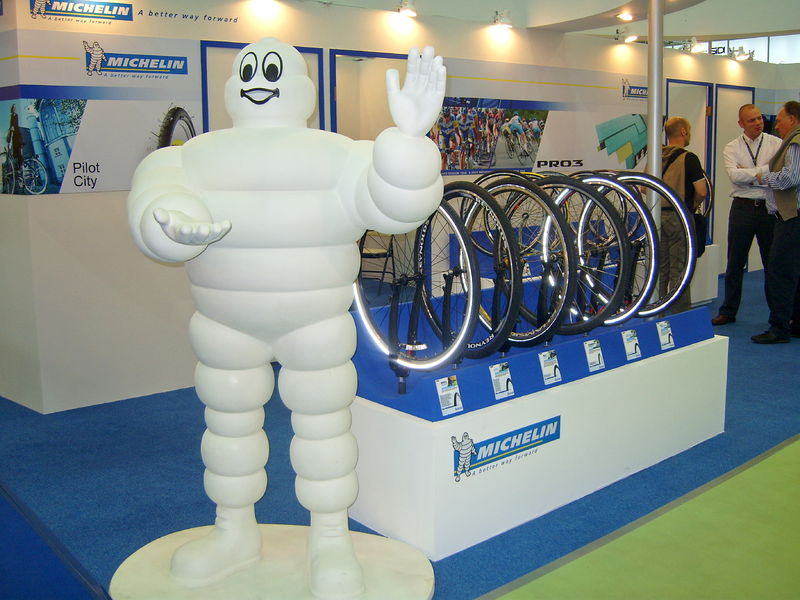
The Michelin Man’s logo design is unique because it is not just a character but a direct representation of the product itself—tires. His body consists of stacked, rounded white tire segments, creating a soft, flexible look rather than a rigid structure. His large, expressive eyes and broad smile give him a friendly and inviting personality, reinforcing trust and approachability. Over the years, his initially thin and skeletal frame has evolved into a rounder, more cartoonish figure, making him appear strong yet approachable. Unlike many corporate mascots, he lacks bright colors, relying instead on white and shades of gray to maintain his iconic look while standing out against the deep blue and yellow Michelin logo.
Michelin Man History
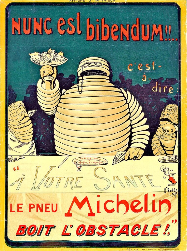
The Michelin Man was created in 1898 by French cartoonist Marius Rossillon (nicknamed O’Galop). The idea for Bibendum came when Édouard and André Michelin, the founders of Michelin, noticed a stack of tires at an exhibition and remarked that if the tires had arms, they could resemble a man. O’Galop took that concept and created an anthropomorphic tire figure, originally depicted as thin, cigar-smoking, and holding a glass of nails and broken glass, symbolizing Michelin’s durable tires that could handle rough terrain. His name, Bibendum, comes from the Latin phrase “Nunc est bibendum”, meaning “Now is the time to drink,” referencing how Michelin tires could “drink up” any road hazards.
The Michelin Man, also known as Bibendum, is one of the oldest and most recognizable mascot logos in the world. First introduced in 1898, the Michelin Man has evolved from an elaborate, almost eerie hand-drawn figure to a friendly, modernized mascot.
While it may seem surprising that a tire company would be associated with fine dining, Michelin’s influence in the food world dates back to the early 20th century, when the company began publishing the Michelin Guide, a restaurant review system that is now one of the most prestigious culinary awards in the world.
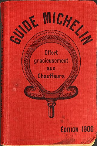
Michelin Guide
The connection between Michelin and food began in 1900, when the Michelin brothers, Édouard and André, launched the Michelin Guide as a way to encourage people to drive more frequently, use their tires, and explore France by car. At the time, automobiles were still relatively new, and road travel was limited. The guide initially contained maps, gas station locations, repair shops, and places to eat or stay overnight, helping motorists navigate long trips.
Over time, the Michelin Guide evolved to focus more on restaurants, and by 1926, it began awarding stars to exceptional establishments. By 1931, the now-famous three-star ranking system was introduced:
One Star: A very good restaurant in its category.
Two Stars: Excellent cooking, worth a detour.
Three Stars: Exceptional cuisine, worth a special journey.
Since then, the Michelin Star has become the ultimate symbol of culinary excellence, with chefs and restaurants worldwide striving to earn (or maintain) their Michelin ratings.
Make your brand as tasty as your food! Whether it’s a friendly doughboy or a bold tiger, a great mascot makes your brand unforgettable. Create a deliciously iconic mascot logo today with Arvin AI Logo Designer!
Technology Mascot Logos
Mailchimp
Mailchimp’s Freddie, the smiling chimp mascot, is a perfect example of a modern, personality-driven logo that blends creativity with professionalism. As the face of one of the most widely used email marketing platforms, Freddie embodies Mailchimp’s friendly, accessible, and slightly quirky brand identity.
Mailchimp was founded in 2001 by Ben Chestnut and Dan Kurzius, and Freddie has been part of the company’s branding since its early days. The chimp mascot was originally inspired by the company’s name, which combined “mail” (email marketing) with “chimp” (playfulness and ease of use).

Freddie’s name and visual identity were refined over the years, evolving from a detailed, semi-realistic chimp illustration to the sleek, modern design used today. His name, Freddie von Chimpenheimer IV, adds a layer of humor and quirkiness, perfectly aligning with Mailchimp’s casual yet professional brand voice.
Freddie’s design is both minimalist and expressive, using a flat, black-and-yellow color scheme that feels bold yet inviting. His signature wide grin, playful wink, and distinctive chimpanzee face immediately communicate a sense of approachability and fun, reinforcing Mailchimp’s mission of making email marketing easy and enjoyable.
The current version of the logo, introduced in 2018, features an ultra-simplified, single-line illustration of Freddie’s head, stripped of excessive detail while retaining his expressive personality. This change aligned with modern branding trends, focusing on clean lines, digital versatility, and instant recognizability. The typography accompanying Freddie is Mailchimp’s custom sans-serif wordmark.
Snoo was originally drawn in 2005 by Alexis Ohanian, one of Reddit’s co-founders, while brainstorming logo ideas for the platform. The name “Snoo” comes from a play on words. Ohanian initially envisioned a futuristic alien asking, “What’s new?” which eventually became “Snoo”.

The goal behind Snoo’s design was to create a character that felt neutral, welcoming, and non-corporate, reflecting Reddit’s diverse and user-driven community. Unlike mascots designed for aggressive branding, Snoo was meant to be a lighthearted, open-ended symbol that users could personalize and interact with.
Reddit’s mascot, Snoo, is a perfect example of a tech company logo that balances simplicity, personality, and cultural relevance. Unlike traditional corporate logos, which often rely on sleek typography or abstract symbols, Reddit uses a friendly alien character to embody its brand identity.
Snoo’s design is intentionally simple yet expressive, consisting of a white alien face with an orange circular head, two black dot eyes, and a curved smile. The antenna with a small dot on top adds to its futuristic yet whimsical look, reinforcing the idea that Snoo is a curious intergalactic being exploring human conversations online. The character is often depicted against a bright orange background, making it instantly recognizable even without text.
The wordmark “Reddit” is written in a rounded sans-serif font, complementing Snoo’s friendly, informal aesthetic.
Twitch
Twitch, the world’s leading live streaming platform for gamers and content creators, has a highly distinctive and modern logo, often referred to as “The Glitch.” Unlike traditional mascot-driven logos that rely on cartoon characters, Twitch’s logo is an abstract yet recognizable representation of the brand’s digital, fast-paced identity.
The Twitch logo, commonly known as The Glitch, features a bold, angular typeface with sharp edges and futuristic geometry, giving it a distinct digital, almost pixelated feel. The most iconic element of the Twitch brand is its purple color scheme, which has become synonymous with the streaming community. This deep Twitch Purple (HEX #9146FF) is used across all branding materials, reinforcing brand recognition and digital identity.
The Glitch icon, which serves as Twitch’s mascot-like emblem, is a speech bubble with two angular eyes, resembling an 8-bit gaming aesthetic. The design subtly references the chat functionality that is central to Twitch’s platform, emphasizing communication and real-time interaction between streamers and viewers. Its blocky, distorted edges create a glitch-like effect, aligning with the platform’s high-energy, real-time nature.
The Twitch wordmark features a thick, custom typeface with a distinctive slanted “T”, making it highly recognizable even in small sizes.
Mascot logos have the power to elevate your brand. Start designing your mascot logo now with Arvin I Logo Designer and build a lasting connection with your audience!
Final Words
Mascot logos continue to shape branding, storytelling, and marketing in ways that simple text logos cannot. If you’re looking to build a brand with character, impact, and emotional appeal, a mascot logo might just be the perfect solution.
For businesses looking to craft a mascot logo that embodies their brand personality, leveraging AI-powered tools can simplify the process. With platforms like Arvin AI Logo Designer, you can create a unique, eye-catching mascot logo that captures your brand’s essence without the need for extensive design experience.
FAQ
A mascot in a logo is a character or figure that represents a brand, business, or organization, giving it a distinct personality and making it more engaging. Unlike traditional logos that rely solely on typography or symbols, mascot logos feature a human, animal, or fictional character that personifies the brand’s identity.
Firstly, you define your brand personality. It can be either fun, professional, friendly or bold. Then, decide on your character type, be it an animal, human, mythical creature or an abstract figure.
Yes, KFC’s logo is considered a mascot logo because it features Colonel Harland Sanders, the brand’s founder, as its central character. Unlike fictional mascots, Colonel Sanders was a real person, but his stylized portrait has been used as KFC’s brand mascot for decades. His white suit, goatee, and black string tie give KFC an instantly recognizable and nostalgic brand identity.
The types are mascot logo, wordmark logo, lettermark logo, pictorial mark, abstract logo, combination mark, and emblem logo.
