A good logo will be able to convey a story with just an image. They’ll be able to leave a lasting impact on the people who see them, with every stroke, shape and color being intentional and designed to evoke emotions and communicate values. Some take it a bit further, with many famous logos with hidden meanings in plain sight.
If you’re looking to design your own logo, try using Arvin AI Logo Maker.
1. Amazon
The Amazon logo was designed in 2000 by Turner Duckworth, a branding agency. This redesign was part of Amazon’s transformation from a simple online bookstore to a global e-commerce giant.
The font used is a custom sans-serif typeface, which was designed to appear modern and friendly, aligning with the brand’s mission to be customer-centric. The arrow connecting the letters “A” and “Z” represents the vast range of products available, indicating that Amazon sells everything from A to Z. Additionally, the arrow doubles as a smile, symbolizing customer satisfaction.
Earlier versions of Amazon’s logo featured a river motif, reflecting the name’s origin (inspired by the Amazon River). The current logo marks a shift toward simplicity and focus on the e-commerce experience.
2. FedEx
The FedEx logo was created in 1994 by Lindon Leader, a renowned graphic designer from Landor Associates. It was part of a rebranding effort to unify the company’s branding across different services. The design has won over 40 awards and is widely regarded as one of the best examples of modern logo design.
The logo uses negative space to create an arrow between the letters “E” and “X.” This arrow symbolizes speed, precision, and efficiency, which are core values of the FedEx brand. The clever use of negative space makes the arrow subtle yet impactful, often leading to an “aha” moment when noticed. Lindon Leader intentionally made the arrow a secondary design element, ensuring it wasn’t too obvious, to create a lasting impression.
The logo often appears in purple and orange, with the purple representing professionalism and reliability, while the orange adds energy and vibrancy. Different divisions of FedEx use unique color pairings (e.g., green for FedEx Ground, red for FedEx Freight).
3. Baskin Robbins
The Baskin Robbins logo was redesigned in 2005 by the branding agency Wyman & Company. Baskin Robbins, founded in 1945 by Burt Baskin and Irv Robbins, has been synonymous with variety and fun. The most iconic feature of the logo is the cleverly embedded number “31” within the letters “B” and “R.” This design choice highlights the brand’s commitment to offering 31 flavors of ice cream—one for each day of the month.
The “31” concept ties directly into the company’s original slogan: “31 Flavors for Every Day of the Month.”
4. Toyota
The three ovals in Toyota’s logo combine to spell out the brand’s name. The overall design represents the company’s dedication to quality, reliability, and innovation. According to Toyota, the three overlapping ellipes ymbolise the unification o the heart of their customers and the heart of Toyota products. Another fun fact is that all the letters of Toyota are within the logo. The logo is designed to be instantly recognizable, even in markets where the name “Toyota” isn’t as well-known.
5. Toblerone
At first glance, it simply features a striking image of the Matterhorn mountain, paying homage to the Swiss Alps where the brand originates. However, upon closer inspection, the silhouette of a bear is cleverly hidden within the mountain. This design choice nods to the city of Bern, Switzerland, where Toblerone was created. Bern, often referred to as the “City of Bears,” prominently features a bear in its coat of arms, tying the logo deeply to its Swiss heritage.
David Airey, a renowned logo designer, once commented on the Toblerone logo’s effectiveness, stating:
“Good logos are those that reveal more the longer you look at them. Toblerone’s logo is one of the finest examples of this—showcasing clever design while building a deeper connection to its origin.”
Similarly, Tobias Spichtig, a Swiss branding consultant, shared in an interview:
“The use of negative space in Toblerone’s logo is a brilliant reminder of how design can subtly incorporate cultural identity without overwhelming the viewer.”
Tourists often associate the brand with a souvenir of Swiss culture.
6. NBC
The NBC logo, often referred to as “The Peacock,” is a brilliant representation of the network’s legacy, innovation, and forward-looking vision. Introduced in 1956 during the rise of color television, the logo was designed to symbolize NBC’s transition to full-color programming, a bold move at the time.
The peacock, with its feathers spread wide, symbolizes pride, diversity, and NBC’s leadership in color broadcasting. The six vibrant feathers, each a different color, represent the network’s various divisions—news, sports, entertainment, stations, network, and production. The design conveys the breadth of NBC’s programming while celebrating creativity and inclusivity.
The peacock’s head faces to the right, symbolizing forward motion and innovation.
The current logo, designed by Chermayeff & Geismar in 1986, modernized earlier versions of the peacock, streamlining the design while retaining its essence. Ivan Chermayeff, a partner at the firm, explained:
“Our goal was to create a timeless logo that honored NBC’s history while positioning it as a pioneer for the future.“
7. Google
Designed with a clean sans-serif font and a playful color palette, the logo conveys innovation, approachability, and creativity.
The color scheme: blue, red, yellow, and green, reflects a sense of fun and inclusivity. However, there’s an underlying logic behind it. The logo starts with a primary color (blue) and alternates between primary (red, yellow) and secondary (green) colors. The green “L” is a deliberate departure from the primary palette, signaling that Google thrives on breaking conventions.
Ruth Kedar, the designer of the logo, explained in an interview:
“We wanted the logo to be accessible and friendly, but not boring. The use of color breaks the mold of strict corporate palettes, reflecting Google’s innovative and unconventional approach to technology.”
8. Pinterest
Designed to double as a pushpin, this clever design choice reinforces the platform’s core functionality of saving and sharing ideas. The simplicity of this symbol allows it to be instantly recognizable, even when used independently as an icon.
In a world where logos are often overcomplicated, the Pinterest logo stands out for its thoughtful simplicity. It’s a perfect example of how minimal design, when done right, can speak volumes about a brand’s purpose and identity.
9. Adidas
Its signature three-stripe design, first introduced in 1949, has evolved into one of the most recognizable brand identities in the world.
The slanted stripes in the current Adidas logo, designed in 1997, are arranged to form a triangular shape resembling a mountain. This imagery symbolizes the challenges and obstacles individuals face and overcome, aligning perfectly with the brand’s ethos of empowering athletes to push their limits.
Peter Moore, the designer behind the updated logo, explained:
“The mountain represents the journey—be it on the field, the track, or in life. It’s about perseverance and the rewards of hard work.”
Adidas has leveraged its logo to establish cultural relevance, collaborating with artists, designers, and athletes to bridge the gap between sports, fashion, and lifestyle.
10. Hyundai
It depicts two figures: one represents a customer, and the other symbolizes a company representative. This handshake signifies trust, partnership, and mutual respect, embodying Hyundai’s core values of customer satisfaction and reliability.
Joon Seo Lee, a former Hyundai brand manager, once explained that they wanted the logo to be more than just an identifier. They wanted it to represent the relationship they build with their customers.
11. Coca-Cola
Designed way back in 1887 by Frank Mason Robinson, the Spencerian script feels nostalgic yet timeless.
The Coca-Cola logo is one of those designs that instantly catches your eye and sticks in your memory. For me, it’s not just the flowing script or the bold red color that makes it special. It’s the little details and stories behind it that make it iconic. Did you know the space between the “O” and “L” in “Cola” forms the Danish flag?
I find it fascinating that Coca-Cola didn’t initially plan for the flag to be part of the logo. Yet, when they realized it, they turned it into a brilliant marketing moment. During a campaign in Denmark, they handed out Danish flags at Copenhagen Airport, connecting their brand to one of the happiest countries in the world.
12. Sony Vaio
Yasuhiro Ootori, one of the designers involved with Sony’s branding, explained:
“We wanted the logo to communicate that Vaio is more than just a laptop; it’s a bridge between tradition and modernity, between analog warmth and digital precision.”
Even though Sony no longer directly produces Vaio laptops, the logo remains iconic. It’s a reminder of a time when Sony was at the forefront of blending innovative technology with sleek design. And for many of us who grew up in the era of Vaio laptops, the logo is a nostalgic symbol of top-tier tech.
13. Tostitos
Every time I see this logo, I think of how food brings people together.
I think what’s genius about this design is how it subtly encourages you to engage with the brand. You don’t just see the word “Tostitos”, you also see a mini-scene that makes you crave chips and salsa.
Take another look at the two “T’s” in the middle of “Tostitos,” and you’ll see something brilliant. The “T’s” represent two people holding a tortilla chip, and the dot of the “I” is actually a bowl of salsa.
The bold, rounded font and dynamic layout of the Tostitos logo make it feel approachable and fun. The bright colors, especially the red salsa and yellow chip, add a pop of vibrancy that matches the festive vibe of the brand.
14. LG
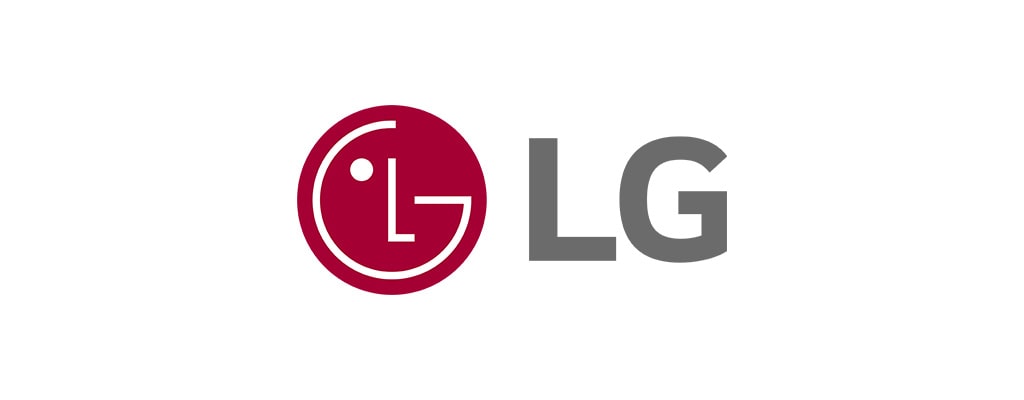
If you look closely, the “L” and “G” within the circular emblem form a smiling human face. The “L” acts as the nose, and the “G” outlines the rest of the face, even including a winking eye. It’s as if the logo is saying, “Life’s Good,” with a playful and welcoming vibe.
15. BMW
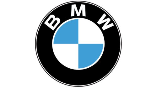
For years, people (myself included) believed that the blue and white segments represented a spinning airplane propeller set against a blue sky. It’s a romantic idea, and it ties in beautifully with BMW’s origins as a manufacturer of aircraft engines during World War I. However, the truth is a bit different.
BMW itself clarified in a 2020 article that the blue-and-white pattern actually comes from the flag of Bavaria, the region in Germany where BMW was founded.
16. Apple
The bite taken out of the apple is often interpreted as a symbol of knowledge, drawing a connection to the biblical story of Adam and Eve. This link to curiosity and discovery ties in beautifully with Apple’s mission to innovate and empower individuals.
Rob Janoff, the designer of the Apple logo, explained that the bite was added for practical reasons:“Without the bite, it looked like a cherry or a tomato. The bite gave it scale and clarity.”
But when he realized the word “bite” sounded like “byte,” the computer term, the design took on an unexpected layer of meaning. This clever double entendre makes the logo resonate even more with tech enthusiasts like me.
17. Spartan Golf Club
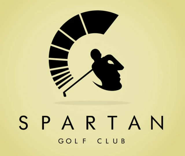
The plume of the helmet doubles as the golfer’s swing arc, capturing the elegance and power of both elements. This kind of dual symbolism is rare in logo design and requires an incredible level of precision and creativity.
The Spartan helmet, a universal symbol of strength and resilience, aligns perfectly with the values often associated with sportsmanship and determination in golf. On the other hand, the silhouette of the golfer represents grace and precision. Together, they create a harmonious balance, which, to me, encapsulates what Spartan Golf Club likely stands for.
18. The Guild of Food Writers
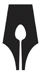
The spoon, a universal symbol for food, is nestled within the shape of the pen nib, representing the craft of writing. This combination perfectly encapsulates the guild’s purpose: celebrating and supporting those who write about food.
As someone who appreciates the intersection of creative fields, this logo resonates deeply. It speaks to the idea that food isn’t just sustenance, and that it’s a story waiting to be told, and The Guild of Food Writers embodies that philosophy through this thoughtful design.
19. Cisco
Cisco was founded in 1984 in San Francisco, and its name is a shortened version of the city’s name. The inclusion of the Golden Gate Bridge in the logo pays tribute to this origin, embedding the company’s identity within the culture and history of its home city.
The Cisco logo is a striking example of how design can simultaneously represent a company’s technological focus and its geographical heritage. The vertical lines in the logo serve a dual purpose: they symbolize both a digital signal, highlighting Cisco’s role in the networking and communications industry, and the iconic Golden Gate Bridge, paying homage to the company’s San Francisco roots.
20. Carrefour
The negative space in the logo forms the letter “C,” representing the brand’s name, while the red and blue arrows on either side point in opposite directions. These arrows symbolize a crossroads, perfectly aligning with the French meaning of “Carrefour,” which translates to “intersection” or “crossroads.”
21. Tour de France
The “O” in “Tour” and the yellow dot above the “i” come together to form a bicycle wheel, with the “R” in “Tour” cleverly doubling as the cyclist. The yellow dot is also a nod to the iconic yellow jersey, worn by the race leader. This small but significant detail ties the design back to one of the Tour de France’s most famous traditions.
22. Goodwill
At first glance, you see a smiling face that immediately radiates warmth and friendliness. But look closer, and you’ll notice that the smiling face is actually a stylized lowercase “g,” subtly referencing the name Goodwill.
This dual representation, combining a face with the brand’s initial, creates a sense of approachability and reinforces the organization’s mission of spreading kindness and fostering connections.
23. Hershey’s Kisses
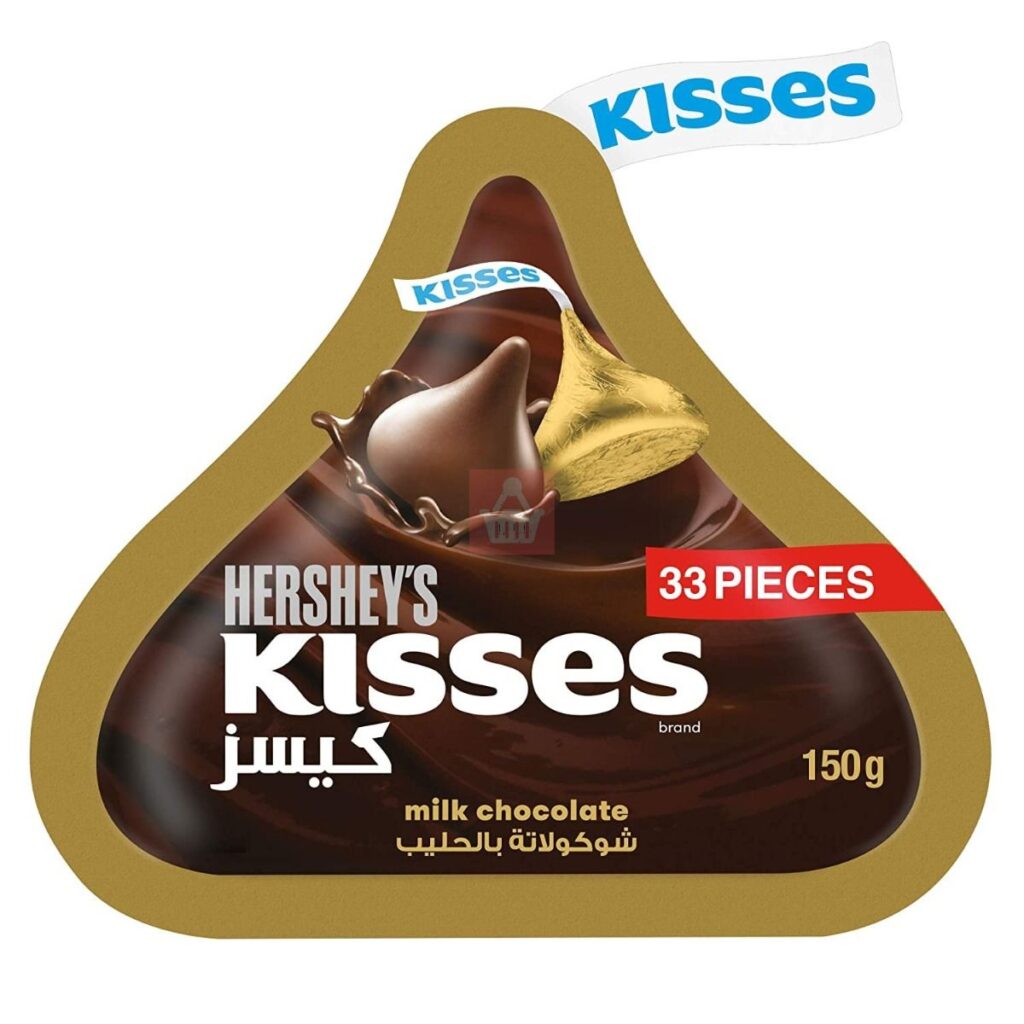
The negative space between the letters “K” and “I” forms the shape of a Hershey’s Kiss, the brand’s signature chocolate. This small yet impactful detail adds a layer of depth and creativity to the design, connecting the product with the logo in a subtle, almost playful way. It’s the kind of design Easter egg that makes you smile once you spot it.
24. Roxy
The Roxy logo is an ingenious design derived from the Quiksilver logo, perfectly adapted to reflect the brand’s unique identity and target audience. As a subsidiary of Quiksilver, Roxy caters primarily to women, particularly those drawn to surfing, snowboarding, and outdoor adventure.
The Roxy logo is essentially two mirrored Quiksilver logos arranged to form a heart shape. This clever reimagining not only ties it visually to the parent brand but also conveys a sense of femininity and emotional connection.
25. Starbucks
The Starbucks logo is a globally recognized symbol, but have you ever wondered about its deeper story?
Starbucks’ iconic siren reflects Seattle’s rich seafaring culture. The founders of Starbucks, drawing from the city’s connection to the ocean, chose a mythical sea creature to symbolize their brand. The siren, a two-tailed mermaid from Greek mythology, represents allure, seduction, and mystery
26. Domino’s
At first glance, the Domino’s logo looks like a simple domino tile, but those three dots carry significant meaning. When the company was founded in 1960 by Tom Monaghan and his brother James in Ypsilanti, Michigan, they started with just three stores. The original plan? To add a new dot for every new location. But as you can imagine, that idea quickly became impractical as Domino’s expanded at a breakneck speed. Today, with over 20,000 locations worldwide, the logo remains frozen in time with its original three dots.
27. Audi
The four rings in the Audi logo represent the Auto Union, a merger of four German automobile manufacturers—Audi, DKW, Horch, and Wanderer—that came together in 1932. Each company had its own strengths:
- Audi focused on innovation and performance.
- DKW specialized in small cars and motorcycles.
- Horch was known for luxury and high-end craftsmanship.
- Wanderer built reliable mid-sized vehicles.
Together, they formed what would later become Audi AG, one of the most prestigious car brands in the world.
Final Words
Creating a logo that tells a story is no easy feat. It requires a balance between creativity, symbolism, and clarity, a combination that successful brands like FedEx, Amazon, and Apple have mastered. If you’re an entrepreneur or designer looking to craft a standout brand identity, you need the right tools to bring your vision to life.
This is where the Arvin AI Logo Maker comes in. Using advanced AI-driven design, Arvin AI helps you create logos that are not just visually appealing but also strategically designed to communicate your brand’s essence. Whether you need a sleek corporate emblem, a minimalist startup logo, or something fun and engaging, Arvin AI generates options tailored to your industry and preferences in seconds.
Why spend hours brainstorming when AI can accelerate your creative process? Let Arvin AI guide you toward a logo that’s not just seen but remembered.
FAQ
Amazon logo features an arrow stretching from “A” to “Z,” symbolizing the company’s vast product selection while also doubling as a smile to represent customer satisfaction. The FedEx logo cleverly hides an arrow in the negative space between the “E” and “X,” symbolizing speed, precision, and efficiency. Meanwhile, Toblerone incorporates a bear hidden within its mountain emblem, a tribute to Bern, Switzerland, known as the “City of Bears.” The Baskin Robbins logo takes an innovative approach by using the pink sections of the “BR” to reveal the number “31,” reflecting the brand’s promise of offering 31 different ice cream flavors.
One of the most effective techniques is incorporating symbolism that reflects the brand’s values, history, or core message.
Designed by Carolyn Davidson in 1971 for just $35, the swoosh is inspired by the wing of the Greek goddess Nike, who symbolizes victory.
It is the bear hidden within the negative space of the mountain, a nod to Bern, Switzerland, the birthplace of Toblerone.
