If it’s time for a refresh, logo evolution can take your brand to the next level.
Whether you want to make subtle changes or are planning a massive overhaul of your branding, changing your logo is a crucial step to consider.
But how do you go about it, and what tools can you use to evolve your logo?
Join us as we explain logo evolution and learn from ten of the most famous and successful examples in history.

What is logo evolution?
Logo evolution is the process of changing a company’s logo. This typically involves an updated version of a current logo, but it may also be a radical change from a company’s previous branding.
Many of the world’s biggest companies have performed logo evolution at least once. McDonald’s, one of the most recognizable brands on earth, has had over ten logos since its inception.
When done professionally and for the right reasons, logo evolution can help your brand stand out, but you need to be careful. Changing your logo too often or for the wrong reasons can harm your positioning. It can also stifle growth.
Why does logo evolution occur?
The main reason for logo evolution is to help a company stay relevant in the shifting landscape within a particular niche. What does that mean?
Well, if a company has been operational for 10+ years, its goals and values may be slightly different today than they were at the time of its launch.
Therefore, it might be necessary to change the logo to reflect this evolution.
Equally, subtle changes to a brand’s look can make a big impact on how it is perceived. Google is a brilliant example of this.
Its 1997 logo was similar to its logo today, but it was less polished, reflecting the early graphic features of Internet search engines.
Over the years, Google has refined its logo into what we know today. If you check out Google’s logo evolution below, would the brand carry the same authority if it kept its first logo? We don’t think so! This is a fine example of why subtle evolution is crucial for brands.
What to consider before carrying out logo evolution

Before we look at some of the best-known examples of logo evolution in history, what must you consider before changing your company’s brand? Here are some things to think about:
Why do you want to make the change?
Start with this question. This will help you decide what steps to take. Perhaps you think your logo is outdated. In this case, subtly changing the font or color scheme can make a big difference without harming your brand.
Is changing your logo enough?
Evolving your logo can work, but your brand might also need a do-over. This can include your company’s tagline, color scheme, and general branding guidelines. If you’re changing your logo, consider adapting your brand at the same time.
Will your customers still recognize your brand?
Radical logo evolution sometimes works, but it can also be detrimental to some brands. Therefore, if you’re planning big changes, make sure you don’t alienate your customer base. We recommend small changes for successful logo evolution to begin with.
10 iconic logo evolution stories from history
If you’re on the fence about whether to go for logo evolution, we’re here to tell you that you’re not alone. Many of the world’s biggest brands have changed and evolved their logos over the years. Let’s look at ten of the most iconic examples and what we’ve learned from each:
1: McDonald’s
| 1940 – 1948 | 1961 – 1968 | 2018 – present |
McDonald’s has changed its logo over ten times throughout its history. Undoubtedly, the biggest change came in 1961 with the introduction of the iconic golden arches.
Today, it’s impossible to overlook the golden arches when you drive down the highway or enter a new city for the first time and it’s arguably the most instantly recongizable logo in the world.
That’s why McDonald’s has stuck with the golden arches since 1961. True, numerous iterations have come and gone since then, but all McDonald’s logos since then have featured the arches. Talk about iconic!
2: Adidas
| 1924 – 1949 | 1971 – 1997 | Today |
German sportswear giant Adidas took its name from its founder, Adi Dassler. From 1924 to 1949, the company logo featured the German entrepreneur’s name alongside footwear, the brand’s primary offering.
In the 1950s, company executives realized the potential of rebranding, opting for the legendary three-stripe design for which Adidas is now famous.
Yes, numerous evolutions of the three stripes have come and gone. However, Adidas’ three stripes are now as recognizable as Nike’s tick. Adidas is a great example of simplifying via logo evolution, and it shows founders how to drop their name from a logo without disrupting production or harming growth.
3: Amazon
| 1995 | 1998 | Today |
Though it’s a comparatively new brand compared to others on this list, Amazon has already gone through six logos since its founding in the 1990s.
The original logo seemed to point to the Amazon River, a potential point of confusion in the brand’s infancy. Also, in 1998, Amazon adopted the strapline “Earth’s Biggest Bookstore,” which didn’t last long given the company’s other e-commerce exploits.
The orange arrow underneath the black-branded and low-case “amazon” is what we all know today. The logo points to the company’s fast delivery and is instantly recognizable.
4: Coca-Cola
| 1886 | 1891 | 1941 – today |
You don’t need us to introduce you to the Coca-Cola brand. While everyone today knows it for its red color scheme, it took the team behind Coca-Cola five years to introduce it. The first logo, in 1886, was black caps. In 1891, the letters were italicised, written in red, and framed by a box.
While there have been numerous iterations of the original red logo, Coca-Cola has stuck to its roots and changed very little over the years. In 2003, the marketing team decided to revert back to Coca-Cola’s 1941 logo, which remains in place today. Therefore, it’s one of the oldest logos in existence and a great example of classic design.
Also, it’s a fine example of how nostalgia can power a brand. Many people agreed with Coca-Cola’s decision to revert to a tried and tested design. And it’s still the biggest soda brand in the world today.
5: Budweiser
| 1876 | 1987-1999 | Today |
America’s favourite beer, Budweiser, is another company that has enjoyed great success with brand evolution. Dubbed “The King of Beers”, Bud has simplified things since the turn of the century.
From 2000 onwards, the logo was simplified into what it is today, bar a couple of minor touches. Still, many people look back to the Bud logo from the 1980s and 1990s as the best. It was also during this period that Bud enjoyed incredible TV advertising success, with several iconic ads that have gone down in history.
Bud’s example highlights how simplifying a logo can work, albeit when powered by a successful and holistic approach to marketing.
6: Apple
| 1976 | 1977 | Today |
Apple’s original 1976 logo is like something out of a Mark Twain novel. Good enough Steve Jobs and his marketing executives decided to simplify things.
The 1977 multi-colored Apple with a piece missing was plastered on all Apple products until the late 1990s. Then, the company designed to simplify things further with a black Apple, which still stands today.
The power of Apple’s marketing lies in its simplicity. The team behind the brand took an overly complex initial design and simplified it over the years, creating an iconic, minimal brand in the process.
7: Starbucks Coffee
| 1971 | 1987 | 2011 – today |
The Starbucks Siren featured on the Seattle-based company’s logo from the outset, but it looked very different to the one we all know and love today.
Interestingly, in the 1970s, Starbucks pushed a tagline of “Coffee, Tea, and Spices.” This was dropped in 1987 when marketers gambled on Starbucks Coffee leading the way. As of 2011, the Starbucks team realized that the Siren herself was all the firm’s customers needed.
Similarly to the Budweiser example, Starbucks has shown how logo simplification can have impressive results. It also fits with the trend of logo evolution, where brands have reduced or eliminated unnecessary text from their logos.
8: Google
| 1997 | 1998 | Today |
Of all the brands on our list, Google’s logo evolution has been uncomplicated. The main difference is the change in font, which, today, looks much more refined.
The color scheme has stayed practically the same since 1997, but Google has trialled different fonts over the years. As mentioned in the introduction, the refinement of Google’s logo has helped enormously with growth and brand recognition.
9: Total
| 1955 – 1963 | 2003 – 2021 | 2021 – today |
Total is a very interesting example of brand and logo evolution, as we see three very different logos. In fact, the first Total logo is unrecognizable compared to the current iteration, which is a seriously bold move for a company to make.
Also, given the climate crisis, Total has undergone another bold change in recent years, opting for TotalEnergies, rather than Total. This signifies the company’s work away from oil and may help the brand stay relevant as countries seek carbon neutrality.
10: Puma
| 1948 – 1951 | 1978 | Today |
Like Adidas and Nike, Puma is a sportswear brand that has undergone significant logo evolution over the years. The 1948 Puma logo is striking and it stayed in place until 1978.
The seventies and eighties were the golden ages for Puma, as the brand dominated European sports and was the brand of choice of many athletes, Pele included.
In a dramatic twist, Puma added its logo to a red background in the 2000s. This was a big decision that changed over 50 years of black-and-white branding. The lesson here is that it’s never too late to pivot.
Ready to design or evolve your logo? Check out our logo evolution tool
Logo evolution has the potential to breathe new life into your company, and as daunting as it may seem, it isn’t difficult.
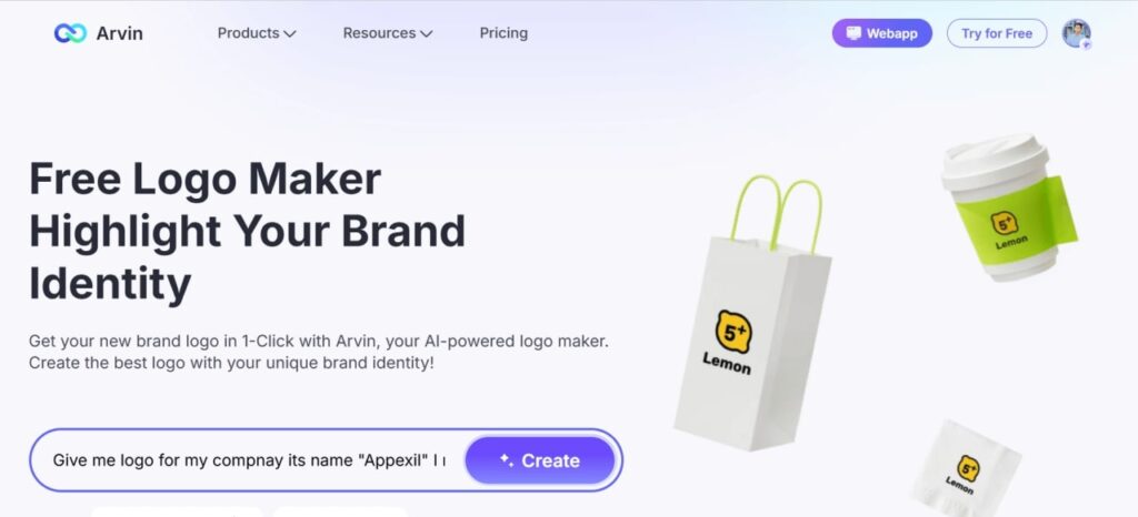
You can use Arvin AI’s Logo Designer Tool to get started. When you input your brand’s details and identity into the tool, it will create numerous logos for you to test.

Whether you’re looking to completely redesign your logo or personalize ready-made templates, Arvin AI Logo Maker is here to make it effortless.
Logo evolution FAQ
This is a personal call, but as a business owner or operator, you might know that it’s time for a refresh. You may feel like you’ve outgrown your old logo, or redesigning your current brand is required to stay up with the competition. Either way, logo evolution is a simple step to breathe new life into your brand.
Companies change their logos for numerous reasons. The main reason is to ensure the logo doesn’t look dated and so the company can keep up with evolving attitudes and consumer preferences. No matter the motivation, logo evolution can be a smart move in competitive industries.
Absolutely. Logo evolution can help to strengthen a brand and help it standout in a competitive landscape. Just look at all the biggest companies in the world. They have all evolved their logos to ensure relevancy and competitiveness in their respective niches.
Numerous logo evolution methods exist. The easiest way to do this is to use Arvin AI’s logo generator for some quick ideas. You can then decide on which of our AI creations suit the needs, interests, and goals of your brand in its current iteration.
Yes, you can! Logo evolution via AI is a brilliant way to save you time, effort, and money. Let Arvin AI generate numerous logo ideas with the click of a button, before getting your marketing team together to decide which design is best suited to your branding guidelines.


