A logo serves as a vital part of the identity of any business. It helps in giving an identification and reminding one about a business. A color is one of the extremely important features of any logo and can bring about emotions and deliver messages while changing how the world identifies a brand. Logo designing will never be the same again thanks to Arvin AI smart logo designing tools. Logo designing is something that has been made easy by Arvin AI and its AI features. In this we will discuss the psychology of different logo colors and give some helpful advice.
Part 1: Why Logo Colors Matter?
Logo colors play a big role in how people feel about a brand. Colors can remind emotions and hint a deeper sense in people. A red often represents energy, passion, or excitement; blue colors logo reminds feelings of calmness, honesty, and safety. Famous brands use colors to send clear messages. For instance, Coca-Cola is red as a representation of excitement and joy, and Facebook’s use of blue brings about comfort and trust. These logo colors are not random but picked based on the brand values and message. Using the correct colors can help differentiate your brand. A unique color palette in a crowded marketplace is what people need to immediately recognize your logo.
Part 2: The Psychology of Logo Colors
Colors are more than just a view. They can impact people’s emotions and change their thoughts about a particular brand. Every color brings out a meaning and an effect that changes the world around people. The selection of such color is important for projecting your brand’s message in values.
- Red: Red immediately catches the eyeballs. It signifies brave emotions like love, energy, or determination. Therefore, most food and sale brands implement red to stimulate people to act.
- Blue: Blue is the color of safety and trust. It’s commonly used by banks, tech companies, and healthcare brands to convey trust and calmness.
- Yellow: Yellow is bright and happy. It induces happiness and creativity. Most kids’ brands and fun businesses use yellow to bring joy.
- Green: Green represents life and balance. It is very much in use with health, environment, or growth-related brands.
- Black & White: Black and white are evergreen and simple. They provide a clean, classy, and modern look. Luxury and simple brands mostly use these colors.
Part 3: Choosing the Right Colors for Your Logo
Choosing the right colors for your logo is a need. It’s not only about looking good; the logo colors must connect with your audience and reflect your brand. Here are key factors to keep in mind.
Target Audience
Think about who you want to reach. Different logo colors appeal to different groups. Bright colors like yellow or pink may attract younger people. Darker colors like black or navy often work better for older or professional audiences.
Industry Standards
Look at what’s common in your industry. Some industries use specific colors to match their values. For example, green is common in eco-friendly brands. Tech companies often use blue for trust and revolution.
Cultural Implications of Colors
Colors can have different meanings in different cultures. Red might mean love in one culture but danger in another. If your brand is global, research how colors are seen in different regions.
Balancing Uniqueness with Relatability
Your logo should be different, yet familiar. The use of bold or unusual colors can make your brand stand out. At the same time, however, do not diverge too far from what is expected in your industry. A good balance helps your logo stay memorable and relatable.
Part 4: Popular Color Combinations for Logos
The right color combination makes your logo look more attractive and professional. Here are some popular trends and tips to create great color pairings.
Trending Color Combinations
Many brands now use bold and vibrant colors. Light shades are also very popular for a soft and modern look. Neutral tones mixed with bright colors can create a balanced and stylish design.
Complementary and Analogous Color Schemes
- Complementary Colors: These are colors that lie opposite to each other on the color wheel, like blue and orange or red and green. They give a very strong and eye-catching contrast.
- Analogous Colors: These are colors lying next to each other on the color wheel, like blue, green, and teal. They give a smooth and melodious look.
Tips for Using Gradients and Multi-Color Logos
Gradients combine two or more logo colors quite smoothly, adding depth with a modern touch. Numerous brands use gradients for something fresh and lively. A multi-colored logo such as that of Google may make a brand look playful and trendy. However, do not spoil colors. A balance is what should be tried for to prevent your logos from looking messy. Colors that will work to give your logo an aftertaste of leaving impressions.
Part 5: Mistakes to Avoid When Choosing Logo Colors
Picking colors for a logo is important, but mistakes can upset your design. Here are common problems to avoid when choosing your logo colors.
Overloading with Too Many Colors
Too many logo colors can make your logo look busy and unprofessional. It may confuse your audience and make your brand hard to remember. Stick to 2–3 main colors that match your brand’s message. Simplicity is key to a clear and strong design.
Ignoring Convenience and Contrast
Color and observations are not the same among all people. Ensure your colors have sufficient contrast so that they can be readable. Light yellow text on a white background is not advisable, for instance. Test the colorblind convenience of your logo. A clear logo is more visible to audiences everywhere.
Failure to Test Logo on Different Formats
Your logo will appear on websites, social media, and in printed materials. If you don’t test it, the logo colors might look different or lose their impact. Check how your logo looks in black and white, on small screens, and in large prints. A flexible logo works better everywhere.
Avoiding these mistakes will make your logo look professional and leave a lasting impression.
Part 6: How Arvin AI Simplifies Logo with Color Selection
Arvin AI makes logo design easy, especially when picking colors. It uses smart tools to suggest the best color schemes based on your brand’s style and audience. The platform supports different design styles, helping you create a logo that fits your brand’s personality. Arvin AI also lets you preview your logo in different formats, like websites or print, to ensure it looks great everywhere. With Arvin AI, choosing the perfect colors is simple and stress-free.
Features of Arvin AI
Here are a few features of Arvin AI for logo design:
- AI-Driven Color Suggestions: Arvin AI helps you choose the best colors for your logo based on your brand and audience.
- Supports Different Design Styles: It works with different styles, like modern, playful, or classic, to match your brand’s personality.
- Preview across Formats: You can see how your logo looks on websites, social media, and print before finalizing it.
- Customizable Designs: It is easy to adjust the logo as per your needs, ranging from changing colors to modifying the layout.
- Quick Design Process: Arvin AI accelerates the design process so that you can create your logo in less time.
- High-Quality Outputs: The designs are of high quality, making sure your logo looks professional everywhere.
- User-Friendly Interface: It is easy to use, even if you don’t have design experience.
- Smart Suggestions for Fonts: It suggests fonts that fit your logo style, making your design even better.
Steps to Use Arvin AI for Logo Design with Color Selection
Step 1: Create an account and log in to Arvin AI
Visit the Arvin AI website, create an account, and log in to access the logo design features.
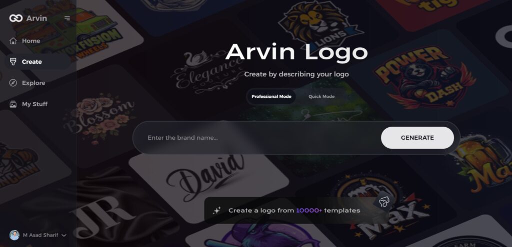
Step 2: Enter your brand details and color preferences
Give your brand name, slogan, and industry. State any color preferences or themes that reflect your brand’s personality.
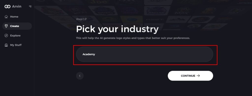
Step 3: Choose your industry
Select your industry to help Arvin AI come up with your logo style and color as per your niche and your target audience.
Step 4: Choose a Logo Style
Select the right logo style that can work best for your brand, and then the AI is guided accordingly to provide your color palettes and design.
Step 5: Customize your logo using tools from Arvin AI
After Arvin AI generates your logo, customize it by adjusting colors, fonts, layouts, and symbol placements. Experiment with different options until you’re satisfied.
Step 6: Save and download your logo
Preview your final logo, then save it in a high-resolution format for both print and digital use.
Conclusion
The colors you choose for your logo determine the viewpoint of your brand. Thus, the right color scheme can make your brand noticeable and memorable for the people. Arvin AI is a great tool in making logos with the right combinations of colors. It will help you make it as easy and effective as possible for you to create a logo that is just like your brand’s heart. If you’re looking to design a powerful logo, try Arvin AI today to take your branding to the next level.
FAQs
Why is choosing the right logo color important?
Convey your brand to your consumers by painting it and it will affect how your customers observe it. They remain critical to achieving successful brand identification on the market.
How do I choose the best color for my brand?
Think about the values of your brand, who your audience is, and what colors are common in your industry. Tools like Arvin AI can make this easier.
Can I use multiple colors in my logo?
You can use multiple colors, but the colors should go well with each other and must be readable in all formats.
What are the current trends in logo colors?
Bold gradients, simple neutral designs, and eco-friendly greens are hot right now in logo design.
