Logos are more than just visual representations; they are the bedrock of a brand’s identity. They go a long way in branding and marketing. A well-designed logo conveys the essence and values at the drop of a hat, giving recognition and trust from the target audience. Black-and-white logos, in particular, have a timeless appeal. Their simplicity and elegance transcend the fleeting nature of design trends, making them a versatile choice for businesses. Whether it is for modern startups or established corporations, black and white logo embody sophistication and clarity, ensuring they remain impactful across generations.
Part 1: The Allure of Black and White Logos
Simplicity and Elegance
Minimalist black-and-white designs are mostly very simple, leaving out all the mess associated with complex logotypes. These designs bestow upon viewers a feeling of elegance and clarity, which creates an even deeper connection with the audience. Cases in point, Chanel and Nike, Shroom logo, prove that such designs can be timeless but at the same time fresh and recognizable.
Versatility
Another important feature of the black-and-white logos is flexibility. They can appear well on digital screens, in print media, or on products; therefore, it does not matter how it is to be used – be it on a website banner, business card, or a T-shirt. They maintain the same impact when used as cross-platform branding.
Psychological Impact
In black and white, the branding ideas stimulate certain psychological reactions. Black is representative of power, sophistication, and authority, while white represents purity, simplicity, and clarity. To put together, they create a balance that proclaims professionalism and confident brand identity.
Part 2: How to Design a Perfect Black and White Logo
Understand the Brand’s Identity
In order to come up with a great, compelling black-and-white logo, it’s necessary to first define a brand’s mission and target audience. The design should reflect the brand’s core values and resonate with its intended demographic. For example, a tech startup may choose a modern and sleek design, while a café may prefer a vintage or hand-drawn aesthetic. Choosing the right style is equally important. A modern style speaks of innovation and forward-thinking, a vintage design speaks of nostalgia, and abstract elements can speak of creativity and uniqueness.
Use of Typography and Symbols
Typography and symbols are central to any logo design. In black-and-white logos, these elements gain even more importance, as they must carry the entire visual weight of the design. Selecting fonts that complement the brand’s personality—whether bold, elegant, or playful—is crucial. Similarly, symbols should enhance the logo without overpowering it. A tech company might use geometric shapes to convey precision, while a luxury brand could rely on ornate symbols to exude sophistication.
Focus on Contrast and Composition
Contrast is the lifeblood of a great black-and-white logo. Contrast is the difference between the elements that makes them stand out and readable. A well-composed logo uses contrast in the interaction between black and white for a visually effective impact. Some great examples of compositions are when contrast calls attention to the text or shapes in the logo so that it remains readable even when reduced to a smaller size.
Part 3: The Evolution of Black and White Logos
Historical Perspective
Black-and-white logos started in the early days of branding, when print technology was limited only to monochromatic formats. Classic logos such as Coca-Cola and Chanel are examples of black-and-white that were designed in the late 19th and early 20th centuries and were simple and clear. These early designs had a reflection of the cultural times they were in, characterized by elegance, functionality, and a direct message.
How Black-and-White Design Trends Have Evolved Over the Decades
This transformation in the history of black and white logos represents cultural shifts with the improvement in technology as well. During the 1950s and the 1960s, modernity dominated all factors, causing black-and-white logos to become streamlined more than any other kind of designs. More about 1980-the media-centric: Boldness, and contrasting with high resolution. In the digital world, black-and-white logos have adapted to versatile, screen-friendly formats, often using gradients or subtle texturing to add depth without violating minimalist principles. Modern Adaptations
Minimalism has dominated branding, and simple monochromatic logos have followed the trend. Brands such as Nike, Apple, and Adidas use simplicity in their design, which portrays clarity and confidence. Minimalism means a logo is easily scalable and versatile on any given platform, while still being very noticeable at first glance.
Why Major Brands Still Prefer Black-and-White Logos in the Digital Age
In an era dominated by digital screens and diverse media channels, black-and-white logos stand out for their adaptability. Monochromatic logos are less prone to distortion and retain their aesthetic appeal across various devices, from mobile phones to large billboards. Additionally, they resonate with modern audiences who value clean, sophisticated visuals over overly complex designs.
Part 4: Benefits of Black and White Logos for Branding
Universal Appeal
Black-and-white logos transcend cultural and industry-specific boundaries, making them universally effective. Their simplicity and neutrality allow them to communicate core brand values without being tied to specific color meanings, which can vary across cultures. This adaptability makes them suitable for industries ranging from luxury fashion to technology and healthcare.
Cost-Effectiveness
A black-and-white logo reduces printing and production costs because it is easy to be reproduced in any medium. Black-and-white logos are not elaborate to reproduce like colorful ones, which require special ink and color-matching process. This is very resourceful for small businesses and startup companies that want to conserve their branding budget.
Timelessness
Color palettes tend to change frequently, but black and white stays the same, which would make such logos timeless. A monochromatic logo would make sure that brands are still recognizable and relevant in decades to come. Like those of The New York Times and Chanel, certain logos remain mostly unchanged over time, proving just how appealing black and white truly is.
Enhanced Recognition
Black-and-white logos are easy to remember because they are simple. Complex logos with many colors can be overpowering for viewers, but monochromatic logos create strong visual imprints. A strong visual imprint leads to brand loyalty and a memory that lasts, especially in markets that are competitive.
Part 5: Transform Your Vision into Timeless Designs with Arvin AI
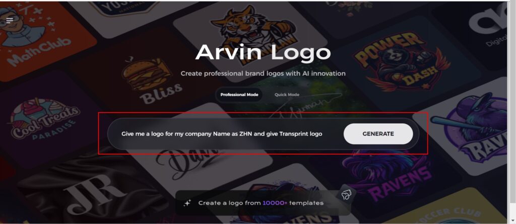
Creating a black-and-white logo that represents your brand has never been easier with Arvin AI.
This design tool revolutionizes the creative process, making it easy to create timeless logos. Whether you are a business owner, a designer, or just starting out, Arvin AI’s intuitive features make professional-grade designs accessible to everyone. Let’s dive into why Arvin AI stands out and how you can use it to transform your vision into a stunning logo.
Why Arvin AI Is a Game-Changer
Arvin AI is an innovative tool that allows users to create professional logos with ease. It has changed the face of logo design because of the following:
- AI-Driven Design Assistance: It creates personalized logo suggestions based on inputs from your brand.
- Extensive Customization Options: The ability to customize colors, fonts, and layouts according to your vision.
- High-Quality Output: This ensures that the designs can be scaled up and used for printing purposes and even in various formats.
- User-Friendly Interface: This makes the process of designing easier and even non-designers can easily access it.
- Time and Cost Efficiency: Avoids expensive designers or lengthy lead times.
Steps for Creating a Black-and-White Logo Using Arvin AI
Step 1: Create an account and log in on Arvin AI
Visit the website of Arvin AI, open an account, and log in for the logo design feature.

Step 2: Input your brand information and preferences
Input your brand name, slogan, and industry. Specify all your design preferences, which may include font styles or images themes.

Step 3: Pick your industry:
Now select your industry related to your niche. This will help the AI generate logo styles and types that better suit your preferences.

Step 4: Select Style:
Now select a style which you would like and continue. This will serve as inspiration to create your preferred logo.

Step 5: Design Personalize through the tools of Arvin AI
After Arvin AI gives create your black and white logo, you can customize those logos with the tools that have elements such as font style, layout, and the positioning of symbols. Experiment on different designs until you like what you see.

Step 6: Save and download the final logo
Preview the finished logo and save it in a high-resolution format for both print and digital uses.

Part 6: Common Mistakes to Avoid in Black and White Logo Design
Overcomplicating the Design
One of the greatest pitfalls of black and white logo design is making it too complex. A logo must be easily recognizable and memorable in its most simple form. Too many details, too many lines, or elaborate patterns may make the logo less effective. Rather, work on clean lines, simple shapes, and a balanced composition for clarity and scalability.
Ignoring the Importance of Negative Space
Negative space can be very potent in the making of a logo, and it is also most important to black and white logos. Otherwise, a very cluttered or even overly filled logo may be made. Applying negative space judiciously enhances the design aesthetic while creating the impression of the logo being different on visual dimensions. It is also possible that there can be clever aspects in design with negative space, such as secret symbols and messages.
Failing to Test the Logo Across Various Platforms
A common mistake is not testing the logo across different mediums and platforms. Black and white logos need to maintain their clarity and impact on digital screens, print materials, and even on small items like business cards or app icons. Ensure the design is versatile and looks consistent, regardless of the background or size, to achieve maximum effectiveness.
Conclusion
Black and white logos are unmatched for elegance, versatility, and timeless appeal. Avoid common design mistakes like overcomplicating the design, not paying enough attention to negative space, and not testing adaptability across platforms. With Arvin AI, designing a professional black and white logo has never been easier. Its user-friendly tools empower you to create a standout logo effortlessly.
FAQs About Black and White Logos
1. Why Do Black and White Logos Have Such Popularity?
Black and white logos are liked because they are simple and versatile. They represent a classic and classy look that is easily acceptable to most people. Black, in psychological terms, means power and elegance, and white represents purity and simplicity, so there is a perfect balance of a visual message.
2. Can I Turn a Colored Logo into Black and White?
Yes, you can easily convert a colored logo to black and white using basic tools or advanced software. Arvin AI offers a seamless feature to transform colored logos into monochrome designs while preserving their essence and visual appeal.
3. Do Black and White Logos Work for All Industries?
Black and white logos are extremely versatile and can be suitable for most industries but really shine for luxury, fashion, tech, and legal brands where refinement, sophistication, and clarity are crucial.
4. How Might Arvin AI Streamline Black and White Logo Design?
Arvin AI has an intuitive design interface and rich customization options that make logo designing a breeze. Users can go through premade templates, customize typography and shapes, fine-tune the minute details to suit their brand identity-and all these with no exposure to advanced design tutorials.
Read More


