Lego has left a permanent mark on popular culture, captivating the imaginations of children and adults alike with its colorful, interlocking bricks. The brand’s identity, strongly tied to its logo, plays a significant role in its global recognition and enduring appeal. This text will try to sketch the historical development of the Lego logo from its early beginnings up to the current forms. It reflect the evolution of the brand across the decades. Knowing such a development will then teach how Lego has been relevant and in so many aspects, charming to generations that followed after one another.
Part 1: The Early Years (1932-1946)
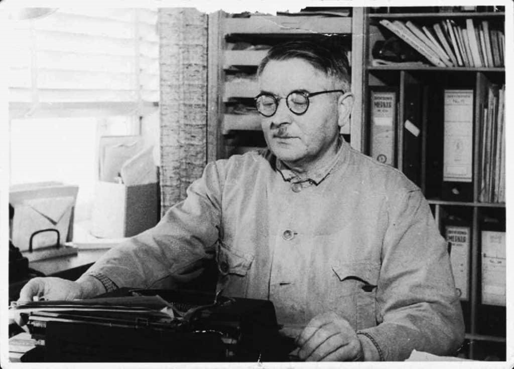
Lego started with the formation of a company by Ole Kirk Christiansen in 1932. He was a skilled carpenter from the city of Billund in Denmark. The company of Christiansen was initially producing wooden toys and household items, but it soon became known for quality craftsmanship. His commitment to excellence was the foundation on which Lego would build its future success. During the Great Depression, though economically straining, the strength of Christiansen’s perseverance. The innovation paved the way for the company’s survival, and subsequently one of the world’s most cherished toy brands was created.
The First Logo Designs: Simple and Functional
The first Lego logos were quite simple and were very functional. The company used to stress a lot on functionality and simplicity. The first logos contained the name of the company written in plain fonts, which contained no ornate design features at all. Thus, the brand was still young. The simple designs did the job and brought the Lego name in a very simple yet professional way.
Influence of the Company’s Early Vision on the Logo
Early logos of Lego reflected the very essence of the company, which aimed at producing durable and safe toys for children. The initial vision of the company was quietly delivered through the logo designs that were simple and clear, setting a foundation for the brand’s identity in the years to come. The minimalist approach reflected the emphasis on quality and safety that became the heart of Lego’s brand philosophy.
Part 2: The Golden Age of Lego (1946-1958)
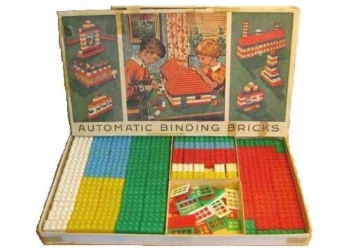
The post-war period marked a turning point for Lego-the plastic toys emerged in 1947, and the first interlocking bricks in 1949. It completely reformed the whole toy industry, and keeping with the inventions, the company did not lose its leadership. Transitioning to plastic enabled Lego to produce more durable and versatile items, which comprised the core of the Lego product range.
Logo Redesigns to Reflect the Shift from Wood to Plastic
As Lego shifted from wood to plastic, the logos of the company were restyled to depict this significant transition. The newly designed logos carried more contemporary and energetic features rather than the primitive feel of the early logos. This was an introduction to even more advanced and colorful logos to represent the qualities of the product being forward thinking. The new logos represented a look that was more progressive than the direction of the company towards its products.
The Establishment of the Classic Red-and-White Logo
By the mid-1950s, Lego had secured its brand identity in the market, thanks to its red-and-white logo. In fact, its bold, rounded letters and iconic color scheme characterize the brand as truly committed to imagination and quality. The red-and-white logo does not only emphasize brand recognition but also epitomizes the imaginative and playful qualities of the lego bricks-a precursor to expansion into other international markets.
Part 3: Global Expansion and Logo Refinement (1958-1973)
At that time, in the late 1950s, when Lego’s products began to receive recognition beyond Denmark, the company needed something more distinctive and striking for the brand communication. That was how the famous yellow Lego font came to be in 1958 to become the brand’s identity. The bold, clean typography logos always came in red or yellow, making it catchy as well as readable.
Logos Reflecting Lego’s Growing International Market
As Lego entered the international market, the company changed its logo to suit the global market. The original logo, which was mainly based on simplicity, was changed to include more dynamic elements, with a focus on a global appeal. By the 1960s, Lego’s branding strategy included elements that resonated across different cultures, such as the use of colors that were universally associated with playfulness and creativity.
The Impact of Global Expansion on Branding Strategy
In the 1960s and 1970s, Lego expanded greatly into the global level. With international subsidiaries, which were the very first, came a drastic modification of its logo and brand language to suit each market. Instead of selling simple toys, it wanted to achieve a universally familiar symbolic nature for imagination and creativity in the industry of toys.
Part 4: The Modern Era (1973-Present)
The 1970s saw a new era by Lego with a modernized approach to brand building. As Lego grew within the toy industry, the company needed a logo that would express this expansion into new products and markets. The logo started to get streamlined: many of its elements were made less complicated so as to have it appear cleaner and more contemporary.
Introduction of the Current Logo Design in the 1990s
In the early 1990s, Lego introduced us to the logo that we are all familiar with. The new logo still featured yellow and red, but with a design even more streamlined. The font was made modern by creating sharper, smoother edges, and the overall composition was streamlined for a sleeker, more professional image. This is part of a strategic repositioning that enforces Lego not only as a toy company but also a key player in entertainment and education businesses. The advent of the new logo marked a maturing of the company and increased its prominence in the markets.
How the Logo Has Become a Symbol of Creativity and Play
Over the decades, the Lego logo has changed from a simple branding mark to become a global symbol of creativity, play, and innovation. It now stands for more than a toy but rather a lifestyle around imagination and learning. The design is simple yet bold with bright colors and clean lines that create a sense of joy and endless possibility. Consistency in the logo has helped cement Lego’s brand identity, so it can keep up with changing tides in an ever-changing global market and a variety of media, from films to video games to theme parks.
Part 5: Lego Logo in Popular Media
The Lego logo moved out of the toy store and to the screens on popular media. Whether it’s part of the franchise Lego Movie, or through playing Lego Star Wars video games, the logo pops up all around the globe; this means further cementing association with imagination and adventure. Furthermore, the brand has also graced the stores on merchandise of clothing, backpacks, to even home decors.
How Lego’s Branding Strategies Have Kept the Logo Relevant
The branding strategy by Lego has ensured that the logo remains relevant even after decades. Moreover, partnerships with large franchises like Harry Potter, Marvel, and Star Wars have kept the logo fresh and appealing to a new generation of consumers. This along with the flexibility it has towards shifting trends has ensured that the company logo survives and thrives in the entertainment as well as the retailing world presently congested with competitions.
Part 6: Digital Transformation and the Lego Logo
As brands go forward in this digital age, they have to shift according to the demands of new platforms and audiences. Probably one of the most recognized logos globally is the Lego logo; so much so, it also had to change for relevance in the digital landscape.
The Adaptation of the Lego Logo for Digital Platforms
The Lego logo has been transformed over the years, mainly in regard to its online foray. With the advent of mobile and social media, the logo fit the different screen sizes and platforms. The digital transformation included creating versions of the logo. That are easy to read on small devices and in social media posts, where space is often limited. Besides, the logo has been animated digitally, making it look even more attractive on websites, apps, and ads.
Challenges and Opportunities in Maintaining Brand Consistency Online
The digital space is a massive opportunity to reach customers, but it also creates challenges in terms of brand consistency. For example, Lego wanted to ensure that its logo was the same on all digital ads, social media, e-commerce, and their mobile app. The challenge is keeping the logo consistent yet adaptable in various formats and creative contexts. However, it also opens a window to being creative with the brand, offering dynamic presentations that could catch the user’s attention.
Part 7: Arvin AI: Revolutionizing Logo Design
Logo design has been revolutionized in recent times with the development of AI-powered tools. Such as Arvin AI that have changed the way logos are designed. The traditional designs in logos required a lot of expertise, sophisticated design software, and time. But with the increase in custom branding demand, businesses and individuals pursue efficient and accessible solutions. Arvin AI utilizes a streamlined approach that will help users design logos with ease and precision.
Key Features of Arvin AI for Logo Creation
- Advanced AI-Powered Design Tools: Arvin AI employs machine learning algorithms to design original and professional logos tailored for your brand personality and industry.
- Customizable Templates: From a wide range of templates that you can customize, Arvin AI lets you design a logo that will fit the vision and style of your business.
- Real-Time Editing: Arvin AI offers the capacity to do live edit of fonts, colors, layout, and the rest in making sure full customizations of logos from beginning till the end.
- User-Friendly Interface: It construct with a very friendly interface in a way it would be suitable for amateur as well as experience designers.
- Fast and Efficient Logo Generation: Arvin AI, being an AI-enabled company, has made the logo design process faster and more efficient, where one can design a logo in minutes rather than hours.
Steps to Use Arvin AI for making Logo
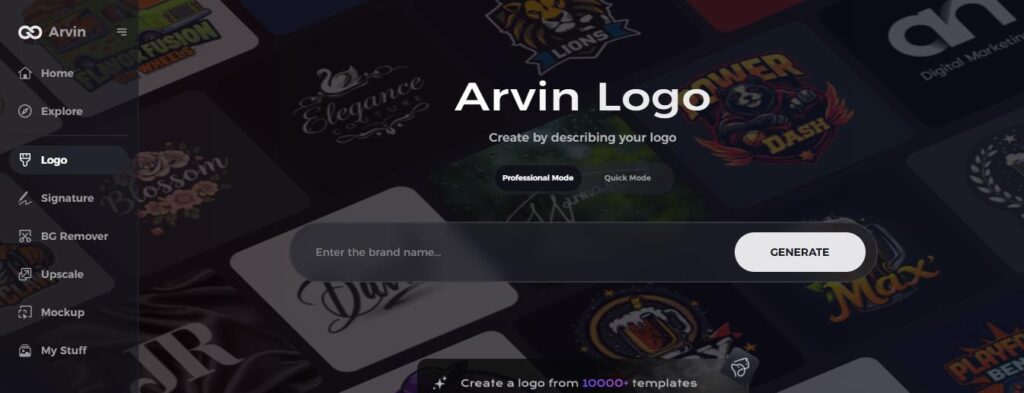
Step 1: Visit the Arvin AI Website
Open your web browser and access the design page of the Arvin AI site to start creating your logos.
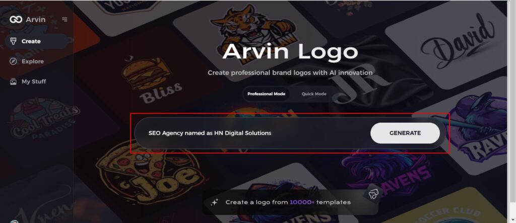
Step 2: Fill out Your Business Information
Fill in necessary business details like your business name and category. This information allows the AI to create designs specific to your brand.
Step 3: Give Industry Name
Select an industry from the list provided. This process narrows down the logo styles and types for the AI to fine-tune based on your choice.
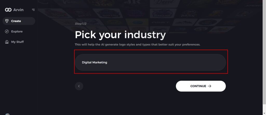
Step 4: Pick the Style
Browse through the style list presented and choose one that is relevant to your brand’s vision. If you still don’t like it, just skip this step and let the AI take its default inspiration.
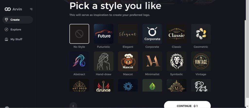
Step 5: Logo Ideas
The AI will create various logo designs according to the inputs provided by you. Review the ideas that appeal to your brand image.
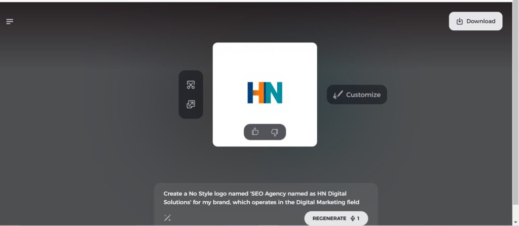
Step 6: Personalize Your Logo
Refine your chosen design by making some changes such as colors, font, icon, and layouts to resemble your style.
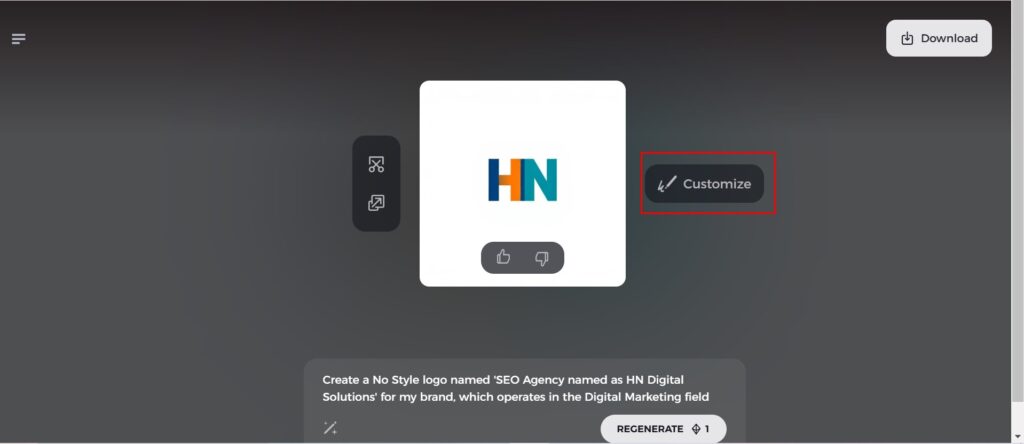
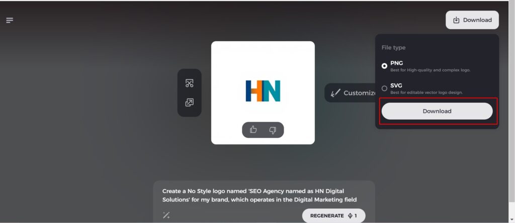
Step 7: Download Your Logo
Once you’re satisfied with the final design, download your logo in formats like PNG or SVG. These formats ensure compatibility for use on websites, social media, and print materials.
Conclusion
The evolution of the Lego logo over the years is a testament to the genius of the brand. Which always innovates and grows in an ever-changing world. The moment companies grow and adapt to the new trends, they need to update their logos. In order to have a powerful and recognizable brand. With Arvin AI, even the most inexperienced business owner or seasoned designer can create professional logos. It speaks so much about the story of their brand. And the audience it serves. The future of logo design with AI is bright and endless for creative expression and branding success.
FAQs
When was the first Lego logo created?
The first Lego logo formed in 1934. The brand name in red color is hand-drawn inside it, in simple font. It has varied from the initial years of becoming a modern logo that people recognize today.
How would you describe if the logo of Lego has changed much over the years?
The Lego logo has undergone change with time. Initially, it was a more formal font, but it slowly evolved into a modern, blocky design. That embodies the playful and creative spirit of the Lego brand.
What does the LEGO logo represent?
The word “Lego” derived from the Danish Phrase “leg godt”, which means play well. So the Lego logo represents the joy of play.
Can Arvin AI help design logos similar to Lego’s?
Yes, Arvin AI offers customizable templates and design tools that help you create logos similar to Lego. By altering the fonts, colors, and shapes, you can create a playful, dynamic logo.
