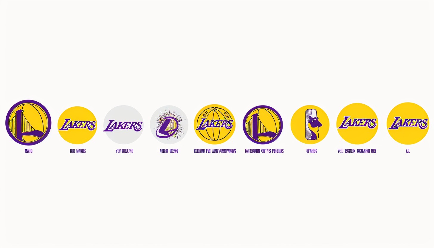
The Los Angeles Lakers are among the most legendary teams in NBA history. Lakers logo is not only a logo, but a logo that signifies the identity of the team, its history, and its identification with the masses. A good logo evokes identification and loyalty from their supporters. Lakers’ logo is an icon of a basketball signifying a championship heritage, superb players, and superb achievements. Its evolution represents how the team started in Los Angeles but matured over the years without losing the strong identity.
Part 1: The Birth of the Lakers and Their First Logo (1947-1960)
The Los Angeles Lakers started out as the Minneapolis Lakers in 1947. They were so called because Minnesota is full of lakes and they overnight became a professional basketball giant. Their early iconic logos reflected their strong connection to Minneapolis, with a map of the state superimposed on a basketball. This logo went far in establishing the identity of the team, emphasizing its heritage and passion for the game.
Early Days of the Minneapolis Lakers
The Lakers began life as the Minneapolis Lakers in 1947. The team was based in Minnesota, the “Land of 10,000 Lakes.” That is how they acquired the name. They were soon one of the strongest teams in early pro hoops, winning a series of championships in the Basketball Association of America (BAA) before the league merged into the NBA. Their early success had made them a dynasty, and their logo hence became an important symbol of their growing heritage.
The Significance of the Initial Logo
The initial logo was more than a simple visual symbol but also a symbol of pride among the Minneapolis fan base. The use of the state outline communicated the local heritage of the team, while adding the basketball denoted its game-oriented mindset. Despite its minimalist aesthetic, the logo was a solid starting point from which the Lakers created an identity that would eventually be transported to Los Angeles.
Part 2: The Move to Los Angeles and a New Identity (1960-1976)
The relocation of the Lakers to Los Angeles in 1960 marked a turning point in history for the team. Not only were they in a new home—there needed to be a new image. They needed a new logo that could symbolize their new beginning in California. Because their old logo associated with Minnesota, they had to make a change.
Moving to a New City
The Lakers relocated to Los Angeles in 1960, a major event on the team’s history. The relocation was a new beginning but at the expense of their original logo, which was rooted in Minneapolis. They needed to establish a new image that would assist in identifying their new home town and growing ambitions. This was crucial to making the Lakers an NBA dynasty and to making them one of the most beloved franchises in the history of basketball.
The Wordmark Logo Introduction
After the relocation of the team to Los Angeles, they adopted a wordmark logo with “Los Angeles Lakers” in bold, italicized letters across the surface of a basketball. Emphasis laid on the name of the team rather than a geographical icon, affirming its identity. The italicized letters provided a vision of movement and strength, which was consistent with the Lakers’ physical brand of play. This logo was a far cry from the last one and became a powerful visual symbol of the team’s changing brand.
The Influence of the New Logo
The new logo instantly became a symbol of the Lakers’ expanding domination of Los Angeles. It drew followers and had an even closer tie with the city. Its streamlined, aerodynamic shape made it instantly recognizable, adding to the team’s increased visibility in the NBA. It set the template for later refinement, which was good but incrementally better over the decades. This new logo symbolizes the brand’s identity and make it uniquely perfect.
Part 3: The Iconic Purple and Gold Era (1976-2001)
The logo of the Lakers made a big leap in 1976 when the team unveiled its then-iconic purple and gold color palette. The shift marked a new era of confidence, prosperity, and domination. Purple represented royalty and nobility, and gold represented excellence and attainment. The brand of the team, further established as they proceeded on to one of the most prosperous times in franchise history.
Transition to the Lakers’ Signature Colors
The Lakers changed the logo colors to purple and gold in 1976, something that would be their identity for decades to come. Purple color used to symbolize royalty, power, and ambition, while gold symbolized excellence, achievement, and success. The two colors united to create a recognizable and unique brand that didn’t have a place in the NBA anywhere. The fans loved the new colors almost right away, and they soon associated with Lakers basketball.
The Lakers’ Dominance in the 1980s
The 1980s were the Lakers’ golden years, when they emerged as one of the all-time great franchises in NBA history. With Magic Johnson, Kareem Abdul-Jabbar, and James Worthy leading the way, the Lakers dominated the league with their high-scoring “Showtime” basketball. Their on-court success made their logo even more iconic because it displayed on championship banners, jerseys, and apparel worldwide.
Minor Refinements and Logo Development
Although the Lakers’ logo did not undergo any major overhauls during this period, small refinements helped keep its design up to date. The color deepened for more vivid tones, the font cleaned up slightly for better readability, and the lines made thinner for sleek looks. These subtle modifications kept the logo contemporary and fresh without losing its historical background.
Part 4: Modern Refinements and the Current Lakers Logo (2001-Present)
The Lakers made their logo finer and more contemporary in 2001 subtly but convincingly. The changes were not extreme but refined the logo fonts and made it clearer. The color was richer, bringing out more purple and gold, making them stand out more. Depth introduced to the basketball, giving it a more dynamic look. These extra elements kept the logo up to date without undermining the Lakers’ rich history and legacy.
The 2001 Logo Update
The Lakers subtly but successfully revamped their logo in 2001 to enhance its design. The hues of the colors darkened and intensified to better outline the purple and gold. The basketball shape added depth to provide a more dynamic and realistic appearance. These were implemented to modernize the logo while maintaining its retro feel. The Lakers’ new logo made their brand strong, recognizable, and fitting for the modern, changing sports world of design.
Minor Changes to Enhance the Logo
Although the changes were slight, they greatly contributed to the overall look. Lettering edges were smoothed and defined to enhance readability and legibility. The basketball was more three-dimensional in appearance, creating a fresh look. All these updates made the logo pop on jerseys, apparel, and advertisement materials. Employing minute but significant updates, the Lakers had a sophisticated, clean, and timeless visual identity.
The Legacy of the Present Logo
The Lakers logo is still a symbol of greatness, tradition, and excellence today. Despite being more than two decades old, it has never failed to deliver in terms of withstanding the test of time. The logo remains popular with fans, gracing everything from jerseys to sneakers and memorabilia. Its longevity is reflective of the Lakers’ continued supremacy of basketball and its dedication to keeping a healthy brand image.
Part 5: The Lakers Logo in Pop Culture and Merchandise
The Lakers logo is not just a symbol of a basketball; it’s a cultural phenomenon. The trademark has been applied to fashion items along with music and movies as well as international products throughout its history. Lakers apparel is worn by fans around the globe, and the logo is known well outside the NBA. It symbolizes achievement, legacy, and the glamour of Los Angeles. From streetwear partnerships to celebrity endorsements, the Lakers logo is now identified with style, luxury, and athletic success.
The Lakers Logo in Fashion and Streetwear
The Lakers logo is more than a sports logo; it is today a force to be equaled in fashion and streetwear. Lakers have formed alliances with various A-list fashion brands to produce exclusive products which include sneakers together with hoodies and jackets. Merging the Lakers’ championship colors and worldwide brand makes their products highly coveted. From fashion to streetwear, the logo is unbeatable.
Celebrity Endorsements and Global Impact
Celebrities from music, film, and even influencers sport Lakers gear. After many popular entertainment celebrities wore it the logo gained status as a distinctive cultural symbol with trendy appeal. Everywhere across the globe actors and sports celebrities along with hip-hop artists brand themselves with the Lakers name thus expanding its worldwide recognition. When celebrities showcase the Lakers emblem on red carpet occasions or perch in games, its fame increases, as do demand for the image, turning it into an emblem of pop culture.
The Business of Lakers Merchandise
The Lakers make millions of dollars annually selling merchandise. Hats and jerseys, sneakers and accessories all bear their logo boldly as part of their branding and marketing strategy. The Lakers’ global sports team fans wear the sporting logo of the Lakers proudly, marking the sporting logo of the Lakers as one of the world’s most recognizable. Limited and special releases are immediate sellers, which indicates the popularity of Lakers-branded products.
Part 6: The Future of the Lakers Logo
With new design and digital media, there may be more updates to remain in line with contemporary branding styles. Although the retro aspects will certainly stick around, slight updates may render it more platform-friendly. As the team itself grows, its logo can symbolize new generations of success without compromising its position as an iconic symbol of basketball heritage. The fans worldwide anticipate what the future will bring to this legendary symbol.
Future Logo Renewals
The Lakers logo has changed over the decades, yet with the course of fashion as it changes, it might get its renewals again. Revisions in the future could involve making the logo thinner and trendier while not forgetting the legacy of the team. Enhancing the digital friendliness of the logo is one that some perceive as an absolute necessity. The squad might test out slight adjustments in the style of the current look and feel while maintaining their retro pieces. Any modification, however, must win the approval of the die-hard fans.
Evolution towards Digital Branding
While digital media remain in the spotlight, the Lakers may streamline their logo to put the focus on it in digital settings. A more condensed version would be better suited to social media, mobile applications, and online merchandise. More and more, brands are moving toward minimalist, responsive logos, and the Lakers could do the same. Either through a shift in subtle shading or a more condensed font, a digitally optimized logo could make the Lakers logo even more powerful in the digital sphere.
Keeping the Lakers Identity
Though changes can be made, the Lakers will remain about who they are. The human mind relates to greatness, heritage, and excellence because of the logo. Changes, thus, should be an embracing of heritage that is open to change. Overhaul will not be undertaken, but improvement could make the logo appear better. The dedication of the Lakers to their brand ensures changes would be made deliberately to commemorate.
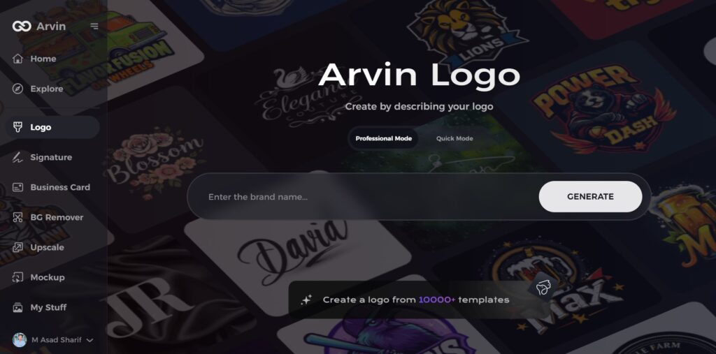
Part 7: Arvin AI: Your Ultimate Logo Design Companion
Arvin AI is a high-performance tool that makes businesses and designers capable of designing logos that cut through the noise. It gives sharp insights into design trends, allowing brands to distill their logos for ultimate effectiveness. Whether you are beginning from ground zero or fine-tuning a current design, Arvin AI has the perfect tools for the task. Similarly, the Lakers logo changed but remained iconic, Arvin AI makes sure that your logo remains relevant and remembered in the long run as well. Arvin AI is utilized by numerous brands for their branding requirements.
Key Features of Arvin AI
- Logo Analysis: Offers comprehensive analysis of design trends and performance in branding.
- AI-Based Design Recommendations: Optimizes and refines logos for maximum recognition.
- Easy-to-Use Interface: User-friendly and intuitive features for general logo creation.
- Customization Options: Enables businesses to customize designs based on their brand identity.
- High-Quality Output: Produces professional-quality designs apt for use in multiple scenarios.
Steps to Use Arvin AI for Logo Creation
Step 1: Visit the Arvin AI Website
Open your web browser and go to the Arvin AI logo maker page to begin designing your logo.
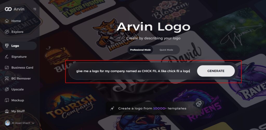
Step 2: Enter Your Business Details
Provide essential information like your business name and category. This helps the AI generate logos tailored to your brand.
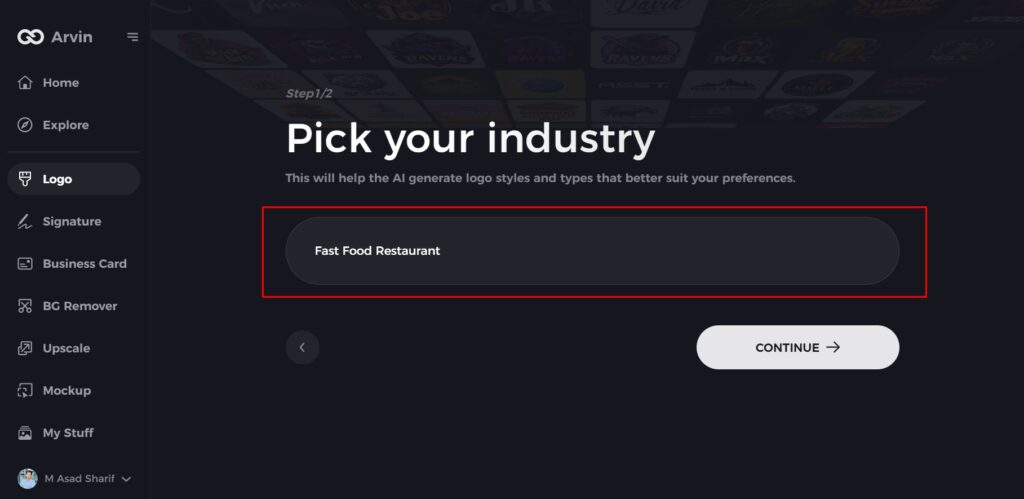
Step 3: Select Your Industry
Choose an industry from the available options. This helps the AI refine logo styles based on your business type.
Step 4: Choose a Style
Browse through different logo styles and select one that matches your brand’s identity. If unsure, skip this step, and the AI will generate a design based on default inspiration.
Step 5: Explore Logo Ideas
Arvin AI will create multiple logo concepts based on your inputs. Review the options and pick one that fits your brand image.
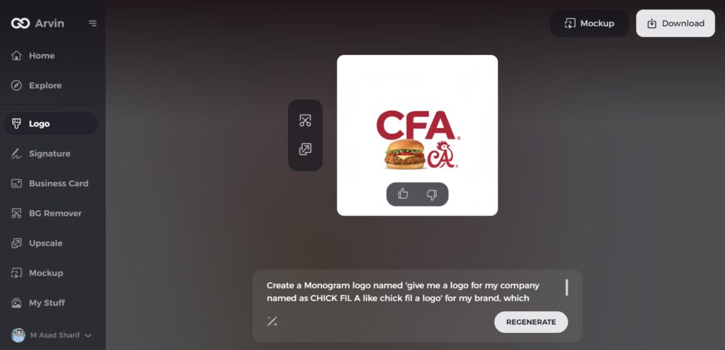
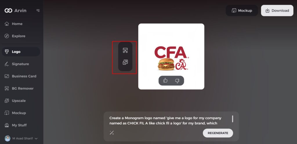
Step 6: Customize Your Logo
Adjust colors, fonts, icons, and layouts to align the logo with your brand’s style.
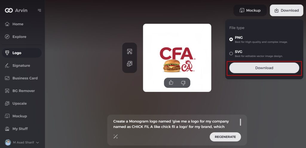
Step 7: Download Your Logo
Once satisfied with the design, download your logo in formats like PNG or SVG for use on websites, social media, and marketing materials.
Conclusion
The Lakers logo evolved over the decades but remained unbroken. From Minneapolis to leading in Los Angeles, the logo reveals much about the team. It stands for more than loop and more about tradition, passion, and heritage. Sports branding relies heavily on effective logo design because the Lakers demonstrated perfect branding through consistent improvements to their logo elements. Arvin AI assists organizations and designers to create logos that never age. An effective, symbolic logo for a company or a sports club is instrumental in establishing a reputed and lasting brand.
FAQs
What was the first Lakers logo?
The initial Lakers logo brought out in 1947 when the team called the Minneapolis Lakers. The logo consisted of a map of Minnesota and a basketball.
Why did the Lakers change their logo in 1960?
The Lakers relocated from Minneapolis to Los Angeles, and thus they had to introduce a new logo for their new base.
Has the Lakers logo changed significantly over the years?
Not significantly. The overall look has not been altered, but there have been minor improvements in color, font, and details.
How can Arvin AI help with logo design?
Arvin AI provides solutions to analyze, design, and optimize logos. It assists companies in designing logos that are classic and effective.
